패키지, 저장소 및 앱 카테고리 검색

day_month_picker 표지
패키지 상세v1.0.3

day_month_picker

이 패키지를 사용하면 원하는 월과 날짜를 쉽게 선택할 수 있습니다! 피커에서 간단한 날짜 선택 프로세스를 선택하세요 — 연도는 필요하지 않습니다. 즐기세요!

AndroidiOSWebmacOSWindowsLinux
30일 다운로드
103
좋아요
29
Pub 점수
150

패키지 설치

flutter pub add day_month_picker

패키지 개요

공개 정보를 바탕으로 생성한 선택 가이드입니다.

연도 선택 없이 사용자가 날짜의 일과 월을 쉽게 선택할 수 있도록 해주는 플러터 패키지입니다. 생일, 기념일, 이벤트 스케줄링 등 월과 일이 중요한 상황에 적합한 간단하고 직관적인 날짜 선택기 인터페이스를 제공합니다. 가볍고 안드로이드, iOS, 웹, macOS, Windows, 리눅스 등 여러 플랫폼을 지원합니다. 간편한 통합을 위해 설계되어 최소한의 설정으로 사용자 경험을 향상시킵니다.

사용 사례

  • 생일 선택
  • 기념일 기획
  • 이벤트 날짜 입력
  • 월간 알림
  • 간단한 날짜 입력

주요 기능

  • 연도 선택이 필요하지 않습니다
  • 크로스 플랫폼 지원
  • 최소 설정
  • 직관적인 사용자 인터페이스
  • 경량 설계

적합한 대상

  • 간단한 날짜 양식
  • 사용자 온보딩 흐름
  • 생일 선택기
  • 연도에 관계없는 날짜
  • 모바일 및 웹 앱

고려 사항

  • 연도 선택이 포함되지 않습니다
  • 일과 월로 제한
  • 완전한 날짜 검증에 적합하지 않습니다
  • 일자 논리 처리를 수동으로 수행해야 합니다
  • 현지화 지원에 대한 언급 없음

원본 README

연결된 소스 저장소의 README 원문 스냅샷입니다. 최신 내용은 저장소에서 확인하세요.

Day Month Picker or You can say Date Month picker

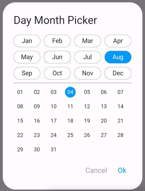
The DayMonthPicker widget is a customizable Flutter component that allows users to select a specific day and month from a dialog interface. It is particularly useful in forms or applications where date input is needed without year.

Features

Easy selection of months and days Customizable appearance Built-in support for existing day and month values Callback function to handle changes

Constructor

const DayMonthPicker({
  Key? key,
  this.surfaceTintColor,
  this.titleTextStyle,
  this.selectedMonthBgColor = Colors.blue,
  this.unSelectedMonthBgColor = Colors.white,
  this.selectedDayBgColor = Colors.blue,
  this.unSelectedDayBgColor = Colors.white,
  this.title = "Date Month Picker",
  this.selectedMonthTextStyle = const TextStyle(color: Colors.white, fontSize: 14),
  this.unSelectedMonthTextStyle = const TextStyle(color: Colors.black, fontSize: 14),
  this.selectedDayTextStyle = const TextStyle(color: Colors.white, fontSize: 12),
  this.unSelectedDayTextStyle = const TextStyle(color: Colors.black, fontSize: 12),
  this.child = const Padding(
    padding: EdgeInsets.all(8.0),
    child: Text("Month Picker"),
  ),
  this.cancelTextStyle = const TextStyle(color: Colors.grey, fontSize: 16),
  this.okTextStyle = const TextStyle(color: Colors.blue, fontSize: 16),
  this.existingDay,
  this.existingMonth,
  required this.onChange,
});

Parameters

  • key: An optional key to identify the widget.
  • surfaceTintColor: A color to tint the dialog surface (default is transparent).
  • titleTextStyle: Text style for the dialog title.
  • selectedMonthBgColor: Background color for the selected month (default is blue).
  • unSelectedMonthBgColor: Background color for unselected months (default is white).
  • selectedDayBgColor: Background color for the selected day (default is blue).
  • unSelectedDayBgColor: Background color for unselected days (default is white).
  • title: The title of the dialog (default is "Date Month Picker").
  • selectedMonthTextStyle: Text style for the selected month label.
  • unSelectedMonthTextStyle: Text style for unselected month labels.
  • selectedDayTextStyle: Text style for the selected day label.
  • unSelectedDayTextStyle: Text style for unselected day labels.
  • child: The widget displayed as the button to open the picker (default is a padded "Month Picker" text).
  • cancelTextStyle: Text style for the cancel button.
  • okTextStyle: Text style for the ok button.
  • existingDay: An optional string representing the already selected day.
  • existingMonth: An optional string representing the already selected month.
  • onChange: A required callback function that is triggered when the user selects a day and month.

Usage

Short and useful examples for package users.

DayMonthPicker(onChange: (DayMonth? dayMonth){
        if(dayMonth != null) {
          print("Day: ${dayMonth.day}");
          print("Month: ${dayMonth.month}");
        }
      }),

Example

@override
Widget build(BuildContext context) {
  return Scaffold(
    appBar: AppBar(title: Text('Day Month Picker Example')),
    body: Center(
      child: DayMonthPicker(
        onChange: (dayMonth) {
          // Do something with the selected day and month
          print('Selected Day: ${dayMonth.day}, Month: ${dayMonth.month}');
        },
      ),
    ),
  );
}

Some UI examples

Day Month Picker Example

Day Month Picker Example image (7)

카테고리

소스 저장소

이 패키지를 사용하는 프로젝트

아직 데이터가 없습니다.