
 v0.2.1
photox
인터랙티브 이미지를 표시하기 위한 종합 솔루션입니다.
7좋아요 5630일 다운로드120Pub 점수
AndroidiOSWebmacOSWindowsLinux
📸 상호작용 가능한 이미지를 표시하기 위한 종합 솔루션

^3.2.3^1.17.0{"sdk":"flutter"}^0.15.0{"sdk":"flutter"}^4.0.0아래는 영문 원문 스냅샷입니다. 최신 내용은 GitHub에서 확인하세요.
An all-in-one solution for displaying interactive images
https://user-images.githubusercontent.com/70937274/216778063-619e86a5-a512-4cf0-af08-6bc35eb75bf6.gif https://user-images.githubusercontent.com/70937274/216778074-3660e543-92a7-48b8-a8c7-65d181eb609e.gif
Add photox as a dependency in your pubspec.yaml file
flutter pub add photox
Import PhotoX:
import 'package:photox/photox.dart';
@override
Widget build(BuildContext context) {
  return Container(
    height: 400,
    width: 400,
    child: PhotoX(
      items: [
        PhotoXItem(
          id: "1", resource: "assets/img1.jpg", isAsset: true),
        PhotoXItem(
          id: "2", resource: "assets/img2.jpeg", isAsset: true),
      ]
    )
  );
}
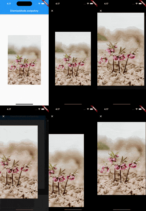
DismissMode.swipeAny |
DismissMode.swipeVertical |
|---|---|
| https://user-images.githubusercontent.com/70937274/218322920-97a5040f-40ad-4052-9ef0-7ee4a176efe3.gif | https://user-images.githubusercontent.com/70937274/218322933-cac41507-6faa-4608-a2d0-1e640f1a562a.gif |
⚠️ DismissMode.swipeAny can only be used when provided with a single PhotoXItem
Whether to show the page indicator in the thumbnail gallery for multiple PhotoXItems
The alignment of the page indicator relative to the gallery
The color of the active bubble in the page indicator
The color of the inactive bubbles in the page indicator
The background color of the page indicator
The radius of the indicator bubbles in the page indicator
The padding between the bubbles in the page indicator
The TextStyle for the AppBar title in the fullscreen gallery
A custom widget to use as the leading widget in the fullscreen gallery AppBar