패키지, 저장소 및 앱 카테고리 검색

photox 표지
패키지 상세v0.2.1

photox

인터랙티브 이미지를 표시하기 위한 종합 솔루션입니다.

AndroidiOSWebmacOSWindowsLinux
30일 다운로드
52
좋아요
7
Pub 점수
120

패키지 설치

flutter pub add photox

패키지 개요

공개 정보를 바탕으로 생성한 선택 가이드입니다.

PhotoX는 여러 플랫폼에서 이미지를 원활하게 표시하고 상호작용할 수 있도록 설계된 포괄적인 Flutter 패키지입니다. 줌, 패닝 및 터치 제스처를 내장 지원하여 사진 갤러리, 이미지 뷰어 및 인터랙티브 시각 콘텐츠에 적합합니다. 성능과 통합의 용이성에 중점을 두어 복잡한 사용자 정의 코드 없이 풍부한 이미지 경험을 구현하는 것을 단순화합니다. 이 패키지는 지속적으로 유지보수되며 Android, iOS, Web, macOS, Windows 및 Linux와 호환됩니다.

사용 사례

  • 인터랙티브 이미지 보기
  • 사진 갤러리 애플리케이션
  • 확대 가능한 이미지 표시
  • 디지털 아트 전시
  • 이미지 주석 도구

주요 기능

  • 제스처 기반 줌 및 팬
  • 크로스 플랫폼 호환성
  • 고성능 렌더링
  • 간단한 API 통합
  • 큰 이미지 지원
  • 반응형 디자인

적합한 대상

  • 이미지가 많은 앱을 개발하는 개발자
  • 빠른 이미지 상호작용 기능이 필요한 팀
  • 다중 플랫폼 이미지 지원이 필요한 프로젝트
  • 교육적 또는 창의적인 응용 프로그램

고려 사항

  • 매우 고해상도 이미지에 대한 최적화가 필요할 수 있습니다
  • 고급 UI 요소에 대한 사용자 정의 제한
  • Flutter의 렌더링 파이프라인에 의존합니다
  • 정적 또는 반상호형 이미지에 가장 적합
  • 실시간 이미지 편집에 적합하지 않음

원본 README

연결된 소스 저장소의 README 원문 스냅샷입니다. 최신 내용은 저장소에서 확인하세요.

PhotoX

An all-in-one solution for displaying interactive images


Features

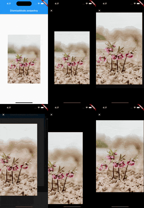
  • Smoothly animate images into fullscreen and back
  • Swipe to dismiss images
  • Pinch to zoom
  • Automatically generate swipeable gallery when given multiple images

Getting started

Add photox as a dependency in your pubspec.yaml file

flutter pub add photox

Import PhotoX:

import 'package:photox/photox.dart';

Usage

@override
Widget build(BuildContext context) {
  return Container(
    height: 400,
    width: 400,
    child: PhotoX(
      items: [
        PhotoXItem(
          id: "1", resource: "assets/img1.jpg", isAsset: true),
        PhotoXItem(
          id: "2", resource: "assets/img2.jpeg", isAsset: true),
      ]
    )
  );
}

Additional parameters

dismissMode
DismissMode.swipeAny DismissMode.swipeVertical

⚠️ DismissMode.swipeAny can only be used when provided with a single PhotoXItem

showPageIndicator

Whether to show the page indicator in the thumbnail gallery for multiple PhotoXItems

pageIndicatorAlignment

The alignment of the page indicator relative to the gallery

pageIndicatorActiveColor

The color of the active bubble in the page indicator

pageIndicatorInactiveColor

The color of the inactive bubbles in the page indicator

pageIndicatorBackgroundColor

The background color of the page indicator

pageIndicatorBubbleRadius

The radius of the indicator bubbles in the page indicator

pageIndicatorBubblePadding

The padding between the bubbles in the page indicator

fullscreenGalleryTitleTextStyle

The TextStyle for the AppBar title in the fullscreen gallery

fullscreenGalleryAppBarLeadingWidget

A custom widget to use as the leading widget in the fullscreen gallery AppBar

카테고리

의존성

의존성 목록 3 개

소스 저장소

이 패키지를 사용하는 프로젝트

아직 데이터가 없습니다.