
 v1.0.7
flutter_dropdown_alert
Flutter용 드롭다운 알림 패키지로, API 호출이 성공하거나 실패하거나 경고가 발생했을 때 사용자에게 푸시 알림처럼 알림을 전달하는 데 도움을 줍니다.
99좋아요 1.3천30일 다운로드140Pub 점수
AndroidiOSWebmacOSWindowsLinux
Flutter 드롭다운 알림은 성공, 경고 또는 오류 발생 시 사용자에게 알림을 제공하여 앱 내 푸시 알림과 유사한 기능을 수행합니다.

{"sdk":"flutter"}{"sdk":"flutter"}아래는 영문 원문 스냅샷입니다. 최신 내용은 GitHub에서 확인하세요.
A dropdown alert package for flutter
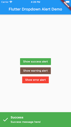
Dropdown alert will help to notify to user when you call api success, error or something like that, such as in app notification. It's will similar with push notification but you can custom more than that. You can show alert at anywhere without widget.
https://github.com/vantuan88291/flutter_dropdown_alert/raw/master/screenshot/dropdown.gif
https://github.com/vantuan88291/flutter_dropdown_alert/raw/master/screenshot/demo-2.png
# pubspec.yaml

dependencies:
  flutter:
    sdk: flutter
  flutter_dropdown_alert: <last-version>
Just create a Stack widget and add DropdownAlert() inside MaterialApp which should be in main.dart like this:
import 'package:flutter_dropdown_alert/dropdown_alert.dart';
 MaterialApp(
       title: 'Dropdown Alert Demo',
       theme: ThemeData(
         visualDensity: VisualDensity.adaptivePlatformDensity,
       ),
       builder: (context, child) => Stack(
         children: [
            child!,
            DropdownAlert()
         ],
       ),
       home: MyHomePage(title: 'Flutter Dropdown Alert Demo'),
     );
https://github.com/vantuan88291/flutter_bloc_modular
Next, import 'alert_controller.dart' into your dart code
import 'package:flutter_dropdown_alert/alert_controller.dart';
AlertController.show("Title", "message here!", TypeAlert.success, payload);
The payload param is Map<String, dynamic>, this param is optional, should use to give data into the alert and get it when click on alert.
The alert will automatically hide, but if you use delayDismiss: 0, it will freeze and not auto hide, you have to hide the alert by this code:
AlertController.hide();
There are 2 ways to do that:
initState() of widget: AlertController.onTabListener((Map<String, dynamic>? payload, TypeAlert type) {
print("$payload - $type");
});
onTap: DropdownAlert(onTap: (Map<String, dynamic> payload?, TypeAlert type) {
print("$payload - $type");
},)
| Type | description |
|---|---|
| TypeAlert.success | Type when action success, the background of alert will green |
| TypeAlert.warning | Type when action warning, the background of alert will brown |
| TypeAlert.error | Type when action error, the background of alert will red |
| parameter | description | default |
|---|---|---|
| onTap | Callback when tab to alert, will give: Function(Map<String, dynamic>, TypeAlert) | null |
| successImage | Image.asset() of success alert, uri of assets image | Icon widget |
| warningImage | Image.asset() of warning alert, uri of assets image | Icon widget |
| errorImage | Image.asset() of error alert, uri of assets image | Icon widget |
| closeImage | Image.asset() of close image, when showCloseButton is true | Icon widget |
| errorBackground | Color of background when error | Colors.red |
| successBackground | Colors.green | |
| warningBackground | 0xFFCE863D | |
| titleStyle | TextStyle of title | |
| contentStyle | TextStyle of content | |
| maxLinesTitle | null | |
| maxLinesContent | null | |
| duration | duration of animation | 300 |
| delayDismiss | delay time when alert auto dismiss, set to 0 if you want to freeze alert | 3000 |
| position | show the position of alert, include: AlertPosition.TOP, AlertPosition.BOTTOM | AlertPosition.TOP |
| showCloseButton | When close button is present, only can click on button close to hide the alert | false |
| avoidBottomInset | Add optional variable for inset overlap | false |
The ideal from react-native-dropdownalert