
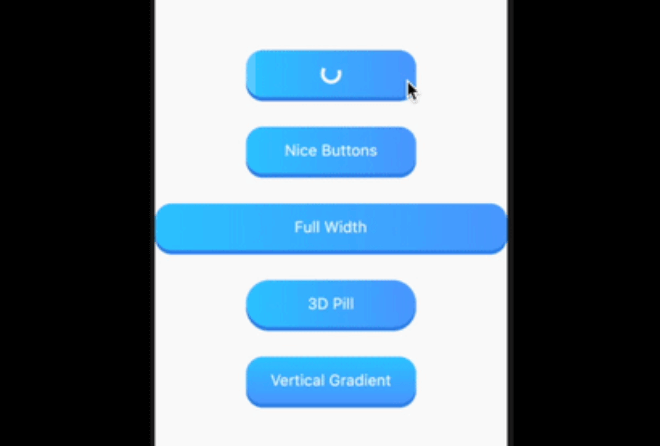
 v0.0.3
nice_buttons
Flutter 프로젝트용으로 아름답고 애니메이션 효과가 있으며 사용자 정의 가능한 3D 버튼으로 내장된 진행률 표시기와 우수한 눌림 애니메이션을 제공합니다.
64좋아요 7230일 다운로드155Pub 점수
AndroidiOSWebmacOSWindowsLinux
귀하의 플러터 프로젝트용으로 아름답고 애니메이션 효과가 있으며 사용자 정의 가능한 3D 버튼

{"sdk":"flutter"}{"sdk":"flutter"}아래는 영문 원문 스냅샷입니다. 최신 내용은 GitHub에서 확인하세요.
nice_buttons a beautiful, animated, and customizable 3D button for your flutter project.
| Android | iOS | Web | MacOS | Linux | Windows |
|---|---|---|---|---|---|
| ✅ | ✅ | ✅ | ✅ | ✅ | ✅ |
Sample Image
Add it as a dependency in their pubspec.yaml:
dependencies:
  nice_buttons: ^0.0.3
| Attribute | Type | Default | Description |
|---|---|---|---|
startColor |
Color |
0xFF2ec8ff |
The gradient start color |
endColor |
Color |
0xFF529fff |
The gradient end color |
borderColor |
Color |
0xFF3489e9 |
The color of the 3D border. |
progressColor |
Color |
white |
The color of circular progress indicator, defaults to white |
progressSize |
Double |
20 |
The size of progress indicator circle, defaults to 20 |
gradientOrientation |
GradientOrientation |
Horizontal |
Orientation of the gradient defaults to Horizontal |
borderThickness |
Double |
5 |
The thickness of the 3D border, defaults to 5 |
height |
Double |
60 |
Height of the button, defaults to 60 |
width |
Double |
200 |
Width of the button defaults to 200, its useless if the stretch property is set to true |
stretch |
bool |
true |
Whether to occupy the full available space in the parent, defaults to true |
borderRadius |
Double |
20 |
The border radius of the button, defaults to 20 |
progress |
bool |
false |
Whether the progress indicator is required or not, defaults to false |
disabled |
bool |
false |
Disables the button, defaults to false |
onTap |
Function(void Function() finish) |
Button tap handler with finish callback to reset the state of progress and animation when called, required* |
|
child |
Widget |
Inner content for the button, required* |
...
import 'package:nice_buttons/nice_buttons.dart';
...
NiceButtons(
  stretch: true,
  gradientOrientation: GradientOrientation.Horizontal,
  onTap: (finish) {
    print('On tap called');
  },
  child: Text(
    'Full Width',
    style: TextStyle(color: Colors.white, fontSize: 18),
  ),
);
Check example folder for more examples.