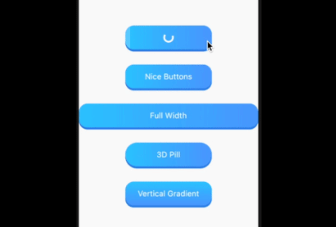
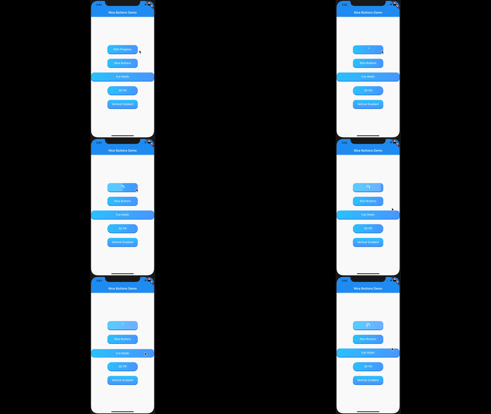
Nice Buttons는 시각적으로 매력적이고 부드러운 눌림 애니메이션과 통합된 진행률 표시기를 갖춘 애니메이션 3D 버튼을 제공하는 Flutter 패키지입니다. 현대적인 앱 인터페이스를 위해 설계되었으며, 동적 피드백과 사용자 정의 가능한 스타일링으로 사용자 상호작용을 향상시킵니다. Android, iOS, 웹, macOS, Windows, Linux 등 여러 플랫폼을 지원하여 크로스플랫폼 프로젝트에 이상적입니다. 직관적인 커스터마이징 옵션을 통해 개발자는 색상, 그림자, 애니메이션 행동을 쉽게 조정하여 앱의 디자인 언어와 일치시킬 수 있습니다.
사용 사례
인터랙티브 3D 버튼으로 UI 향상
내장된 진행률을 사용하여 로딩 상태 표시
매력적인 행동 유도 요소 만들기
양식 및 작업에서 사용자 피드백 개선
모바일 및 웹 앱에 세련된 마무리 추가하기
주요 기능
3D 애니메이션 버튼 효과
내장형 진행률 표시기
사용자 정의 가능한 외관 및 동작
부드러운 누름 애니메이션
크로스 플랫폼 호환성
pub.dev를 통한 간편한 통합
적합한 대상
매력적인 UI 컴포넌트를 찾는 플러터 개발자
상호작용 중 시각적 피드백이 필요한 프로젝트
현대적이고 세련된 디자인을 추구하는 앱
사용자 경험 향상에 집중하는 개발자
다중 플랫폼 애플리케이션을 개발하는 팀
고려 사항
저사양 기기에서는 성능 최적화가 필요할 수 있습니다
사용자 정의 옵션은 번들 크기를 약간 증가시킬 수 있습니다
애니메이션의 복잡성이 과도하게 사용될 경우 반응성에 영향을 미칠 수 있다
명확하고 단일 작업을 가진 버튼에 가장 적합
애니메이션이 필요 없는 간단한 정적 버튼에는 권장되지 않습니다
원본 README
연결된 소스 저장소의 README 원문 스냅샷입니다. 최신 내용은 저장소에서 확인하세요.
nice_buttons
nice_buttons a beautiful, animated, and customizable 3D button for your flutter project.
Platform Support
Android
iOS
Web
MacOS
Linux
Windows
✅
✅
✅
✅
✅
✅
Installation
Add it as a dependency in their pubspec.yaml:
dependencies:nice_buttons:^0.0.3
Customizations
Attribute
Type
Default
Description
startColor
Color
0xFF2ec8ff
The gradient start color
endColor
Color
0xFF529fff
The gradient end color
borderColor
Color
0xFF3489e9
The color of the 3D border.
progressColor
Color
white
The color of circular progress indicator, defaults to white
progressSize
Double
20
The size of progress indicator circle, defaults to 20
gradientOrientation
GradientOrientation
Horizontal
Orientation of the gradient defaults to Horizontal
borderThickness
Double
5
The thickness of the 3D border, defaults to 5
height
Double
60
Height of the button, defaults to 60
width
Double
200
Width of the button defaults to 200, its useless if the stretch property is set to true
stretch
bool
true
Whether to occupy the full available space in the parent, defaults to true
borderRadius
Double
20
The border radius of the button, defaults to 20
progress
bool
false
Whether the progress indicator is required or not, defaults to false
disabled
bool
false
Disables the button, defaults to false
onTap
Function(void Function() finish)
Button tap handler with finish callback to reset the state of progress and animation when called, required*