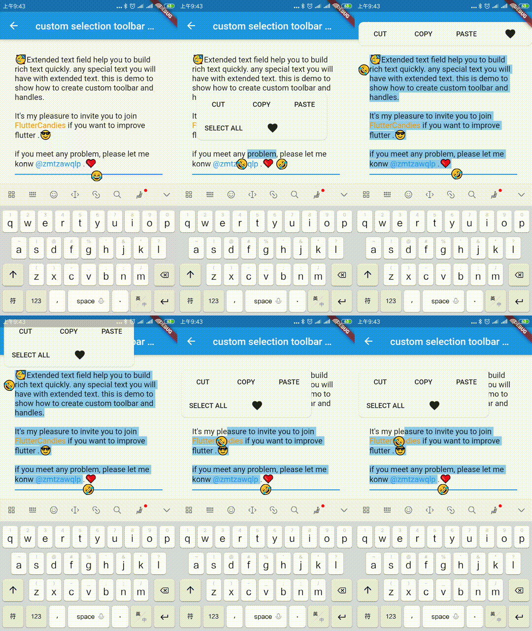
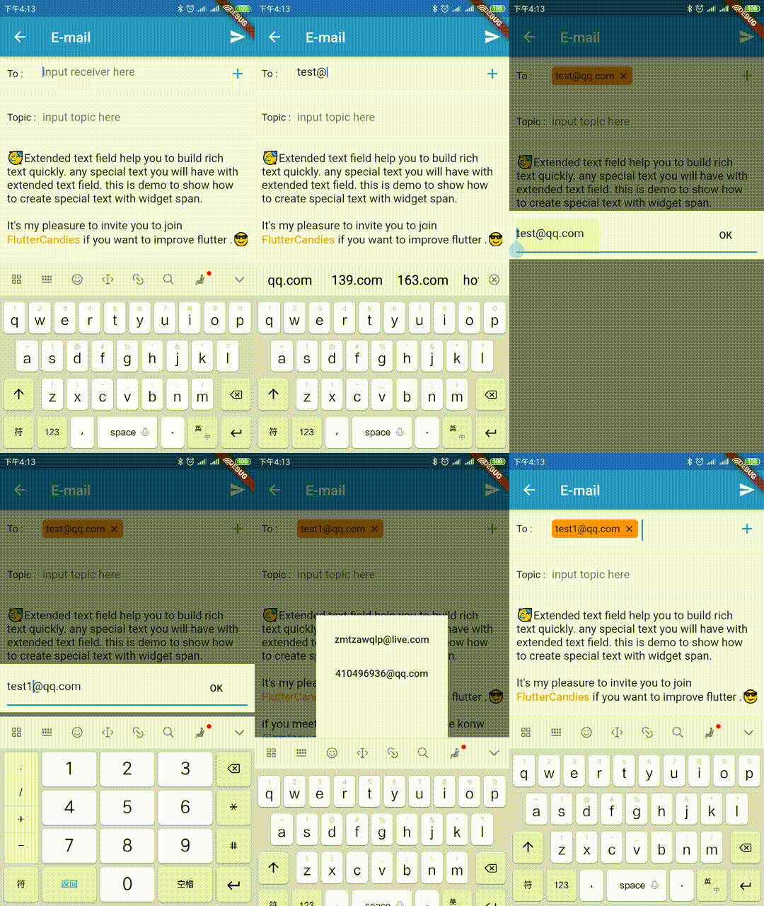
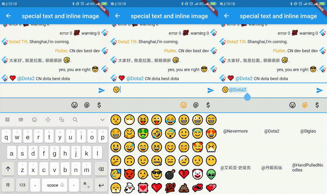
Extended official text field to build special text like inline image, @somebody, custom background etc quickly.It also support to build custom seleciton toolbar and handles.
The scale to place in the [ImageInfo] object of the image.
1.0
headers
The HTTP headers that will be used with [HttpClient.get] to fetch image from network.
-
cache
whether cache image to local
false
retries
the time to retry to request
3
timeLimit
time limit to request image
-
timeRetry
the time duration to retry to request
milliseconds: 100
cancelToken
token to cancel network request
CancellationToken()
/// Clear the disk cache directory then return if it succeed./// <param name="duration">timespan to compute whether file has expired or not</param>Future<bool> clearDiskCachedImages({Duration duration}) async
TextSelectionControls
override [ExtendedTextField.extendedContextMenuBuilder] and [TextSelectionControls] to custom your toolbar widget or handle widget
constdouble _kHandleSize = 22.0;
/// Android Material styled text selection controls.classMyTextSelectionControlsextendsTextSelectionControlswithTextSelectionHandleControls{
staticWidgetdefaultContextMenuBuilder(
BuildContext context, ExtendedEditableTextState editableTextState) {
returnAdaptiveTextSelectionToolbar.buttonItems(
buttonItems: <ContextMenuButtonItem>[
...editableTextState.contextMenuButtonItems,
ContextMenuButtonItem(
onPressed: () {
launchUrl(
Uri.parse(
'mailto:xxx@live.com?subject=extended_text_share&body=${editableTextState.textEditingValue.text}',
),
);
editableTextState.hideToolbar(true);
editableTextState.textEditingValue
.copyWith(selection: constTextSelection.collapsed(offset: 0));
},
type: ContextMenuButtonType.custom,
label: 'like',
),
],
anchors: editableTextState.contextMenuAnchors,
);
// return AdaptiveTextSelectionToolbar.editableText(// editableTextState: editableTextState,// );
}
/// Returns the size of the Material handle.@overrideSizegetHandleSize(double textLineHeight) =>
constSize(_kHandleSize, _kHandleSize);
/// Builder for material-style text selection handles.@overrideWidgetbuildHandle(
BuildContext context, TextSelectionHandleType type, double textLineHeight,
[VoidCallback? onTap, double? startGlyphHeight, double? endGlyphHeight]) {
finalWidget handle = SizedBox(
width: _kHandleSize,
height: _kHandleSize,
child: Image.asset(
'assets/40.png',
),
);
// [handle] is a circle, with a rectangle in the top left quadrant of that// circle (an onion pointing to 10:30). We rotate [handle] to point// straight up or up-right depending on the handle type.switch (type) {
caseTextSelectionHandleType.left: // points up-rightreturnTransform.rotate(
angle: math.pi / 4.0,
child: handle,
);
caseTextSelectionHandleType.right: // points up-leftreturnTransform.rotate(
angle: -math.pi / 4.0,
child: handle,
);
caseTextSelectionHandleType.collapsed: // points upreturn handle;
}
}
/// Gets anchor for material-style text selection handles.////// See [TextSelectionControls.getHandleAnchor].@overrideOffsetgetHandleAnchor(TextSelectionHandleType type, double textLineHeight,
[double? startGlyphHeight, double? endGlyphHeight]) {
switch (type) {
caseTextSelectionHandleType.left:
returnconstOffset(_kHandleSize, 0);
caseTextSelectionHandleType.right:
returnOffset.zero;
default:
returnconstOffset(_kHandleSize / 2, -4);
}
}
@overrideboolcanSelectAll(TextSelectionDelegate delegate) {
// Android allows SelectAll when selection is not collapsed, unless// everything has already been selected.finalTextEditingValue value = delegate.textEditingValue;
return delegate.selectAllEnabled &&
value.text.isNotEmpty &&
!(value.selection.start == 0 &&
value.selection.end == value.text.length);
}
}
WidgetSpan
support to select and hitTest ExtendedWidgetSpan, you can create any widget in ExtendedTextField.
or you need to override ignoreTextInputShow, you can do as following.
classYourBindingextendsTextInputBinding{
@override// ignore: unnecessary_overridesboolignoreTextInputShow() {
// you can override it base on your case// if NoKeyboardFocusNode is not enoughreturnsuper.ignoreTextInputShow();
}
}
voidmain() {
YourBinding();
runApp(constMyApp());
}
TextInputFocusNode
you should pass the [TextInputFocusNode] into [ExtendedTextField] or [TextField].
finalTextInputFocusNode _focusNode = TextInputFocusNode();
@overrideWidgetbuild(BuildContext context) {
returnExtendedTextField(
// request keyboard if need
focusNode: _focusNode..debugLabel = 'ExtendedTextField',
);
}
@overrideWidgetbuild(BuildContext context) {
returnTextField(
// request keyboard if need
focusNode: _focusNode..debugLabel = 'CustomTextField',
);
}
we prevent system keyboard show base on current focus is [TextInputFocusNode] and ignoreSystemKeyboardShow is true。
finalFocusNode? focus = FocusManager.instance.primaryFocus;
if (focus != null &&
focus isTextInputFocusNode &&
focus.ignoreSystemKeyboardShow) {
returntrue;
}
### CustomKeyboardshow/hide your custom keyboard on [TextInputFocusNode] focus is changed.
if your custom keyboard can be close without unFocus, you need also handle
show custom keyboard when [ExtendedTextField] or [TextField] `onTap`.
``` dart
@overridevoidinitState() {
super.initState();
_focusNode.addListener(_handleFocusChanged);
}
void_onTextFiledTap() {
if (_bottomSheetController == null) {
_handleFocusChanged();
}
}
void_handleFocusChanged() {
if (_focusNode.hasFocus) {
// just demo, you can define your custom keyboard as you want
_bottomSheetController = showBottomSheet<void>(
context: FocusManager.instance.primaryFocus!.context!,
// set false, if don't want to drag to close custom keyboard
enableDrag: true,
builder: (BuildContext b) {
// your custom keyboardreturnContainer();
});
// maybe drag close
_bottomSheetController?.closed.whenComplete(() {
_bottomSheetController = null;
});
} else {
_bottomSheetController?.close();
_bottomSheetController = null;
}
}
@overridevoiddispose() {
_focusNode.removeListener(_handleFocusChanged);
super.dispose();
}




 v17.0.0