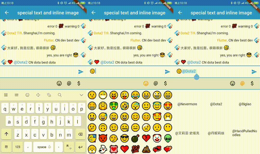
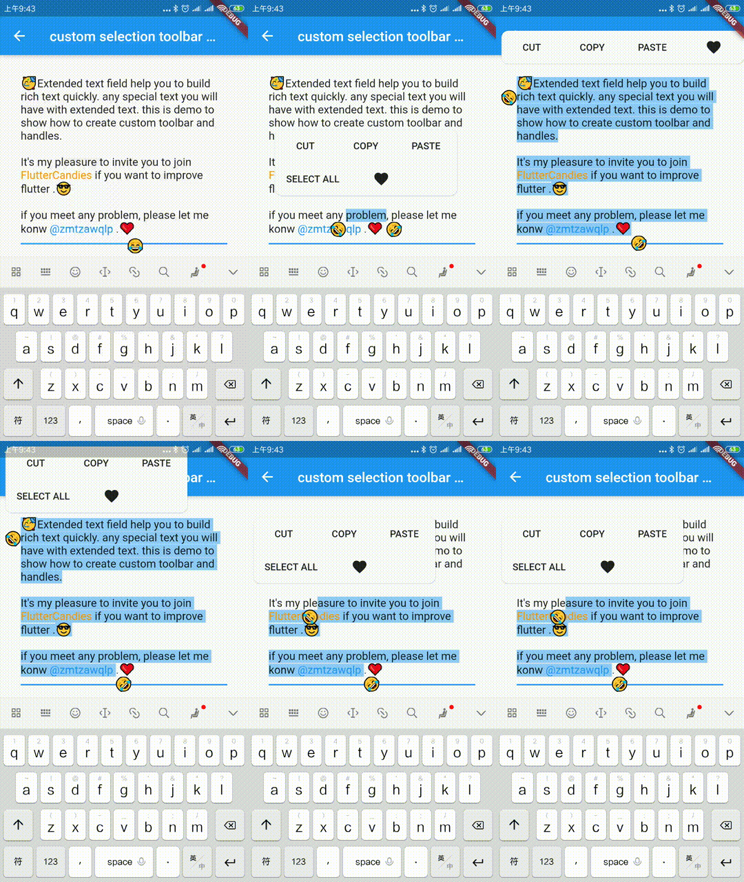
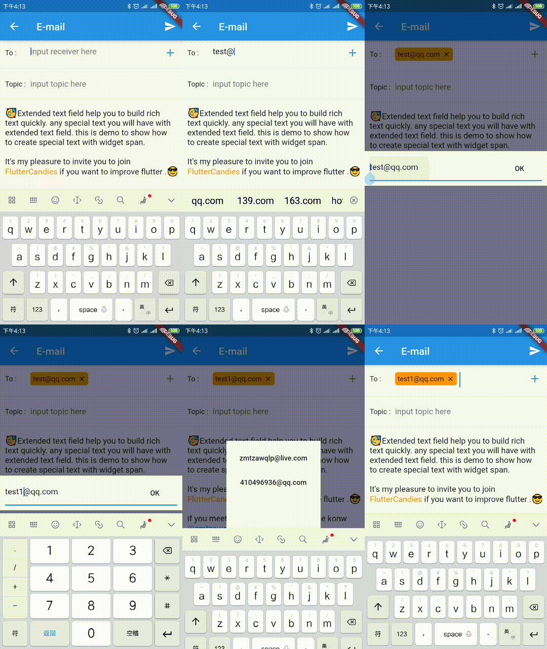
Campo de texto oficial estendido para criar rapidamente textos especiais como imagem embutida, @alguém, fundo personalizado, etc. Também oferece suporte para criar barras de ferramentas de seleção personalizadas e manipuladores.
Orientação gerada a partir de informações públicas. Apenas para referência.
ExtendedTextField é um poderoso pacote do Flutter que aprimora o campo de texto padrão ao permitir recursos de texto rico, como imagens embutidas, menções (@somebody) e fundos personalizados. Ele suporta a criação de barras de ferramentas de seleção personalizadas e alças de toque, oferecendo maior controle sobre as interações do usuário. Projetado para desenvolvedores que buscam capacidades avançadas de edição de texto, simplifica a criação de entradas de texto interativas e visualmente ricas em múltiplas plataformas.
Casos de uso
Criando interfaces de bate-papo com menções
Incorporar imagens no texto
Construindo aplicativos ricos de anotações
Implementando menus personalizados de seleção de texto
Desenvolvendo campos de texto em mídias sociais
Adicionar formatação de texto dinâmica
Principais recursos
Suporta imagens embutidas
Gerencia menções @ e hashtags
Barra de ferramentas de seleção personalizável
tipos de trecho de texto extensíveis
Compatibilidade multiplataforma
Manipuladores de toque configuráveis
Indicado para
Desenvolvedores construindo editores de texto rico
Aplicativos que exigem entrada de texto interativa
Aplicativos de bate-papo ou mensagens
Ferramentas de criação de conteúdo
componentes de texto intensivos em UI
Considerações
Requer compreensão de TextSpan e RichText
Pode aumentar a complexidade do aplicativo
Requer manipulação cuidadosa da lógica de seleção de texto
Documentação limitada em comparação com widgets principais
Impacto potencial no desempenho com muitos spans
README original
Snapshot do README original do repositório-fonte vinculado. Consulte o repositório para o conteúdo mais recente.
Extended official text field to build special text like inline image, @somebody, custom background etc quickly.It also support to build custom seleciton toolbar and handles.
The scale to place in the [ImageInfo] object of the image.
1.0
headers
The HTTP headers that will be used with [HttpClient.get] to fetch image from network.
-
cache
whether cache image to local
false
retries
the time to retry to request
3
timeLimit
time limit to request image
-
timeRetry
the time duration to retry to request
milliseconds: 100
cancelToken
token to cancel network request
CancellationToken()
/// Clear the disk cache directory then return if it succeed./// <param name="duration">timespan to compute whether file has expired or not</param>Future<bool> clearDiskCachedImages({Duration duration}) async
TextSelectionControls
override [ExtendedTextField.extendedContextMenuBuilder] and [TextSelectionControls] to custom your toolbar widget or handle widget
constdouble _kHandleSize = 22.0;
/// Android Material styled text selection controls.classMyTextSelectionControlsextendsTextSelectionControlswithTextSelectionHandleControls{
staticWidgetdefaultContextMenuBuilder(
BuildContext context, ExtendedEditableTextState editableTextState) {
returnAdaptiveTextSelectionToolbar.buttonItems(
buttonItems: <ContextMenuButtonItem>[
...editableTextState.contextMenuButtonItems,
ContextMenuButtonItem(
onPressed: () {
launchUrl(
Uri.parse(
'mailto:xxx@live.com?subject=extended_text_share&body=${editableTextState.textEditingValue.text}',
),
);
editableTextState.hideToolbar(true);
editableTextState.textEditingValue
.copyWith(selection: constTextSelection.collapsed(offset: 0));
},
type: ContextMenuButtonType.custom,
label: 'like',
),
],
anchors: editableTextState.contextMenuAnchors,
);
// return AdaptiveTextSelectionToolbar.editableText(// editableTextState: editableTextState,// );
}
/// Returns the size of the Material handle.@overrideSizegetHandleSize(double textLineHeight) =>
constSize(_kHandleSize, _kHandleSize);
/// Builder for material-style text selection handles.@overrideWidgetbuildHandle(
BuildContext context, TextSelectionHandleType type, double textLineHeight,
[VoidCallback? onTap, double? startGlyphHeight, double? endGlyphHeight]) {
finalWidget handle = SizedBox(
width: _kHandleSize,
height: _kHandleSize,
child: Image.asset(
'assets/40.png',
),
);
// [handle] is a circle, with a rectangle in the top left quadrant of that// circle (an onion pointing to 10:30). We rotate [handle] to point// straight up or up-right depending on the handle type.switch (type) {
caseTextSelectionHandleType.left: // points up-rightreturnTransform.rotate(
angle: math.pi / 4.0,
child: handle,
);
caseTextSelectionHandleType.right: // points up-leftreturnTransform.rotate(
angle: -math.pi / 4.0,
child: handle,
);
caseTextSelectionHandleType.collapsed: // points upreturn handle;
}
}
/// Gets anchor for material-style text selection handles.////// See [TextSelectionControls.getHandleAnchor].@overrideOffsetgetHandleAnchor(TextSelectionHandleType type, double textLineHeight,
[double? startGlyphHeight, double? endGlyphHeight]) {
switch (type) {
caseTextSelectionHandleType.left:
returnconstOffset(_kHandleSize, 0);
caseTextSelectionHandleType.right:
returnOffset.zero;
default:
returnconstOffset(_kHandleSize / 2, -4);
}
}
@overrideboolcanSelectAll(TextSelectionDelegate delegate) {
// Android allows SelectAll when selection is not collapsed, unless// everything has already been selected.finalTextEditingValue value = delegate.textEditingValue;
return delegate.selectAllEnabled &&
value.text.isNotEmpty &&
!(value.selection.start == 0 &&
value.selection.end == value.text.length);
}
}
WidgetSpan
support to select and hitTest ExtendedWidgetSpan, you can create any widget in ExtendedTextField.
or you need to override ignoreTextInputShow, you can do as following.
classYourBindingextendsTextInputBinding{
@override// ignore: unnecessary_overridesboolignoreTextInputShow() {
// you can override it base on your case// if NoKeyboardFocusNode is not enoughreturnsuper.ignoreTextInputShow();
}
}
voidmain() {
YourBinding();
runApp(constMyApp());
}
TextInputFocusNode
you should pass the [TextInputFocusNode] into [ExtendedTextField] or [TextField].
finalTextInputFocusNode _focusNode = TextInputFocusNode();
@overrideWidgetbuild(BuildContext context) {
returnExtendedTextField(
// request keyboard if need
focusNode: _focusNode..debugLabel = 'ExtendedTextField',
);
}
@overrideWidgetbuild(BuildContext context) {
returnTextField(
// request keyboard if need
focusNode: _focusNode..debugLabel = 'CustomTextField',
);
}
we prevent system keyboard show base on current focus is [TextInputFocusNode] and ignoreSystemKeyboardShow is true。
finalFocusNode? focus = FocusManager.instance.primaryFocus;
if (focus != null &&
focus isTextInputFocusNode &&
focus.ignoreSystemKeyboardShow) {
returntrue;
}
### CustomKeyboardshow/hide your custom keyboard on [TextInputFocusNode] focus is changed.
if your custom keyboard can be close without unFocus, you need also handle
show custom keyboard when [ExtendedTextField] or [TextField] `onTap`.
``` dart
@overridevoidinitState() {
super.initState();
_focusNode.addListener(_handleFocusChanged);
}
void_onTextFiledTap() {
if (_bottomSheetController == null) {
_handleFocusChanged();
}
}
void_handleFocusChanged() {
if (_focusNode.hasFocus) {
// just demo, you can define your custom keyboard as you want
_bottomSheetController = showBottomSheet<void>(
context: FocusManager.instance.primaryFocus!.context!,
// set false, if don't want to drag to close custom keyboard
enableDrag: true,
builder: (BuildContext b) {
// your custom keyboardreturnContainer();
});
// maybe drag close
_bottomSheetController?.closed.whenComplete(() {
_bottomSheetController = null;
});
} else {
_bottomSheetController?.close();
_bottomSheetController = null;
}
}
@overridevoiddispose() {
_focusNode.removeListener(_handleFocusChanged);
super.dispose();
}