
 v2.0.0
editable
Um pacote de tabela de dados editável e altamente personalizável (planilha) para projetos Flutter.
223Curtidas 962Downloads em 30 dias150Pontos Pub
AndroidiOSWebmacOSWindowsLinux
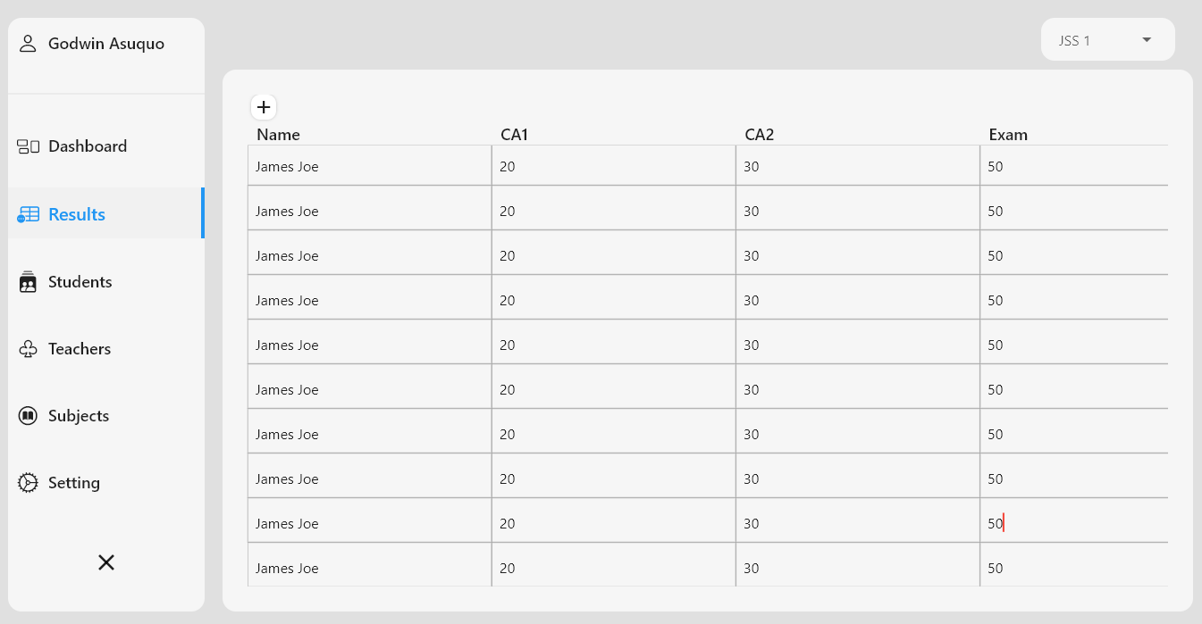
Esta biblioteca permite criar tabelas e planilhas editáveis com facilidade, fornecendo uma contagem inicial de linhas e colunas para exibir uma tabela vazia ou usando conjuntos de dados pré-definidos de linhas e colunas.

{"sdk":"flutter"}{"sdk":"flutter"}Texto original em inglês. Visite o GitHub para a versão atual.
⚡️A highly customizable, editable table package for Flutter projects.
This package allows you to create editable tables and spreadsheets with ease, either by providing inital row and column count to display an empty table, or use it with predefined rows and column data sets.
It is compatible with Flutter Desktop (Windows, Linux, MacOS), IOS, Android, and Web. ❤️
You can buy us a cup of coffee. Sponsor our next milestones
In the pubspec.yaml of your flutter project, add the following
dependency:
dependencies:
  ...
  editable: "^1.1.4"
In your library add the following import:
import 'package:editable/editable.dart';
To create a new table, use the Editable() widget class and provide the table data properties as follows:
column: an array of objects example
example:
List cols = [
  {"title":'Name', 'widthFactor': 0.2, 'key':'name'},
  {"title":'Date', 'widthFactor': 0.1, 'key':'date'},
  {"title":'Month', 'widthFactor': 0.1, 'key':'month'},
  {"title":'Status',  'key':'status'},
];
[title] is the column heading
[widthFactor] a custom size ratio of each column width, if not provided, defaults to [columnRatio = 0.20]
dart 'widthFactor': 0.1 //gives 10% of screen size to the column 'widthFactor': 0.2 //gives 20% of screen size to the column
[key] an identifyer preferably without space and special characters
rows: an array of objects, where each object key represents a column [key],
example:
List rows = [
    {"name": 'James Joe', "date":'23/09/2020',"month":'June',"status":'completed'},
    {"date":'12/4/2020',"month":'March',"name": 'Daniel Paul', "status":'new'},
  ];
Each objects DO NOT have to be positioned in same order as its column
rowCount: Interger value of number of rows to be generated: Optional if row data is provided
columnCount: Interger value of number of columns to be generated: Optional if column data is provided
columnRatio: fraction of the screen width occupied by each column. This is usefull for shrinking and expanding table width
example:
columnRation: 0.2 //sets each column to occupy 20 percent of screen width
borderColor: Color of table border
borderWidth: width of table borders
tdPaddingLeft: Table data cell padding left
tdPaddingTop: Table data cell padding top
tdPaddingRight: Table data cell padding right;
tdPaddingBottom: Table data cell padding bottom;
tdAlignment: Aligns the table data ;
tdStyle: Style the table data;
thPaddingLeft: Table header cell padding left;
thPaddingTop: Table header cell padding top;
thPaddingRight: Table header cell padding right;
thPaddingBottom: Table header cell padding bottom;
trHeight: Table Row Height, cannot be less than 40.0 ;
thWeight: Table headers fontweight;
thSize: Table headers fontSize;
tdEditableMaxLines : Max lines allowed in editable text, default: 1 (longer data will not wrap and be hidden), setting to 100 will allow wrapping and not increase row size;
showSaveIcon: Toogles the save button, if [true] displays an icon to save rows,
adds an addition column to the right
saveIcon: Icon for to save row data, example:
dart saveIcon : Icons.add
saveIconColor: Color for the save Icon
saveIconSize: Size for the saveIcon
showCreateButton: displays a button that adds a new row onPressed
stripeColor1: The first row alternate color, if stripe is set to true
stripeColor2: The Second row alternate color, if stripe is set to true;
zebraStripe: Enable zebra-striping, set to false by default
// if zebraStripe is enabled, you can style the colors [stripeColor1] and [stripeColor2]
createButtonAlign: Aligns the button for adding new rows;
createButtonIcon: Icon displayed in the create new row button;
createButtonColor: Color for the create new row button;
createButtonShape: border shape of the create new row button
createButtonShape: RoundedRectangleBorder( borderRadius: BorderRadius.circular(8) )
createButtonLabel: Label for the create new row button
Default styles can be supplied using EditableThemeData. Add the theme to
ThemeData.extensions or wrap a subtree with EditableTheme:
MaterialApp(
  theme: ThemeData(
    extensions: const [
      EditableThemeData(borderColor: Colors.blueGrey),
    ],
  ),
  home: MyHomePage(),
);
Unset parameters on widgets will fall back to values from the nearest
EditableTheme.
onSubmitted: [onSubmitted] callback is triggered when the enter button is tapped (for desktop users)
Or when edit is complete(on mobile) on a table data cell
it returns a value of the edited cell data
onRowSaved: [onRowSaved] callback is triggered when a [saveButton] is pressed.
returns only values if row is edited, otherwise returns a string ['no edit']
EditableState key: To get all Edited Rows outside the current context, you can access the editable state using a GlobalKey,
example:
     /// Create a Key for EditableState
    final _editableKey = GlobalKey<EditableState>();


    /// Function to add a new row
    /// Using the global key assigined to Editable widget
    /// Access the current state of Editable
    void _addNewRow() {
      setState(() {
        _editableKey.currentState.createRow();
      });
    }

    ///Print only edited rows.
    void _printEditedRows() {
      List editedRows = _editableKey.currentState.editedRows;
      print(editedRows);
    }

      @override
    Widget build(BuildContext context) {
      return Scaffold(
        appBar: AppBar(
          leadingWidth: 200,
          leading: FlatButton.icon(
              onPressed: () => _addNewRow(),
              icon: Icon(Icons.add),
              label: Text(
                'Add',
                style: TextStyle(fontWeight: FontWeight.bold),
              )),
          title: Text(widget.title),
          actions: [
            Padding(
              padding: const EdgeInsets.all(8.0),
              child: FlatButton(
                  onPressed: () => _printEditedRows(),
                  child: Text('Print Edited Rows',
                      style: TextStyle(fontWeight: FontWeight.bold))),
            )
          ],
        ),
        body: Editable(
          key: _editableKey, //Assign Key to Widget
          columns: cols,
          rows: rows,
          zebraStripe: true,
          stripeColor2: Colors.grey[200],
          borderColor: Colors.blueGrey,
        ),
      );
    }
| Editable Table with Data (zebraStripe) | Empty SpreadSheet (zebraStripe) | Empty SpreadSheet (No Stripe) |
|---|---|---|
| https://user-images.githubusercontent.com/41484542/96218374-85cb8100-0f7c-11eb-9bd3-f3154073d747.png | https://user-images.githubusercontent.com/41484542/96218512-caefb300-0f7c-11eb-93e1-77fd66f7cc2b.png | https://user-images.githubusercontent.com/41484542/96218567-e490fa80-0f7c-11eb-8df1-03aebd4b4ee4.png |
Table with Save Icon :-------------:| https://user-images.githubusercontent.com/41484542/95015531-4da37480-0645-11eb-965a-f3d3507c18da.png
The Following are resources to help you build with Editable:
I highly encourage the community to step forward and improve this library further. You can fix any reported bug, propose or implement new features, write tests, etc.
Here is a quick list of things to remember
This Editable table package for Flutter is developed by Godwin Asuquo
CY Uket AmitB Tim Maffet Thumbert ❤️Thank you all for your contributions
Also, as always, please give us a star to help!