
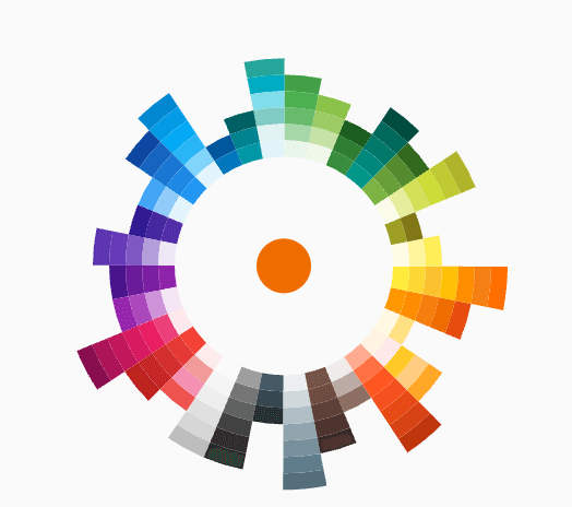
 v0.0.1
flutter_color_picker_wheel
一個完全用dart編寫的輪狀顏色選擇器
40喜歡 118近 30 天下載120Pub 分數
AndroidiOSWebmacOSWindowsLinux
一個受概念應用顏色選擇器啟發的 Flutter 顏色選擇器

^2.0.1{"sdk":"flutter"}{"sdk":"flutter"}^1.0.0以下為英文專案原文快照,最新內容請造訪 GitHub。
dashbook
Flutter Color Picker Wheel is an easy-to-use widget that can be heavily customized.
Add the dependency to your pubspec.yaml
flutter_color_picker_wheel: ^0.0.1
Currently this Storybook only works well on Web
TODO: [ ] Use another storybook to provide better preview for both web and phone
https://flutter-color-picker-wheel.kexinlu.com
| Fan default Fan Default Preset | Fan simpleFan Simple Preset | Ray Default Sun Ray Default |
| Sun Ray Simple Sun Ray Simple | Detached Overlay default Detached Full Screen without Gap | Detached Full Screen with gap Detached Full Screen with Gap |
| Custom Color Custom Color Set | Custom Animation Custom Animation | Manage your own OverlayEntry Manage Your Own OverlayEntry |
you can find more examples in the example path of this repository
import 'package:flutter_color_picker_wheel/flutter_color_picker_wheel.dart';

Color color; /// you want to initialize this color in the initState method

Widget myButton = WheelColorPicker(
  onSelect: (Color newColor) {
    setState(() {
       color = newColor;
    });
  },
  /// long press to open, another behaviour is clickToOpen to open
  behaviour: ButtonBehaviour.longPressToOpen,
  /// inital color
  defaultColor: color,
  /// fanLikeAnimationConfig is a preset, you can import this from the package
  animationConfig: fanLikeAnimationConfig,
  /// simpleColors is a preset, you can import this from the package
  colorList: simpleColors,
  /// size of the clickable button in the middle
  buttonSize: 40,
  /// height of each piece (outerRadius - innerRadius of a piece)
  pieceHeight: 25,
  /// starting radius of the donut shaped wheel
  innerRadius: 80,
);
WheelColorPicker(
  onSelect: (Color newColor) {
    setState(() {
      color = newColor;
    });
  },
  defaultColor: color,
  animationConfig: fanLikeAnimationConfig,
  colorList: const [
    [Colors.red, Colors.redAccent, Colors.deepOrange],
    [Colors.black26, Colors.black45, Colors.black87],
    [Colors.blue, Colors.blueAccent, Colors.blueGrey],
    [Colors.deepPurpleAccent, Colors.purpleAccent],
  ],
  buttonSize: 40,
  pieceHeight: 15,
  innerRadius: 80,
);
WheelColorPicker(
  onSelect: (Color newColor) {
    setState(() {
      color = newColor;
    });
  },
  behaviour: ButtonBehaviour.clickToOpen,
  defaultColor: color,
  animationConfig: const FanAnimationConfig(
    animationDurationInMillisecond: 1000,
    rayAnimationConfig: RayAnimationConfig(
      curve: Curves.easeInQuad,
      enabled: false,
    ),
    scaleAnimationConfig: ScaleAnimationConfig(
      curve: Curves.easeInOutCubic,
      enabled: true,
      animationStartDelay: 0,
      animationFinishDelay: 0.2,
    ),
    opacityAnimationConfig: OpacityAnimationConfig(
      curve: Curves.linear,
      enabled: true,
      animationStartDelay: 0.2,
      animationFinishDelay: 0,
    ),
    rotationAnimationConfig: RotationAnimationConfig(
      curve: Curves.easeInQuad,
      enabled: true,
      animationFinishDelay: 0.4
    )
  ),
  colorList: defaultAvailableColors,
  buttonSize: 40,
  pieceHeight: 25,
  innerRadius: 80,
)
Note: This use case is a bit complicated.
If you decided to go this route there are several core ideas that you need to wrap your head around.
WheelOverlayEntryContent should be generated only ONCE but not generated each build. You can have a new OverlayEntry, but you only need one WheelOverlayEntryContent. This helps us to have a decent performance.WheelOverlayEntryContent to some component, you want to use LayerLink.
See WheelColorPicker as an exampleAnimationController to the Widget, thus you want to extend some ticker provider, eg. SingleTickerProviderStateMixinExample:
class ExampleUseOverlayOnlyState extends State<ExampleUseOverlayOnly> with SingleTickerProviderStateMixin {
  Color color = Colors.redAccent;
  late Widget overlayContent;
  late AnimationController controller;
  OverlayEntry? _overlayEntry;
  bool isOpen = false;

  @override
  void dispose() {
    if (_overlayEntry != null) {
      _overlayEntry!.remove();
      _overlayEntry = null;
    }
    controller.dispose();
    super.dispose();
  }

  void _showOverlay() async {
    if (!isOpen) {
      isOpen = true;
      controller.forward();
      OverlayState? overlayState = Overlay.of(context);
      _overlayEntry = OverlayEntry(builder: (context) => overlayContent);
      overlayState?.insert(_overlayEntry!);
    }
  }

  void _hideOverlay() async {
    if (isOpen) {
      isOpen = false;
      controller.reverse();
      Future.delayed(const Duration(milliseconds: 500)).then((_) {
        if (_overlayEntry != null) {
          _overlayEntry!.remove();
          _overlayEntry = null;
        }
      });
  }
  }

  @override
  void initState() {
    super.initState();
    controller = AnimationController(vsync: this, duration:Duration(milliseconds: 500));
    overlayContent = WheelOverlayEntryContent(
      animationController: controller,
      animationConfig: sunRayLikeAnimationConfig,
      colors: simpleColors,
      innerRadius: 200,
      pieceHeight: 20,
      pieceBorderSize: 5,
      hideOverlay: _hideOverlay,
      onSelect: (Color selectedColor) {
        _hideOverlay();
        setState(() {
          color = selectedColor;
        });
      },
    );
  }

  @override
  Widget build(BuildContext context) {
    return Container(
      padding: const EdgeInsets.all(150),
      child: Column(
        children:[
          Expanded(
            flex:12,
            child: Container(
              height: 500,
              width: 500,
              decoration: BoxDecoration(
                borderRadius: BorderRadius.circular(45),
                border: Border.all(
                  width: 15,
                  color: color
                )
              ),
            )
          ),
          const Expanded(flex:2, child: SizedBox()),
          Expanded(
            flex:2,
            child: MaterialButton(
              color: Colors.blueAccent,
              textColor: Colors.white,
              child: const Text("Click to Open"),
              onPressed: _showOverlay,
            ),
          ),
        ],
      )
    );
  }
}