搜尋套件、儲存庫與 APP 分類

flutter_color_picker_wheel 封面
套件詳情v0.0.1

flutter_color_picker_wheel

一個完全用dart編寫的輪狀顏色選擇器

AndroidiOSWebmacOSWindowsLinux
近 30 天下載
127
喜歡數
40
Pub 分數
120

安裝套件

flutter pub add flutter_color_picker_wheel

套件介紹

根據套件公開資料產生的選型評估,僅供參考。

一個完全以 Dart 寫成、輪狀的顏色選擇器,專為 Flutter 應用程式設計。它提供直覺的圓形介面來選擇顏色,非常適合設計工具、主題自訂器與創意應用。此選擇器支援平滑的顏色過渡,並相容於所有主要平台,包含 Android、iOS、Web、macOS、Windows 與 Linux。其乾淨且可自訂的使用者介面,讓開發者能以最少設定整合視覺上吸引人的顏色選擇體驗。

適用情境

  • 設計工具整合
  • 主題自訂介面
  • 創意應用顏色選擇
  • 行動和桌面應用程式使用者介面
  • 基於網路的顏色選擇器

主要特色

  • 圓形輪盤顏色選擇
  • 完全用 Dart 編寫
  • 跨平台相容性
  • 平滑顏色過渡
  • 可自定義的使用者介面
  • 與 Flutter 的輕鬆整合

適合對象

  • UI/UX 設計師
  • 應用開發者建構創意工具
  • 主題啟用的應用程式
  • 跨平台 Flutter 項目

使用建議

  • 限制為基於輪盤的選擇
  • 可能需要額外的樣式來實現品牌化
  • 不適用於複雜色彩模型,如 HSL 或 HSV

原始 README

以下為關聯原始碼儲存庫的 README 原文快照,最新內容請造訪原始碼儲存庫。

Flutter Color Picker Wheel

dashbook

Flutter Color Picker Wheel is an easy-to-use widget that can be heavily customized.

  • You can use the WheelColorPicker directly by providing list of colors you want to include and animation configs.
  • You can use the WheelColorPickerEntryContent and manage OverlayEntry yourself.
  • This library provides some presets which make it even easier to use this component.

How to use

Add the dependency to your pubspec.yaml

flutter_color_picker_wheel: ^0.0.1

Try it out

Currently this Storybook only works well on Web

TODO: [ ] Use another storybook to provide better preview for both web and phone

https://flutter-color-picker-wheel.kexinlu.com

Showcase

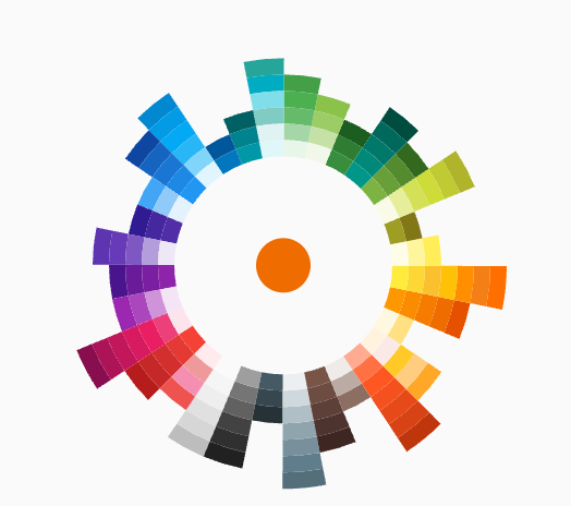
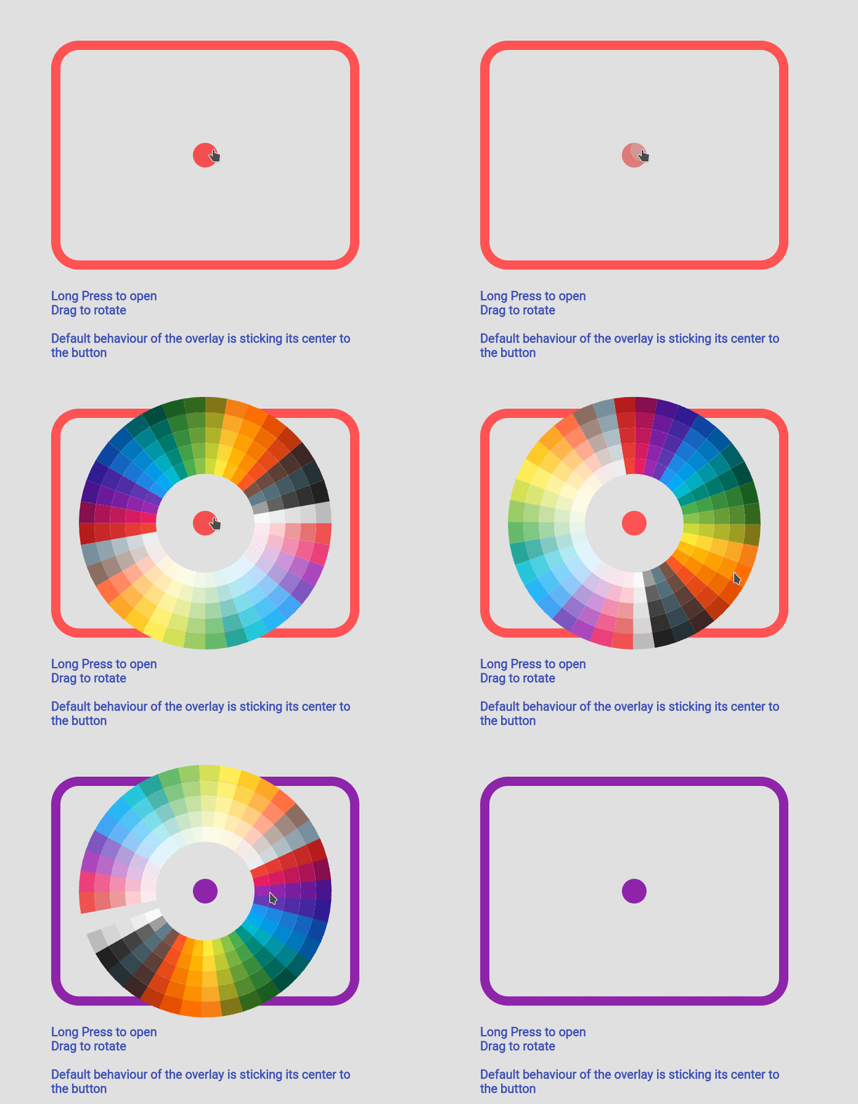
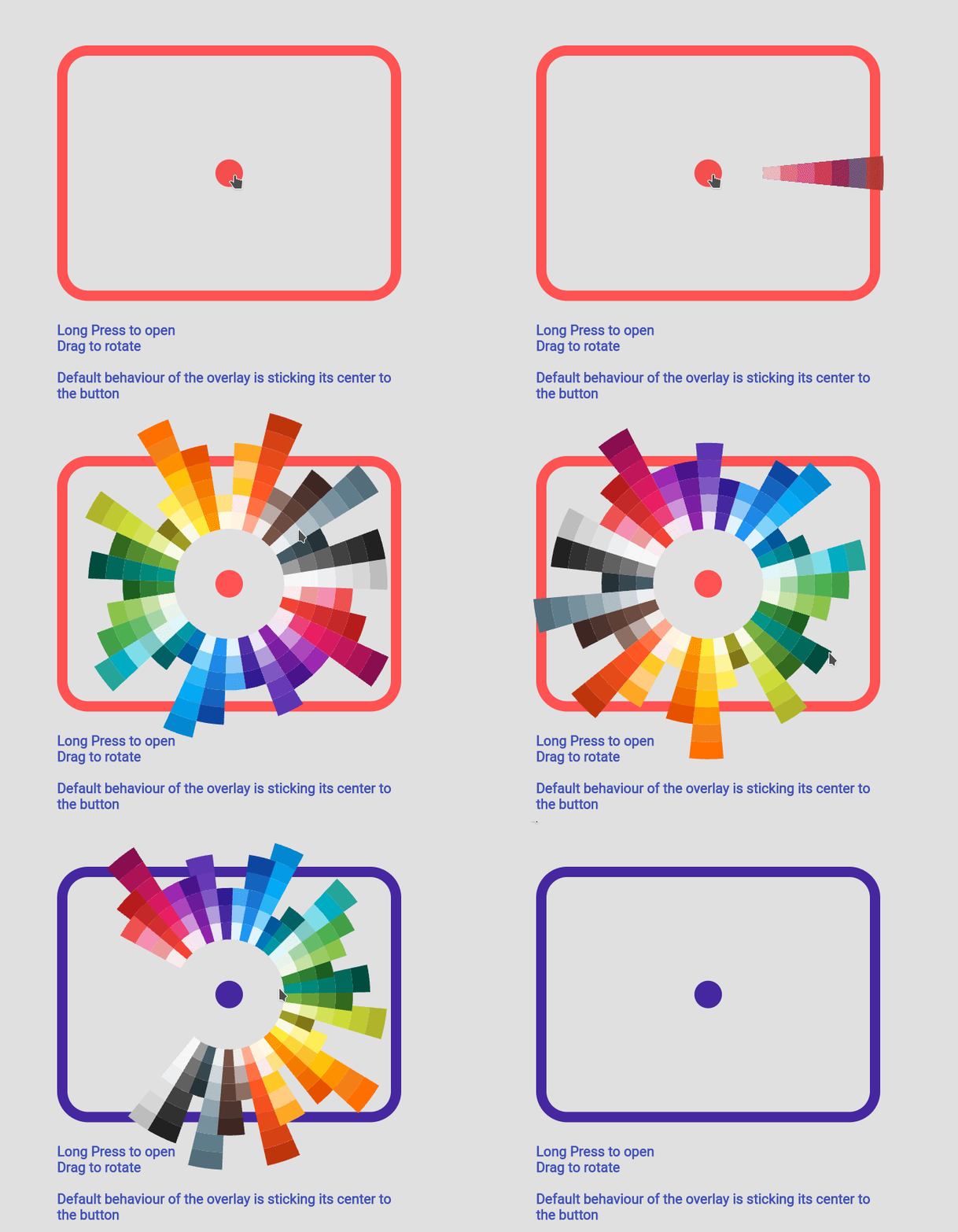
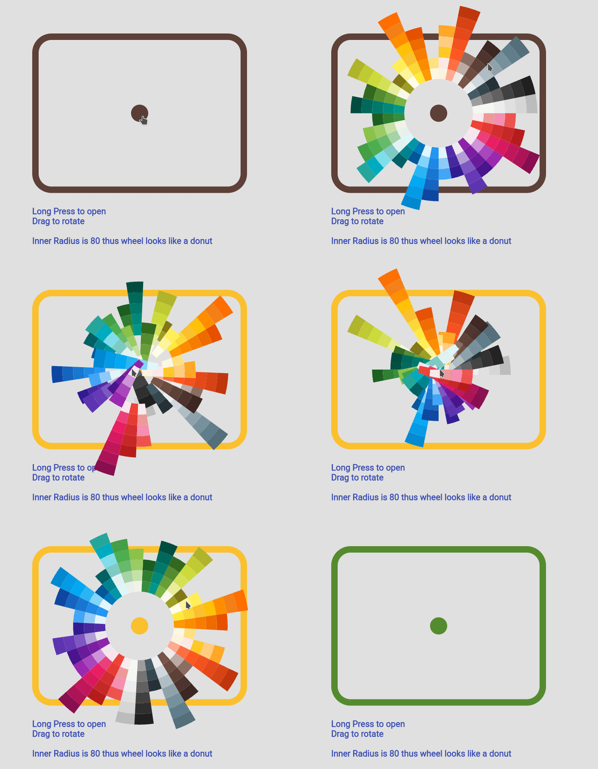
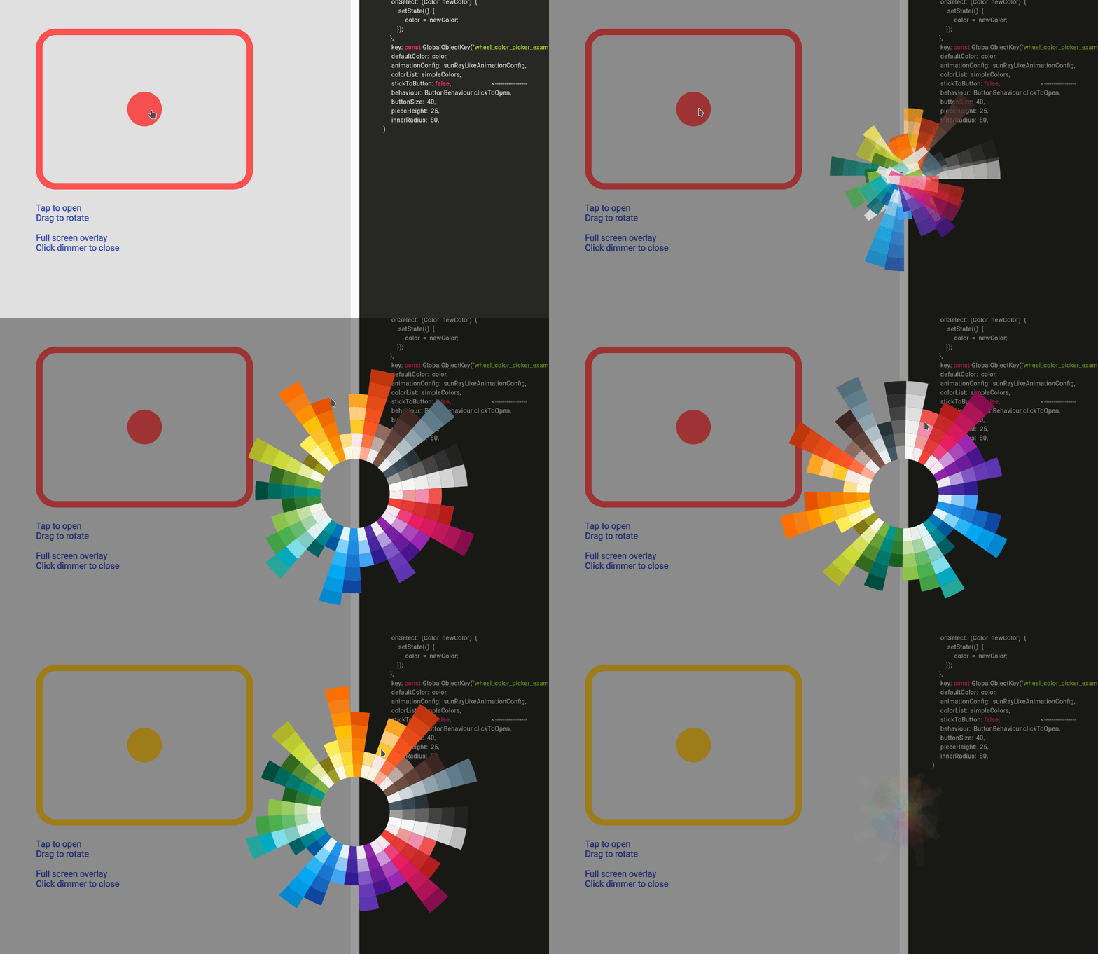
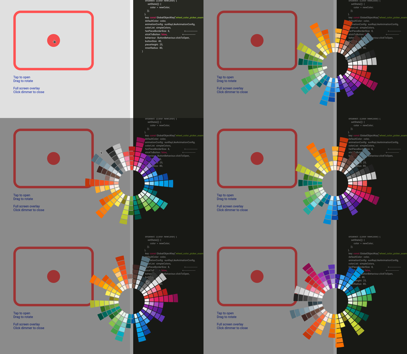
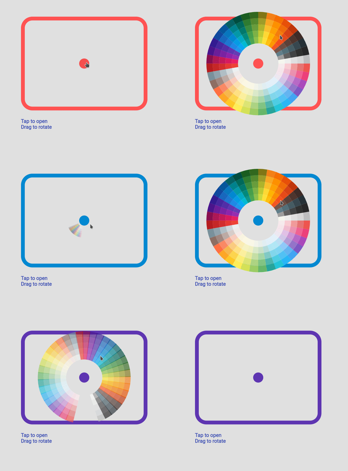
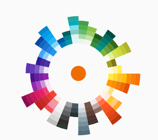
Fan default Fan Default Preset Fan simpleFan Simple Preset Ray Default Sun Ray Default
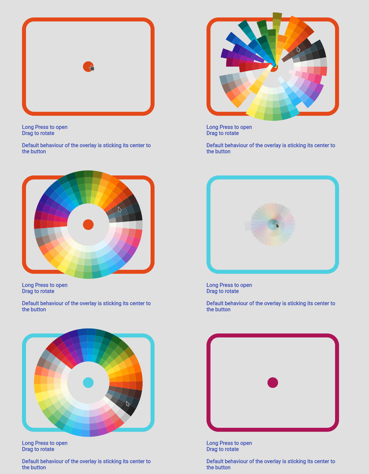
Sun Ray Simple Sun Ray Simple Detached Overlay default Detached Full Screen without Gap Detached Full Screen with gap Detached Full Screen with Gap
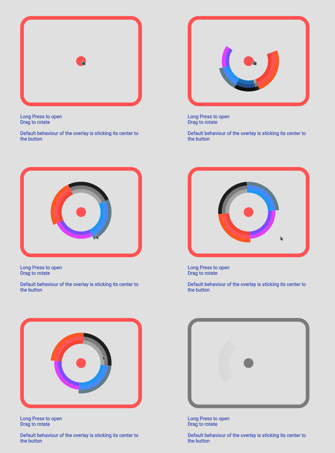
Custom Color Custom Color Set Custom Animation Custom Animation Manage your own OverlayEntry Manage Your Own OverlayEntry

Example Code

you can find more examples in the example path of this repository

Simple Usecase
Sun Ray Simple
import 'package:flutter_color_picker_wheel/flutter_color_picker_wheel.dart';

Color color; /// you want to initialize this color in the initState method

Widget myButton = WheelColorPicker(
  onSelect: (Color newColor) {
    setState(() {
       color = newColor;
    });
  },
  /// long press to open, another behaviour is clickToOpen to open
  behaviour: ButtonBehaviour.longPressToOpen,
  /// inital color
  defaultColor: color,
  /// fanLikeAnimationConfig is a preset, you can import this from the package
  animationConfig: fanLikeAnimationConfig,
  /// simpleColors is a preset, you can import this from the package
  colorList: simpleColors,
  /// size of the clickable button in the middle
  buttonSize: 40,
  /// height of each piece (outerRadius - innerRadius of a piece)
  pieceHeight: 25,
  /// starting radius of the donut shaped wheel
  innerRadius: 80,
);

Custom Color Set
Sun Ray Simple
WheelColorPicker(
  onSelect: (Color newColor) {
    setState(() {
      color = newColor;
    });
  },
  defaultColor: color,
  animationConfig: fanLikeAnimationConfig,
  colorList: const [
    [Colors.red, Colors.redAccent, Colors.deepOrange],
    [Colors.black26, Colors.black45, Colors.black87],
    [Colors.blue, Colors.blueAccent, Colors.blueGrey],
    [Colors.deepPurpleAccent, Colors.purpleAccent],
  ],
  buttonSize: 40,
  pieceHeight: 15,
  innerRadius: 80,
);

Custom Animation
Sun Ray Simple
WheelColorPicker(
  onSelect: (Color newColor) {
    setState(() {
      color = newColor;
    });
  },
  behaviour: ButtonBehaviour.clickToOpen,
  defaultColor: color,
  animationConfig: const FanAnimationConfig(
    animationDurationInMillisecond: 1000,
    rayAnimationConfig: RayAnimationConfig(
      curve: Curves.easeInQuad,
      enabled: false,
    ),
    scaleAnimationConfig: ScaleAnimationConfig(
      curve: Curves.easeInOutCubic,
      enabled: true,
      animationStartDelay: 0,
      animationFinishDelay: 0.2,
    ),
    opacityAnimationConfig: OpacityAnimationConfig(
      curve: Curves.linear,
      enabled: true,
      animationStartDelay: 0.2,
      animationFinishDelay: 0,
    ),
    rotationAnimationConfig: RotationAnimationConfig(
      curve: Curves.easeInQuad,
      enabled: true,
      animationFinishDelay: 0.4
    )
  ),
  colorList: defaultAvailableColors,
  buttonSize: 40,
  pieceHeight: 25,
  innerRadius: 80,
)

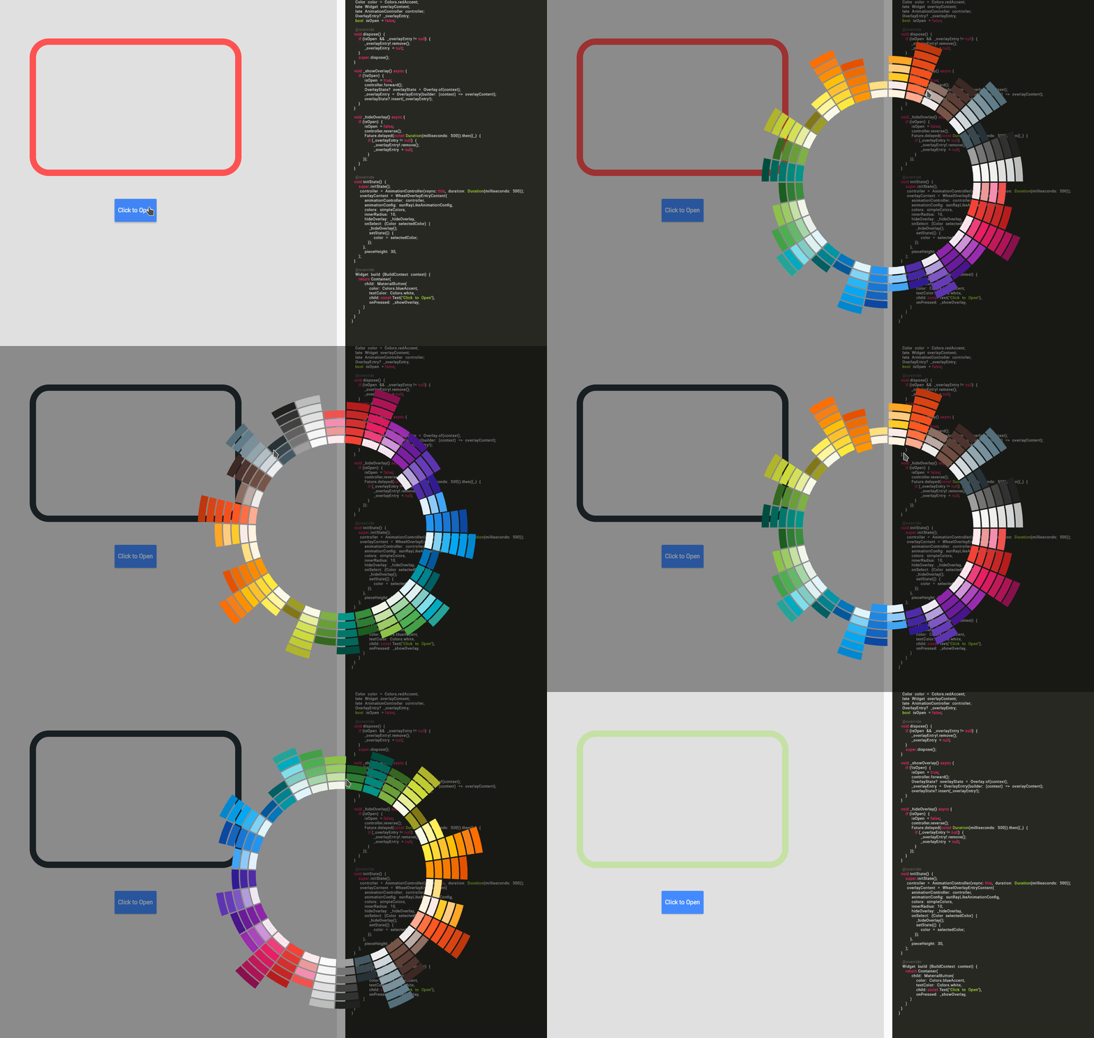
Using WheelColorPickerEntryContent
Sun Ray Simple

Note: This use case is a bit complicated.

If you decided to go this route there are several core ideas that you need to wrap your head around.

  • WheelOverlayEntryContent should be generated only ONCE but not generated each build. You can have a new OverlayEntry, but you only need one WheelOverlayEntryContent. This helps us to have a decent performance.
  • To stick the WheelOverlayEntryContent to some component, you want to use LayerLink. See WheelColorPicker as an example
  • You need to provide AnimationController to the Widget, thus you want to extend some ticker provider, eg. SingleTickerProviderStateMixin

Example:

class ExampleUseOverlayOnlyState extends State<ExampleUseOverlayOnly> with SingleTickerProviderStateMixin {
  Color color = Colors.redAccent;
  late Widget overlayContent;
  late AnimationController controller;
  OverlayEntry? _overlayEntry;
  bool isOpen = false;

  @override
  void dispose() {
    if (_overlayEntry != null) {
      _overlayEntry!.remove();
      _overlayEntry = null;
    }
    controller.dispose();
    super.dispose();
  }

  void _showOverlay() async {
    if (!isOpen) {
      isOpen = true;
      controller.forward();
      OverlayState? overlayState = Overlay.of(context);
      _overlayEntry = OverlayEntry(builder: (context) => overlayContent);
      overlayState?.insert(_overlayEntry!);
    }
  }

  void _hideOverlay() async {
    if (isOpen) {
      isOpen = false;
      controller.reverse();
      Future.delayed(const Duration(milliseconds: 500)).then((_) {
        if (_overlayEntry != null) {
          _overlayEntry!.remove();
          _overlayEntry = null;
        }
      });
  }
  }

  @override
  void initState() {
    super.initState();
    controller = AnimationController(vsync: this, duration:Duration(milliseconds: 500));
    overlayContent = WheelOverlayEntryContent(
      animationController: controller,
      animationConfig: sunRayLikeAnimationConfig,
      colors: simpleColors,
      innerRadius: 200,
      pieceHeight: 20,
      pieceBorderSize: 5,
      hideOverlay: _hideOverlay,
      onSelect: (Color selectedColor) {
        _hideOverlay();
        setState(() {
          color = selectedColor;
        });
      },
    );
  }

  @override
  Widget build(BuildContext context) {
    return Container(
      padding: const EdgeInsets.all(150),
      child: Column(
        children:[
          Expanded(
            flex:12,
            child: Container(
              height: 500,
              width: 500,
              decoration: BoxDecoration(
                borderRadius: BorderRadius.circular(45),
                border: Border.all(
                  width: 15,
                  color: color
                )
              ),
            )
          ),
          const Expanded(flex:2, child: SizedBox()),
          Expanded(
            flex:2,
            child: MaterialButton(
              color: Colors.blueAccent,
              textColor: Colors.white,
              child: const Text("Click to Open"),
              onPressed: _showOverlay,
            ),
          ),
        ],
      )
    );
  }
}

所屬分類

依賴

依賴清單 1 項

原始碼儲存庫

使用此套件的專案

暫無相關資料。