
 v2.2.0
flutter_expandable_table
用於建立可展開表格的 Flutter 小部件,包含固定表頭與第一欄。
178喜歡 2130近 30 天下載160Pub 分數
AndroidiOSWebmacOSWindowsLinux
用於建立可展開表格的 Flutter 小部件,包含固定表頭與第一欄。

{"sdk":"flutter"}^1.2.6^0.2.0^6.1.5+1^6.0.0{"sdk":"flutter"}^4.6.0以下為英文專案原文快照,最新內容請造訪 GitHub。
https://img.shields.io/static/v1?label=flutter&message=flutter_expandable_table&color=red??style=for-the-badge&logo=GitHub Pub Package Pub Points Pub Likes
Package Issue Package License
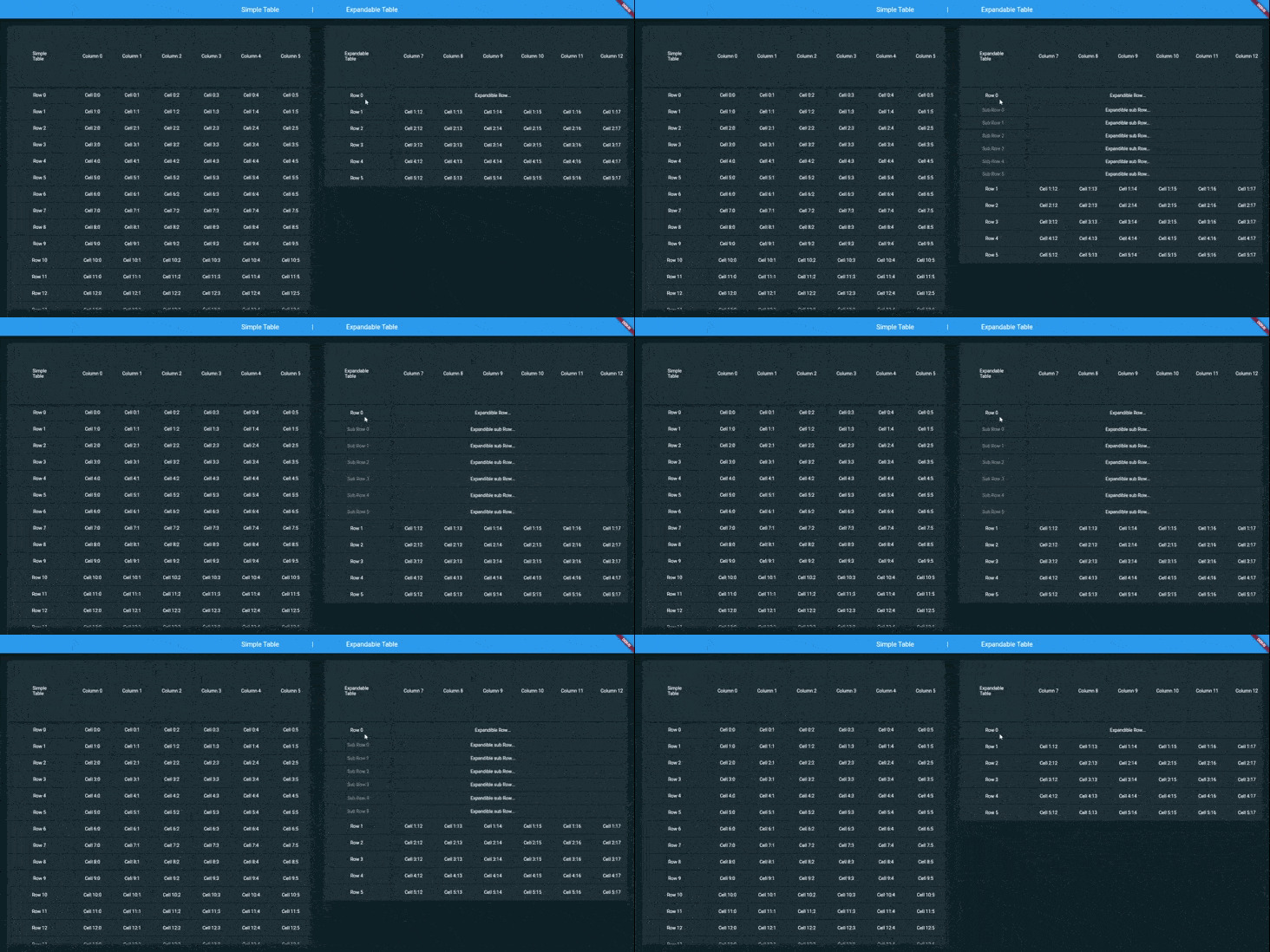
ExpandableTable is a widget for Flutter that create a Table with header and first column fixed. You can create a nested Rows/Columns grouped in expandable Row/Column
| Image |
|---|
| ExpandableTable |
Make sure to check out the examples on GitHub.
Add the following line to pubspec.yaml:
dependencies:
  flutter_expandable_table: <last-release>
Complete example available here.
     return ExpandableTable(
      firstHeaderCell: ExpandableTableCell(
        child: Text('Simple\nTable'),
      ),
      headers: headers,
      rows: rows,
    );
You can create an external controller to be able to dynamically manage the table, for example to add or remove rows within it.
Here is an example:
    //... Inside Widget State
    late ExpandableTableController controller;
    //....
    @override
    void initState() {
      controller = ExpandableTableController(
        firstHeaderCell: ExpandableTableCell(child: Container()),
        headers: [],
        rows: [],
        headerHeight: 263,
        defaultsColumnWidth: 200,
        firstColumnWidth: 300,
        scrollShadowColor: AppColors.black,
      );
      super.initState();
    }
    void _onEvent(){
      controller.rows.add(...your code...);
    }
    @override
    Widget build(BuildContext context) {
      return ExpandableTable(
        controller: controller,
      );
    }
//....
firstHeaderCell: Is the top left cell, i.e. the first header cell.headers: contains the list of all column headers, each one of these can contain a list of further headers, this allows you to create nested and expandable columns.rows: contains the list of all the rows of the table, each of these can contain a list of further rows, this allows you to create nested and expandable rows.headerHeight: is the height of each column header, i.e. the first row.firstColumnWidth: determines first Column width size.defaultsColumnWidth: defines the default width of all columns, it is possible to redefine it for each individual column.defaultsRowHeight: defines the default height of all rows, it is possible to redefine it for every single row.duration: determines duration rendered animation of Rows/Columns expansion.curve: determines rendered curve animation of Rows/Columns expansion.scrollShadowDuration: determines duration rendered animation of shadows.scrollShadowFadeInCurve: determines rendered curve animation of shadows appearance.scrollShadowFadeOutCurve: determines rendered curve animation of shadows disappearance.scrollShadowColor: determines rendered color of shadows.scrollShadowSize: determines size of shadows.visibleScrollbar: determines visibility of horizontal and vertical scrollbars.trackVisibilityScrollbar: indicates that the scrollbar track should be visible.thumbVisibilityScrollbar: indicates that the scrollbar thumb should be visible, even when a scroll is not underway.expanded: indicates that the table expands, so it fills the available space along the horizontal and vertical axes.