flutter_expandable_table
Expandable Table






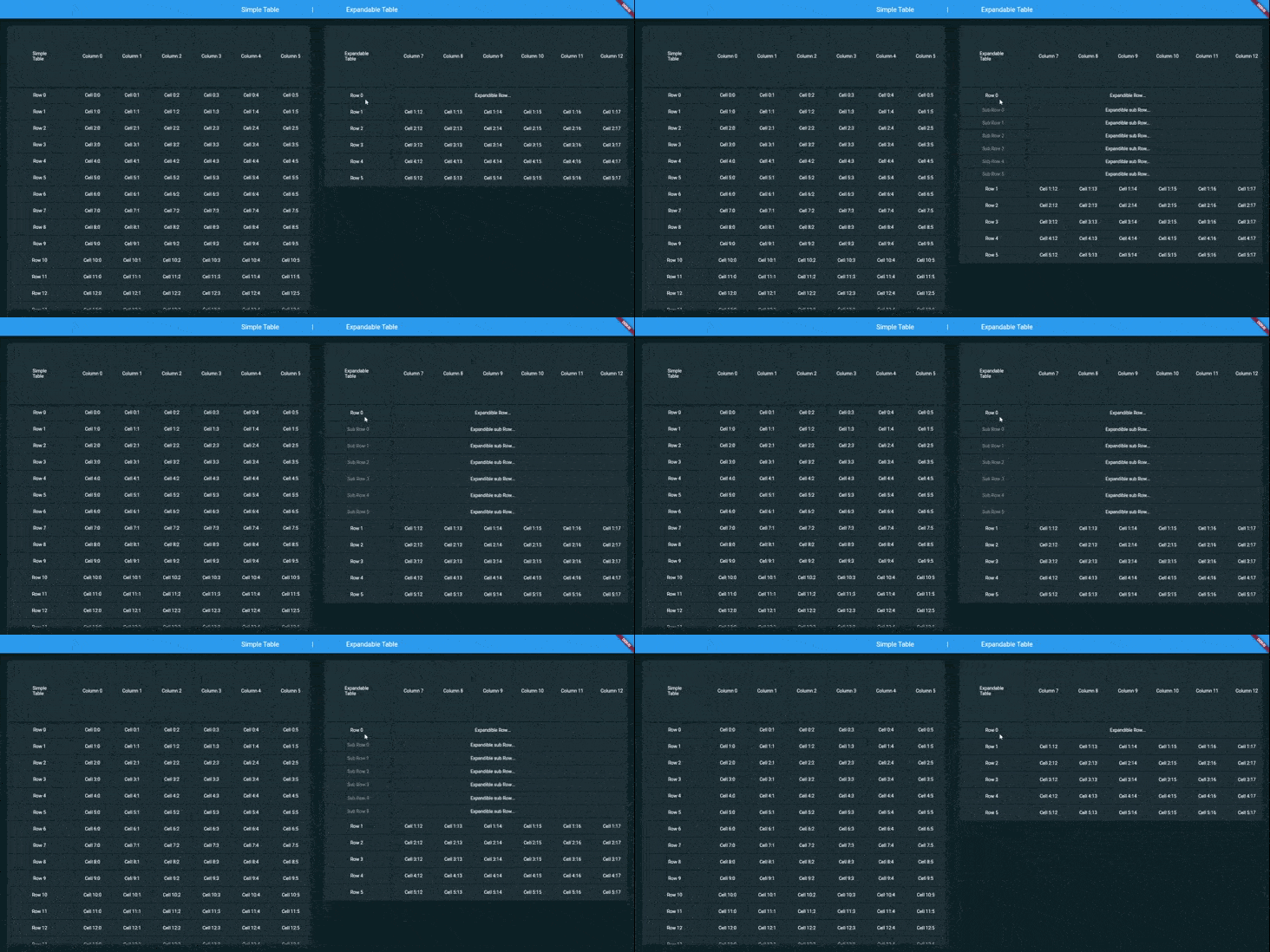
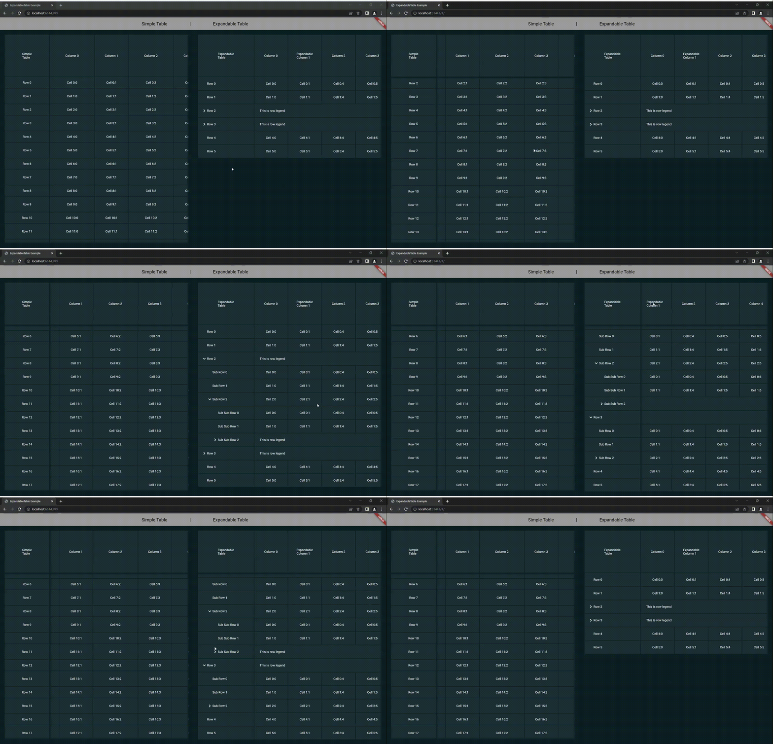
ExpandableTable is a widget for Flutter that create a Table with header and first column fixed. You can create a nested Rows/Columns grouped in expandable Row/Column
 |
| ExpandableTable |
Features
- Header and first column fixed
- Supports vertical and horizontal scroll
- Customizable animation Duration and Curve
- Specific height definition for each single row
- Specific width definition for each single column
- Access to cell address when building cell content
- Access to the parent rows and columns of the cell while building the contents of a cell
Usage
Make sure to check out the examples on GitHub.
Installation
Add the following line to pubspec.yaml:
dependencies:
  flutter_expandable_table: <last-release>
Basic setup
Complete example available here.
     return ExpandableTable(
      firstHeaderCell: ExpandableTableCell(
        child: Text('Simple\nTable'),
      ),
      headers: headers,
      rows: rows,
    );
Use with the controller
You can create an external controller to be able to dynamically manage the table, for example to add or remove rows within it.
Here is an example:
late ExpandableTableController controller;
@override
void initState() {
controller = ExpandableTableController(
firstHeaderCell: ExpandableTableCell(child: Container()),
headers: [],
rows: [],
headerHeight: 263,
defaultsColumnWidth: 200,
firstColumnWidth: 300,
scrollShadowColor: AppColors.black,
);
super.initState();
}
void _onEvent(){
controller.rows.add(...your code...);
}
@override
Widget build(BuildContext context) {
return ExpandableTable(
controller: controller,
);
}
ExpandableTable Properties
firstHeaderCell: Is the top left cell, i.e. the first header cell.headers: contains the list of all column headers, each one of these can contain a list of further headers, this allows you to create nested and expandable columns.rows: contains the list of all the rows of the table, each of these can contain a list of further rows, this allows you to create nested and expandable rows.headerHeight: is the height of each column header, i.e. the first row.firstColumnWidth: determines first Column width size.defaultsColumnWidth: defines the default width of all columns, it is possible to redefine it for each individual column.defaultsRowHeight: defines the default height of all rows, it is possible to redefine it for every single row.duration: determines duration rendered animation of Rows/Columns expansion.curve: determines rendered curve animation of Rows/Columns expansion.scrollShadowDuration: determines duration rendered animation of shadows.scrollShadowFadeInCurve: determines rendered curve animation of shadows appearance.scrollShadowFadeOutCurve: determines rendered curve animation of shadows disappearance.scrollShadowColor: determines rendered color of shadows.scrollShadowSize: determines size of shadows.visibleScrollbar: determines visibility of horizontal and vertical scrollbars.trackVisibilityScrollbar: indicates that the scrollbar track should be visible.thumbVisibilityScrollbar: indicates that the scrollbar thumb should be visible, even when a scroll is not underway.expanded: indicates that the table expands, so it fills the available space along the horizontal and vertical axes.
📚 My open source projects
Flutter
| Package |
Verison |
Score |
Likes |
Test |
Coverage |
|
|
|
|
|
|
 |
 |
 |
 |
|
|
 |
 |
 |
 |
|
|
 |
 |
 |
 |
|
|
Dart
| Package |
Verison |
Score |
Likes |
Test |
Coverage |
 |
 |
 |
 |
 |
 |
 |
 |
 |
 |
 |
 |