
 v1.0.25
fast_ui_kit
Fast UI Kit is a UI kit for fast development of applications in flutter
43Likes 20630-day downloads50Pub points
AndroidiOSmacOSWindowsLinux
flutter ui kit
English project snapshot. Visit GitHub for the latest content.
The "Fast UI Kit" is a Flutter package that aims to simplify application development by providing a collection of ready-to-use components. Similar to Quasar, it offers a set of components that can be used to quickly and efficiently create user interfaces while maintaining a consistent and elegant design.
The main goal of the "Fast UI Kit" is to expedite the development process by allowing developers to utilize pre-defined components instead of building each element from scratch. This saves time and effort while helping to maintain a cohesive visual appearance throughout the application.

✅ Dark Mode suporte ✅ Color scheme suporte
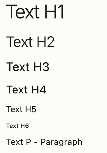
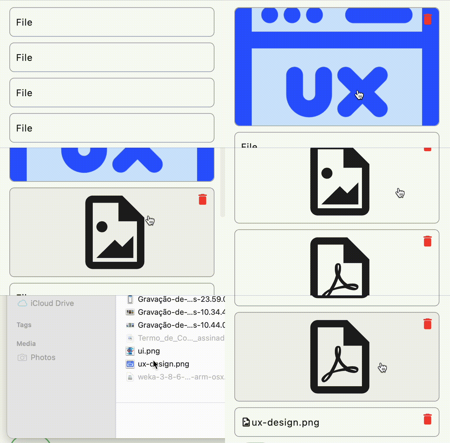
The components screenshots with colors scheme green selected



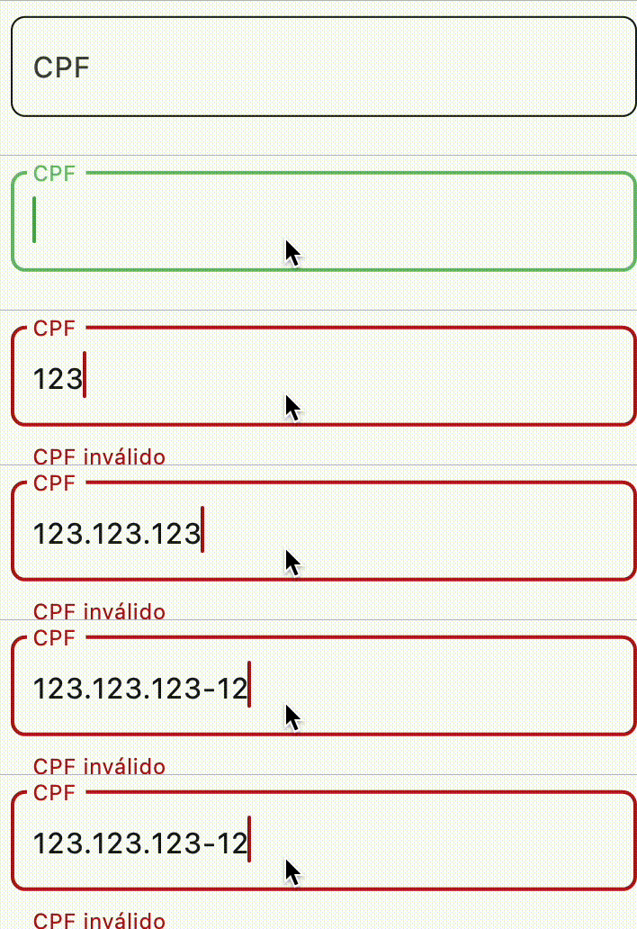

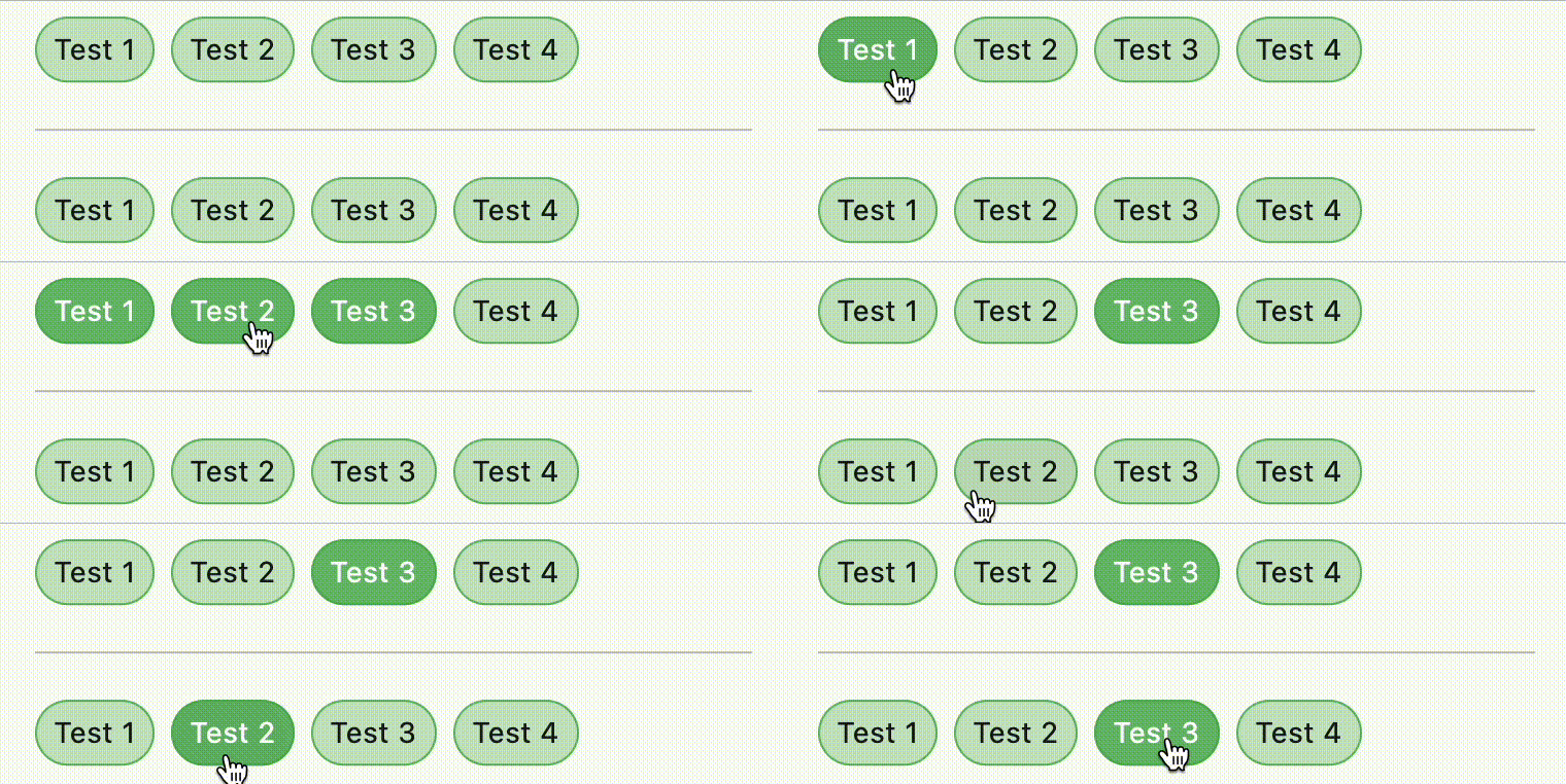

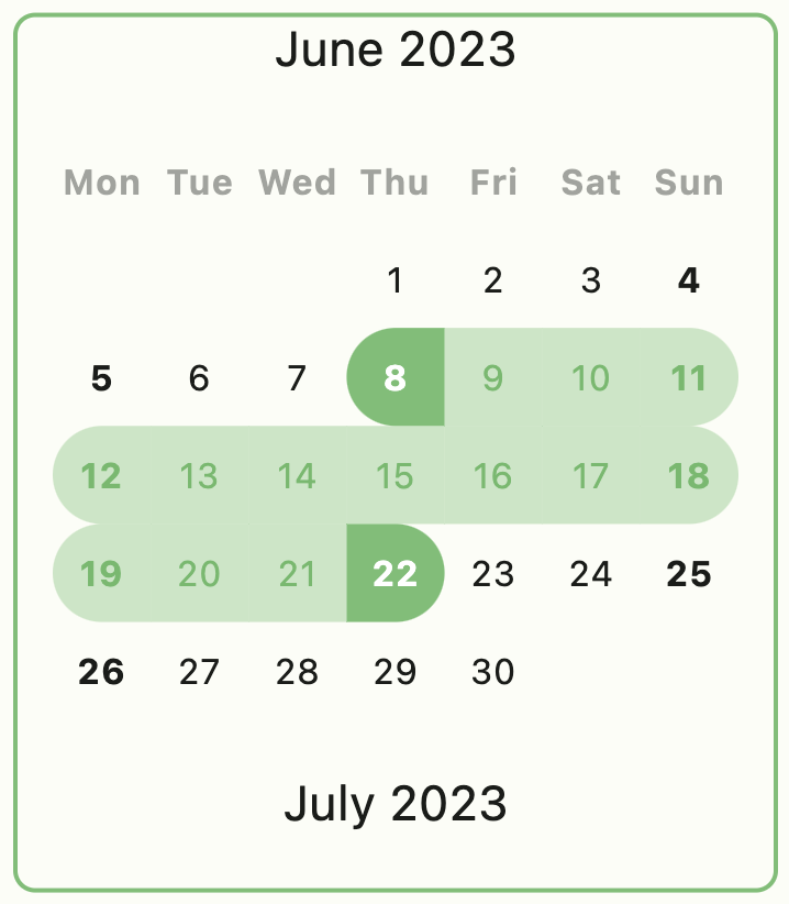


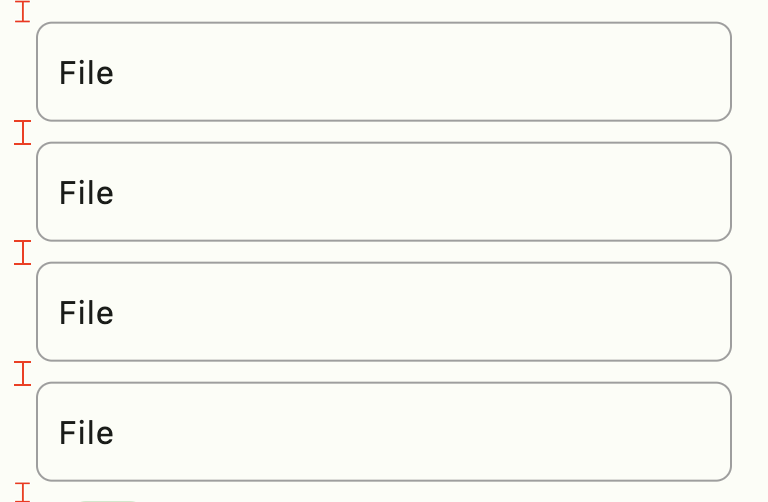
Use FastColumn to have a vertical gap between components
class MyApp extends StatelessWidget {
  MyApp({super.key});

  final theme = FastTheme(seed: Colors.green);

  @override
  Widget build(BuildContext context) {
    return MaterialApp(
      darkTheme: theme.dark,
      theme: theme.light,
      home: const HomePage(),
    );
  }
}
Icon(FastIcons.library.icon)color schemecurrent themebutton scheme of colorsbrightness of applicationexample:
context.showMessage(
  'Update user successful',
  title: 'Sucesso', //optional field
  type: MessageVariant.success, //optional field
  position: MessagePosition.top, //optional field
  style: Style.flat, //optional field
);
Feito com ❤️ by Weliton Sousa

Dependency list 13 items
^3.0.2^11.0.2{"sdk":"flutter"}^4.2.0^1.0.5^1.0.1^6.1.0^1.4.1^4.1.0^3.0.1^3.0.0{"sdk":"flutter"}^4.0.0Start with your use case, compare repository activity, and check the original project before adopting it.
“A repository is the most basic element of GitHub.”
GitHub Docs — About repositories ↗