Search categories, packages and repositories

fast_ui_kit cover
Package detailsv1.0.25

fast_ui_kit

Fast UI Kit is a UI kit for fast development of applications in flutter

AndroidiOSmacOSWindowsLinux
30-day downloads
206
Likes
43
Pub points
50

Install package

flutter pub add fast_ui_kit

Package Overview

Package selection guidance compiled from public package information, community data, and project usage.

Fast UI Kit is a Flutter widget library designed to accelerate application development with pre-built, customizable UI components. It offers a collection of ready-to-use widgets that streamline the creation of consistent and visually appealing interfaces across multiple platforms. Ideal for developers seeking efficiency without sacrificing design quality, it supports Android, iOS, macOS, Windows, and Linux. The kit promotes rapid prototyping and production-ready UIs through modular, reusable elements.

Use cases

  • Rapid app prototyping
  • Cross-platform UI development
  • Streamlining repetitive UI tasks
  • Building consistent design systems
  • Accelerating feature implementation

Key features

  • Pre-designed, customizable widgets
  • Cross-platform compatibility
  • Modular component architecture
  • Support for dark/light themes
  • Easy integration via pub.dev

Suitable for

  • Beginner to intermediate Flutter developers
  • Teams prioritizing development speed
  • Projects requiring consistent UI patterns
  • Startups needing fast time-to-market
  • Apps targeting multiple operating systems

Considerations

  • May require customization for unique design needs
  • Limited documentation beyond basic setup
  • Depends on external dependencies for full functionality
  • Not ideal for highly specialized or custom UI requirements
  • Potential learning curve for new users
Original README

Original README snapshot from the linked source repository. Visit the repository for the latest content.

Simple Implementation !

The "Fast UI Kit" is a Flutter package that aims to simplify application development by providing a collection of ready-to-use components. Similar to Quasar, it offers a set of components that can be used to quickly and efficiently create user interfaces while maintaining a consistent and elegant design.

The main goal of the "Fast UI Kit" is to expedite the development process by allowing developers to utilize pre-defined components instead of building each element from scratch. This saves time and effort while helping to maintain a cohesive visual appearance throughout the application.

✅ Dark Mode suporte ✅ Color scheme suporte

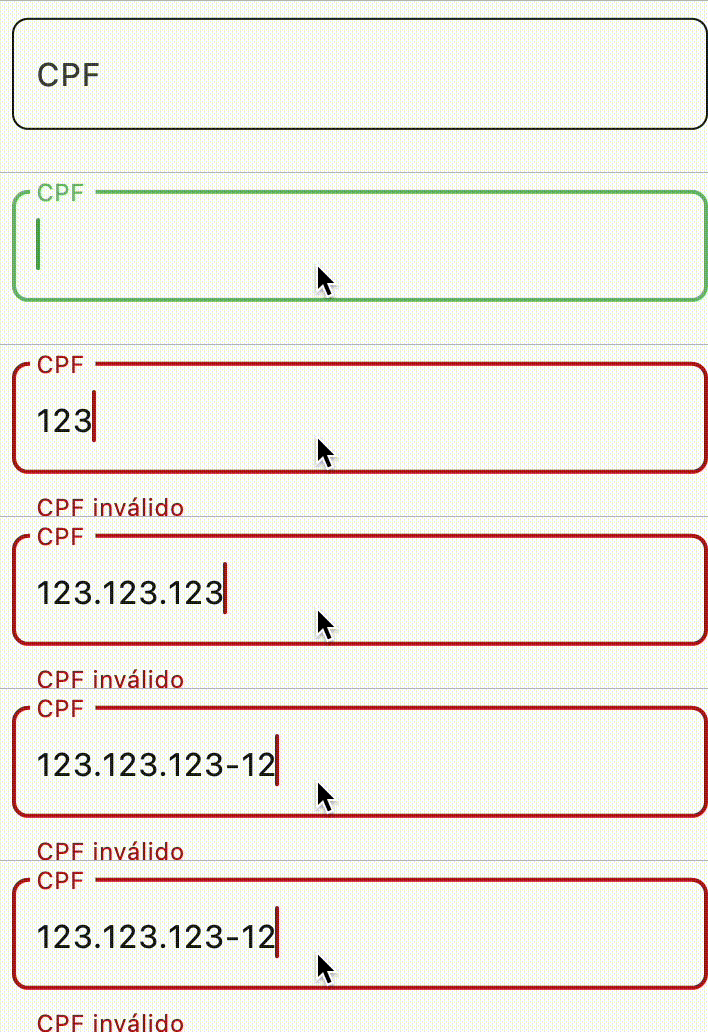
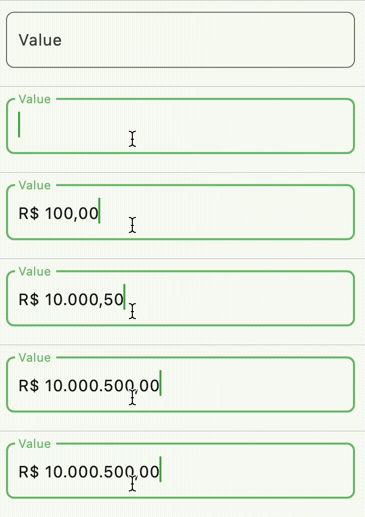
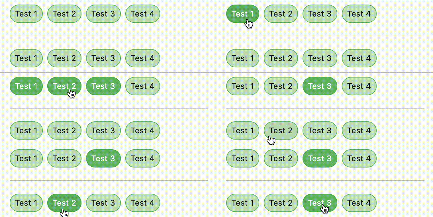
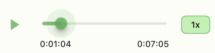
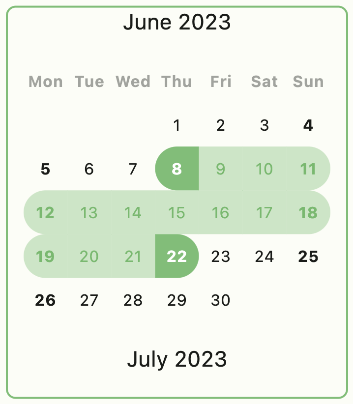
The components screenshots with colors scheme green selected

example of button


example of form field


example of form field


example of button group


example of audio player


example of calendar


example of carousel


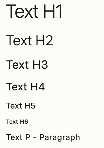
example of typographic


example of LinkFy


example of input picker


example of column

Use FastColumn to have a vertical gap between components


Define your theme
class MyApp extends StatelessWidget {
  MyApp({super.key});

  final theme = FastTheme(seed: Colors.green);

  @override
  Widget build(BuildContext context) {
    return MaterialApp(
      darkTheme: theme.dark,
      theme: theme.light,
      home: const HomePage(),
    );
  }
}
Components
  • FastColum
  • FastRow
  • FastImg
  • FastAvatar
  • FastAnimate
  • FastCalendar
  • FastTable
  • FastSkeleton
  • FastSearchAppBar
  • FastFormField
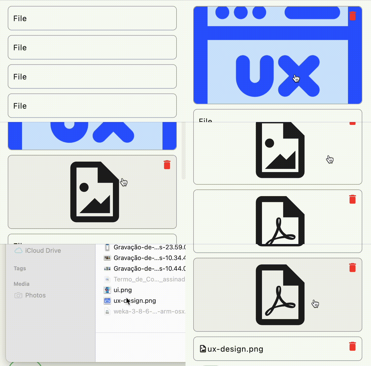
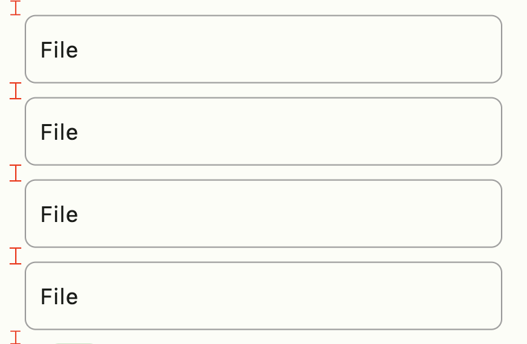
  • FastFormFieldFile
  • FastFormAvatarFile
  • FastDropDown
  • FastSearchSelect
  • FastDialog
  • FastContent
  • FastCarousel
  • FastButton
  • FastButtonIcon
  • FastButtonGroup
  • FastAudio
  • FastLinkFy
  • FastIcon -> Icon(FastIcons.library.icon)
Extension
Typographic
  • context.H1
  • context.H2
  • context.H3
  • context.H4
  • context.H5
  • context.H6
  • context.P

Size
  • context.height
  • context.width

Navigation
  • context.dialog
  • context.push
  • context.pushNamed
  • context.pushReplacement
  • context.pushReplacementNamed
  • context.pushAndRemoveUntil
  • context.pushAndRemoveUntilNamed
  • pop
  • popUntil
  • popUntilNamed

Style
  • context.colors color scheme
  • context.theme current theme
  • context.button button scheme of colors
  • context.brightness brightness of application

Message
  • context.showMessage

example:

context.showMessage(
  'Update user successful',
  title: 'Sucesso', //optional field
  type: MessageVariant.success, //optional field
  position: MessagePosition.top, //optional field
  style: Style.flat, //optional field
);
Utils
  • FastDebounce
  • FastUUID
  • FastClipboard
  • FastLinkFyHelper
Services
  • FastAudioService
  • FastPickerService

📄 Access the example file


Feito com ❤️ by Weliton Sousa

Categories

Dependencies

Dependency list 10 items

Source repository

Projects using this package

No data available yet.