Search packages, repositories and app categories

animated_bottom_navigation_bar cover
Package detailsv1.4.1

animated_bottom_navigation_bar

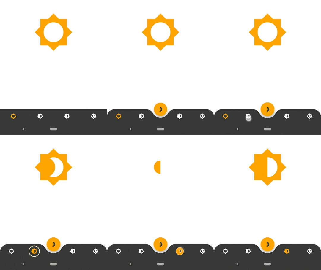
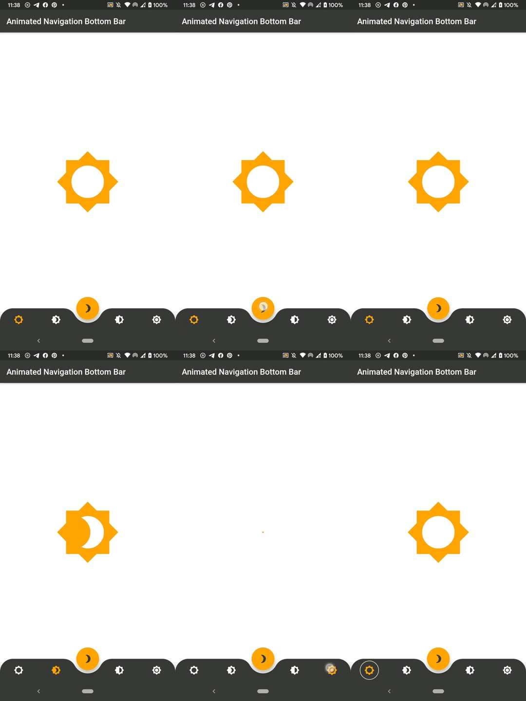
Animated Bottom Navigation Bar Widget implementation inspired by https://dribbble.com/shots/7134849-Simple-Tab-Bar-Animation

AndroidiOSWebmacOSWindowsLinux
30-day downloads
19.3K
Likes
1.5K
Pub points
150

Install package

flutter pub add animated_bottom_navigation_bar

Package Overview

Package selection guidance compiled from public package information, community data, and project usage.

A Flutter package that provides an animated bottom navigation bar widget, inspired by a Dribbble design. It offers smooth, visually appealing transitions between tabs with customizable animations, colors, and icons. The widget is lightweight and easy to integrate into any Flutter app, supporting multiple platforms including Android, iOS, Web, macOS, Windows, and Linux. Ideal for enhancing user experience with dynamic navigation interfaces.

Use cases

  • Mobile app navigation
  • Web application dashboards
  • Cross-platform UI enhancements
  • Interactive tab switching
  • Modern app design

Key features

  • Smooth animation transitions
  • Customizable colors and icons
  • Responsive design across platforms
  • Easy integration with existing Flutter projects
  • Support for multiple platform targets

Suitable for

  • Developers seeking modern UI components
  • Design-focused Flutter applications
  • Apps requiring engaging navigation experiences
  • Cross-platform mobile and web apps
  • UI/UX designers implementing interactive elements

Considerations

  • May require additional styling for complex layouts
  • Animation performance should be tested on lower-end devices
  • Limited customization beyond basic properties
  • Best suited for apps with 3-5 navigation items
  • Not recommended for highly complex navigation structures

Original README

Original README snapshot from the linked source repository. Visit the repository for the latest content.

SWUbanner

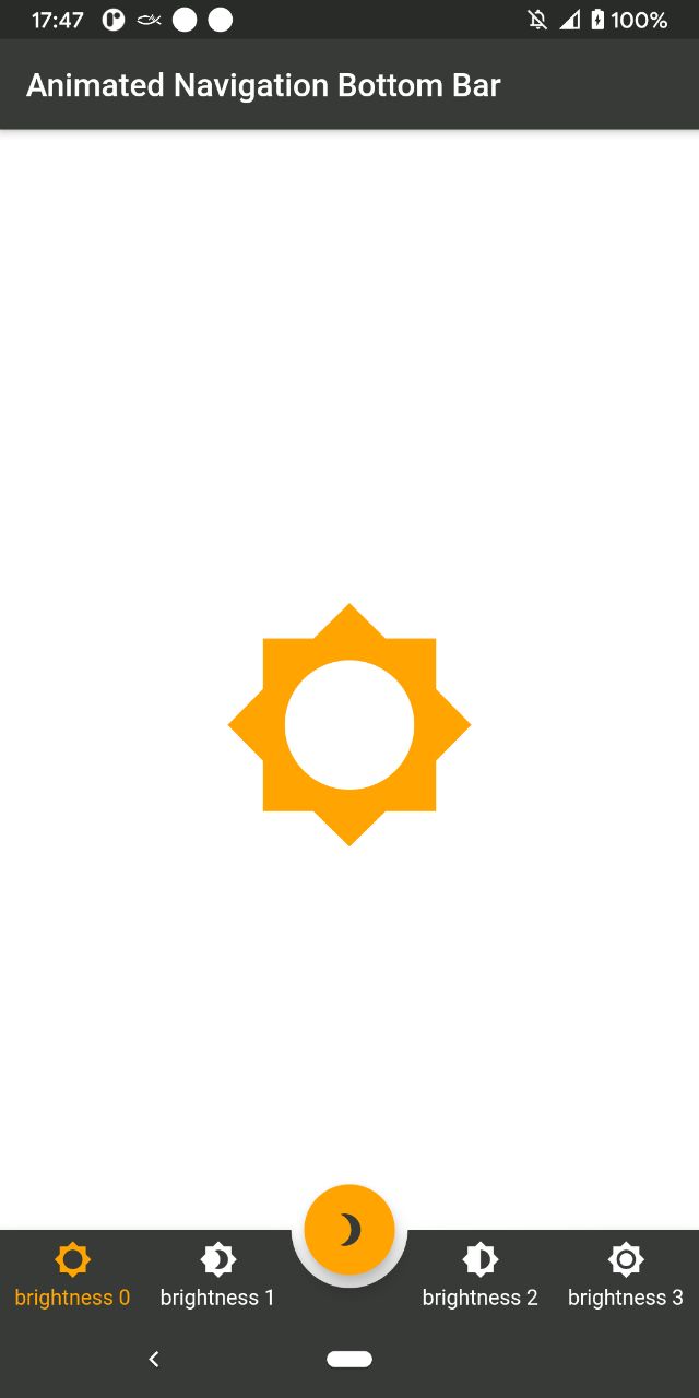
AnimatedBottomNavigationBar is a customizable widget inspired by dribble shot.

pub package

"Buy Me A Coffee"

With AnimatedBottomNavigationBar.builder you are able to customize tab view however you need. In this case you are responsible to handle an active(inactive) state of tabs.

Getting Started

To get started, place your AnimatedBottomNavigationBar or AnimatedBottomNavigationBar.builder in the bottomNavigationBar slot of a Scaffold. The AnimatedBottomNavigationBar respects FloatingActionButton location. For example:

Scaffold(
   body: Container(), //destination screen
   floatingActionButton: FloatingActionButton(
      //params
   ),
   floatingActionButtonLocation: FloatingActionButtonLocation.centerDocked,
   bottomNavigationBar: AnimatedBottomNavigationBar(
      icons: iconList,
      activeIndex: _bottomNavIndex,
      gapLocation: GapLocation.center,
      notchSmoothness: NotchSmoothness.verySmoothEdge,
      leftCornerRadius: 32,
      rightCornerRadius: 32,
      onTap: (index) => setState(() => _bottomNavIndex = index),
      //other params
   ),
);

There is also a more flexible way to build bottomNavigationBar with Builder (see example for more insights):

Scaffold(
   body: Container(), //destination screen
   floatingActionButton: FloatingActionButton(
      //params
   ),
   floatingActionButtonLocation: FloatingActionButtonLocation.centerDocked,
   bottomNavigationBar: AnimatedBottomNavigationBar.builder(
      itemCount: iconList.length,
      tabBuilder: (int index, bool isActive) {
        return Icon(
          iconList[index],
          size: 24,
          color: isActive ? colors.activeNavigationBarColor : colors.notActiveNavigationBarColor,
        );
      activeIndex: _bottomNavIndex,
      gapLocation: GapLocation.center,
      notchSmoothness: NotchSmoothness.verySmoothEdge,
      leftCornerRadius: 32,
      rightCornerRadius: 32,
      onTap: (index) => setState(() => _bottomNavIndex = index),
      //other params
   ),
);

Customization

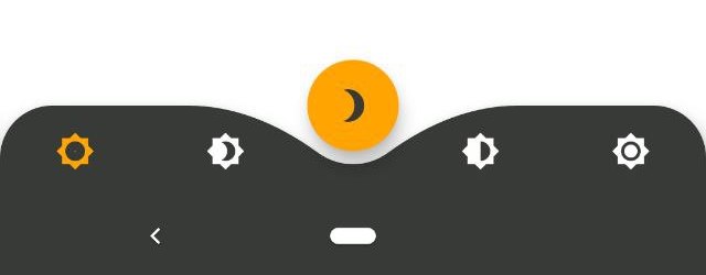
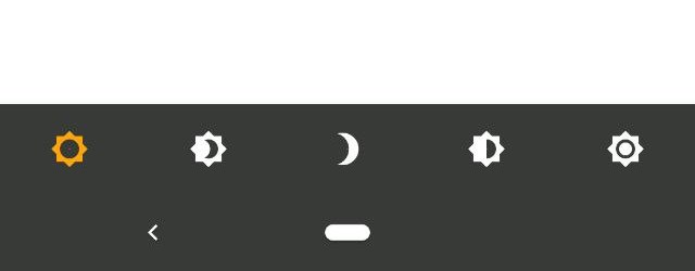
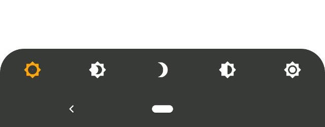
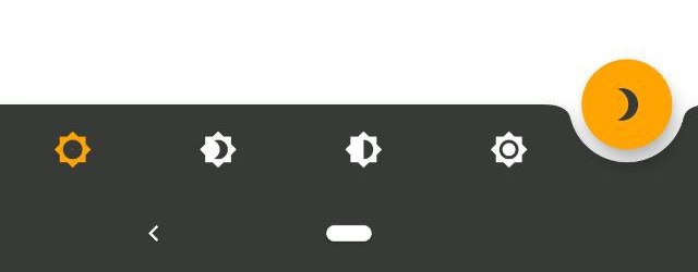
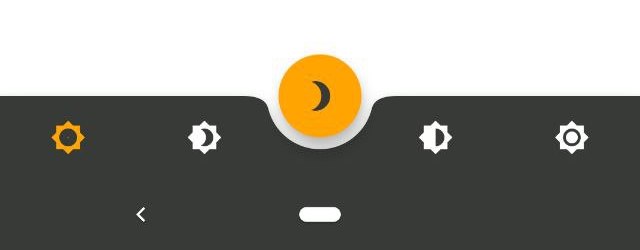
AnimatedBottomNavigationBar is customizable and works with 2, 3, 4, or 5 navigation elements.

Scaffold(
   bottomNavigationBar: AnimatedBottomNavigationBar(
      icons: iconList,
      activeIndex: _bottomNavIndex,
      onTap: (index) => setState(() => _bottomNavIndex = index),
      //other params
   ),
);
Scaffold(
   bottomNavigationBar: AnimatedBottomNavigationBar(
      icons: iconList,
      activeIndex: _bottomNavIndex,
      leftCornerRadius: 32,
      rightCornerRadius: 32,
      onTap: (index) => setState(() => _bottomNavIndex = index),
      //other params
   ),
);
Scaffold(
   floatingActionButton: FloatingActionButton(
      //params
   ),
   floatingActionButtonLocation: FloatingActionButtonLocation.endDocked,
   bottomNavigationBar: AnimatedBottomNavigationBar(
      icons: iconList,
      activeIndex: _bottomNavIndex,
      gapLocation: GapLocation.end,
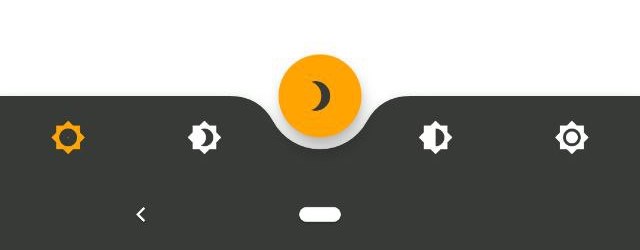
      notchSmoothness: NotchSmoothness.defaultEdge,
      onTap: (index) => setState(() => _bottomNavIndex = index),
      //other params
   ),
);
Scaffold(
   floatingActionButton: FloatingActionButton(
      //params
   ),
   floatingActionButtonLocation: FloatingActionButtonLocation.centerDocked,
   bottomNavigationBar: AnimatedBottomNavigationBar(
      icons: iconList,
      activeIndex: _bottomNavIndex,
      gapLocation: GapLocation.center,
      notchSmoothness: NotchSmoothness.defaultEdge,
      onTap: (index) => setState(() => _bottomNavIndex = index),
      //other params
   ),
);
Scaffold(
   floatingActionButton: FloatingActionButton(
      //params
   ),
   floatingActionButtonLocation: FloatingActionButtonLocation.centerDocked,
   bottomNavigationBar: AnimatedBottomNavigationBar(
      icons: iconList,
      activeIndex: _bottomNavIndex,
      gapLocation: GapLocation.center,
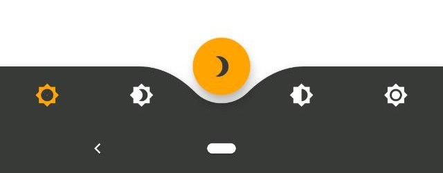
      notchSmoothness: NotchSmoothness.softEdge,
      onTap: (index) => setState(() => _bottomNavIndex = index),
      //other params
   ),
);
Scaffold(
   floatingActionButton: FloatingActionButton(
      //params
   ),
   floatingActionButtonLocation: FloatingActionButtonLocation.centerDocked,
   bottomNavigationBar: AnimatedBottomNavigationBar(
      icons: iconList,
      activeIndex: _bottomNavIndex,
      gapLocation: GapLocation.center,
      notchSmoothness: NotchSmoothness.smoothEdge,
      onTap: (index) => setState(() => _bottomNavIndex = index),
      //other params
   ),
);
Scaffold(
   floatingActionButton: FloatingActionButton(
      //params
   ),
   floatingActionButtonLocation: FloatingActionButtonLocation.centerDocked,
   bottomNavigationBar: AnimatedBottomNavigationBar(
      icons: iconList,
      activeIndex: _bottomNavIndex,
      gapLocation: GapLocation.center,
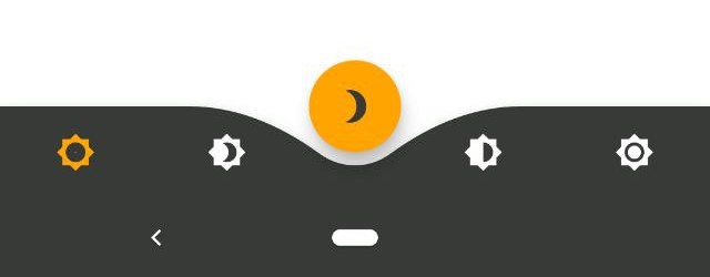
      notchSmoothness: NotchSmoothness.verySmoothEdge,
      onTap: (index) => setState(() => _bottomNavIndex = index),
      //other params
   ),
);

Driving Navigation Bar Changes

You have to change the active navigation bar tab programmatically by passing a new activeIndex to the AnimatedBottomNavigationBar widget.

class _MyAppState extends State<MyApp> {
  int activeIndex;

  /// Handler for when you want to programmatically change
  /// the active index. Calling `setState()` here causes
  /// Flutter to re-render the tree, which `AnimatedBottomNavigationBar`
  /// responds to by running its normal animation.
  void _onTap(int index) {
    setState((){
      activeIndex = index;
    });
  }

  Widget build(BuildContext context) {
    return AnimatedBottomNavigationBar(
      activeIndex: activeIndex,
      onTap: _onTap,
      //other params
    );
  }
}

Categories

Source repository

Projects using this package