Search packages, repositories and app categories

animated_theme_switcher cover
Package detailsv2.0.10

animated_theme_switcher

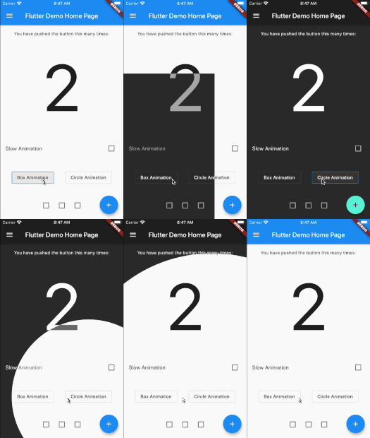
Flutter animated theme switcher, that help to create beautiful transactions during the theme switch.

AndroidiOSWebmacOSWindowsLinux
30-day downloads
2.7K
Likes
533
Pub points
140

Install package

flutter pub add animated_theme_switcher

Package Overview

Package selection guidance compiled from public package information, community data, and project usage.

A Flutter package that enables smooth, animated transitions when switching between light and dark themes. It enhances user experience by providing visually appealing theme changes without abrupt visual shifts. Designed for developers who want to implement elegant theme switching with minimal code. The package supports all major platforms including Android, iOS, Web, macOS, Windows, and Linux. It integrates seamlessly with Flutter's theme system and allows customization of animation duration, curve, and transition effects.

Use cases

  • Smooth theme transitions in mobile apps
  • Enhancing UI/UX with animated theme changes
  • Implementing dark mode with visual flair
  • Creating responsive design with dynamic themes
  • Supporting accessibility through gradual theme shifts

Key features

  • Animated theme transitions
  • Customizable animation duration and curve
  • Cross-platform compatibility
  • Easy integration with ThemeData
  • Supports both light and dark modes
  • Minimal boilerplate required

Suitable for

  • App developers seeking polished UI transitions
  • Design-focused Flutter projects
  • Apps with frequent theme switching
  • Developers prioritizing user experience
  • Projects requiring platform-wide theme consistency

Considerations

  • May impact performance on low-end devices
  • Requires careful tuning of animation parameters
  • Limited to theme-related animations only
  • Not suitable for non-theme state changes
  • Depends on Flutter's theme system for full functionality

Original README

Original README snapshot from the linked source repository. Visit the repository for the latest content.

animated_theme_switcher

Pub

Animated theme switcher.

This library starts from Peyman's stackoverflow question how-to-add-animation-for-theme-switching-in-flutter

demo

Getting started

Add animated_theme_switcher: "^2.0.8" in your pubspec.yaml dependencies.

dependencies:
 animated_theme_switcher: "^2.0.8"
How To Use

Import the following package in your dart file

import 'package:animated_theme_switcher/animated_theme_switcher.dart';

Wrap MaterialApp with ThemeProvider widget, as it has shown in the following example:

  ThemeProvider(
      initTheme: initTheme,
      builder: (context, myTheme) {
        return MaterialApp(
          title: 'Flutter Demo',
          theme: myTheme,
          home: MyHomePage(),
        );
      }),
    ),

But if all you want is to provide a theme, use as follows:

  ThemeProvider(
      initTheme: initTheme,
      child: SomeCoolPage(),
    ),

Wrap the screen where you whant to make them switch with ThemeSwitchingArea widget, as it has shown in the following example:

    ThemeSwitchingArea(
      child: Builder(builder: (context) {
        return ...,
      },
    );

Wrap every switcher with ThemeSwitcher builder, and use ThemeSwitcher.of(context).changeTheme function to switch themes;


    ThemeData newTheme = ThemeData(
      primaryColor: Colors.amber
    );
    ...
    ThemeSwitcher(
      builder: (context) {
        ...
        onTap: () => ThemeSwitcher.of(context).changeTheme(
          theme: newTheme,
          isReversed: false // default: false 
        );
        ...
      },
    );

Alternatively you could use ThemeSwitcher.switcher() or ThemeSwitcher.withTheme().
Builders of this constructors already provide you ThemeSwitcher.
ThemeSwitcher.withTheme() also provides current theme:

    ThemeSwitcher.switcher(
      builder: (context, switcher) {
        ...
        onTap: () => switcher.changeTheme(
          theme: newTheme,
        );
        ...
      },
    );
    
    ThemeSwitcher.withTheme(
      builder: (context, switcher, theme) {
        ...
        onTap: () => switcher.changeTheme(
          theme: theme.brightness == Brightness.light
              ? darkTheme
              : lightTheme,
        );
        ...
      },
    );

Use optional named parameter clipper to pass the custom clippers.

    ...
    ThemeSwitcher(
      clipper: ThemeSwitcherBoxClipper(),
      builder: (context) {
        ...
      },
    );

Notes:

  1. This package is not intended to persist selected theme on the local device. But we added special example to show how to do it using shared_preferences package.

  2. Use the CanvasKit rendering engine to use it on web, more about it..

Categories

Source repository

Projects using this package