Search packages, repositories and app categories

circular_countdown_timer cover
Package detailsv0.2.4

circular_countdown_timer

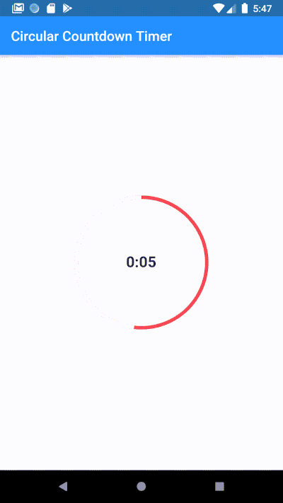
Make an animated circular countdown using Circular Countdown Timer.

AndroidiOSWebmacOSWindowsLinux
30-day downloads
30.4K
Likes
617
Pub points
140

Install package

flutter pub add circular_countdown_timer

Package Overview

Package selection guidance compiled from public package information, community data, and project usage.

A Flutter package that enables developers to create animated circular countdown timers with smooth visual transitions. It provides a customizable, visually appealing timer widget ideal for apps requiring time-based interactions such as quizzes, fitness tracking, or meditation sessions. The timer supports configurable colors, stroke width, and animation effects, making it suitable for both simple and complex use cases. Built with performance in mind, it runs efficiently across all major platforms including mobile, web, and desktop.

Use cases

  • Quiz applications
  • Fitness and workout timers
  • Meditation and focus sessions
  • Event countdowns
  • Interactive learning apps

Key features

  • Animated circular progress display
  • Customizable colors and stroke width
  • Smooth countdown animation
  • Cross-platform compatibility
  • Easy integration with Flutter widgets
  • Configurable start and end times

Suitable for

  • Developers building time-sensitive apps
  • Designers seeking attractive UI components
  • Educational and wellness app creators
  • Apps requiring intuitive countdown visuals

Considerations

  • Requires basic knowledge of Flutter widgets
  • Limited to circular timer design
  • No built-in pause/resume functionality
  • May need additional logic for complex timing scenarios
  • Not optimized for extremely long countdown durations

Original README

Original README snapshot from the linked source repository. Visit the repository for the latest content.

Circular Countdown Timer

Make an animated circular countdown using Circular Countdown Timer.

Getting Started

To use this plugin, add circular_countdown_timer as a dependency in your pubspec.yaml file.

Features

  • Forward Countdown Timer.
  • Reverse Countdown Timer.
  • Start, Pause, Resume, Restart and Reset Timer.

Usage

CircularCountDownTimer(
     duration: 10,
     initialDuration: 0,
     controller: CountDownController(),
     width: MediaQuery.of(context).size.width / 2,
     height: MediaQuery.of(context).size.height / 2,
     ringColor: Colors.grey[300]!,
     ringGradient: null,
     fillColor: Colors.purpleAccent[100]!,
     fillGradient: null,
     backgroundColor: Colors.purple[500],
     backgroundGradient: null,
     strokeWidth: 20.0,
     strokeCap: StrokeCap.round,
     textStyle: TextStyle(
         fontSize: 33.0, color: Colors.white, fontWeight: FontWeight.bold),
     textAlign: TextAlign.center,
     textFormat: CountdownTextFormat.S,
     isReverse: false,
     isReverseAnimation: false,
     isTimerTextShown: true,
     autoStart: false,
     onStart: () {
        debugPrint('Countdown Started');
     },
     onComplete: () {
        debugPrint('Countdown Ended');
     },
     onChange: (String timeStamp) {
        debugPrint('Countdown Changed $timeStamp');
     },
     timeFormatterFunction: (defaultFormatterFunction, duration) {
        if (duration.inSeconds == 0) {
           return "Start";
        } else {
           return Function.apply(defaultFormatterFunction, [duration]);
        }
     },
 );

Parameters

Name Type Default Value Description
key Key null Key for Countdown Timer.
duration int null Countdown duration in Seconds.
initialDuration int 0 Countdown initial elapsed Duration in Seconds.
controller CountDownController null Controls (i.e Start, Pause, Resume, Restart) the Countdown Timer.
width double null Width of the Countdown Widget.
height double null Height of the Countdown Widget.
ringColor Color null Ring Color for Countdown Widget.
ringGradient Gradient null Ring Gradient for Countdown Widget. Note that ringColor will not be effective if gradient is provided.
fillColor Color null Filling Color for Countdown Widget.
fillGradient Gradient null Filling Gradient for Countdown Widget. Note that fillColor will not be effective if gradient is provided.
backgroundColor Color null Background Color for Countdown Widget.
backgroundGradient Gradient null Background Gradient for Countdown Widget. Note that backgroundColor will not be effective if gradient is provided.
strokeWidth double 5.0 Border Thickness of the Countdown Ring.
strokeCap StrokeCap StrokeCap.butt Begin and end contours with a flat edge and no extension.
textStyle TextStyle TextStyle(fontSize: 16.0,color: Colors.black,) Text Style for Countdown Text.
textFormat String null Format for the Countdown Text.
isReverse bool false Handles Countdown Timer (true for Reverse Countdown (max to 0), false for Forward Countdown (0 to max)).
isReverseAnimation bool false Handles Animation Direction (true for Reverse Animation, false for Forward Animation).
isTimerTextShown bool true Handles visibility of the Countdown Text.
autoStart bool true Handles the timer start.
onStart VoidCallback null This Callback will execute when the Countdown Starts.
onComplete VoidCallback null This Callback will execute when the Countdown Ends.
onChange ValueChanged<String> null This Callback will execute when the Countdown Changes.
timeFormatterFunction Function(Function(Duration duration) defaultFormatterFunction,Duration duration) null This Callback allows you to format the current duration to any String in Countdown Widget.

Demo

demo

Youtube

Bekar Programmer

Buy Me A Coffee

Categories

Source repository

Projects using this package