Search packages, repositories and app categories

desktop cover
Package detailsv6.0.2

desktop

Flutter design standard for desktop. Just simple, usable wigdets to create apps. See the gallery for examples of the components used.

30-day downloads
215
Likes
173
Pub points
70

Install package

flutter pub add desktop

Package Overview

Package selection guidance compiled from public package information, community data, and project usage.

A Flutter widget library designed specifically for desktop applications, offering simple and usable components following a consistent design standard. It provides a set of ready-to-use widgets optimized for Windows, Linux, and macOS, enabling developers to build intuitive desktop apps with minimal effort. The package emphasizes usability and visual coherence, with examples showcased in its gallery. Ideal for developers seeking a streamlined approach to desktop UI development within the Flutter ecosystem.

Use cases

  • Building cross-platform desktop applications
  • Creating consistent UIs across Windows, Linux, and macOS
  • Rapid prototyping of desktop interfaces
  • Developing productivity tools
  • Designing user-friendly desktop dashboards
  • Enhancing Flutter's native desktop widget support

Key features

  • Desktop-optimized widget design
  • Consistent and clean UI components
  • Simple integration via pub
  • Gallery with component examples
  • Cross-platform compatibility
  • Minimal configuration required

Suitable for

  • Flutter developers targeting desktop platforms
  • Teams building desktop-first applications
  • UI-focused app designers
  • Beginners exploring desktop Flutter development
  • Developers wanting standardized desktop components

Considerations

  • Limited to desktop platforms (no mobile or web)
  • Depends on Flutter's desktop support
  • May require custom styling for advanced use cases
  • Not suitable for mobile or web projects
  • Best used with Flutter 3.0+ for full platform compatibility
  • No built-in theming beyond basic styles

Original README

Original README snapshot from the linked source repository. Visit the repository for the latest content.

Desktop

pub package

Minimal Desktop widgets for Flutter.

  • Navigation
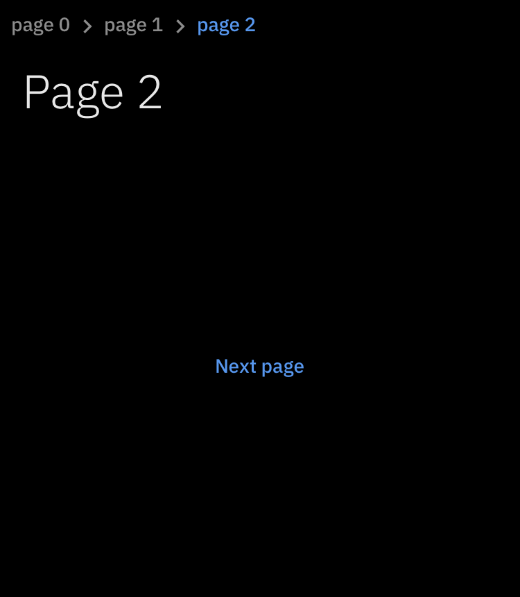
    • Breadcrumb
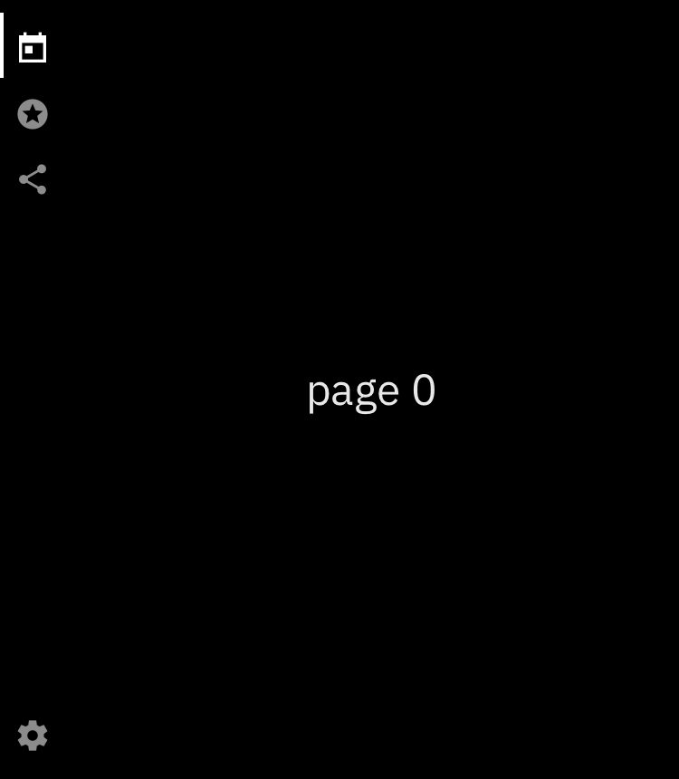
    • Nav
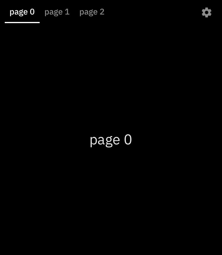
    • Tab
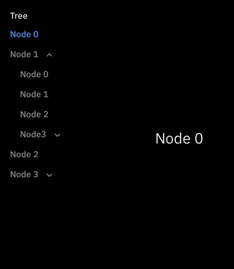
    • Tree
  • Data
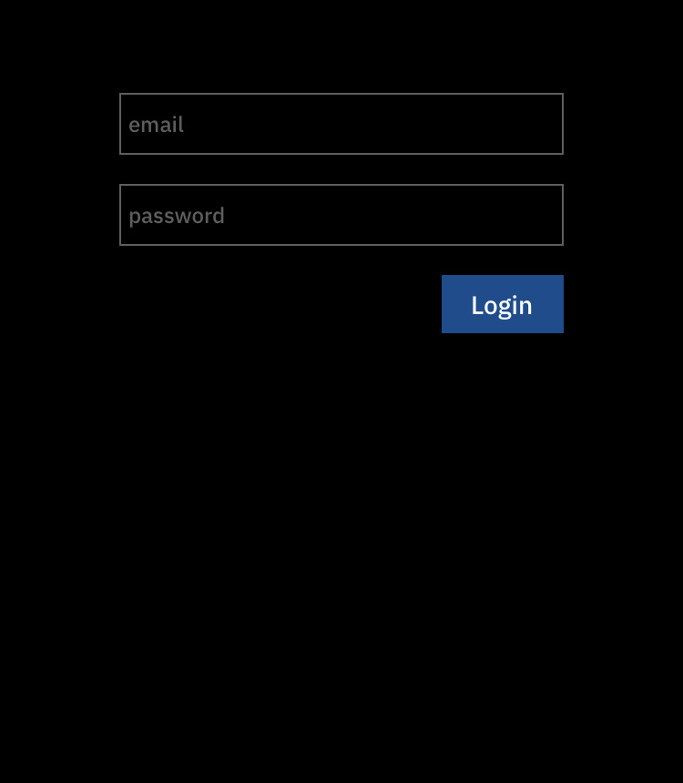
    • List table
    • Date form field
    • Text form field
  • Dialogs
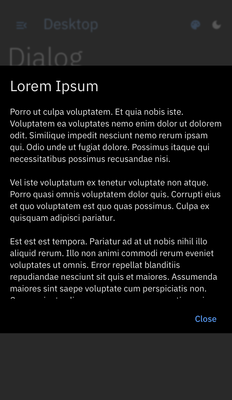
    • Dialog
    • Message
    • Tooltip
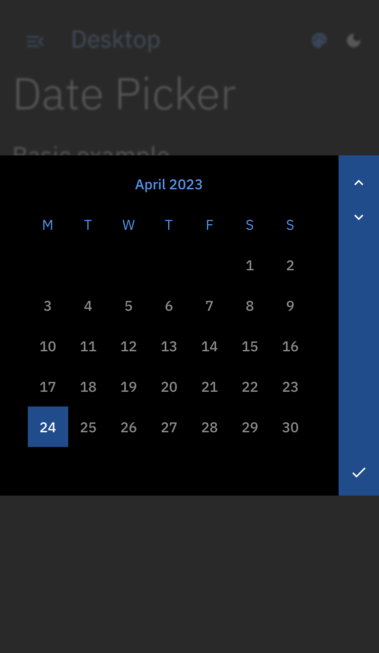
    • Date picker
    • Drawer
  • Input
    • Button
    • Context menu
    • Dropdown menu
    • Hyperlink
    • Slider
    • Checkbox
    • Radio
    • Toggle switch
  • Status
    • Progress indicator
  • Text
    • Text field
    • Selectable text
  • Scrollbar

Gallery

Navigation
Breadcrumb Nav
breadcrumb nav_vertical
Nav Horizontal Tree
nav_horizontal tree
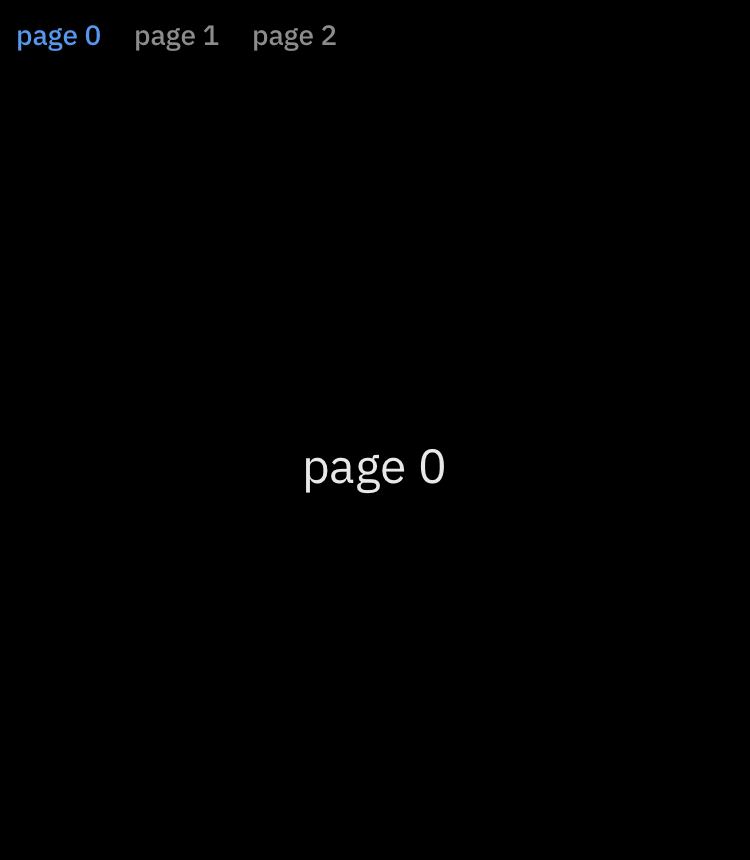
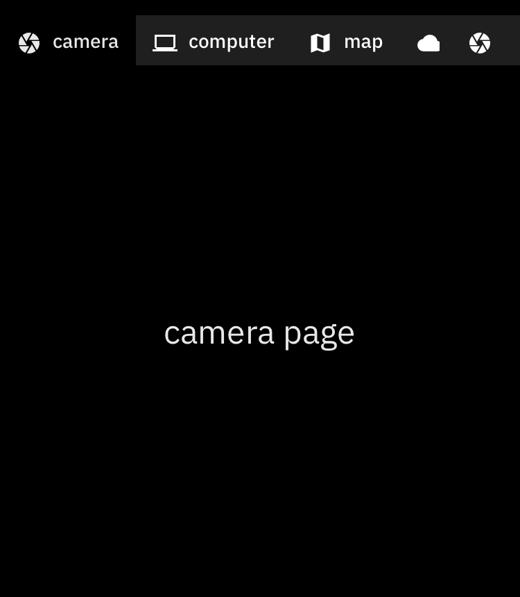
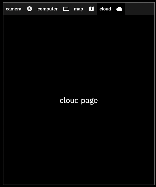
Tab Custom Tab
tab tab_custom
Data
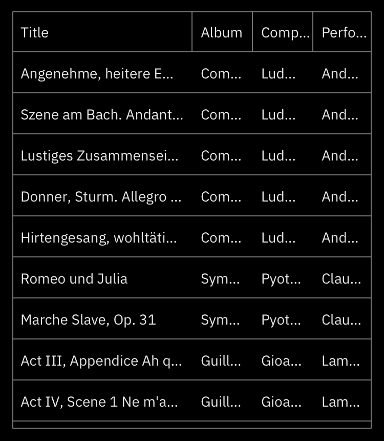
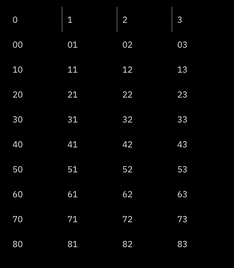
List Table List Table Borderless
list_table list_table_borderless
Text Form Field Date Form Field
text_form_field date_form_field
Dialogs
Dialog Date Picker
dialog date_picker
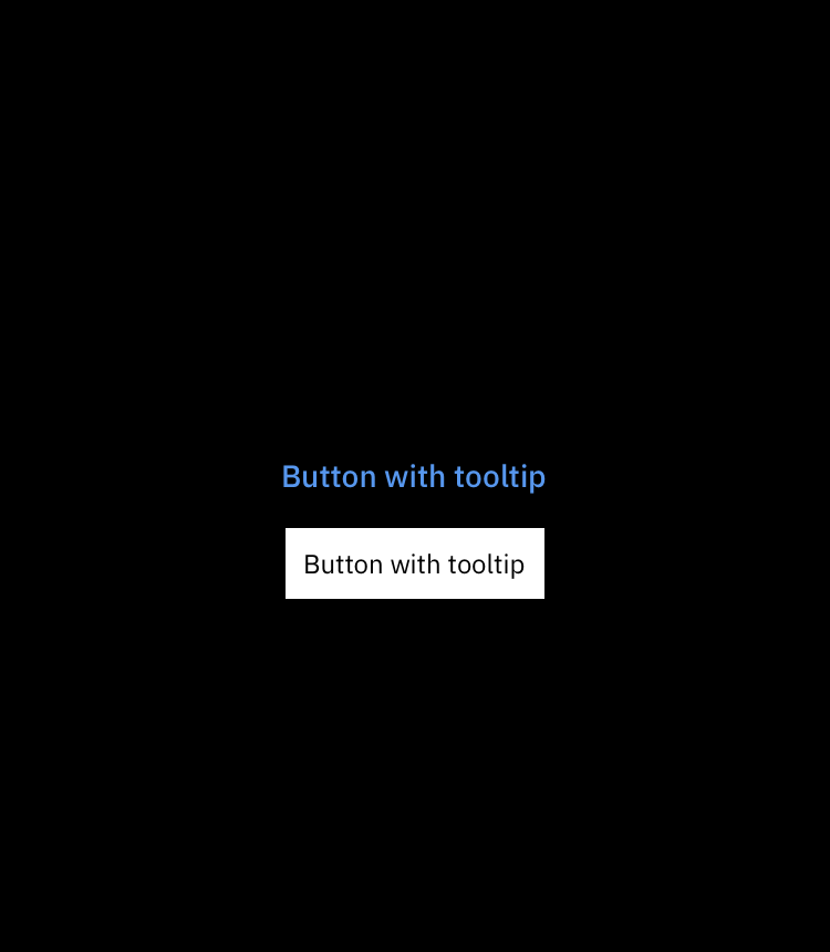
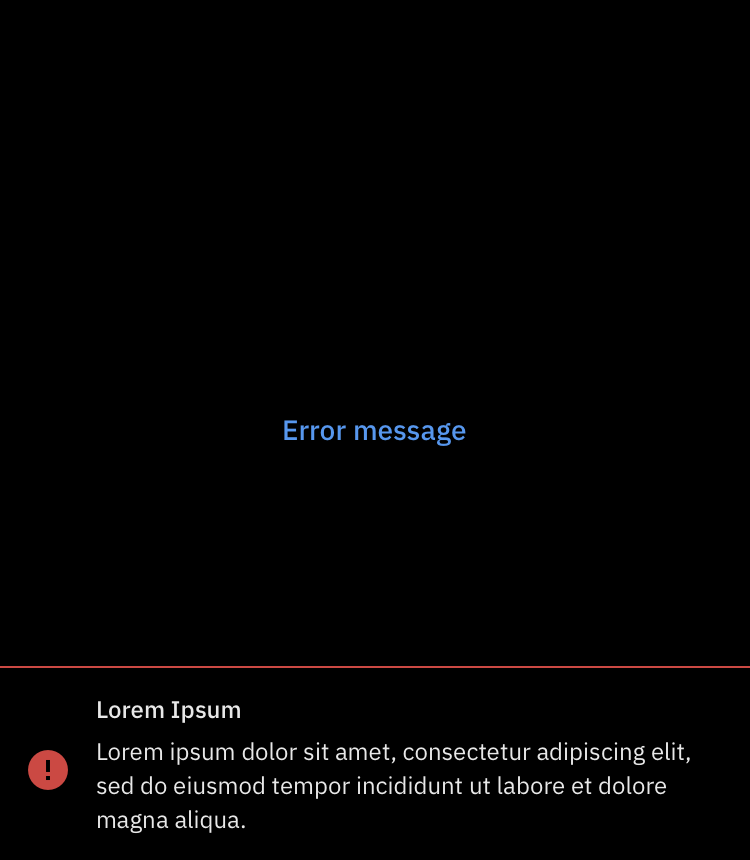
Tooltip Message
tooltip message_error
Input
Button Hyperlink
button hyperlink
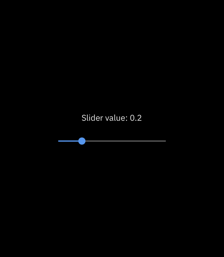
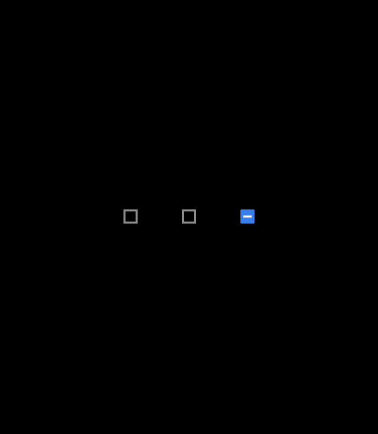
Slider Checkbox
slider checkbox
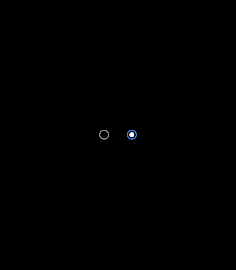
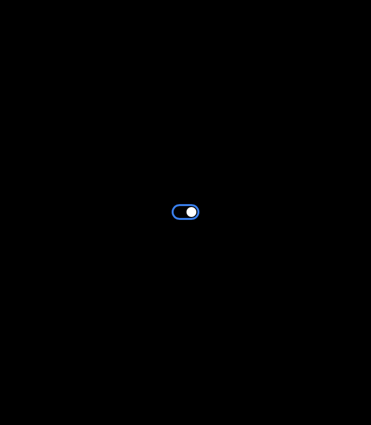
Radio Toggle Switch
radio toggle_switch
Status
Linear Progress Indicator Circular Progress Indicator
linear_progress_bar circular_progress

See Gallery, for more examples.

Example

DesktopApp(
  theme: ThemeData(
    brightness: Brightness.dark,
    primaryColor: PrimaryColors.royalBlue.primaryColor,
  ),
  home: Nav(
    trailingMenu: [
      NavItem(
        title: 'settings',
        builder: (context) => NavDialog(
          child: Container(
            alignment: Alignment.center,
            padding: EdgeInsets.all(32.0),
            width: 600.0,
            child: Text(
              'Settings page',
              style: textTheme.subtitle,
            ),
          ),
        ),
        icon: Icons.settings,
      ),
    ],
    items: [
      NavItem(
        builder: (context) => Center(
            child: Text(
          'Home',
          style: textTheme.title,
        )),
        title: 'Home',
        icon: Icons.today,
      ),
      NavItem(
        builder: (context) => Center(
            child: Text(
          'Library',
          style: textTheme.title,
        )),
        title: 'Library',
        icon: Icons.today,
      ),
    ],
  ),
)

Project structure

  • desktop - The main package.
  • docs - The folder with the html page built by the docs_web component.
  • docs_web - The implementation of desktop documentation.

Categories

Dependencies

Dependency list 1 items

Source repository

Projects using this package

No data available yet.