Search packages, repositories and app categories

diagram_editor cover
Package detailsv1.0.0

diagram_editor

A Flutter library for building interactive diagram editors with type-safe components, links, pan/zoom, and serialization.

AndroidiOSWebmacOSWindowsLinux
30-day downloads
1.1K
Likes
184
Pub points
160

Install package

flutter pub add diagram_editor

Package Overview

Package selection guidance compiled from public package information, community data, and project usage.

A Flutter library designed for creating interactive diagram editors with support for type-safe components, dynamic links, pan and zoom functionality, and seamless serialization. It enables developers to build rich visual tools for flowcharts, wireframes, and other diagram types with consistent, reusable UI elements. The library is cross-platform, supporting Android, iOS, Web, macOS, Windows, and Linux, making it ideal for applications requiring real-time diagram manipulation and data persistence. Built with a focus on developer experience, it provides intuitive APIs for managing diagram state and interactions.

Use cases

  • Creating flowchart builders
  • Designing wireframing tools
  • Building visual programming interfaces
  • Developing collaborative diagramming apps
  • Implementing network topology visualizers

Key features

  • Type-safe component system
  • Interactive link management
  • Built-in pan and zoom controls
  • Serialization for data persistence
  • Cross-platform compatibility
  • Extensible plugin architecture

Suitable for

  • UI/UX developers building visual tools
  • Educational app creators
  • Software architects designing workflow systems
  • Teams needing cross-platform diagramming solutions
  • Prototyping interactive diagrams quickly

Considerations

  • Requires understanding of Flutter's widget tree
  • May need custom styling for complex diagrams
  • Performance impact with very large diagrams
  • Limited built-in shape library (extensible)
  • Initial learning curve for advanced features

Original README

Original README snapshot from the linked source repository. Visit the repository for the latest content.

diagram_editor

pub package

Flutter library for building interactive diagram editors. Create, connect, and manipulate nodes and links with pan, zoom, and full gesture support.

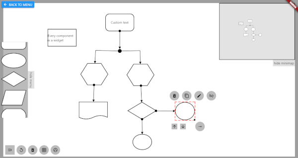
Quick Start

import 'package:diagram_editor/diagram_editor.dart';
import 'package:flutter/material.dart';

class MyDiagram extends StatelessWidget {
  MyDiagram({super.key});

  final controller = DiagramController<void, void>();

  @override
  Widget build(BuildContext context) {
    return DiagramEditor<void, void>(
      controller: controller,
      componentBuilder: (context, component) => Container(
        color: Colors.blue,
        child: Center(child: Text(component.id)),
      ),
      onCanvasTapUp: (details) {
        controller.addComponent(ComponentData(
          size: const Size(96, 72),
          position: controller.fromCanvasCoordinates(details.localPosition),
        ));
      },
      onComponentTap: (id) => controller.removeComponent(id),
    );
  }
}

Pan, zoom, link joints, and link control all work out of the box.

Type-Safe Custom Data

Use generic type parameters to attach typed data to components and links:

class MyNodeData {
  final Color color;
  final String label;
  MyNodeData({required this.color, required this.label});
}

final controller = DiagramController<MyNodeData, void>(
  componentDataCodec: JsonCodec(
    encode: (d) => {'color': d.color.toHex(), 'label': d.label},
    decode: (j) => MyNodeData(
      color: Color(int.parse(j['color'] as String, radix: 16)),
      label: j['label'] as String,
    ),
  ),
);

// No more casting — data is typed
controller.addComponent(ComponentData(
  data: MyNodeData(color: Colors.blue, label: 'Start'),
  size: const Size(96, 72),
));

// Access data without casting
final node = controller.getComponent('id');
final color = node.data?.color; // Color, not dynamic

Connecting Components

final linkId = controller.connect(
  sourceComponentId: 'node-1',
  targetComponentId: 'node-2',
  linkStyle: LinkStyle(
    arrowType: ArrowType.arrow,
    lineWidth: 2,
    color: Colors.grey,
  ),
);

Configuration

DiagramEditor<MyNodeData, void>(
  controller: controller,
  componentBuilder: (context, data) => MyNodeWidget(data),

  // Canvas config
  canvasConfig: const CanvasConfig(
    backgroundColor: Color(0xFFF5F5F5),
    minScale: 0.2,
    maxScale: 5.0,
  ),

  // Link endpoint alignment strategy
  linkEndpointAlignment: LinkAttachment.oval(),

  // Disable defaults if you want full control
  enableDefaultPanZoom: true,       // default
  enableDefaultLinkControl: true,   // default
  enableDefaultJointControl: true,  // default

  // Links rendered on top of components
  linksOnTop: true,                 // default

  // All gesture callbacks
  onCanvasTapUp: (details) { /* ... */ },
  onComponentTap: (id) { /* ... */ },
  onComponentScaleUpdate: (id, details) { /* ... */ },
  onLinkTap: (id) { /* ... */ },

  // Custom layers
  backgroundBuilder: (context) => [CustomPaint(painter: GridPainter())],
  foregroundBuilder: (context) => [/* selection UI, toolbars, etc. */],
  componentOverlayBuilder: (context, data) => /* resize handles, etc. */,
);

Serialization

// Save
final json = controller.serialize();

// Load
controller.deserialize(json);

Custom data is serialized via the JsonCodec passed to the controller.

API Overview

DiagramController

The central class managing all diagram state.

Category Methods
Components addComponent, removeComponent, moveComponent, getComponent, componentExists, components, componentsSorted
Links connect, removeLink, getLink, linkExists, links
Z-order bringToFront, sendToBack, setComponentZOrder
Parent-child setComponentParent, removeComponentParent
Canvas setCanvasPosition, panCanvas, zoomCanvas, resetCanvasView, fromCanvasCoordinates, toCanvasCoordinates
Joints insertLinkJoint, removeLinkJoint, showLinkJoints, hideLinkJoints
Serialization serialize, deserialize
Link Endpoint Alignment
Strategy Method
Rectangular LinkAttachment.rectangular() (default)
Oval LinkAttachment.oval()
Crystal/Diamond LinkAttachment.crystal()
Center LinkAttachment.center()
Link Styles
  • Arrow types: none, arrow, pointedArrow, circle, centerCircle, semiCircle
  • Line types: solid, dashed, dotted
Built-in Painters
  • GridPainter — canvas grid background
  • ComponentHighlightPainter — selection highlight
  • DeleteIconPainter — delete icon overlay

Migration from v0.x

See the full Migration Prompt for a detailed mapping of every old API surface to its new equivalent, including complete before/after examples.

Key changes:

  • PolicySet with mixins -> DiagramEditor with callbacks
  • canvasWriter.model.addComponent(...) -> controller.addComponent(...)
  • componentData.data as MyType -> componentData.data (typed generics)
  • provider dependency removed (uses built-in ListenableBuilder)

Categories

Dependencies

Dependency list 1 items

Source repository

Projects using this package

No data available yet.