Search packages, repositories and app categories

dropdown_textfield cover
Package detailsv1.2.0

dropdown_textfield

A DropdownTextfield is a material design TextField. The DropDownButton is a widget that we can use to select one unique value or multivalue from a set of values.

AndroidiOSWebmacOSWindowsLinux
30-day downloads
6K
Likes
181
Pub points
140

Install package

flutter pub add dropdown_textfield

Package Overview

Package selection guidance compiled from public package information, community data, and project usage.

DropdownTextfield is a Flutter package that combines a TextField with a DropdownButton, enabling users to select one or multiple values from a list in a material design interface. It enhances form inputs by providing an intuitive dropdown selection experience within a text input field. The widget supports both single and multi-value selection, making it suitable for dynamic data entry scenarios. It is compatible across all major platforms including Android, iOS, Web, macOS, Windows, and Linux.

Use cases

  • Form inputs with selectable options
  • Multi-select dropdowns in forms
  • Material design-compliant selection fields
  • Dynamic data filtering
  • User-friendly value selection interfaces

Key features

  • Single and multi-value selection
  • Material design integration
  • Cross-platform compatibility
  • Customizable dropdown items
  • Easy integration with existing forms

Suitable for

  • Developers building form-heavy apps
  • Designers seeking material-compliant widgets
  • Apps requiring flexible selection inputs
  • Cross-platform Flutter projects
  • UI components needing dropdown functionality

Considerations

  • Requires proper state management for multi-selection
  • May need styling adjustments for custom themes
  • Limited to predefined value sets
  • Not ideal for very large datasets
  • Depends on parent widget's layout constraints
Original README

Original README snapshot from the linked source repository. Visit the repository for the latest content.

Flutter DropdownTextfield

A DropdownTextfield is a Material Design TextField. The DropDownButton is a widget that can be used to select one unique value or multiple values from a set of options.

Key Features

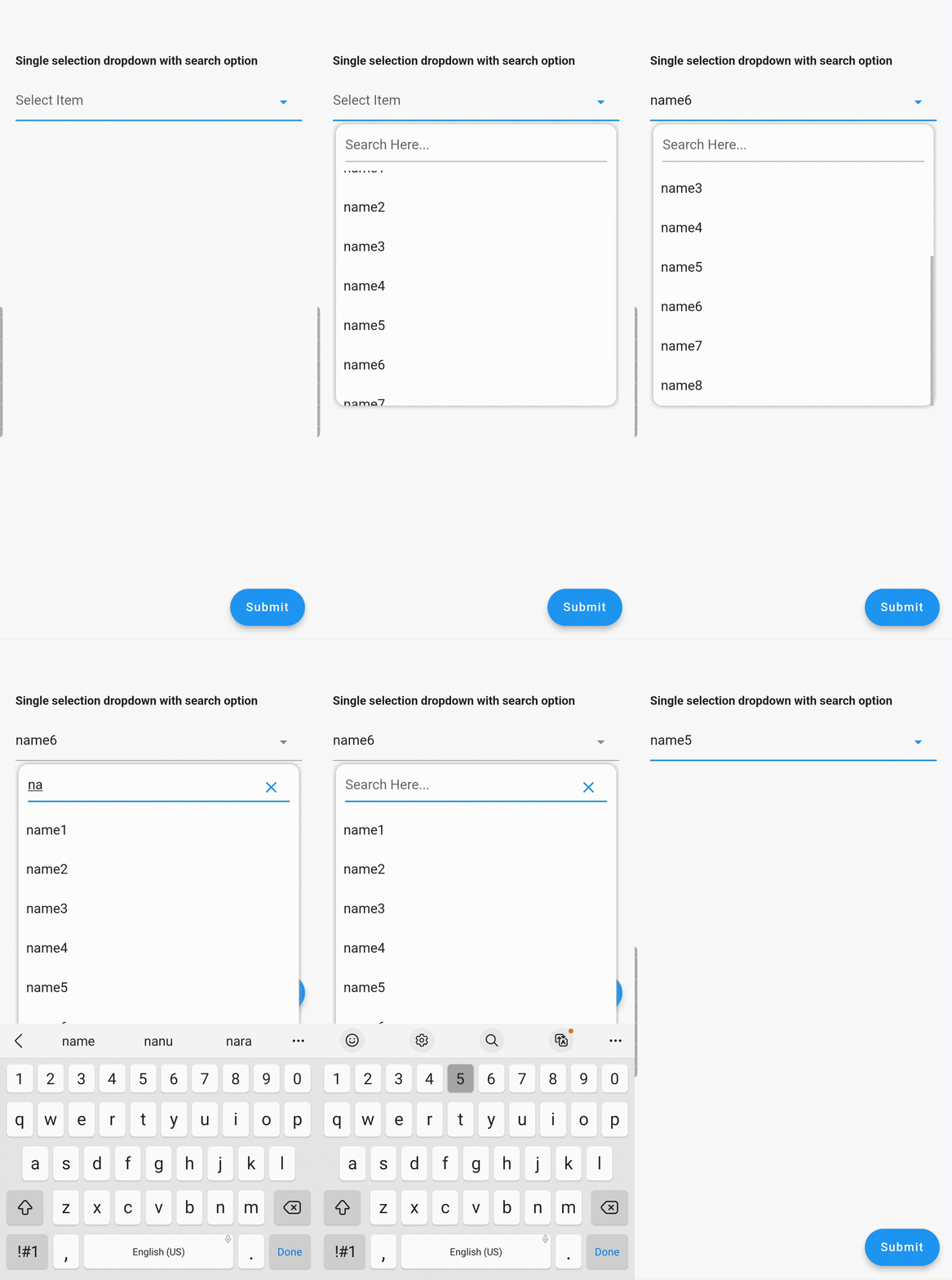
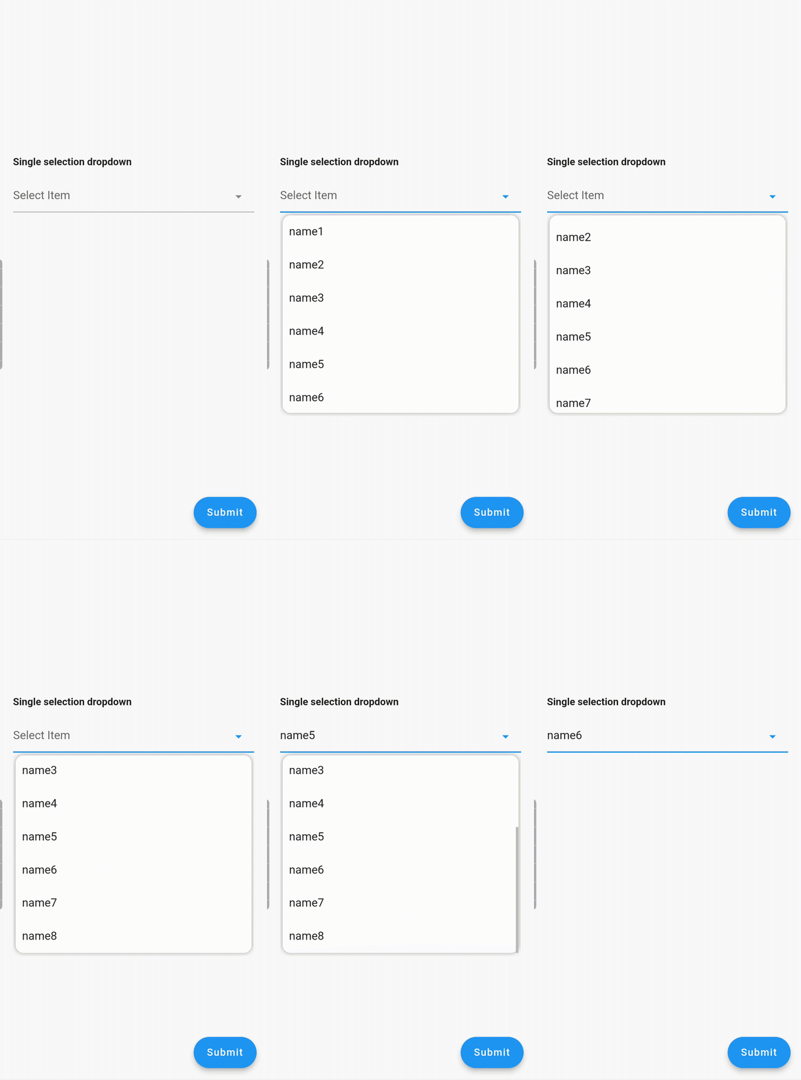
  1. Searchable dropdown
  2. Single & multi-selection
  3. Material dropdown
  4. Easily customizable UI
  5. Easy implementation into StatelessWidget
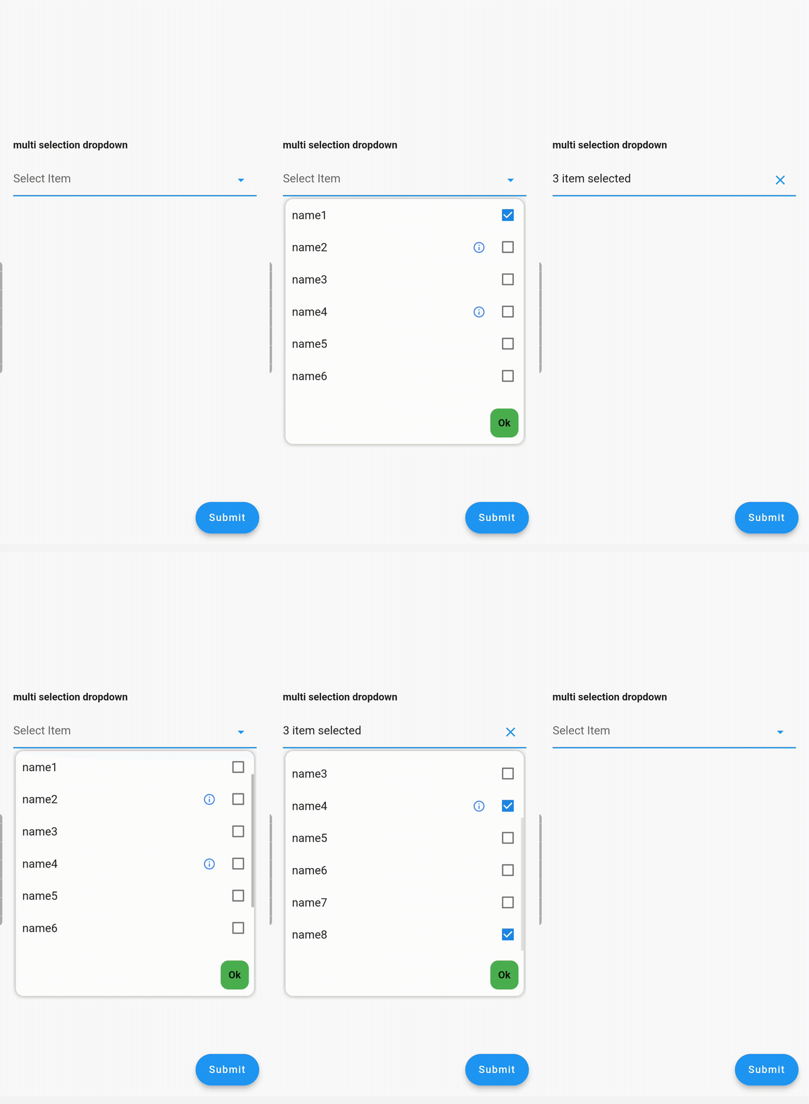
  6. ToolTip dialogue for multi-selection dropdown items

Examples

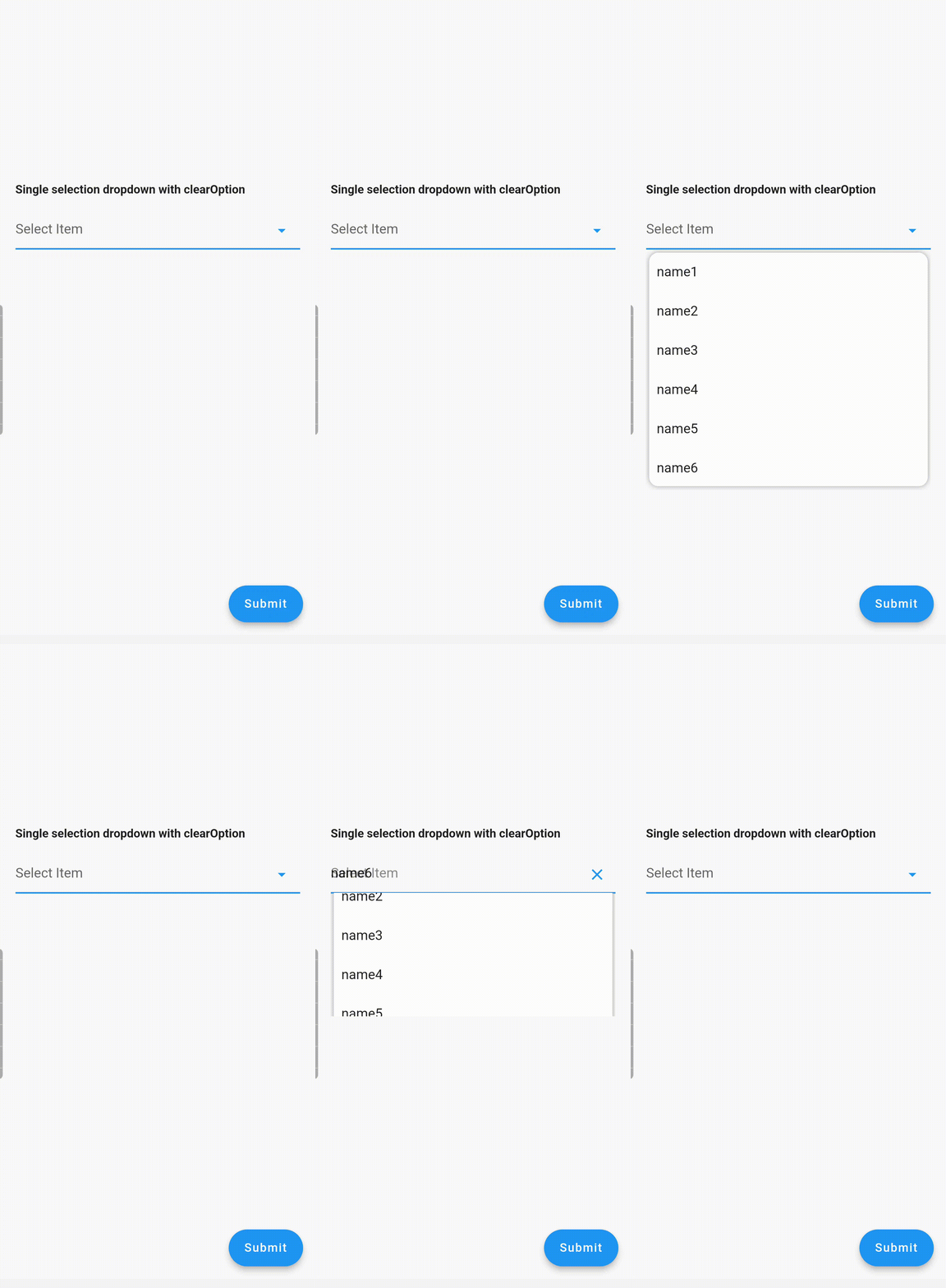
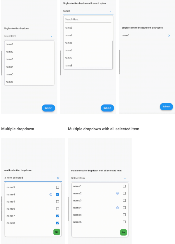
Single Dropdown Single Dropdown with Search Option Single Dropdown with Clear Option
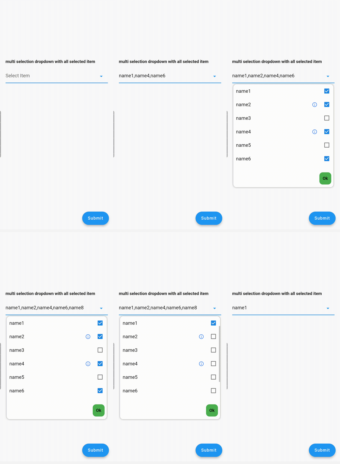
Multiple Dropdown Multiple Dropdown with All Selected Items

Usage

Controllers

You need to use SingleValueDropDownController for single dropdown and MultiValueDropDownController for multiple dropdown.

Properties
  • dropdownRadius: Defines the radius of the dropdown list. Default value is 12.
  • boxDecoration: Add custom BoxDecoration to decorate the dropdown container styling
  • boxMargin: Add custom margins to the dropdown container and override the default vertical: 5, horizontal: 4 margins
  • initialValue: Sets the initial value. If null or not in the dropDownList, it will not display any value.
  • dropDownList: A list of dropdown values of type <DropDownValueModel>.
  • onChanged: Listens for item selection changes. Returns a single DropDownValueModel object for single selection dropdown, and a list of DropDownValueModel objects for multi-selection dropdown.
  • textFieldDecoration: Overrides the default text field decoration.
  • dropDownIconProperty: Customizes the dropdown icon size and color.
  • isEnabled: Set to false to disable the text field. Default value is true.
  • enableSearch: Set to true to enable the search option in the dropdown. Currently available only for single selection dropdown.
  • displayCompleteItem: Set to true to display the complete list of selected items in the text field. Otherwise, it will display as "number_of_items selected".
  • dropDownItemCount: Maximum number of dropdown items to display. Default value is 6.
  • searchKeyboardType: Overrides the default search keyboard type. Applicable only if enableSearch=true.
  • searchTextStyle: Text style for the search text field.
  • searchAutofocus: Set to true to autofocus the search text field. Applicable only if enableSearch=true. Default value is false.
  • searchShowCursor: Set to false to hide the cursor from the search text field. Applicable only if enableSearch=true.
  • clearOption: Set to false to hide the clear suffix icon button from the text field.
  • clearIconProperty: Customizes the clear icon size and color.
  • listSpace: Space between the text field and the list. Default value is 0.
  • listPadding: Padding for dropdown list items.
  • submitButtonText: Text for the multi-dropdown submit button.
  • submitButtonColor: Color of the multi-dropdown submit button.
  • submitButtonTextStyle: Text style for the multi-dropdown submit button.
  • listTextStyle: Text style for dropdown list items.
  • checkBoxProperty: Customizes the properties of multiple checkboxes.

Contributing

Seeking contributions to improve the DropdownTextfield! If you have ideas for new features, optimizations, or bug fixes, please feel free to open a pull request or issue on our GitHub repository. Your contributions are greatly appreciated and will help make this package even better.

Categories

Dependencies

Dependency list 2 items

Source repository

Projects using this package

No data available yet.