Search packages, repositories and app categories

flutter_advanced_drawer cover
Package detailsv1.5.0

flutter_advanced_drawer

An advanced drawer widget, that can be fully customized with size, text, color, radius of corners.

AndroidiOSWebmacOSWindowsLinux
30-day downloads
9.7K
Likes
439
Pub points
160

Install package

flutter pub add flutter_advanced_drawer

Package Overview

Package selection guidance compiled from public package information, community data, and project usage.

A highly customizable drawer widget for Flutter that supports full control over size, text, colors, and corner radius. Designed for modern UIs, it enhances navigation with smooth animations and flexible styling options across all major platforms. Ideal for apps requiring a polished, responsive drawer experience with minimal setup. The package is actively maintained and integrates seamlessly into existing Flutter projects.

Use cases

  • Customizable side navigation menus
  • Enhanced user onboarding flows
  • Responsive app layouts
  • Interactive dashboard interfaces
  • Modern mobile and web applications

Key features

  • Fully customizable size and shape
  • Support for custom text and icons
  • Configurable corner radius
  • Platform-agnostic design
  • Smooth animation transitions
  • Extensible styling options

Suitable for

  • Developers building complex navigation systems
  • Design-focused Flutter apps
  • Cross-platform applications
  • UI-heavy dashboards
  • Apps needing unique drawer aesthetics

Considerations

  • Requires manual handling of open/close states
  • Limited built-in accessibility features
  • May need additional logic for complex routing
  • Not ideal for simple use cases with default drawers
  • Performance impact with heavy content inside drawer
Original README

Original README snapshot from the linked source repository. Visit the repository for the latest content.

flutter_advanced_drawer

An advanced drawer widget, that can be fully customized with size, text, color, radius of corners.

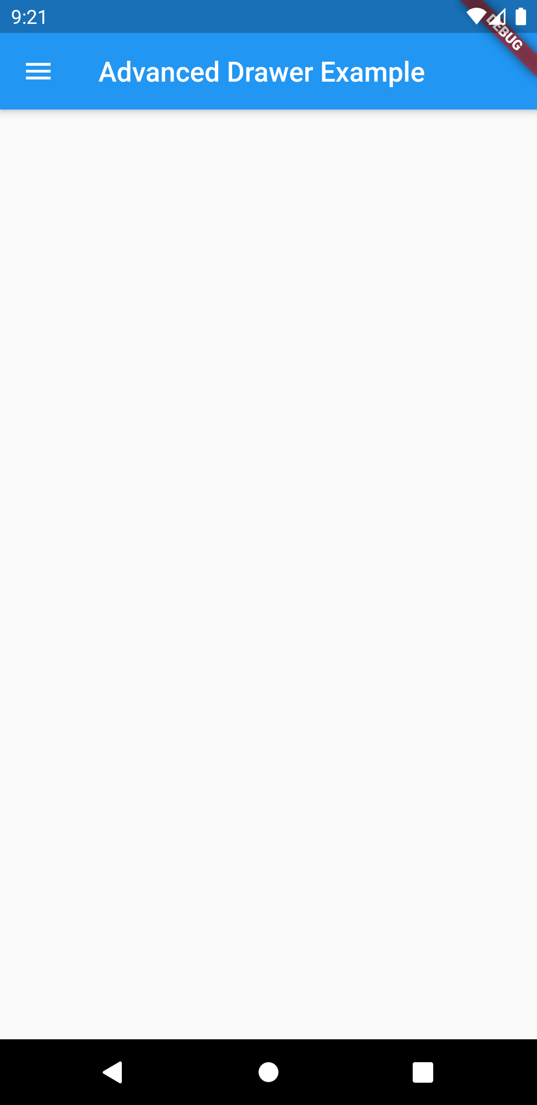
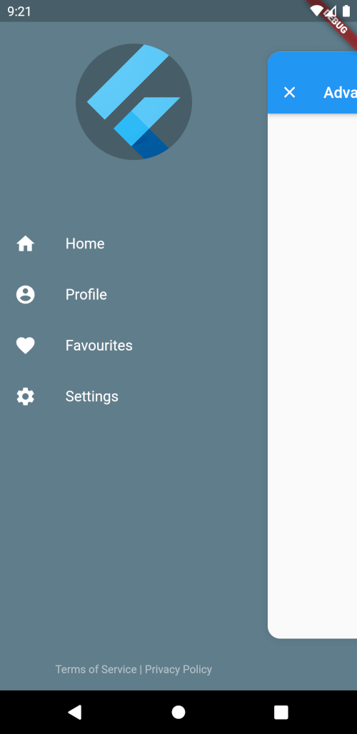
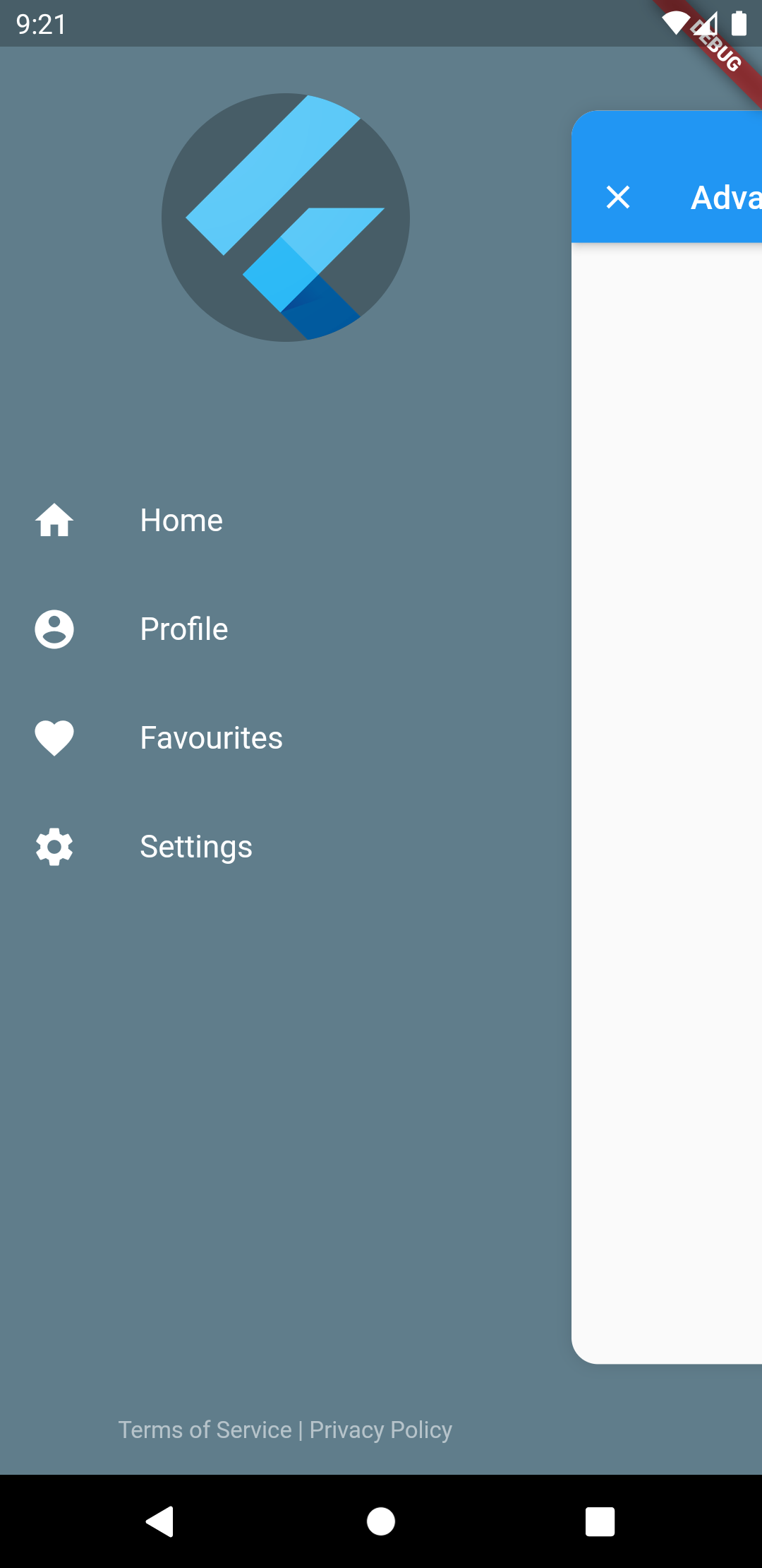
Advanced Drawer States

Drawer Open State Drawer Closed State
Advanced Drawer Open State Advanced Drawer Closed State

AdvancedDrawer Parameters

Parameter Description Type Default
child Screen widget Widget required
drawer Drawer widget Widget required
controller Widget controller AdvancedDrawerController
backdropColor Backdrop color Color
backdrop Backdrop widget for custom background Widget
openRatio Opening ratio double 0.75
openScale Opening child scale factor double 0.85
animationDuration Animation duration Duration 300ms
animationCurve Animation curve Curve Curves.easeInOut
childDecoration Child container decoration BoxDecoration Shadow, BorderRadius
animateChildDecoration Indicates that [childDecoration] might be animated or not. bool true
rtlOpening Opening from Right-to-left. bool false
disabledGestures Disable gestures. bool false
initialDrawerScale How large the drawer segment should scale from. double 0.75
drawerSlideRatio How far the drawer segment should slide with the content. double 0
drawerCloseSemanticLabel Semantic label for the close drawer button. String 'Close drawer'

Preview

Preview Tap Preview Gesture
Advanced Drawer Tap Animation Advanced Drawer Gestures

Categories

Source repository

Projects using this package