
 v1.1.0
quickalert
QuickAlert를 사용하면 성공, 오류, 경고, 확인, 로딩 또는 사용자 정의 대화 상자와 같은 애니메이션 알림 대화 상자를 즉시 표시할 수 있습니다.
589좋아요 1.2만30일 다운로드150Pub 점수
AndroidiOSWebmacOSWindowsLinux
플러터를 사용하여 어떤 플랫폼에서도 개발을 위한 즉시 사용 가능한 기능이 풍부한 알림입니다. QuickAlert를 사용하면 성공, 오류, 경고, 확인, 로딩 또는 사용자 정의 대화 상자와 같은 애니메이션 알림 다이얼로그를 표시할 수 있습니다.

{"sdk":"flutter"}^2.1.2{"sdk":"flutter"}^2.0.0아래는 영문 원문 스냅샷입니다. 최신 내용은 GitHub에서 확인하세요.
An instantly ready, full-featured alerts for development on any platform with flutter. Enabling you to complete projects and deploy quickly. With QuickAlert, you can display animated alert dialogs such as success, error, warning, confirm, loading or even a custom dialog.
Easy To Use
The alerts are very flexible and can be customized very easily. In QuickAlert, the QuickAlert.show() triggers the alert, which informs the user about the situations that need acknowledgment.
Predefined Beautiful Alert Styles
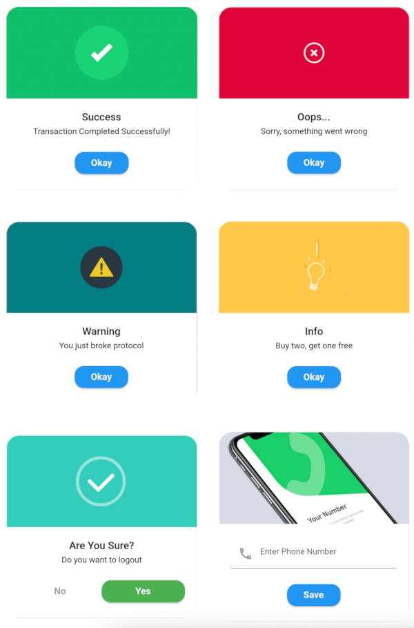
Make use of the predefined alerts are very beautiful and can also be customized very easily. In QuickAlert there are 6 different types of alerts, they are Success, Error, Warning, Info, Confirm & Loading.
Predefined Title & Actions
In QuickAlert all the 6 different types of alerts have predefined title & actions matching the alert type.
Super Customizable
Build your custom alert with power of QuickAlert using the flutter widgets.
Change Animation
Set your favorite animation by choosing from scale, rotate, slideInDown, slideInUp, slideInLeft, slideInRight.
Set Auto close
Auto close the alert by setting auto close duration.
Set Overlay Tap to Dismiss
Control the alert's Barrier Dismissible Property by setting barrierDismissible to true or false.
And Many More...
QuickAlert Demo
Start by adding the library as a dependency to your project.
dependencies:
  quickalert: <latest version>
Run the command get the dependency
$ flutter pub get
Import it in your dart code, you can use
import 'package:quickalert/quickalert.dart';
To display alert use QuickAlert.show() and define the type of alert.
QuickAlert.show(
  context: context,
  type: QuickAlertType.success,
); // That's it to display an alert, use other properties to customize.
There is a detailed example project in the example folder. You can directly run and play on it. There are code snippets from example project below.
Success
QuickAlert.show(
 context: context,
 type: QuickAlertType.success,
 text: 'Transaction Completed Successfully!',
);
Error
QuickAlert.show(
 context: context,
 type: QuickAlertType.error,
 title: 'Oops...',
 text: 'Sorry, something went wrong',
);
Warning
QuickAlert.show(
 context: context,
 type: QuickAlertType.warning,
 text: 'You just broke protocol',
);
Info
QuickAlert.show(
 context: context,
 type: QuickAlertType.info,
 text: 'Buy two, get one free',
);
Confirm
QuickAlert.show(
 context: context,
 type: QuickAlertType.confirm,
 text: 'Do you want to logout',
 confirmBtnText: 'Yes',
 cancelBtnText: 'No',
 confirmBtnColor: Colors.green,
);
Loading
QuickAlert.show(
 context: context,
 type: QuickAlertType.loading,
 title: 'Loading',
 text: 'Fetching your data',
);
Custom
QuickAlert.show(
  context: context,
  type: QuickAlertType.custom,
  barrierDismissible: true,
  confirmBtnText: 'Save',
  customAsset: 'assets/custom.gif',
  widget: TextFormField(
  decoration: const InputDecoration(
     alignLabelWithHint: true,
     hintText: 'Enter Phone Number',
     prefixIcon: Icon(
     Icons.phone_outlined,
     ),
    ),
    textInputAction: TextInputAction.next,
      keyboardType: TextInputType.phone,
      onChanged: (value) => message = value,
    ),
    onConfirmBtnTap: () async {
     if (message.length < 5) {
      await QuickAlert.show(
       context: context,
       type: QuickAlertType.error,
       text: 'Please input something',
      );
      return;
    }
    Navigator.pop(context);
     await Future.delayed(const Duration(milliseconds: 1000));
     await QuickAlert.show(
      context: context,
      type: QuickAlertType.success,
      text: "Phone number '$message' has been saved!.",
     );
    },
  );
 },
 title: 'Custom',
 text: 'Custom Widget Alert',
 leadingImage: 'assets/custom.gif',
);
Here are some screenshots of the QuickAlert Dialogs.
https://raw.githubusercontent.com/belovance/QuickAlert/master/screenshots/success.png?raw=true https://raw.githubusercontent.com/belovance/QuickAlert/master/screenshots/error.png?raw=true https://raw.githubusercontent.com/belovance/QuickAlert/master/screenshots/warning.png?raw=true https://raw.githubusercontent.com/belovance/QuickAlert/master/screenshots/info.png?raw=true https://raw.githubusercontent.com/belovance/QuickAlert/master/screenshots/confirm.png?raw=true https://raw.githubusercontent.com/belovance/QuickAlert/master/screenshots/custom.png?raw=true https://raw.githubusercontent.com/belovance/QuickAlert/master/screenshots/loading.png?raw=true
These are the options available in QuickAlert Class.
| Attribute | Data type | Description | Default Value |
|---|---|---|---|
| context | BuildContext | @required BuildContext | N/A |
| type | QuickAlertType | @required - Type of alert dialog, ex: QuickAlertType.success for success dialogs | NULL |
| title | String | Set a custom title for dialog | Based on the QuickAlertType selected |
| text | String | Set the description text of the dialog. | NULL |
| widget | Widget | Set custom widget of the dialog. | NULL |
| confirmBtnText | String | Text of confirm button | 'Okay' |
| onConfirmBtnTap | Function | Function that handle click of confirm button | () => Navigator.pop(context) |
| confirmBtnColor | Color | Color of confirm Button | Colors.blue |
| showCancelBtn | bool | Determines if cancel button is shown or not | false |
| showConfirmBtn | bool | Determines if confirm button is shown or not | true |
| cancelBtnText | String | Text of cancel button | 'Cancel' |
| onCancelBtnTap | Function | Function that handle click of cancel button | () => Navigator.pop(context) |
| barrierDismissible | bool | Dismiss dialog on touch overlay | true |
| animType | QuickAlertAnimType | Type of dialogue enter animation | QuickAlertAnimType.scale |
| confirmBtnTextStyle | TextStyle | Confirm button text theme | TextStyle(color: Colors.white, fontWeight:FontWeight.w600,fontSize: 18.0) |
| cancelBtnTextStyle | TextStyle | Cancel button text theme | TextStyle(color: Colors.grey, fontWeight:FontWeight.w600,fontSize: 18.0) |
| backgroundColor | Color | Color of dialog background | Colors.white |
| headerBackgroundColor | Color | Background Color of dialog Header Background | Colors.white |
| titleColor | Color | Color of title | Colors.black |
| textColor | Color | Color of text | Colors.black |
| barrierColor | Color | Color of Barrier | NULL |
| customAsset | String | Asset path of your custom asset | NULL |
| autoCloseDuration | Duration | Determines how long the dialog stays open for before closing | NULL |
| width | double | Dialog width | MediaQuery.of(context).size.shortestSide |
| titleAlignment | TextAlign | Title Alignment of the dialog | NULL |
| textAlignment | TextAlign | Text Alignment of the dialog | NULL |
| borderRadius | double | Dialog's border radius | 15.0 |
| disableBackBtn | bool | Determines if the dialog should be closed when back button is pressed | false |