

 v2.0.0
flutter_toggle_tab
Biblioteca para criar widget de guia alternável bonito e personalizado no Flutter
121Curtidas 10,7 milDownloads em 30 dias160Pontos Pub
AndroidiOSWebmacOSWindowsLinux
Biblioteca para criar alternadores / guias personalizados em seus aplicativos

Texto original em inglês. Visite o GitHub para a versão atual.

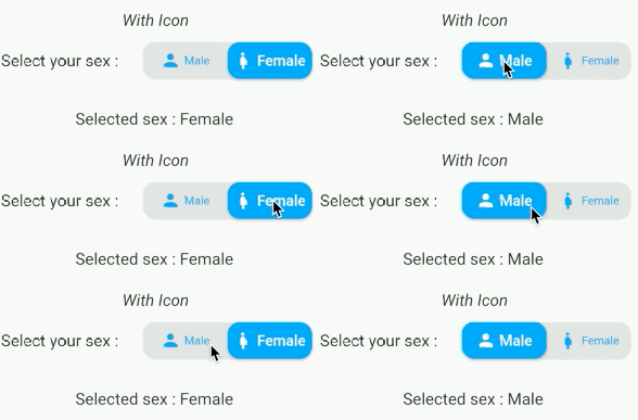
A Beautiful and Simple Toggle Tab widget. It can be fully customized with desired icons, width, colors, text, corner radius, etc. It also maintains selection state.
In the pubspec.yaml of your flutter project, add the following dependency:
dependencies:
  flutter_toggle_tab: "^latestVersion"
Import it:
import 'package:flutter_toggle_tab/flutter_toggle_tab.dart';

// Here default theme colors are used for activeBgColor, activeFgColor, inactiveBgColor and inactiveFgColor
FlutterToggleTab
(
  width: 90, // width in percent
  borderRadius: 30,
  height: 50,
  selectedIndex: _tabTextIndexSelected,
  selectedBackgroundColors: [Colors.blue, Colors.blueAccent],
  selectedTextStyle: TextStyle(
  color: Colors.white,
  fontSize: 18,
  fontWeight: FontWeight.w700),
  unSelectedTextStyle: TextStyle(
  color: Colors.black87,
  fontSize: 14,
  fontWeight: FontWeight.w500),
  dataTabs: _listTextTabToggle,
  selectedLabelIndex: (index) {
    setState(() {
        _tabTextIndexSelected = index;
    });
  },
  isScroll:false,
)

// Here default theme colors are used for activeBgColor, activeFgColor, inactiveBgColor and inactiveFgColor
FlutterToggleTab
(
  width: 90, // width in percent
  borderRadius: 30,
  height: 50,
  selectedIndex: _tabTextIndexSelected,
  selectedBackgroundColors: [Colors.blue, Colors.blueAccent],
  selectedTextStyle: TextStyle(
  color: Colors.white,
  fontSize: 18,
  fontWeight: FontWeight.w700),
  unSelectedTextStyle: TextStyle(
  color: Colors.black87,
  fontSize: 14,
  fontWeight: FontWeight.w500),
  dataTabs: _listTextTabToggleCounter,
  selectedLabelIndex: (index) {
    setState(() {
        _tabTextIndexSelected = index;
    });
  },
  isScroll:false,
)

FlutterToggleTab
(
  width: 50,
  borderRadius: 15,
  selectedTextStyle: TextStyle(
  color: Colors.white,
  fontSize: 18,
  fontWeight: FontWeight.w600),
  unSelectedTextStyle: TextStyle(
  color: Colors.blue,
  fontSize: 14,
  fontWeight: FontWeight.w400),
  dataTabs: _listGenderText,
  selectedIndex: _tabTextIconIndexSelected,
  selectedLabelIndex: (index) {
    setState(() {
      _tabTextIconIndexSelected = index;
    });
  },
)

FlutterToggleTab
(
  width: 40,
  borderRadius: 15,
  selectedIndex: _tabIconIndexSelected,
  selectedTextStyle: TextStyle(
  color: Colors.white,
  fontSize: 18,
  fontWeight: FontWeight.w600),
  unSelectedTextStyle: TextStyle(
  color: Colors.grey,
  fontSize: 14,
  fontWeight: FontWeight.w400),
  dataTabs: _listIconTabToggle,
  selectedLabelIndex: (index) {
    setState(() {
      _tabIconIndexSelected = index;
    });
  },
  marginSelected: EdgeInsets.symmetric(horizontal: 4,vertical:4),
)
FlutterToggleTab
(
  width: 90,
  borderRadius: 15,
  selectedIndex: _tabSelectedIndexSelected,
  selectedTextStyle: TextStyle(
  color: Colors.white,
  fontSize: 18,
  fontWeight: FontWeight.w600),
  unSelectedTextStyle: TextStyle(
  color: Colors.grey,
  fontSize: 14,
  fontWeight: FontWeight.w400),
  dataTabs: _listTextSelectedToggle,
  selectedLabelIndex: (index) {
    setState(() {
      _tabSelectedIndexSelected = index;
    });
  },
)
| Param | isRequired |
|---|---|
| List<DataTab> dataTabs | Yes |
| Function(int) selectedLabelIndex | Yes |
| TextStyle selectedTextStyle default:Theme.of(context).textTheme.bodyMedium, | No |
| TextStyle unSelectedTextStyle default:Theme.of(context).textTheme.bodyMedium, | No |
| int selectedIndex (listener for index selected) see on example | Yes |
| double width (in Percent of width Screen) default: 100 | No |
| double height (double) default: 45 | No |
| double iconSize | No |
| double borderRadius (double) default 30 | No |
| List<Color> selectedBackgroundColors default : [ Theme.of(context).primaryColor] | No |
| List<Color> unSelectedBackgroundColors default [ Color(0xffe0e0e0)] | No |
| Alignment begin default : Alignment.topCenter | No |
| Alignment end default : Alignment.bottomCenter | No |
| bool isScroll default : true | No |
| EdgeInsets marginSelected default : EdgeInsets.zero | No |
| bool isShadowEnable default : true | No |
| bool isInnerShadowEnable default : true | No |

|

|



Lista de dependências 3 itens
{"sdk":"flutter"}{"sdk":"flutter"}^2.3.0Filtre pelo caso de uso, compare a atividade e confira o projeto original antes de adotá-lo.
“A repository is the most basic element of GitHub.”
GitHub Docs — About repositories ↗