Buscar pacotes, repositórios e categorias de apps

Capa de flutter_toggle_tab
Detalhes do pacotev2.0.0

flutter_toggle_tab

Biblioteca para criar widget de guia alternável bonito e personalizado no Flutter

AndroidiOSWebmacOSWindowsLinux
Downloads em 30 dias
10,7 mil
Curtidas
121
Pontos Pub
160

Instalar pacote

flutter pub add flutter_toggle_tab

Visão geral do pacote

Orientação gerada a partir de informações públicas. Apenas para referência.

Um pacote Flutter que permite aos desenvolvedores criar widgets de guias alternáveis visualmente atraentes e altamente personalizáveis. Oferece uma interface flexível e fácil de usar para implementar controles segmentados com animações suaves e comportamento responsivo em todas as principais plataformas. Ideal para filtrar conteúdo, alternar entre visualizações ou selecionar opções em uma interface limpa e moderna. A biblioteca suporta estilização personalizada, alinhamento e renderização de conteúdo dinâmico, tornando-a adequada para casos de uso simples e complexos.

Casos de uso

  • Filtrar dados por categoria
  • Alternar entre visualizações do aplicativo
  • Criando seletores de entrada de formulário
  • Implementando alternância de tema
  • Construindo guias de navegação
  • Personalizando controles segmentados

Principais recursos

  • Aparência altamente personalizável
  • Transições de animação suaves
  • Compatibilidade multiplataforma
  • Suporte para conteúdo dinâmico
  • Integração fácil com widgets existentes
  • Tratamento de design responsivo

Indicado para

  • Desenvolvedores de interfaces modernas
  • Aplicativos que exigem seleção segmentada
  • Designers em busca de acabamento visual
  • Projetos em múltiplas plataformas
  • Equipes que priorizam componentes reutilizáveis

Considerações

  • Requer conhecimento dos princípios de layout do Flutter
  • Pode ser necessário estilos adicionais para temas complexos
  • Impacto no desempenho com grande número de abas
  • Recursos de acessibilidade embutidos limitados
  • Não otimizado para atualizações de frequência extremamente alta

README original

Snapshot do README original do repositório-fonte vinculado. Consulte o repositório para o conteúdo mais recente.

Flutter Tab Toggle

pub package

A Beautiful and Simple Toggle Tab widget. It can be fully customized with desired icons, width, colors, text, corner radius, etc. It also maintains selection state.

Getting Started

In the pubspec.yaml of your flutter project, add the following dependency:

dependencies:
  flutter_toggle_tab: "^latestVersion"

Import it:

import 'package:flutter_toggle_tab/flutter_toggle_tab.dart';

Usage Examples

Basic tab/toggle switch

image


// Here default theme colors are used for activeBgColor, activeFgColor, inactiveBgColor and inactiveFgColor
FlutterToggleTab
(
  width: 90, // width in percent
  borderRadius: 30,
  height: 50,
  selectedIndex: _tabTextIndexSelected,
  selectedBackgroundColors: [Colors.blue, Colors.blueAccent],
  selectedTextStyle: TextStyle(
  color: Colors.white,
  fontSize: 18,
  fontWeight: FontWeight.w700),
  unSelectedTextStyle: TextStyle(
  color: Colors.black87,
  fontSize: 14,
  fontWeight: FontWeight.w500),
  dataTabs: _listTextTabToggle,
  selectedLabelIndex: (index) {
    setState(() {
        _tabTextIndexSelected = index;
    });
  },
  isScroll:false,
)

Basic tab/toggle switch with Custom Counter Widget

image


// Here default theme colors are used for activeBgColor, activeFgColor, inactiveBgColor and inactiveFgColor
FlutterToggleTab
(
  width: 90, // width in percent
  borderRadius: 30,
  height: 50,
  selectedIndex: _tabTextIndexSelected,
  selectedBackgroundColors: [Colors.blue, Colors.blueAccent],
  selectedTextStyle: TextStyle(
  color: Colors.white,
  fontSize: 18,
  fontWeight: FontWeight.w700),
  unSelectedTextStyle: TextStyle(
  color: Colors.black87,
  fontSize: 14,
  fontWeight: FontWeight.w500),
  dataTabs: _listTextTabToggleCounter,
  selectedLabelIndex: (index) {
    setState(() {
        _tabTextIndexSelected = index;
    });
  },
  isScroll:false,
)

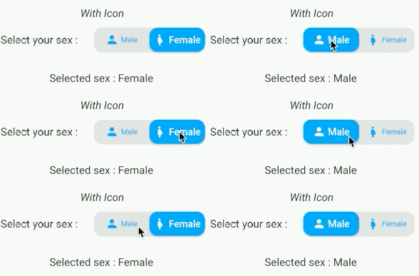
Basic tab/toggle switch with Icon

image

FlutterToggleTab
(
  width: 50,
  borderRadius: 15,
  selectedTextStyle: TextStyle(
  color: Colors.white,
  fontSize: 18,
  fontWeight: FontWeight.w600),
  unSelectedTextStyle: TextStyle(
  color: Colors.blue,
  fontSize: 14,
  fontWeight: FontWeight.w400),
  dataTabs: _listGenderText,
  selectedIndex: _tabTextIconIndexSelected,
  selectedLabelIndex: (index) {
    setState(() {
      _tabTextIconIndexSelected = index;
    });
  },
)

Basic tab/toggle switch with Icon Only and add margin on selected item

image

FlutterToggleTab
(
  width: 40,
  borderRadius: 15,
  selectedIndex: _tabIconIndexSelected,
  selectedTextStyle: TextStyle(
  color: Colors.white,
  fontSize: 18,
  fontWeight: FontWeight.w600),
  unSelectedTextStyle: TextStyle(
  color: Colors.grey,
  fontSize: 14,
  fontWeight: FontWeight.w400),
  dataTabs: _listIconTabToggle,
  selectedLabelIndex: (index) {
    setState(() {
      _tabIconIndexSelected = index;
    });
  },
  marginSelected: EdgeInsets.symmetric(horizontal: 4,vertical:4),
)

Update selected tab Programmatically
FlutterToggleTab
(
  width: 90,
  borderRadius: 15,
  selectedIndex: _tabSelectedIndexSelected,
  selectedTextStyle: TextStyle(
  color: Colors.white,
  fontSize: 18,
  fontWeight: FontWeight.w600),
  unSelectedTextStyle: TextStyle(
  color: Colors.grey,
  fontSize: 14,
  fontWeight: FontWeight.w400),
  dataTabs: _listTextSelectedToggle,
  selectedLabelIndex: (index) {
    setState(() {
      _tabSelectedIndexSelected = index;
    });
  },
)

Available Parameters

Param isRequired
List<DataTab> dataTabs Yes
Function(int) selectedLabelIndex Yes
TextStyle selectedTextStyle default:Theme.of(context).textTheme.bodyMedium, No
TextStyle unSelectedTextStyle default:Theme.of(context).textTheme.bodyMedium, No
int selectedIndex (listener for index selected) see on example Yes
double width (in Percent of width Screen) default: 100 No
double height (double) default: 45 No
double iconSize No
double borderRadius (double) default 30 No
List<Color> selectedBackgroundColors default : [ Theme.of(context).primaryColor] No
List<Color> unSelectedBackgroundColors default [ Color(0xffe0e0e0)] No
Alignment begin default : Alignment.topCenter No
Alignment end default : Alignment.bottomCenter No
bool isScroll default : true No
EdgeInsets marginSelected default : EdgeInsets.zero No
bool isShadowEnable default : true No
bool isInnerShadowEnable default : true No

LinkedIn

Buy me coffee if you love my works ☕️

buymeacoffe      ko-fi      paypal


Categorias

Dependências

Lista de dependências 1 itens

Repositório-fonte

Projetos que usam este pacote

Ainda não há dados.