Buscar pacotes, repositórios e categorias de apps

Detalhes do pacotev0.0.5

adaptive_screen_flutter

Torne o layout adaptável para telas de celular, tablet e web.

AndroidiOSWebmacOSWindowsLinux
Downloads em 30 dias
91
Curtidas
23
Pontos Pub
150

Instalar pacote

flutter pub add adaptive_screen_flutter

Visão geral do pacote

Orientação gerada a partir de informações públicas. Apenas para referência.

AdaptiveScreenFlutter é um pacote de interface responsiva que permite que os layouts se ajustem automaticamente a diferentes tamanhos de tela em plataformas móveis, tablets e web. Ele simplifica a criação de designs fluidos ao detectar o tipo de dispositivo e as dimensões da tela, permitindo que desenvolvedores definam comportamentos adaptativos sem escrever lógica condicional complexa. O pacote integra-se perfeitamente com o sistema de widgets do Flutter e suporta todas as principais plataformas, incluindo Android, iOS, Web, macOS, Windows e Linux. Ideal para aplicativos que exigem experiências consistentes de usuário em diversos dispositivos.

Casos de uso

  • Criando aplicativos multiplataforma com layouts responsivos
  • Criando interfaces adaptativas para tablets e desktops
  • Projetando interfaces unificadas para móveis e web
  • Otimizando a interface do usuário para tamanhos de tela variados
  • Desenvolvendo interfaces de painel escaláveis
  • Suporte à implantação de aplicativos em múltiplos dispositivos

Principais recursos

  • Detecção automática do tamanho da tela
  • design responsivo independente de plataforma
  • Pontos de quebra embutidos para mobile, tablet e web
  • Integração fácil com projetos Flutter existentes
  • Suporte para todas as plataformas-alvo do Flutter
  • Configuração de layout flexível

Indicado para

  • Desenvolvedores direcionados para múltiplas plataformas
  • Equipes construindo painéis responsivos
  • Aplicativos que precisam de suporte para tablet e web
  • Projetos que exigem mínimo boilerplate responsivo
  • equipes de Flutter voltadas para o frontend

Considerações

  • Pode exigir testes em vários tipos de dispositivos
  • A lógica de layout deve ser cuidadosamente estruturada
  • Não ideal para necessidades altamente dinâmicas ou de renderização personalizada
  • Depende da detecção precisa das dimensões da tela
  • Melhor usado com árvores de widget bem organizadas
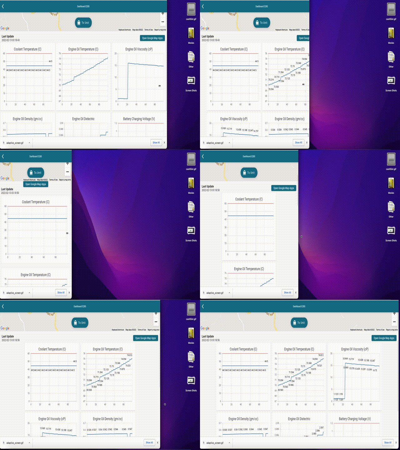
README original

Snapshot do README original do repositório-fonte vinculado. Consulte o repositório para o conteúdo mais recente.

Hi Flutter dev, this package helps you to build UI with adaptive screen based on mobile, tablet and web.

Example

Getting started

You can customize the brakepoint of the screen width or just use the default of this package for the screen width.

Usage

The defaut brake point of tablet is 600.0 and 950 for the web.

OR

If you want to custom the brake point, you can set init brake point in main method like this

void main(){
    // here for setting mobile to tablet brakepoint
    ScreenInit.setTabletBrakePoint(650.0);
    // here for setting tablet to web brakepoint
    ScreenInit.setWebBrakePoint(1000.0);
    runApp(MyApp());
}

Wrap your widget with AdaptiveScreen()

AdaptiveScreen(
    mobile: Center(
        child: Text('Ini Mobile')
    ),
    tablet: Row(
        children:[
            Text('Ini tablet'),
            Container()
            // ...
        ]
    ),
    web: Column(
        children:[
            Text('Ini web'),
            SizedBox(height:30),
            // ...
        ]
    )
)

LICENSE

MIT License

Copyright (c) 2022 Ferdian Gunawan

Permission is hereby granted, free of charge, to any person obtaining a copy
of this software and associated documentation files (the "Software"), to deal
in the Software without restriction, including without limitation the rights
to use, copy, modify, merge, publish, distribute, sublicense, and/or sell
copies of the Software, and to permit persons to whom the Software is
furnished to do so, subject to the following conditions:

The above copyright notice and this permission notice shall be included in all
copies or substantial portions of the Software.

THE SOFTWARE IS PROVIDED "AS IS", WITHOUT WARRANTY OF ANY KIND, EXPRESS OR
IMPLIED, INCLUDING BUT NOT LIMITED TO THE WARRANTIES OF MERCHANTABILITY,
FITNESS FOR A PARTICULAR PURPOSE AND NONINFRINGEMENT. IN NO EVENT SHALL THE
AUTHORS OR COPYRIGHT HOLDERS BE LIABLE FOR ANY CLAIM, DAMAGES OR OTHER
LIABILITY, WHETHER IN AN ACTION OF CONTRACT, TORT OR OTHERWISE, ARISING FROM,
OUT OF OR IN CONNECTION WITH THE SOFTWARE OR THE USE OR OTHER DEALINGS IN THE
SOFTWARE.

Additional Information

Please don't hesitate to contribute to this package.

Shout out to Abdelouahed Medjoudja that has inspired me for the default width screen 600 and 950.

Categorias

Repositório-fonte

Projetos que usam este pacote

Ainda não há dados.