Orientação gerada a partir de informações públicas. Apenas para referência.
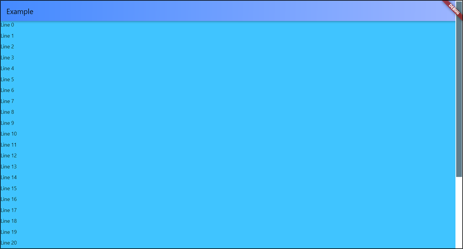
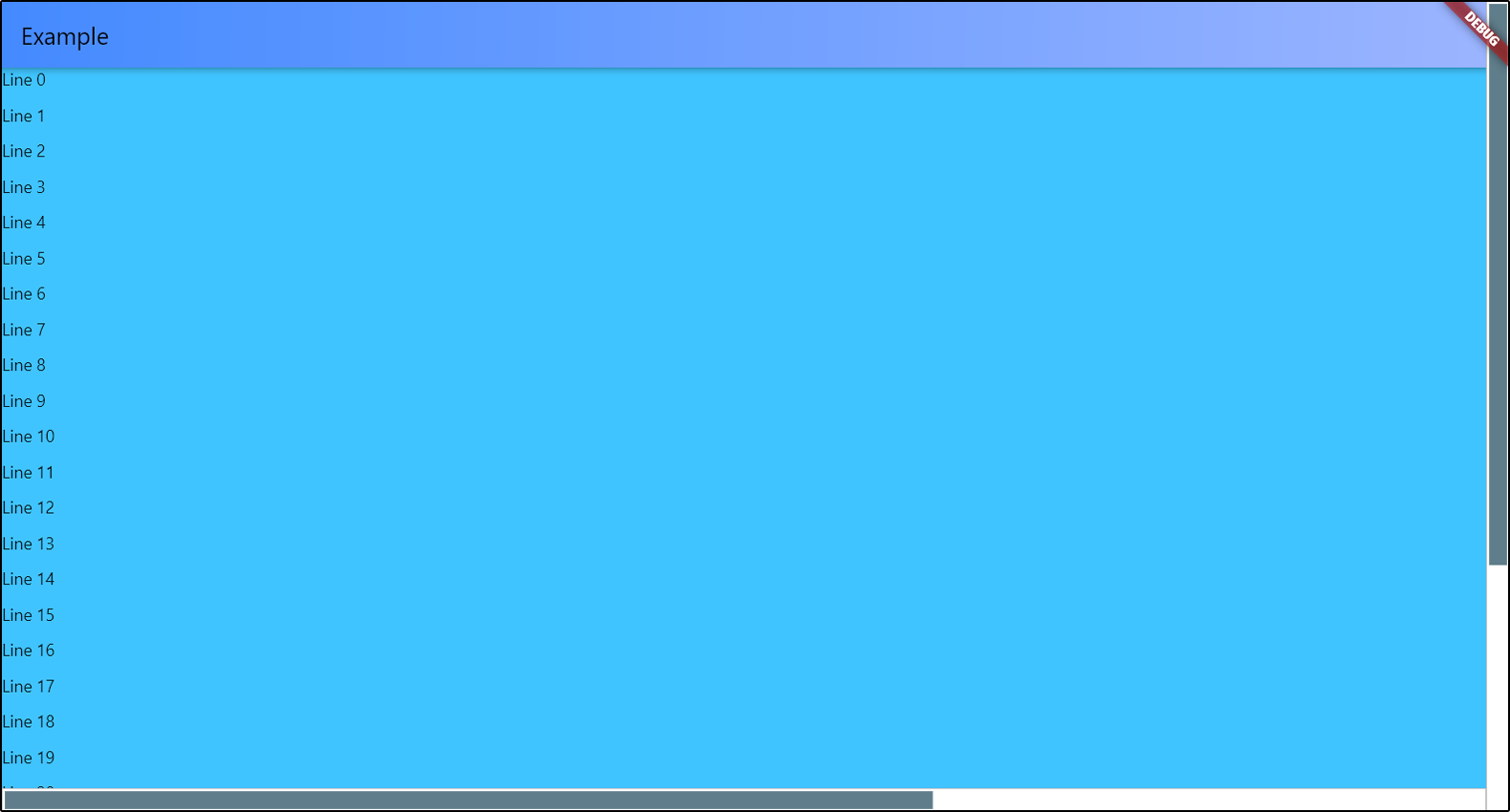
O Adaptive Scrollbar é um pacote do Flutter que fornece uma barra de rolagem com estilo de desktop que se ajusta automaticamente à sua posição e aparência com base na plataforma e no contexto. Pode ser posicionado à esquerda ou à direita de um widget rolável, oferecendo uma experiência consistente em diferentes dispositivos. Projetado para interfaces modernas, melhora a usabilidade em interfaces táteis e não táteis. A barra de rolagem se adapta a diferentes tamanhos de tela e métodos de entrada, tornando-a ideal para aplicativos voltados para múltiplas plataformas, incluindo móvel, web e desktop.
Casos de uso
Aplicativos multiplataforma com conteúdo rolagem
Experiências semelhantes às de desktop no mobile
Acessibilidade aprimorada para listas longas
indicadores de rolagem personalizáveis
Interfaces responsivas na web e desktop
Principais recursos
Posicionamento automático à esquerda ou à direita
Design orientado a plataforma
Suporta dispositivos com toque e sem toque
Aparência configurável
Integração suave com ScrollViews
Indicado para
Desenvolvedores direcionados a aplicativos multiplataforma
Designers procurando interfaces do tipo desktop
Aplicativos que exigem rolagem acessível
Projetos com conteúdo de longa forma
Aplicações Flutter voltadas para web e desktop
Considerações
Pode exigir estilos adicionais para temas personalizados
Impacto no desempenho em listas muito grandes
Personalização limitada além da posição básica
Não adequado para designs minimalistas
Requer posicionamento cuidadoso em layouts complexos
README original
Snapshot do README original do repositório-fonte vinculado. Consulte o repositório para o conteúdo mais recente.
Adaptive Scrollbar is a library that allows you to create one or more desktop-style
scrollbars on a single screen, each of which is bound only to its own object
and placed in its own place on the screen.
Just wrap with AdaptiveScrollbar your widget that contains your ScrollView
object and specify the controller that is attached to this ScrollView object.
You can add multiple scrollbars to the screen at once. The controller
is a required parameter in order to track changes to only one object
if there are several ScrollView objects in your widget.
You can position your scrollbar on any of the 4 sides of the screen.
There is only one thing - if you choose ScrollbarPosition.top or
ScrollbarPosition.bottom, your scrollbar will actually be rotated 90 degrees,
and the top will be on the left. Do not forget about this if you specify
the spacings for slider and under the slider part. I'll think about how to simplify this.
AdaptiveScrollbar(
controller: verticalScroll,
width: verticalWidth,
child: AdaptiveScrollbar(
controller: horizontalScroll,
position: ScrollbarPosition.bottom,
//the horizontal scrollbar will have a padding// on the RIGHT by the width of the vertical scrollbar
underSpacing: EdgeInsets.only(bottom: verticalWidth),
width: horizontalWidth,
child: ...
),
To set slider width, you can set the horizontal sliderSpacing.
The vertical sliderSpacing will determine the padding of the slider
from the start and the end of the bottom. The height of the slider
is determined automatically based on the size of the ScrollView object.
If ScrollView object has nowhere to scroll, the scrollbar will not be displayed
on the screen.
You can set colors for slider and under the slider part, or completely set
the decorations for them.
Slider scroll-to-click speed
You can set your own speed parameters for moving the slider in the direction
of the click. scrollToClickDelta is the distance that the slider will move
in one move. scrollToClickFirstDelay is the duration of the first delay
between the slider moves in the direction of the click, in milliseconds.
scrollToClickOtherDelay is the duration of the remaining delays between scrolls
in the click direction, in milliseconds.