Orientação gerada a partir de informações públicas. Apenas para referência.
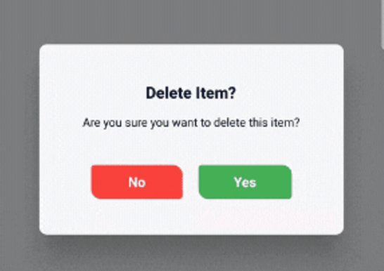
Um pacote Flutter que fornece diálogos de confirmação personalizáveis com animações opcionais de giro 3D e uma interface moderna e elegante. Ele melhora a interação do usuário ao oferecer feedback visual suave durante as ações de confirmação. Os desenvolvedores podem facilmente adaptar a aparência, os botões e o comportamento do diálogo para corresponder à linguagem de design do seu aplicativo. O pacote é compatível com múltiplas plataformas, incluindo Android, iOS, Web, macOS, Windows e Linux, garantindo experiências consistentes em dispositivos diferentes.
Casos de uso
Confirmação de ação do usuário
Verificação de envio de formulário
Excluir ou cancelar operações
Alterações nas configurações do aplicativo
Confirmações de etapa de onboarding
Prompts relacionados à segurança
Principais recursos
Estilo de diálogo personalizável
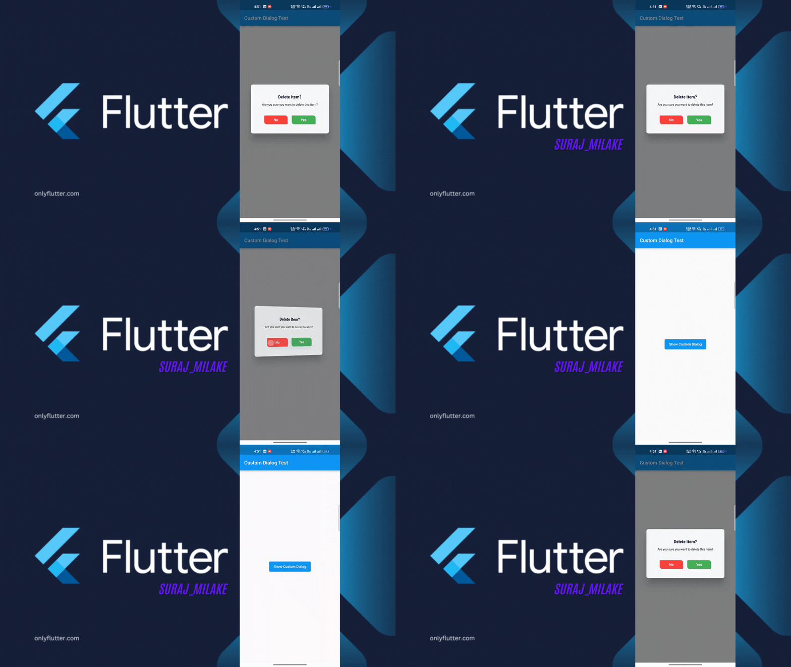
Animação opcional de giro 3D
Interface do usuário moderna e responsiva
Compatibilidade multiplataforma
Integração fácil com o Flutter
Rótulos e ações de botão configuráveis
Indicado para
Desenvolvedores em busca de interações de diálogo refinadas
Aplicativos que exigem confirmações intuitivas do usuário
Projetos que enfatizam feedback visual
Aplicativos móveis e web multiplataforma
Aplicações Flutter voltadas para a UI
Considerações
Pode exigir estilos adicionais para temas complexos
Desempenho de animação em dispositivos de baixa gama
Limitado a casos de uso de confirmação
Depende do framework de animação do Flutter
Não adequado para popups não interativos
README original
Snapshot do README original do repositório-fonte vinculado. Consulte o repositório para o conteúdo mais recente.
animated_confirm_dialog
A customizable Flutter package for displaying confirmation dialogs with optional 3D flip animations and modern UI. This package allows you to easily show stylish confirmation dialogs with a clean and modern design, making it highly customizable.
Features
Customizable Dialogs: Easily adjust the title, message, and button text.
Animations: Includes optional 3D flip animation for dialog transitions.
Modern UI: A visually appealing, modern design with customizable button styles and colors.
Dismissable: Optionally control if the dialog can be dismissed by tapping outside.
Demo Video
Getting Started
To use animated_confirm_dialog in your Flutter project, follow these simple steps.
Prerequisites
Before starting, ensure that you have the following installed:
Flutter SDK: >=3.0.0
Dart SDK: >=3.1.3 <4.0.0
Installation
Open your pubspec.yaml file.
Under dependencies, add the following line:
dependencies:animated_confirm_dialog:^1.0.2
Usage
Once you’ve installed the package, you can use the showCustomDialog function to display the confirmation dialog. Here’s an example of how to use it:
import'package:animated_confirm_dialog/animated_confirm_dialog.dart';
showCustomDialog(
context: context,
title: 'Delete Item?',
message: 'Are you sure you want to delete this item?',
cancelButtonText: 'No',
confirmButtonText: 'Yes',
cancelButtonColor: Colors.red,
cancelButtonTextColor: Colors.white,
confirmButtonColor: Colors.green,
confirmButtonTextColor: Colors.white,
onCancel: () {
// Action when cancel button is pressedNavigator.of(context).pop();
},
onConfirm: () {
// Action when confirm button is pressedNavigator.of(context).pop();
},
isFlip: true, // You can set isFlip to true for 3D rotation effect
);
Customization
You can customize various aspects of the dialog by passing different parameters. Below is a list of customizable options:
Parameter
Description
Default
title
The title of the dialog.
'Logout Confirmation'
message
The message displayed inside the dialog.
'Are you sure you want to log out?'
cancelButtonText
Text for the cancel button.
'Cancel'
confirmButtonText
Text for the confirm button.
'Logout'
backgroundColor
Background color of the dialog.
Color(0xFFF5F5F5)
titleColor
Color of the title text.
Color(0xFF000000)
messageColor
Color of the message text.
Color(0xFF000000)
cancelButtonColor
Background color of the cancel button.
Color(0xFF007BFF)
cancelButtonTextColor
Color of the cancel button text.
Colors.white
confirmButtonColor
Background color of the confirm button.
Colors.white
confirmButtonTextColor
Color of the confirm button text.
Color(0xFF007BFF)
onCancel
A callback function triggered when the cancel button is tapped.
null (no action)
onConfirm
A callback function triggered when the confirm button is tapped.
null (no action)
isFlip
Enables a 3D flip animation when the dialog is shown.
false
dismissible
Controls whether the dialog can be dismissed by tapping outside.
true
Licence
This project is licensed under the MIT License. You can view the full license in the LICENSE file.