Orientação gerada a partir de informações públicas. Apenas para referência.
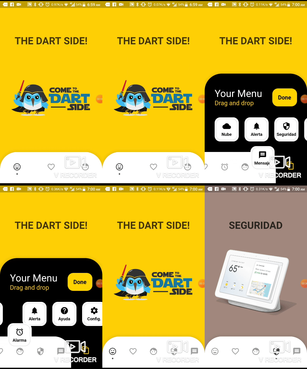
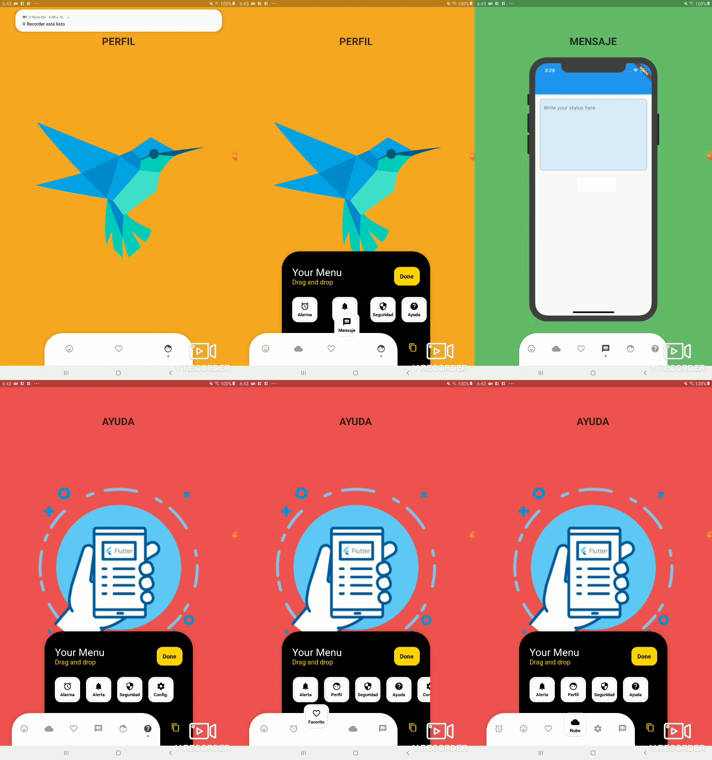
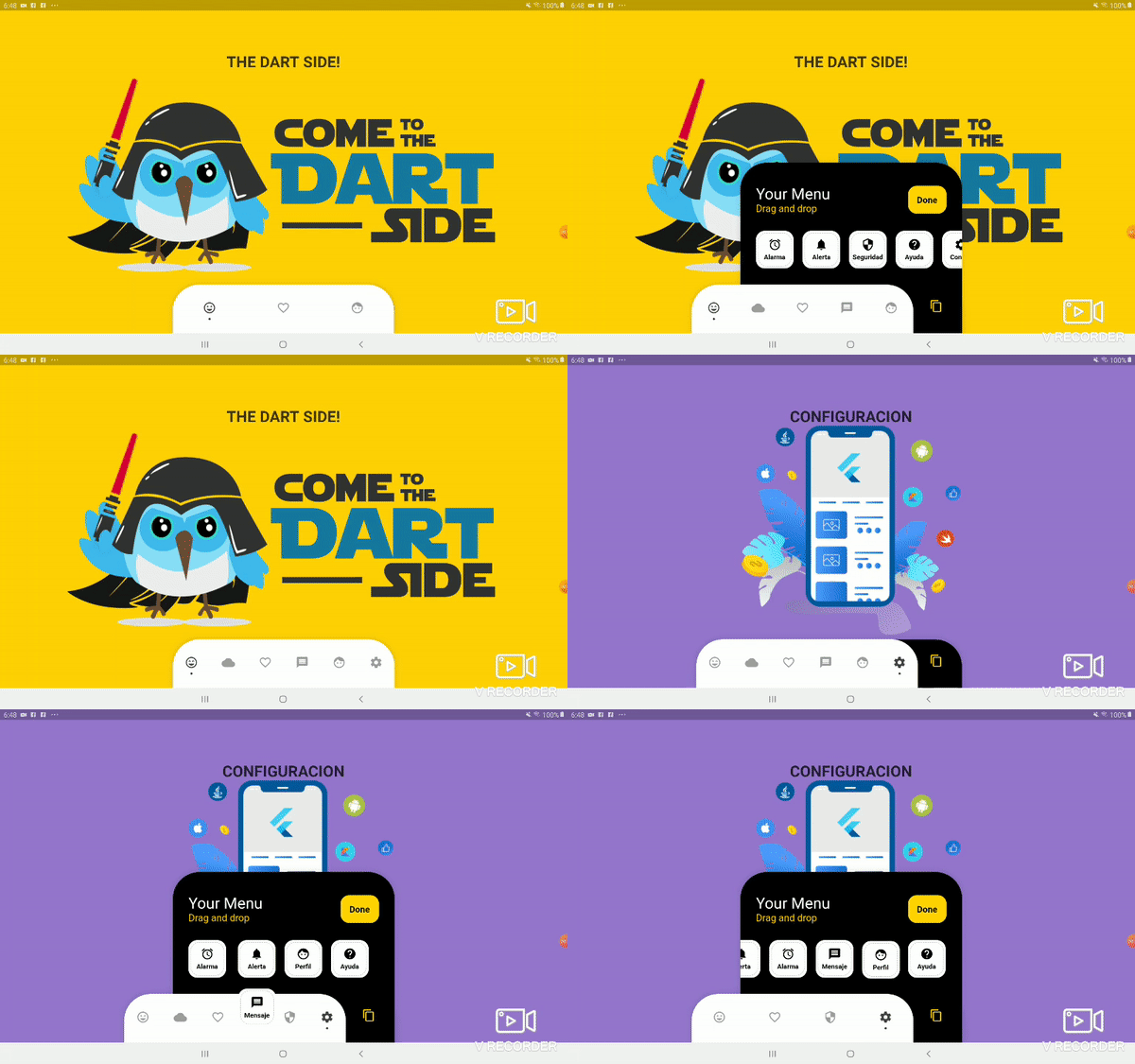
Uma barra de navegação inferior personalizável no Flutter que permite aos usuários arrastar e soltar itens para personalizar seu layout. Oferece uma experiência dinâmica e interativa para organizar ícones de navegação com controle total sobre aparência e comportamento. Ideal para aplicativos que exigem padrões de navegação flexíveis, este pacote aumenta o engajamento do usuário por meio de personalização intuitiva. A barra suporta transições suaves e design responsivo, tornando-a adequada para aplicativos móveis modernos.
Casos de uso
Navegação de aplicativo personalizável
Layouts de interface orientados pelo usuário
Barras inferiores interativas
Personalização de aplicativo móvel
Reorganização dinâmica da interface
Principais recursos
Reordenar itens por arrastar e soltar
indicadores de ponto totalmente personalizáveis
Suporte a design responsivo
Integração fácil com o Flutter
Suporta estilização personalizada
Indicado para
Desenvolvedores procurando navegação interativa
Aplicativos com design centrado no usuário
Interfaces móveis personalizáveis
Projetos Flutter que precisam de barras inferiores dinâmicas
Desenvolvimento de aplicativos focado em design
Considerações
Documentação específica da plataforma limitada
Nenhuma animação embutida além das transições básicas
Requer manipulação manual da gestão de estado
Não otimizado para grandes quantidades de itens
Pode ser necessário estilos adicionais para temas complexos
README original
Snapshot do README original do repositório-fonte vinculado. Consulte o repositório para o conteúdo mais recente.
Bottom Personalized Dot Bar
A bottom navigation bar that you can customize with the options you need, without any limits. You can also customize the appearance of the navigation bar.
List of items to be displayed in the navigation bar
hiddenItems
List of items that will be hidden
keyItemSelected
Item key that is selected
width
Navigation bar width
height
Navigation bar height
borderRadius
Navigation bar radius
selectedColorIcon
Selected Icon color
unSelectedColorIcon
Unselected Icon color
navigatorBackground
Navigator Container Background color
settingBackground
Setting Container Background color (Hidden items)
iconSetting
Settings button icon
iconSettingColor
Settings button icon color
settingTitleText
Setting Title Text
settingTitleColor
Setting Title color
settingSubTitleText
Setting Sub-Title Text
settingSubTitleColor
Setting Sub-Title color
doneText
Done button Text
textDoneColor
Text Done Color
buttonDoneColor
Button done color
hiddenItemBackground
Background of hidden item
iconHiddenColor
Icon Hidden Color
textHiddenColor
Text Hidden Color
dotColor
Selection Indicator Color (Dot
boxShadow
Shadow of container
onOrderHideItems
Event when you sort the hidden options, this has as parameter the list of hidden options with the new order. onOrderHideItems: (List<BottomPersonalizedDotBarItem> hiddenItems) { /* Your action */ }
onOrderItems
Event when ordering browser options, this has as parameter the list of options with the new order onOrderItems: (List<BottomPersonalizedDotBarItem> items) { /* Your action */ }
onAddItem
Event when you add a new option to the navigation bar, this has as parameters the item you add and the list of options. onAddItem: (BottomPersonalizedDotBarItem itemAdd, List<BottomPersonalizedDotBarItem> items) { /* Your action */ }
onRemoveItem
Event when you delete an option from the navigation bar, this has as parameters the element to delete and the list of hidden options. onRemoveItem: (BottomPersonalizedDotBarItem itemRemove, List<BottomPersonalizedDotBarItem> hiddenItems) { /* Your action */ }
BottomPersonalizedDotBarItem
Attribute
Description
keyItem
Unique key
icon
Item icon
name
Item name
onTap
Event with you press the item. onTap: (String keyItem) { /* Your action */ }