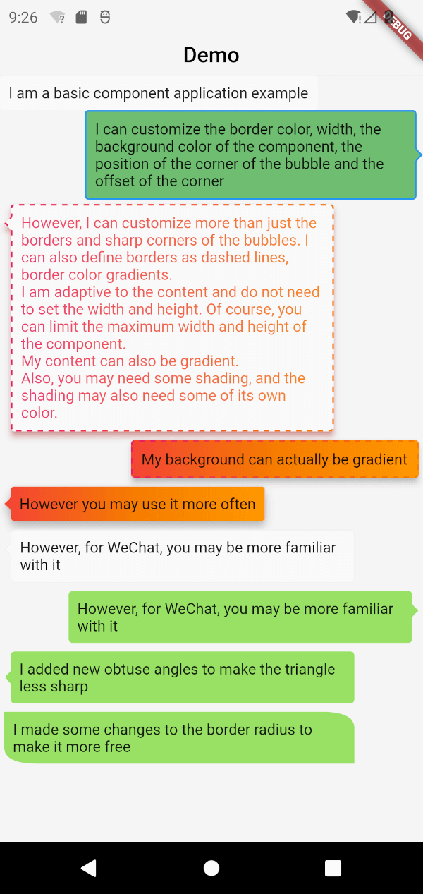
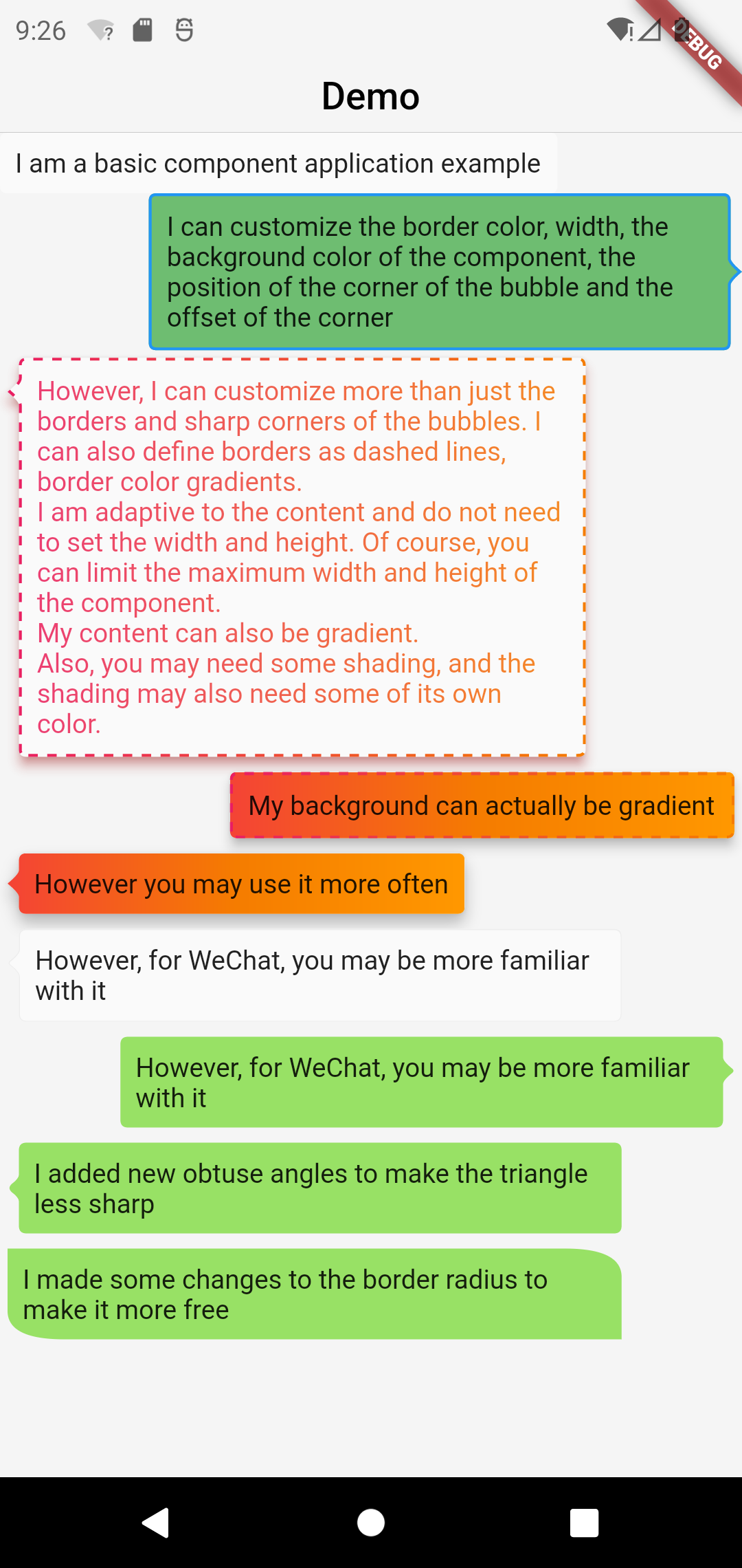
Uma caixa de bolha poderosa que implementa bolhas básicas, bordas, linha tracejada, cor gradiente, ângulo, largura e altura adaptáveis, direção da bolha, deslocamento, etc.
Orientação gerada a partir de informações públicas. Apenas para referência.
Bubble Box é um pacote do Flutter que permite aos desenvolvedores criar contêineres com formato de bolha visualmente atraentes, com recursos personalizáveis como bordas, linhas pontilhadas, gradientes, ângulos, dimensionamento adaptativo e deslocamentos direccionais. Ele suporta múltiplas plataformas, incluindo Android, iOS, Web, macOS, Windows e Linux. O pacote simplifica a implementação de elementos de interface dinâmicos e estilosos, ideais para dicas, badges ou componentes de design interativos. Com opções intuitivas de configuração, ele melhora a estética da interface do usuário sem exigir pintura personalizada complexa.
Casos de uso
Criando dicas animadas
Criando bolhas de conversa
Construindo emblemas interativos
Melhorando a UI com efeitos de gradiente
Implementando layouts de bolhas responsivos
Principais recursos
Direção de bolha personalizável
Largura e altura adaptáveis
Suporte de cor gradiente
Bordas de linha pontilhada
Ajustes de ângulo e deslocamento
Compatibilidade entre plataformas
Indicado para
Designers de UI em busca de charme visual
Desenvolvedores construindo interfaces de chat
Aplicativos que precisam de componentes de badge dinâmicos
Projetos com foco em efeitos visuais
Aplicativos móveis e web multiplataforma
Considerações
Pode afetar o desempenho com uso excessivo
Requer gerenciamento cuidadoso do layout
Documentação limitada além dos exemplos básicos
Não ideal para formas retangulares simples
README original
Snapshot do README original do repositório-fonte vinculado. Consulte o repositório para o conteúdo mais recente.
A powerful bubble box, which implements basic bubble, border, dotted line, gradient color, angle, adaptive width and height, bubble direction, offset, etc.
This project was wrote with pure dart code,which means it's support both iOS As well as Android, web, windows, linux, etc.
Modified a lot of APIs, please pay attention to upgrade
Screenshot
Basic Components
BubbleBox(
    maxWidth: MediaQuery.of(context).size.width * 0.8,
    child: Text('I am a basic component application example'),
)
Customize the border color, width, and component background color
BubbleBox(
maxWidth: MediaQuery.of(context).size.width * 0.8,
shape: BubbleShapeBorder(
border: BubbleBoxBorder(
color: Colors.blue,
width: 3,
),
position: constBubblePosition.center(0),
direction: BubbleDirection.right,
),
backgroundColor: Colors.green.withOpacity(0.8),
child: Text('I can customize the color and width of the border, the background color of the component, the position of the sharp corner of the bubble and the offset of the sharp corner'),
)
Define the border as a dashed line and the border color gradient
BubbleBox(
maxWidth: MediaQuery.of(context).size.width * 0.8,
gradient: LinearGradient(
colors: [
Colors.pink,
Colors.orange[700],
],
),
blendMode: BlendMode.srcATop,
shape: BubbleShapeBorder(
border: BubbleBoxBorder(
gradient: LinearGradient(
colors: [
Colors.pink,
Colors.orange[700],
],
),
width: 3,
style: BubbleBoxBorderStyle.dashed,
),
direction: BubbleDirection.left,
position: constBubblePosition.start(12),
),
margin: EdgeInsets.all(4),
elevation: 5,
shadowColor: Colors.redAccent,
child: Text(
'However, I can not only customize the border and sharp corners of the bubble. I can also define the border as a dashed line and a gradient of border color. \nI am adaptive to the content, there is no need to set the width and height. Of course, you can limit the maximum width and height of the component. \nMy content can also be faded. \nIn addition, you may need some shadows, and the shadows may also need some of their own colors.'),
)
BubbleBox(
maxWidth: MediaQuery.of(context).size.width * 0.85,
shape: BubbleShapeBorder(
direction: BubbleDirection.left,
position: constBubblePosition.start(12),
arrowQuadraticBezierLength: 2,
),
backgroundColor: Color(0xff98E165),
margin: EdgeInsets.all(4),
child: Text(
'We added new obtuse angles so that the triangles are no longer so sharp',
),
),
enhanced radius
BubbleBox(
    maxWidth: MediaQuery.of(context).size.width * 0.85,
    backgroundColor: Color(0xff98E165),
    margin: EdgeInsets.all(4),
    shape: BubbleShapeBorder(
      radius: BorderRadius.only(
          topRight: Radius.elliptical(30, 15),
          bottomLeft: Radius.elliptical(30, 15)),
    ),
    child: Text(
      'We have made some modifications to the border radius to make it more free',
    ),
  ),