Buscar pacotes, repositórios e categorias de apps

Capa de calendar_day_slot_navigator
Detalhes do pacotev0.0.2

calendar_day_slot_navigator

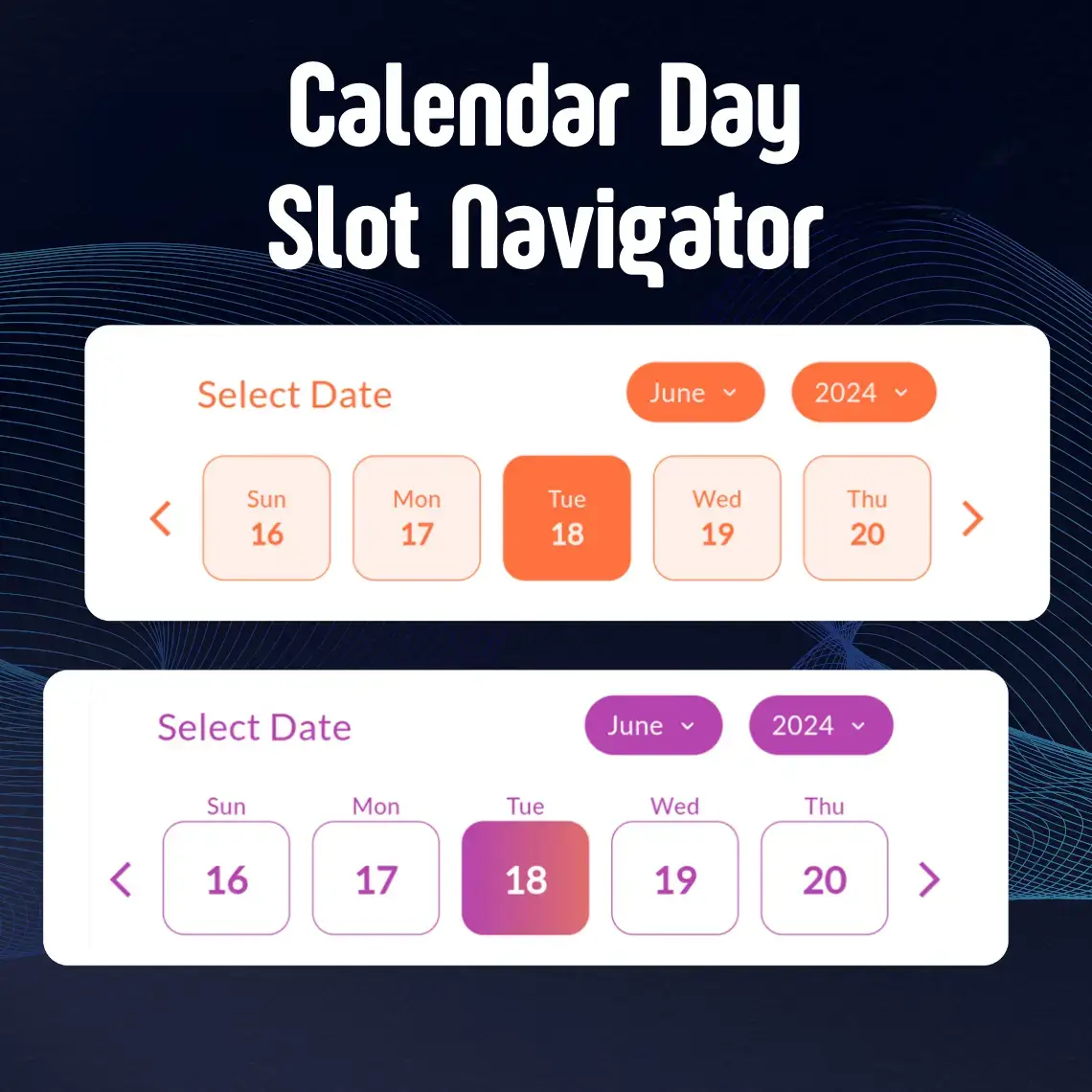
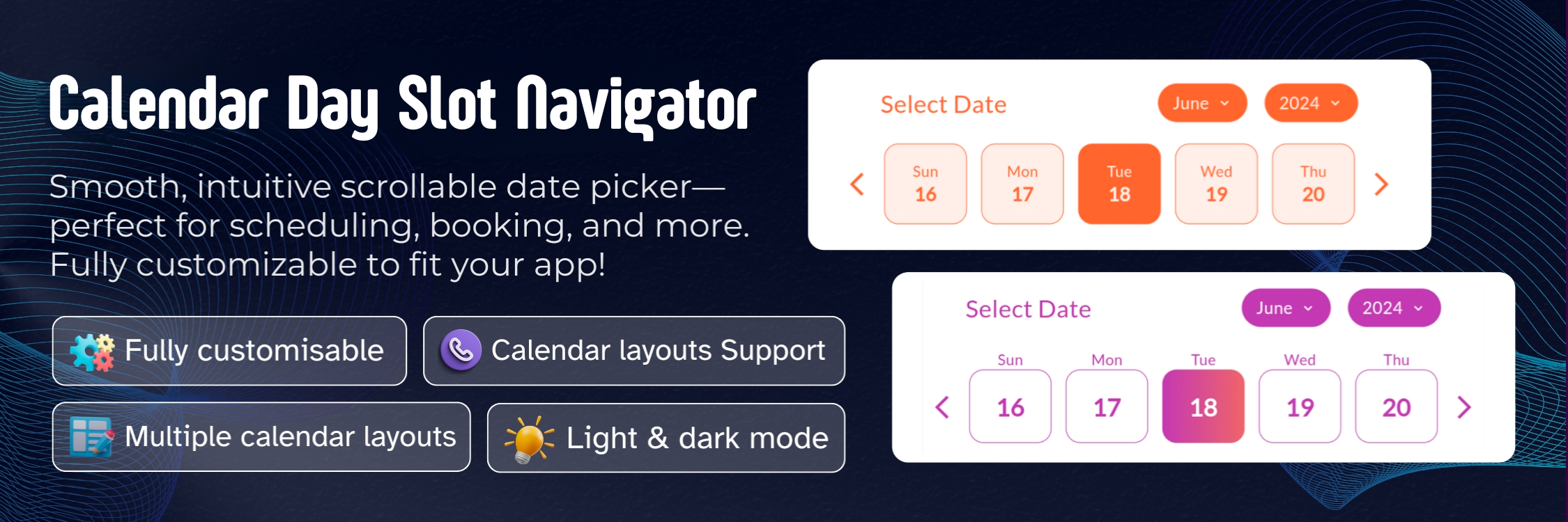
O Calendar Day Slot Navigator é um widget personalizável do Flutter para seleção de datas, com suporte a várias paletas de cores, cenários de seleção de datas e personalizações de layout.

AndroidiOSmacOSWindowsLinux
Downloads em 30 dias
60
Curtidas
25
Pontos Pub
150

Instalar pacote

flutter pub add calendar_day_slot_navigator

Visão geral do pacote

Orientação gerada a partir de informações públicas. Apenas para referência.

O Calendar Day Slot Navigator é um widget personalizável do Flutter projetado para seleção de datas com opções flexíveis de layout e múltiplas paletas de cores. Ele suporta diversos cenários de seleção de data, incluindo seleção única e múltipla, e permite que desenvolvedores ajustem aparência e comportamento conforme as necessidades de design do aplicativo. Desenvolvido com compatibilidade entre plataformas em mente, funciona perfeitamente em Android, iOS, macOS, Windows e Linux. O widget é ideal para aplicativos que exigem interações intuitivas com calendários e alto nível de personalização visual.

Casos de uso

  • Seleção de data em aplicativos de agendamento
  • Sistemas de reserva com disponibilidade de datas
  • Interfaces de planejamento de eventos
  • Visualizações personalizadas de calendário em ferramentas de produtividade
  • Configuração do perfil do usuário com entrada de data de nascimento

Principais recursos

  • Suporte a múltiplos paletas de cores
  • Personalização de layout flexível
  • Compatibilidade multiplataforma
  • Suporte para seleção de data única e múltipla
  • Aparência configurável do slot de dia

Indicado para

  • Desenvolvedores criando recursos baseados em calendário
  • Aplicativos que precisam de seletor de data visualmente distintos
  • Projetos que exigem seleção de data independente de plataforma
  • Aplicações voltadas para design com requisitos personalizados de interface
  • Formulários interativos com entradas de data

Considerações

  • Requer compreensão da composição de widgets do Flutter
  • Pode ser necessário estilos adicionais para temas complexos
  • Suporte limitado de localização embutido
  • Impacto no desempenho com grandes intervalos de datas
  • Dependente de atualizações de pacotes externos para correções de bugs

README original

Snapshot do README original do repositório-fonte vinculado. Consulte o repositório para o conteúdo mais recente.

📅 Calendar_Day_Slot_Navigator

A powerful and highly customizable Flutter calendar widget that makes date selection beautiful and intuitive. Whether you're building a booking app, scheduling system, or any application that needs elegant date picking, CalendarSlot provides the flexibility and features you need.

✨ Features

  • 🌗 Theming Support

    • Seamless integration with both light and dark modes
    • Full control over colors and gradients
    • Customizable active and inactive states
  • 🎨 Advanced Customization

    • Flexible border radius for all elements
    • Custom header text and styling
    • Adjustable day box dimensions and borders
    • Support for custom fonts including Google Fonts
  • 📆 Powerful Selection Options

    • Single date selection
    • Date range selection
    • Customizable active/inactive date ranges
    • Multiple calendar layout options
  • 🎯 Flexible Display Modes

    • Inside box day display
    • Outside box day display
    • Adjustable slot length for different view sizes

🚀 Getting Started

Installation

Add calendar_day_slot_navigator to your project by including it in your pubspec.yaml:

dependencies:
  calendar_day_slot_navigator: ^0.0.1

Run pub get to install the package:

flutter pub get
Import

Import the package in your Dart file:

import 'package:calendar_day_slot_navigator/calendar_day_slot_navigator.dart';

💻 Usage Examples

Basic Implementation

Here's a simple example to get you started:

CalendarDaySlotNavigator(
  slotLength: 5,
  initialSelectedDate: DateTime.now(),
  dayDisplayMode: DayDisplayMode.outsideDateBox,
  headerText: "Select Date",
  onDateSelect: (selectedDate) {
    print("Selected date: $selectedDate");
  },
)
Custom Styling

Add beautiful gradients and custom styling:

CalendarDaySlotNavigator(
  slotLength: 7,
  dayBoxHeightAspectRatio: 8,
  initialSelectedDate: DateTime.now(),
  dayDisplayMode: DayDisplayMode.insideDateBox,
  isGradientColor: true,
  activeGradientColor: LinearGradient(
    colors: [
      Color(0xffb644ae),
      Color(0xff873999),
    ],
    begin: Alignment.topLeft,
    end: Alignment.bottomRight,
  ),
  monthYearTabBorderRadius: 15,
  dayBoxBorderRadius: 10,
  headerText: "Select Your Preferred Date",
  fontFamilyName: "Roboto",
  isGoogleFont: true,
  dayBorderWidth: 0.5,
  onDateSelect: (selectedDate) {
    print("Selected date: $selectedDate");
  },
)
Date Range Selection

Implement date range selection with specific active dates:

CalendarDaySlotNavigator(
  dateSelectionType: DateSelectionType.activeRangeDates,
  rangeDates: [
    DateTime(2024, 6, 1),
    DateTime(2024, 6, 2),
    DateTime(2024, 6, 3),
    DateTime(2024, 6, 4),
    DateTime(2024, 6, 5),
  ],
  onDateSelect: (selectedDate) {
    print("Selected date within range: $selectedDate");
  },
)

🛠️ Properties Guide

Essential Properties
Property Type Default Description
slotLength int? 7 📏 Determines how many days are displayed in each row. Useful for different screen sizes and layouts.
dayBoxHeightAspectRatio double? 6.0 📐 Controls the height of day boxes relative to their width. Higher values make boxes shorter.
dayDisplayMode DayDisplayMode outsideDateBox 🎯 Determines where day names appear relative to date boxes. Choose between outsideDateBox or insideDateBox.
Styling Properties
Property Type Default Description
activeColor Color? Theme primary 🎨 Background color for selected dates
deActiveColor Color? White ⚪️ Background color for unselected dates
isGradientColor bool? false 🌈 Enable gradient backgrounds for dates
activeGradientColor LinearGradient? null 🎨 Custom gradient for selected dates
deActiveGradientColor LinearGradient? null ⚪️ Custom gradient for unselected dates
monthYearTabBorderRadius double? 10.0 📏 Border radius for month/year selection tabs
dayBoxBorderRadius double? 8.0 📏 Border radius for individual day boxes
dayBorderWidth double? 1.0 ✏️ Width of borders around day boxes
Font Properties
Property Type Default Description
fontFamilyName String? System 🔤 Name of the font family to use
isGoogleFont bool? false 📱 Set to true when using Google Fonts
Selection Properties
Property Type Description
dateSelectionType DateSelectionType 🎯 Controls which dates can be selected
rangeDates List<DateTime>? 📅 List of dates for range-based selection types
onDateSelect Function(DateTime)? 🖱️ Callback function when a date is selected
initialSelectedDate DateTime 📍 Sets the default selected date when calendar first loads
Date Selection Types Explained
  1. activeAllDates

    • All dates in the calendar are selectable
    • Useful for unrestricted date picking
  2. activePastDates

    • Only dates before today are selectable
    • Perfect for selecting historical dates
  3. activeFutureDates

    • Only dates after today are selectable
    • Ideal for booking systems and scheduling
  4. activeTodayAndPastDates

    • Today and all past dates are selectable
    • Good for recording past events including today
  5. activeTodayAndFutureDates

    • Today and all future dates are selectable
    • Great for appointment scheduling
  6. activeRangeDates

    • Only specified dates in rangeDates are selectable
    • Useful for custom date ranges
  7. deActiveRangeDates

    • Specified dates in rangeDates are not selectable
    • Perfect for blocking out unavailable dates

📱 Display Modes

Outside Date Box Mode
dayDisplayMode: DayDisplayMode.outsideDateBox
  • Day names appear above the date boxes
  • Provides a clean, separated look
  • More space for date numbers
Inside Date Box Mode
dayDisplayMode: DayDisplayMode.insideDateBox
  • Day names appear inside the date boxes
  • More compact layout
  • Ideal for space-conscious designs

🎨 Styling Tips

  1. Color Combinations

    activeColor: Color(0xffb644ae),    // Purple for selected
    deActiveColor: Color(0xffF5F5F5),  // Light grey for unselected
    
  2. Gradient Effects

    isGradientColor: true,
    activeGradientColor: LinearGradient(
      colors: [Color(0xffb644ae), Color(0xff873999)],
      begin: Alignment.topLeft,
      end: Alignment.bottomRight,
    ),
    
  3. Border Styling

    dayBoxBorderRadius: 12,
    dayBorderWidth: 0.5,
    

💡 Best Practices

  1. Responsive Design

    • Adjust slotLength based on screen width
    • Use appropriate dayBoxHeightAspectRatio for different screen sizes
  2. Selection Types

    • Choose appropriate dateSelectionType for your use case
    • Always handle onDateSelect callback for user interactions
  3. Accessibility

    • Use sufficient color contrast
    • Provide clear header text
    • Consider font size and readability

🤝 Contributing


Made with ❤️ by the DevCodeSpace

Categorias

Dependências

Lista de dependências 4 itens

Repositório-fonte

Projetos que usam este pacote

Ainda não há dados.