Orientação gerada a partir de informações públicas. Apenas para referência.
Clean Calendar é um pacote moderno e personalizável do Flutter projetado para criar calendários elegantes e simples com facilidade. Oferece uma API limpa para construir visualizações de calendário interativas em múltiplas plataformas, incluindo Android, iOS, Web, macOS, Windows e Linux. Com suporte à personalização de datas, estilos e integração de eventos, é ideal para aplicativos que precisam de seleção intuitiva de datas ou recursos de agendamento. O pacote enfatiza simplicidade e desempenho, permanecendo altamente flexível para desenvolvedores.
Casos de uso
Seleção de data em formulários
Interfaces de agendamento de eventos
Aplicativos de planejamento diário
Filtragem de dados baseada em calendário
Rastreamento de aniversário ou compromisso do usuário
Principais recursos
Interface do usuário altamente personalizável
Compatibilidade multiplataforma
Manipulação simples de data
Suporte para marcadores de evento
Renderização leve e rápida
Indicado para
Desenvolvedores construindo recursos de calendário
Aplicativos que exigem seletores de data
Projetos focados no design de interface limpo
Iniciantes do Flutter explorando widgets
Interfaces de data personalizáveis
Considerações
Gerenciamento de eventos embutido limitado
Requer implementação manual para interações complexas
Sem suporte nativo a eventos recorrentes
Documentação mínima além do uso básico
Depende de gerenciamento externo de estado para dados dinâmicos
README original
Snapshot do README original do repositório-fonte vinculado. Consulte o repositório para o conteúdo mais recente.
Word from creator
Hello👋, Clean Calendar is in the early stages of development and can have many breaking changes. If you have any questions or suggestions, contact me via GitHub issues, email, discord, or any of the ways listed on my GitHub profile.
Yes, giving the package a 👍(Pub) or ⭐(Github) will encourage me to work on it more.
Package description
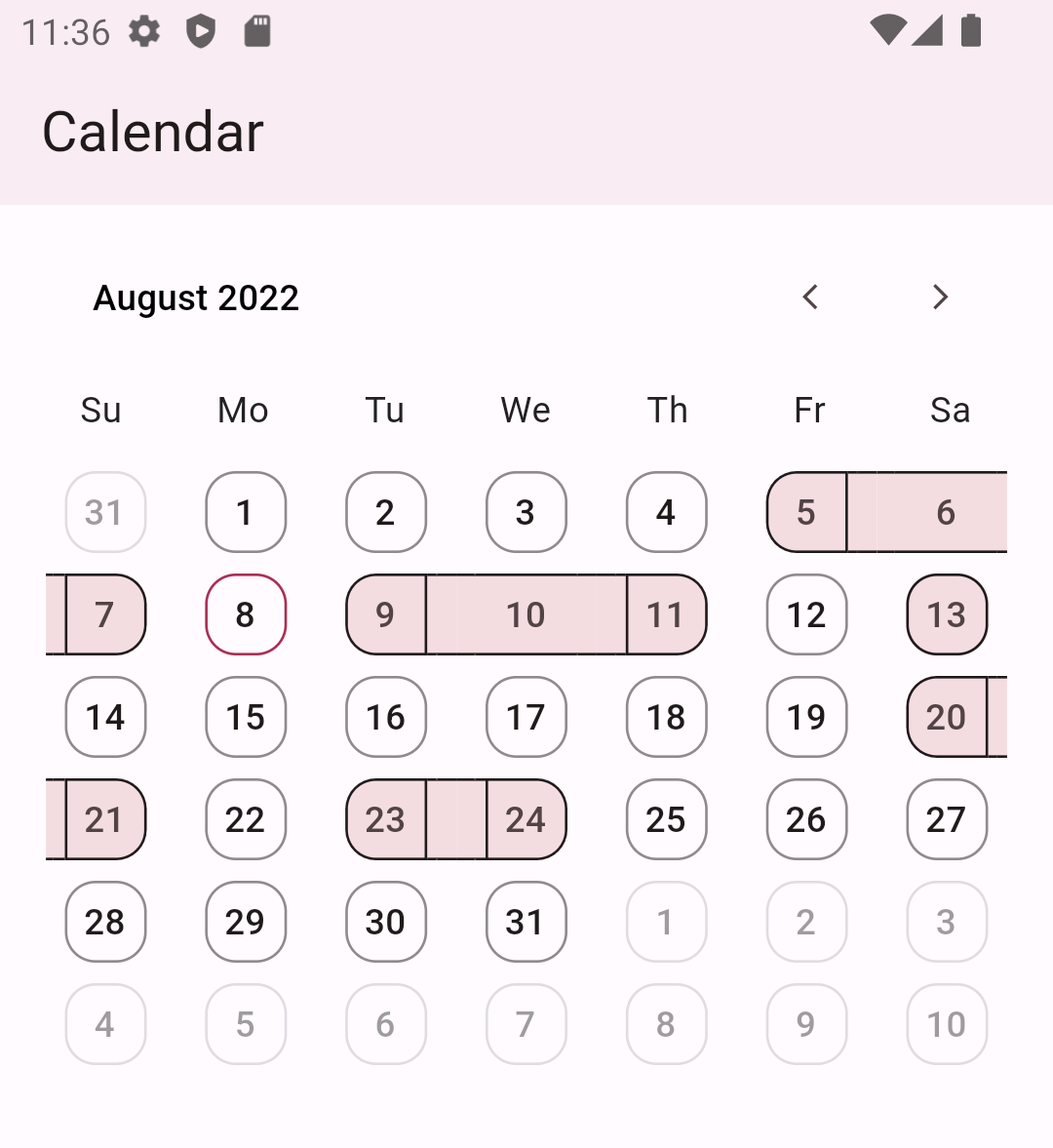
Get ready to enhance your Flutter app with this fantastic calendar package! With its simple yet elegant design, you can create a fully customized calendar that suits your needs. It provides a customizable month view and the ability to highlight dates with streaks. It is just the beginning, and we will add more features.
Customise date boundary behaviour and tap behaviour
CleanCalendar(
)
CleanCalendar(
  // To allow date boundary to shrink.
  enableDenseViewForDates: true,

  // To allow date tap splash to shrink.
  enableDenseSplashForDates: true,
)
Note: This dense mode could lead to overflow if the available width to calendar is smaller than 280px so it is advised to disable them in smaller space than 280px.
// Enabling selecting single or multiple dates. Defaults to disable selection. dateSelectionMode: DatePickerSelectionMode.singleOrMultiple,
// Listening to selected dates. onSelectedDates: (List<DateTime> value) { // If selected date picked again then removing it from selected dates. if (selectedDates.contains(value.first)) { selectedDates.remove(value.first); } else { // If unselected date picked then adding it to selected dates. selectedDates.add(value.first); } // setState to update the calendar with new selected dates. setState(() {}); },
// Providing calendar the dates to select in ui. selectedDates: selectedDates,
Note:weekdaysSymbol defaults to Mo, Tu, We, Th, Fr, Sa, Su from monday to sunday and monthsSymbol defaults to January, February, March, April, May, June, July, August, September, October, November, December.
Accessing selected dates
To access selected dates use the onSelectedDates callback but keep in mind that this callback always provides a list of dates as shown below:
CleanCalendar(
...
onSelectedDates: (List<DateTime> selectedDates) {
// Called every time dates are selected or deselected.print(selectedDates);
},
)
Note: Even for single selection mode it provides a list with just one date and for multiple selection it provides a list with multiple dates.
Providing pre-selected dates
You can provide pre-selected dates by providing a list of dates to selectedDates as shown below:
Note: Even with selection mode set to single or disable it will still show the provided pre-selected dates as selected. And I think is the correct behavious as sometimes we might want to show selected dates while also preventing users from interacting with them.
Providing start and end dates
You can provide start and end dates for calendar view as shown below:
CleanCalendar(
  ...
  // Setting start date of calendar.
  startDateOfCalendar: DateTime(2022,6,5),

  // Setting end date of calendar.
  endDateOfCalendar: DateTime(2022,10,15),
)
Note:startDateOfCalendar defaults to DateTime.utc(0000, 1, 1) and endDateOfCalendar defaults to DateTime.utc(9999, 1, 1).
Providing initial month view for calendar
You can provide initial month view for calendar by providing date of that month as shown below:
Note:initialViewMonthDateTime defaults to current date and if current is not between startDateOfCalendar and endDateOfCalendar then defaults to start date..
Providing current date for calendar
You can provide current date for calendar as shown below:
CleanCalendar(
  ...
  // Setting current date of calendar.
  currentDateOfCalendar: DateTime(2022,9,5),
)
Note:currentDateOfCalendar defaults to DateTime.now().
Listening for calendar view week or month change
You can listen and get the current calendar view date on calendar view change. Useful in case you want to change your ui acording to the dates visible to user.
CleanCalendar(
...
onCalendarViewDate: (DateTime calendarViewDate) {
// Called every time view is changed like scrolled etc.print(calendarViewDate);
},
)
Note: For now onCalendarViewDate will only provide the view starting date. Later I may can add an option to get all dates of current view depending on users request. Also, onCalendarViewDate is called only on change of view like scroll, etc and will not be called on the creation of calendar as at thst time we already know the date.
Additional information
Support is surely planned for these:
Complete documentation.
Option to disable user interactions on whole view, past dates, and dates after-before end-start date. (🐇)
More customization and premade templates for calendar. (🐢)
More calendar view types. (🐢)
Date selection options such as range, and multiple range selections. (🐢)
A calendar option for choosing a view by year, month, or day. (🐢)
Support for dates to be displayed in events style. (🐢)
Dry mode, which optimizes performance for low-end devices by removing or substituting heavy animations and widgets. (🐢)
And, if I'm forgetting something crucial/important/necessary then please let me know.