Orientação gerada a partir de informações públicas. Apenas para referência.
ControlStyle é um pacote Flutter que melhora a aparência visual de controles de interface como campos de texto e botões, aplicando decorações personalizáveis. Permite que desenvolvedores ajustem facilmente o aspecto e sensação dos widgets padrão sem escrever código de estilização repetitivo. Com suporte em todas as principais plataformas, ele simplifica a personalização da interface para designs consistentes e refinados. O pacote se integra perfeitamente em projetos existentes do Flutter por meio de um simples comando pub add.
Casos de uso
Personalizando bordas de campo de texto
Melhorar a estética do botão
Criando temas de interface unificados
Melhorando a visualização de entradas de formulário
Simplificando a consistência do design
Adicionando efeitos decorativos aos controles
Principais recursos
Integração fácil com widgets do Flutter
Compatibilidade multiplataforma
Sistema de decoração extensível
Mínimo boilerplate necessário
Suporta design responsivo
Estilo sensível ao tema
Indicado para
Designers de interface procurando acabamento visual
Desenvolvedores construindo formulários
Equipes que mantêm sistemas de design consistentes
Aplicativos que exigem aparência personalizada de controles
Projetos com prazos rígidos de UI
Iniciantes do Flutter explorando estilização de widget
Considerações
Pode exigir configuração adicional para layouts complexos
Limitado a melhorias visuais (sem alterações funcionais)
Depende do pipeline de renderização do Flutter
Impacto potencial no desempenho com muitos controles decorados
Não adequado para necessidades de personalização não visuais
Requer compreensão da árvore de widgets do Flutter
README original
Snapshot do README original do repositório-fonte vinculado. Consulte o repositório para o conteúdo mais recente.
Applies additional appearance settings to Flutter text fields, buttons and other controls. Currently supports: outer shadow, inner shadow, border, inner gradient.
The Flutter library provides limited opportunities to set up the appearance of controls. You usually make this customisation by wrapping the components into a Container widget and configuring it using the decoration parameter. Such an approach has limitations as it leads to increasing the volume of work and complicating the code. Especially time consuming in this case is creating animations for switching between different appearances depending on a state of a control.
In addition, this approach works incorrectly when you are adding shadows to text fields in combination with errorText and helperText:
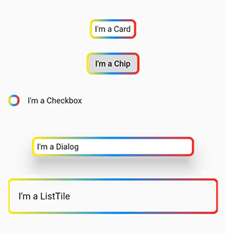
This package helps to solve the aforementioned problem. It provides the most common customisation features for control elements which have shape field such as buttons, text fields, Card, Chip, Checkbox, Dialog, Drawer, inks, ListTile, Material, NavigationBar.
The package provides the same customisation parameters to all controls, which allows for identically decorating any of the controls.
The package enables outer shadow, inner shadow, border and inner gradient styles for Flutter’s standard controls. These can be applied without using external control widgets.
Usage
You can customize all your controls at once via the theme setting of MaterialApp, or separate controls through changing their own styles.
To use the plugin with inputs, you need to wrap InputBorder with DecoratedInputBorder and configure its parameters.
Add the borderGradient or GradientBorderSide parameter to DecoratedInputBorder or DecoratedOutlinedBorder. This parameters differ from the Flutter’ BorderSide in that they use gradient parameter instead of color.
The wrappers DecoratedInputBorder and DecoratedOutlinedBorder reach an element’s border through the child parameter and apply stylization above the default border of this element. In case of an outer shadow, the shadow’s part above the control then gets cut off in order to create an illusion of the shadow being located behind the control.
Decorative styles are applied above the layer that contains an element’s border. Hence, when it comes to buttons, such stylisation overlaps the inner area of an element. Using transparent colours hence used to address this issue. This limitation is due to Flutter itself.
Compatibility
The following borders have been tested.
Inputs:
UnderlineInputBorder
OutlineInputBorder
Buttons:
BeveledRectangleBorder
CircleBorder
ContinuousRectangleBorder
RoundedRectangleBorder
StadiumBorder
Issues
Shadows may overlap nearby elements.
The decoration of the inner area of the button overlaps the button itself.