Buscar pacotes, repositórios e categorias de apps

Capa de crystal_navigation_bar
Detalhes do pacotev2.0.0

crystal_navigation_bar

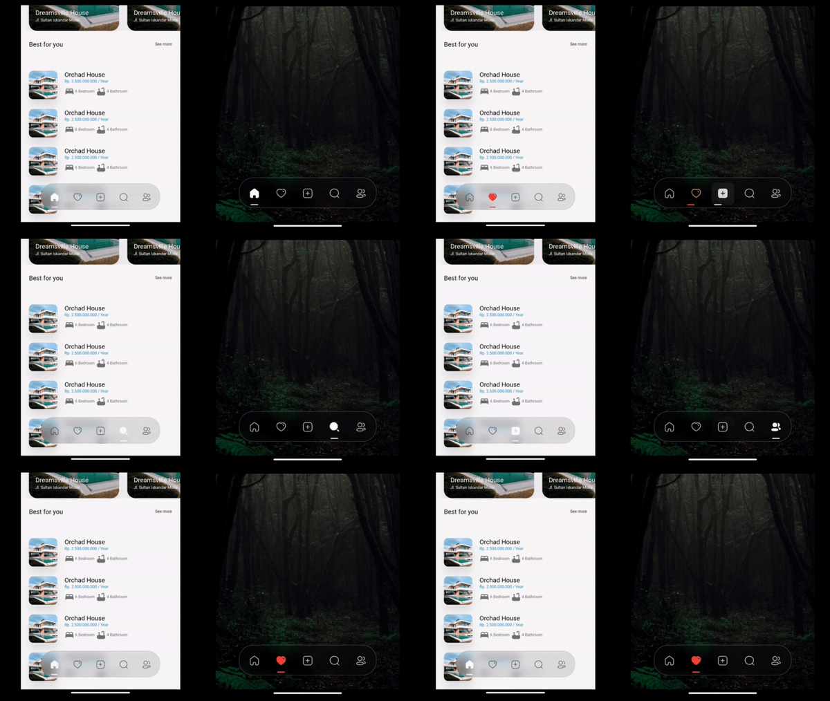
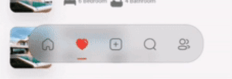
Barra de navegação inferior com desfoque elegante e indicador dinâmico para navegação suave no aplicativo.

AndroidiOSWebmacOSWindowsLinux
Downloads em 30 dias
2,5 mil
Curtidas
137
Pontos Pub
160

Instalar pacote

flutter pub add crystal_navigation_bar

Visão geral do pacote

Orientação gerada a partir de informações públicas. Apenas para referência.

Crystal Navigation Bar é uma barra de navegação inferior visualmente impactante para aplicativos Flutter, com um efeito de desfoque elegante e cristalino e um indicador dinâmico que melhora a experiência do usuário. Projetada para navegação suave em múltiplas plataformas, oferece animações suaves e estética moderna. O pacote suporta Android, iOS, Web, macOS, Windows e Linux, tornando-o ideal para desenvolvimento multiplataforma. Com configuração mínima via `flutter pub add`, integra-se facilmente em projetos existentes. Seu foco em clareza visual e transições fluidas o torna perfeito para aplicativos que priorizam design e usabilidade.

Casos de uso

  • Aplicativos móveis e web multiplataforma
  • Designs de interface modernos com efeitos de desfoque
  • Aplicativos que exigem navegação inferior intuitiva
  • Interfaces de usuário de alta gama
  • Navegação baseada em indicadores dinâmicos

Principais recursos

  • efeito de desfoque cristalino
  • Animação de indicador dinâmico
  • Compatibilidade multiplataforma
  • Minimal setup with pub add
  • Animações de transição suave
  • Aparência personalizável

Indicado para

  • Desenvolvedores Flutter focados em design
  • Aplicativos com requisitos premium de UI/UX
  • Desenvolvedores direcionados para múltiplas plataformas
  • Projetos com ênfase no acabamento visual
  • Usuários procurando padrões modernos de navegação

Considerações

  • Pode afetar o desempenho em dispositivos de baixa potência
  • O efeito de desfoque requer aceleração por GPU
  • Personalização limitada além das funcionalidades principais
  • Mais adequado para interfaces com tema claro
  • Possíveis inconsistências de renderização em versões mais antigas do sistema operacional

README original

Snapshot do README original do repositório-fonte vinculado. Consulte o repositório para o conteúdo mais recente.

Crystal Bottom Navigation Bar


undefined undefined
undefined undefined undefined undefined undefined
undefined undefined

A highly flexible bottom navigation bar that allows you to tailor it to your specific needs without any constraints. Elevate your UI/UX with seamless animations, customizable appearance—including the option to incorporate blur effects—and the ability to fully personalize the interface.

Styles

Screenshot 1

Simple BottomBar

With Border

Screenshot 2

Simple BottomBar

With Badge


CRYSTAL BOTTOM NAVIGATION BAR


  • Blur navigation bar
  • Frosted navigation bar
  • Floating navigation bar
  • Rounded navigation bar
  • Modern navigation bar

Getting Started

To install, add it to your pubspec.yaml file:

dependencies:
    crystal_navigation_bar:

import 'package:crystal_navigation_bar/crystal_navigation_bar.dart';

How to use it

Use CrystalNavigationBar constructor in Your app with in Scaffold's bottomNavigationBar:

Make sure extendBody in Scaffold should be true to use Floating behavior

      extendBody: true,

if you do not want to make round navigation bar with show body behind the navbar you have to make that

      extendBody: false,
Widget build(BuildContext context) {
  return Scaffold(
    body: Center(),
    extendBody: true,//<------like this 
    bottomNavigationBar:  CrystalNavigationBar(
          currentIndex: _SelectedTab.values.indexOf(_selectedTab),
          onTap: _handleIndexChanged,
          indicatorColor: Colors.white,
          // enableFloatingNavBar: false
          items: [
            
            
          ],
        ),
  );
}

basic implementation

Widget build(BuildContext context) {
    return Scaffold(
      extendBody: true,
      body: SizedBox(
        height: MediaQuery.of(context).size.height,
        child: Image.network(
          "https://images.pexels.com/photos/1671325/pexels-photo-1671325.jpeg?auto=compress&cs=tinysrgb&w=1260&h=750&dpr=2",
          fit: BoxFit.fitHeight,
        ),
      ),
      bottomNavigationBar: Padding(
        padding: const EdgeInsets.only(bottom: 10),
        child: CrystalNavigationBar(
          currentIndex: _SelectedTab.values.indexOf(_selectedTab),
          // indicatorColor: Colors.white,
          unselectedItemColor: Colors.white70,
          backgroundColor: Colors.black.withOpacity(0.1),
          // outlineBorderColor: Colors.black.withOpacity(0.1),
          borderWidth: 2,
          outlineBorderColor: Colors.white,
          onTap: _handleIndexChanged,
          items: [
            /// Home
            CrystalNavigationBarItem(
              icon: IconlyBold.home,
              unselectedIcon: IconlyLight.home,
              selectedColor: Colors.white,
              badge: Badge(
                label: Text(
                  "9+",
                  style: TextStyle(color: Colors.white),
                ),
              ),
            ),

            /// Favourite
            CrystalNavigationBarItem(
              icon: IconlyBold.heart,
              unselectedIcon: IconlyLight.heart,
              selectedColor: Colors.red,
            ),

            /// Add
            CrystalNavigationBarItem(
              icon: IconlyBold.plus,
              unselectedIcon: IconlyLight.plus,
              selectedColor: Colors.white,
            ),

            /// Search
            CrystalNavigationBarItem(
                icon: IconlyBold.search,
                unselectedIcon: IconlyLight.search,
                selectedColor: Colors.white),

            /// Profile
            CrystalNavigationBarItem(
              icon: IconlyBold.user_2,
              unselectedIcon: IconlyLight.user,
              selectedColor: Colors.white,
            ),
          ],
        ),
      ),
    );
  }

The constructor has 19 attributes related to the Widget:

  • items: A list of tabs to display, example Home, Profile,Search, etc
  • height: The height of CrystalNavigationBar, [Default] & [Minimum] height is 105,
  • currentIndex: The tab to display.
  • onTap:Returns the index of the tab that was tapped.
  • outlineBorderColor : Border Color of the Bottom bar.
  • borderWidth : Border Width of the Bottom bar.
  • badge : Badge to display. (to display notification count etc).
  • selectedItemColor:The color of the icon and text when the item is selected.
  • unselectedItemColor: The color of the icon and text when the item is not selected.
  • margin:A convenience field for the margin surrounding the entire widget.
  • itemPadding:The padding of each item.
  • duration: The transition duration.
  • curve: The transition curve.
  • indicatorColor:The color of the tab indicator.
  • marginR:margin for the bar to give some radius .
  • paddingR:padding for the bar to give some radius.
  • borderRadius:border radius for nav bar.
  • backgroundColor:background colors for the nav bar.
  • boxShadow: floating nav bar shadow ,it takes List of BoxShadow
  • enableFloatingNavBar: make Floating nav bar enabled.
  • enablePaddingAnimation: enable the animation on item during item change.
  • splashColor: Color of the item's Splash Color. To disable, use Colors.transparent.

iconly package is used for Icons in the demo/example

Adjust Colors of background, unselectedItemColor, selectedItemColor according to your UI for better Design.

Example Usage

See Example Code for more info.

Contributing

Every pull request is welcome.

Contributors

Imtiaz Ahmad

  • Twitter
  • GitHub
  • LinkedIn

Categorias

Dependências

Lista de dependências 1 itens

Repositório-fonte

Projetos que usam este pacote