Buscar pacotes, repositórios e categorias de apps

Capa de custom_pointed_popup
Detalhes do pacotev0.0.4

custom_pointed_popup

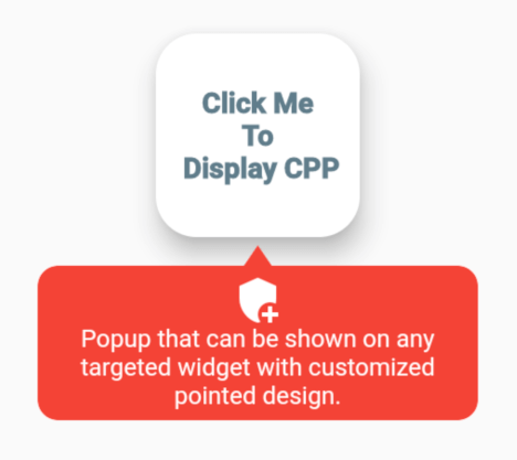
Popup que pode ser exibido em qualquer widget alvo com design pontual personalizado.

AndroidiOSWebmacOSWindowsLinux
Downloads em 30 dias
116
Curtidas
23
Pontos Pub
130

Instalar pacote

flutter pub add custom_pointed_popup

Visão geral do pacote

Orientação gerada a partir de informações públicas. Apenas para referência.

Um pacote Flutter que permite exibir popups personalizáveis com ponta, ancorados a qualquer widget específico. Ele suporta designs únicos com ponta direcional, ideal para dicas ou pistas contextuais. O popup pode ser posicionado com precisão em relação ao seu alvo e é compatível com todas as principais plataformas, incluindo móvel, web e desktop. Melhora a experiência do usuário fornecendo feedback visual sem interromper o fluxo da interface.

Casos de uso

  • Exibindo dicas de ferramenta em botões
  • Criando menus de contexto personalizados
  • Destacar campos de formulário
  • Fornecendo orientação interativa
  • Mostrando informações dinâmicas perto dos widgets

Principais recursos

  • Forma de ponteiro personalizável
  • Posicionamento preciso em relação ao widget-alvo
  • Suporte para renderização em múltiplas plataformas
  • Design extensível por meio de widgets personalizados
  • Transições de animação suaves

Indicado para

  • Designers de UI/UX procurando elementos interativos
  • Desenvolvedores criando fluxos guiados de onboarding
  • Aplicativos que exigem sistemas de ajuda contextual
  • Projetos com interfaces interativas ricas
  • Equipes usando Flutter para aplicativos multiplataforma

Considerações

  • Requer gerenciamento cuidadoso do layout
  • Pode ser necessário estilos adicionais para designs complexos
  • Impacto no desempenho com muitos popups simultâneos
  • Temas internos limitados, requer implementação personalizada
  • Não é adequado para áreas grandes de conteúdo devido às restrições de tamanho

README original

Snapshot do README original do repositório-fonte vinculado. Consulte o repositório para o conteúdo mais recente.

custom_pointed_popup

Popup that can be shown on any targeted widget with customized pointed design.

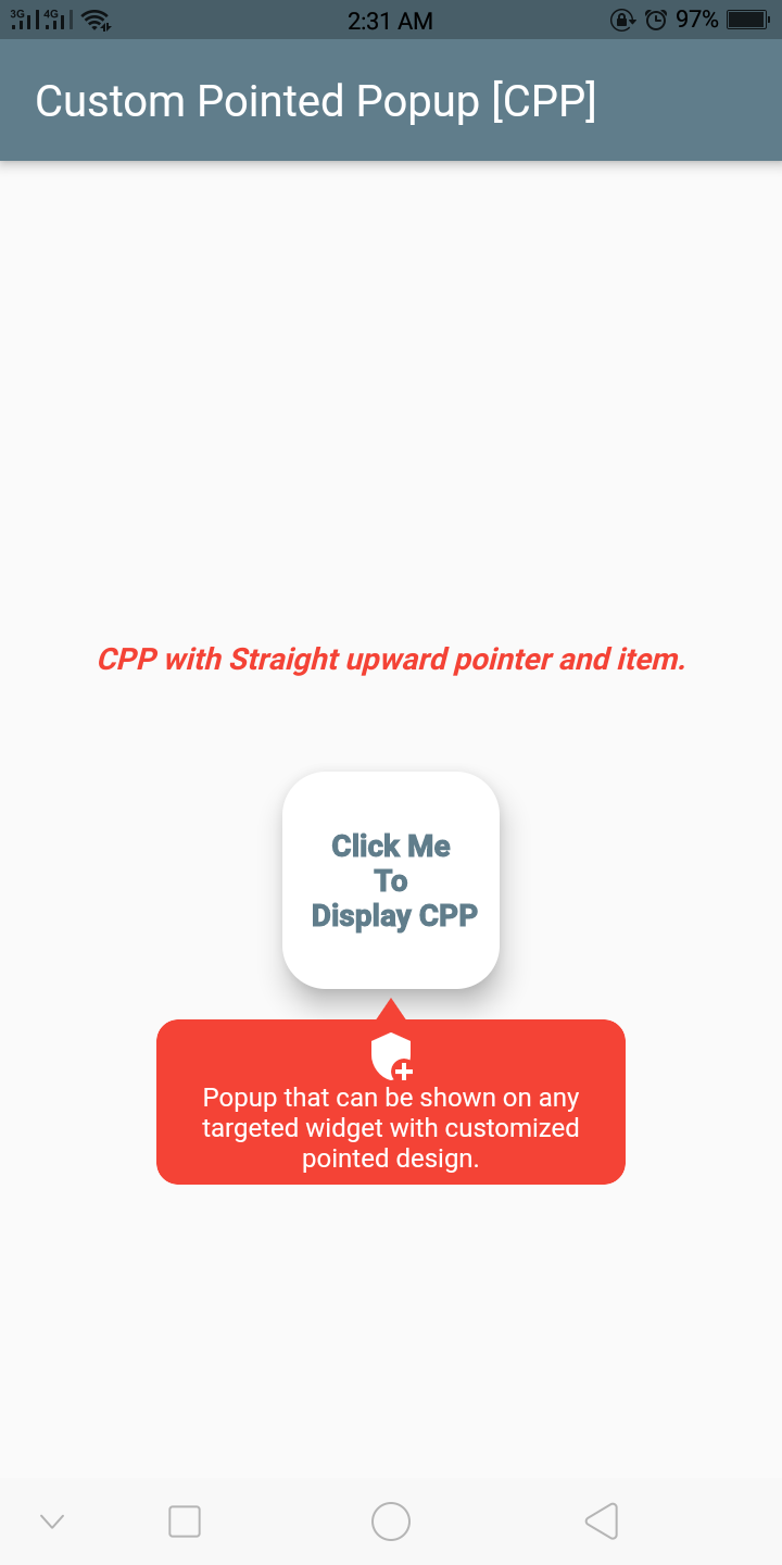
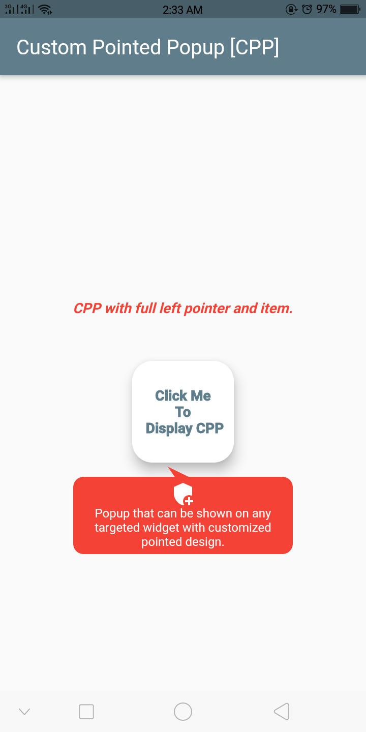
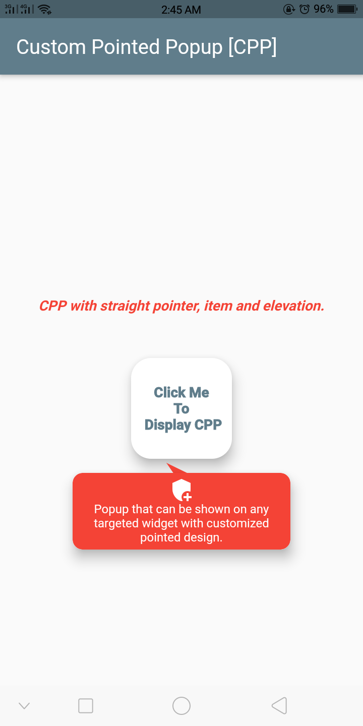
Screenshots

alt text alt text alt text alt text

Getting Started

Example
  final GlobalKey widgetKey = GlobalKey();

  CustomPointedPopup getCustomPointedPopup(BuildContext context) {
    return CustomPointedPopup(
      backgroundColor: Colors.red,
      context: context,
      lineColor: Colors.tealAccent,
      widthFractionWithRespectToDeviceWidth: 3,
      displayBelowWidget: true,
      triangleDirection: TriangleDirection.FullLeft,
      popupElevation: 10,

      ///you can also add border radius
      ////popupBorderRadius:,
      item: CustomPointedPopupItem(
        title: 'Popup that can be shown on any targeted widget with customized pointed design.',
        textStyle: Theme.of(context).textTheme.caption!.copyWith(
              color: Theme.of(context).cardColor,
            ),
        iconWidget: Icon(
          Icons.add_moderator,
          color: Theme.of(context).cardColor,
        ),

        ///Or you can add custom item widget below instead above 3
        ///itemWidget: Container(),
      ),
      onClickWidget: (onClickMenu) {
        print('popup item clicked');
      },
      onDismiss: () {
        print('on dismissed called');
      },
    );
  }

  @override
  Widget build(BuildContext context) {
    return Scaffold(
      appBar: AppBar(
        title: Text(
          'Custom Pointed Popup [CPP]',
        ),
      ),
      body: Container(
        child: Center(
          child: Column(
            mainAxisAlignment: MainAxisAlignment.center,
            children: [
              Text(
                'CPP with straight pointer & item.',
                style: TextStyle(
                  color: Colors.red,
                  fontSize: 14.0,
                  fontStyle: FontStyle.italic,
                  fontWeight: FontWeight.bold,
                ),
              ),
              SizedBox(
                height: 40,
              ),
              GestureDetector(
                onTap: () {
                  getCustomPointedPopup(context)
                    ..show(
                      widgetKey: widgetKey,
                    );
                },
                child: Card(
                  key: widgetKey,
                  elevation: 10,
                  shape: RoundedRectangleBorder(
                    borderRadius: BorderRadius.circular(20),
                  ),
                  child: Container(
                    height: 100,
                    width: 100,
                    child: Center(
                      child: Text(
                        'Click Me \nTo\n Display CPP',
                        textAlign: TextAlign.center,
                        overflow: TextOverflow.clip,
                        style: TextStyle(
                          color: Colors.blueGrey,
                          fontWeight: FontWeight.w900,
                          fontSize: 14.0,
                        ),
                      ),
                    ),
                  ),
                ),
              ),
            ],
          ),
        ),
      ),
    );
  }

Important Class, Function And Enum

The important class to know. CustomPointedPopupItem - Model item to display inside the pointed popup:

Attribute Type Default Required Description
iconWidget Widget No This will create an icon inside the pointed popup.
title String No Title or text for the pointed popup.
textStyle TextStyle No Text style for the title.
textAlign TextAlign No Alignment for the title.
itemWidget Widget No Custom item widget or child for the pointed popup. No need to add iconWidget & title if you added this.

The important function to know. show - Function to show the custom pointed popup:

Attribute Type Default Required Description
rect Rect No The rect bound that the popup should appear around it.
widgetKey GlobalKey No The key to widget.
item CustomPointedPopupItem [class] No If you want the dynamic item widget or child inside the popup per action, you can add the item here.

The important enum to know. TriangleDirection - Enum to choose the direction of pointer or triangle shape:

Value Description
Straight This will create an pointer with straight upward.
Right This will create an pointer with slightly bended towards right.
FullRight This will create an pointer with fully bended towards right.
Left This will create an pointer with slightly bended towards left.
FullLeft This will create an pointer with fully bended towards left.

In order to create a custom pointed popup on the widget, there are several attributes that are supported by custom_pointed_popup:

Attribute Type Default Required Description
item CustomPointedPopupItem [class] Yes To create the item widget or child in pointed popup.
customHeight double Yes The custom height of the pointed popup.
displayBelowWidget bool false No If true always display the popup below the widget else automatically calculate the space and display the popup either up or below the widget.
triangleDirection TriangleDirection [enum] TraingleDirection.Straight No Determines the direction of pointer or triangle shape.
popupBorderRadius BorderRadius BorderRadius.circular(10.0) No Defines the border of the custom pointed popup.
popupElevation double 0 No The elevation of the pointed popup.
stateChanged Function(bool isShow) No This event function will fire immediately the the popup state changes.
backgroundColor Color Colors.red No Background color for pointed popup.
widthFractionWithRespectToDeviceWidth int 3 No Width ratio with respect to the device width.
onDismiss VoidCallBack No Callback function that fire when the custom pointed popup dismissed.
onClickWidget Function(CustomPointedPopupItem item) No Callback function that fire when the child of popup is clicked.
context BuildContext Yes Context where the popup to be shown.

##If you have any queries, email me to dipak.shrestha@eemc.edu.np

CREDITS

Contributors

Made with contributors-img.

Categorias

Repositório-fonte

Projetos que usam este pacote

Ainda não há dados.