Orientação gerada a partir de informações públicas. Apenas para referência.
Um pacote Flutter que fornece uma decoração de linha pontilhada para widgets, compatível com o Flutter 3 e segurança nula. Permite aos desenvolvedores adicionar facilmente linhas pontilhadas estilizadas em suas interfaces em múltiplas plataformas, incluindo Android, iOS, Web, macOS, Windows e Linux. O pacote é ideal para criar separadores visuais ou elementos decorativos com tamanho de traço, espaçamento e cor personalizáveis. Integra-se perfeitamente em projetos existentes do Flutter usando uma API simples.
Casos de uso
Criando divisores visuais em listas
Designando separadores de campo personalizados
Adicionando bordas decorativas em layouts
Melhorando a interface com linhas tracejadas
Construindo elementos de design responsivo
Principais recursos
Seguro contra nulos e compatível com o Flutter 3
Tamanho e espaçamento de traço personalizáveis
Suporte multiplataforma
Integração simples da API
Suporta várias orientações de linha
Indicado para
Designers de UI procurando elementos decorativos
Desenvolvedores de aplicativos multiplataforma
Projetos que exigem decorações com linhas tracejadas
Iniciantes do Flutter explorando widgets personalizados
Aplicativos que precisam de separação visual limpa e moderna
Considerações
Limitado a decoração apenas com linhas
Sem suporte a animação
Requer alinhamento manual em layouts complexos
Não adequado para geração dinâmica de linha
Depende das restrições do widget pai para renderização
README original
Snapshot do README original do repositório-fonte vinculado. Consulte o repositório para o conteúdo mais recente.
fdottedline
Use the easiest way to create a dotted line view 👀!
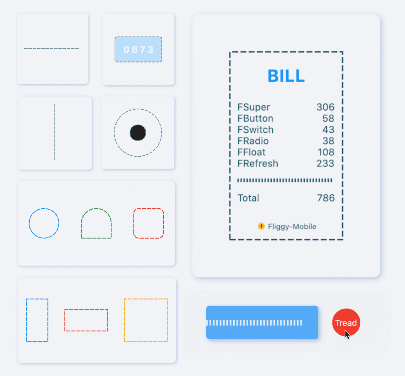
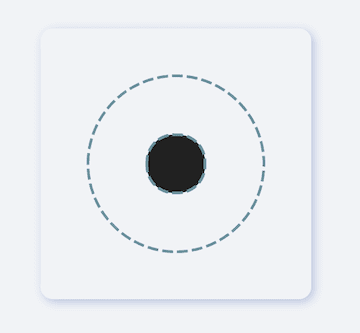
[FDottedLine] provides developers with the ability to create dashed lines. It also supports creating a dashed border for a [Widget]. Support for controlling the thickness, spacing, and corners of the dotted border.
Supports dotted lines in both horizontal and vertical directions
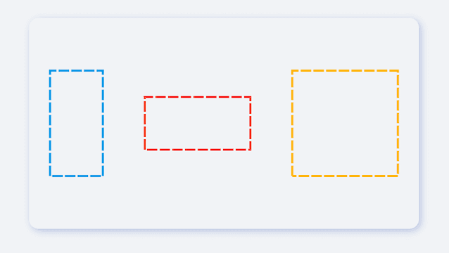
Support to create dashed shapes
Provide super easy way to add dotted border to Widget
Support creating flexible dotted corner effects
⚙️ Parameter & Interface
🔩 FDottedLine param
Param
Type
Necessary
Default
desc
color
Color
false
Colors.black
Dotted line color
height
double
false
null
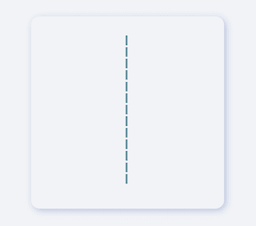
height. If there is only [height] and no [width], you will get a dotted line in the vertical direction.If there are both [width] and [height], you will get a dotted border.
width
double
false
null
width. If there is only [width] and no [height], you will get a dotted line in the horizontal direction.If there are both [width] and [height], you will get a dotted border.
strokeWidth
double
false
1.0
The thickness of the dotted line
dottedLength
double
false
5.0
The length of each small segment in the dotted line
space
double
false
3.0
The distance between each segment in the dotted line
corner
FDottedLineCorner
false
null
The corners of the dotted border. See [FDottedLineCorner] for details
child
Widget
false
null
If [child] is set, [FDottedLine] will serve as the dotted border of [child].At this time, [width] and [height] will no longer be valid.
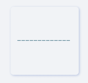
It is very simple to create a horizontal dotted line through FDottedLine.
The developer only needs to set the width parameter, but not the height parameter, which is all the developer needs to do for this.
If you want to control the thickness of the dotted line, set strokeWidth.
Through the dottedLength and space parameters, developers can freely control the length of each small segment in the dotted line and the distance between them.
In the past, it was very difficult to add a dotted border to a Widget.
Because the official did not provide us with a good solution. But now, FDottedLine makes things easier than ever. Developers only need to use their Widget as a child of FDottedLine.
This also means that through the nesting of FDottedLine, many super interesting views can be created.
💡 More Demo
See what FDottedLine can do!
When there is such a simple way to create a dotted line, developers can freely build more wonderful views.
More about the application of FDottedLine , look forward to the exploration of developers 🔆.
😃 How to use?
Add dependencies in the project pubspec.yaml file:
🌐 pub dependency
dependencies:fdottedline:^<versionnumber>
⚠️ Attention,please go to [pub] (https://pub.dev/packages/fdottedline) to get the latest version number of FDottedLine
🖥 Git dependency
dependencies:fdottedline:git:url:'git@github.com:Fliggy-Mobile/fdottedline.git'ref:'<Branch number or tag number>'
⚠️ Attention,please refer to [FDottedLine] (https://github.com/Fliggy-Mobile/fdottedline) official project for branch number or tag.
💡 License
Copyright2020-present FliggyAndroidTeam <alitrip_android@list.alibaba-inc.com>.
Licensed under the ApacheLicense, Version2.0 (the "License");
you may not use this file except in compliance with the License.
You may obtain a copy of the License at following link.
http://www.apache.org/licenses/LICENSE-2.0Unlessrequired by applicable law or agreed to in writing, software
distributed under the Licenseis distributed on an "AS IS" BASIS,
WITHOUT WARRANTIES OR CONDITIONS OF ANY KIND, either express or implied.
See the Licensefor the specific language governing permissions and
limitations under the License.