Buscar pacotes, repositórios e categorias de apps

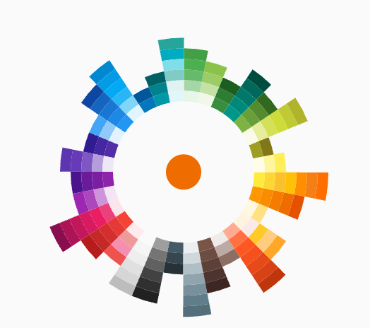
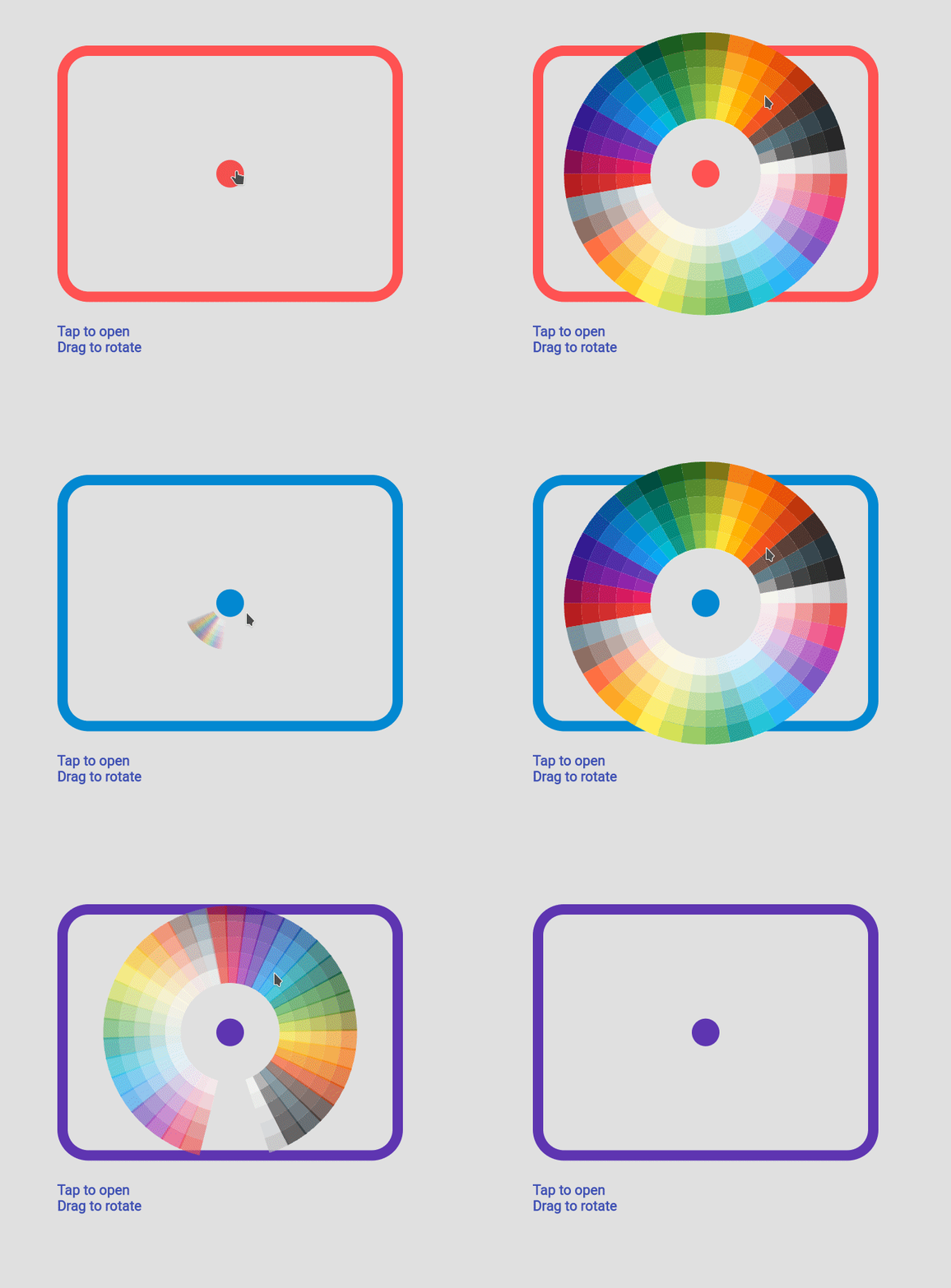
Capa de flutter_color_picker_wheel
Detalhes do pacotev0.0.1

flutter_color_picker_wheel

Um seletor de cores em formato de roda escrito totalmente em dart

AndroidiOSWebmacOSWindowsLinux
Downloads em 30 dias
120
Curtidas
40
Pontos Pub
120

Instalar pacote

flutter pub add flutter_color_picker_wheel

Visão geral do pacote

Orientação gerada a partir de informações públicas. Apenas para referência.

Um seletor de cores em formato de roda totalmente escrito em Dart, projetado para aplicações Flutter. Oferece uma interface circular intuitiva para seleção de cores, sendo ideal para ferramentas de design, personalizadores de temas e aplicativos criativos. O seletor suporta transições suaves entre cores e é compatível com todas as principais plataformas, incluindo Android, iOS, Web, macOS, Windows e Linux. Seu design limpo e personalizável permite que desenvolvedores integrem uma experiência visualmente atraente de seleção de cores com configuração mínima.

Casos de uso

  • Integrações de ferramentas de design
  • Interfaces de personalização de tema
  • Seleção de cor do aplicativo criativo
  • Interfaces de usuário de aplicativos móveis e desktop
  • seletores de cores baseados na web

Principais recursos

  • Seleção de cor do disco circular
  • Escrito totalmente em Dart
  • Compatibilidade multiplataforma
  • Transição suave de cor
  • Interface do usuário personalizável
  • Integração fácil com o Flutter

Indicado para

  • designers de UI/UX
  • Desenvolvedores de aplicativos construindo ferramentas criativas
  • Aplicativos habilitados para tema
  • Projetos Flutter multiplataforma

Considerações

  • Limitado à seleção baseada em roda
  • Pode exigir estilos adicionais para branding
  • Não adequado para modelos de cor complexos como HSL ou HSV

README original

Snapshot do README original do repositório-fonte vinculado. Consulte o repositório para o conteúdo mais recente.

Flutter Color Picker Wheel

dashbook

Flutter Color Picker Wheel is an easy-to-use widget that can be heavily customized.

  • You can use the WheelColorPicker directly by providing list of colors you want to include and animation configs.
  • You can use the WheelColorPickerEntryContent and manage OverlayEntry yourself.
  • This library provides some presets which make it even easier to use this component.

How to use

Add the dependency to your pubspec.yaml

flutter_color_picker_wheel: ^0.0.1

Try it out

Currently this Storybook only works well on Web

TODO: [ ] Use another storybook to provide better preview for both web and phone

https://flutter-color-picker-wheel.kexinlu.com

Showcase

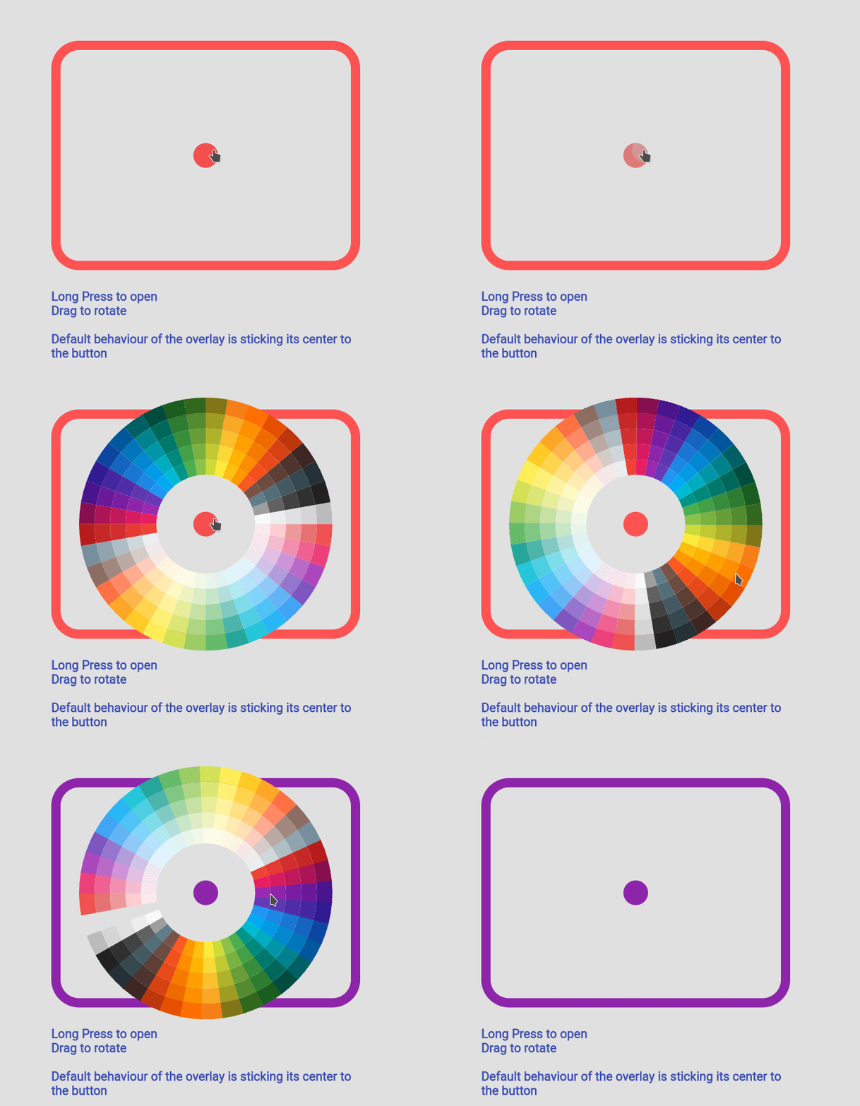
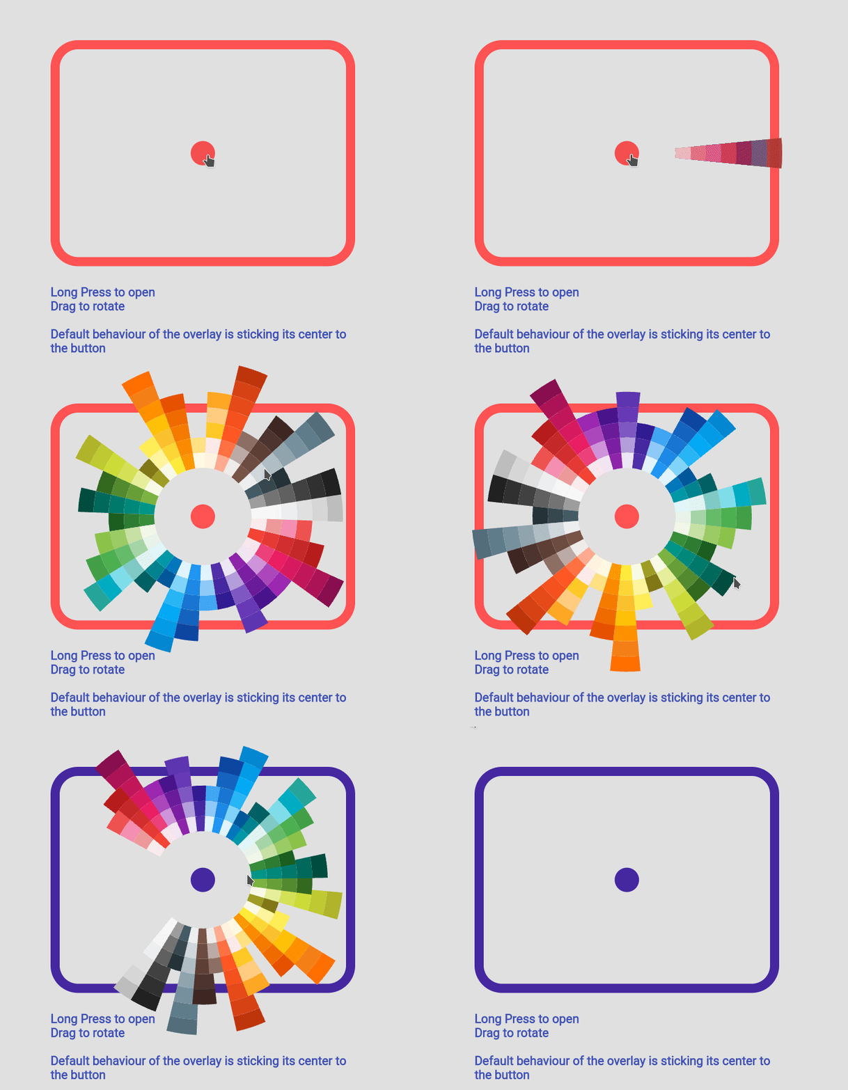
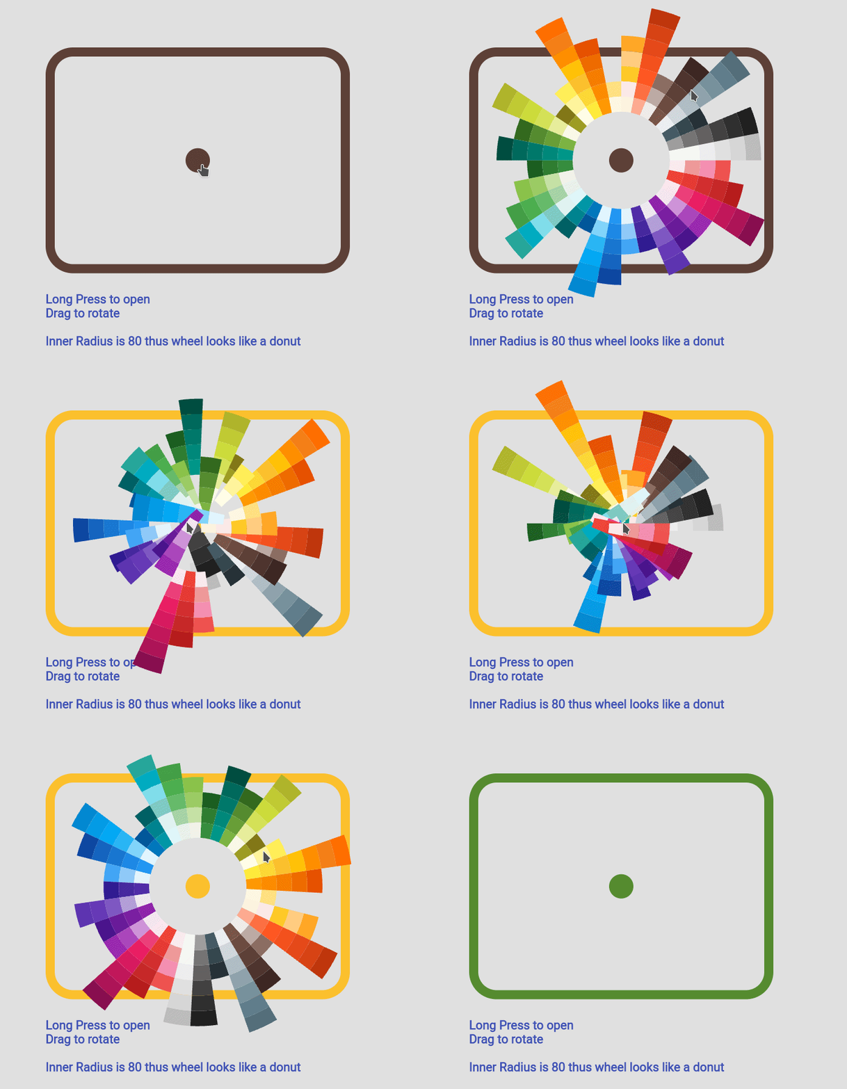
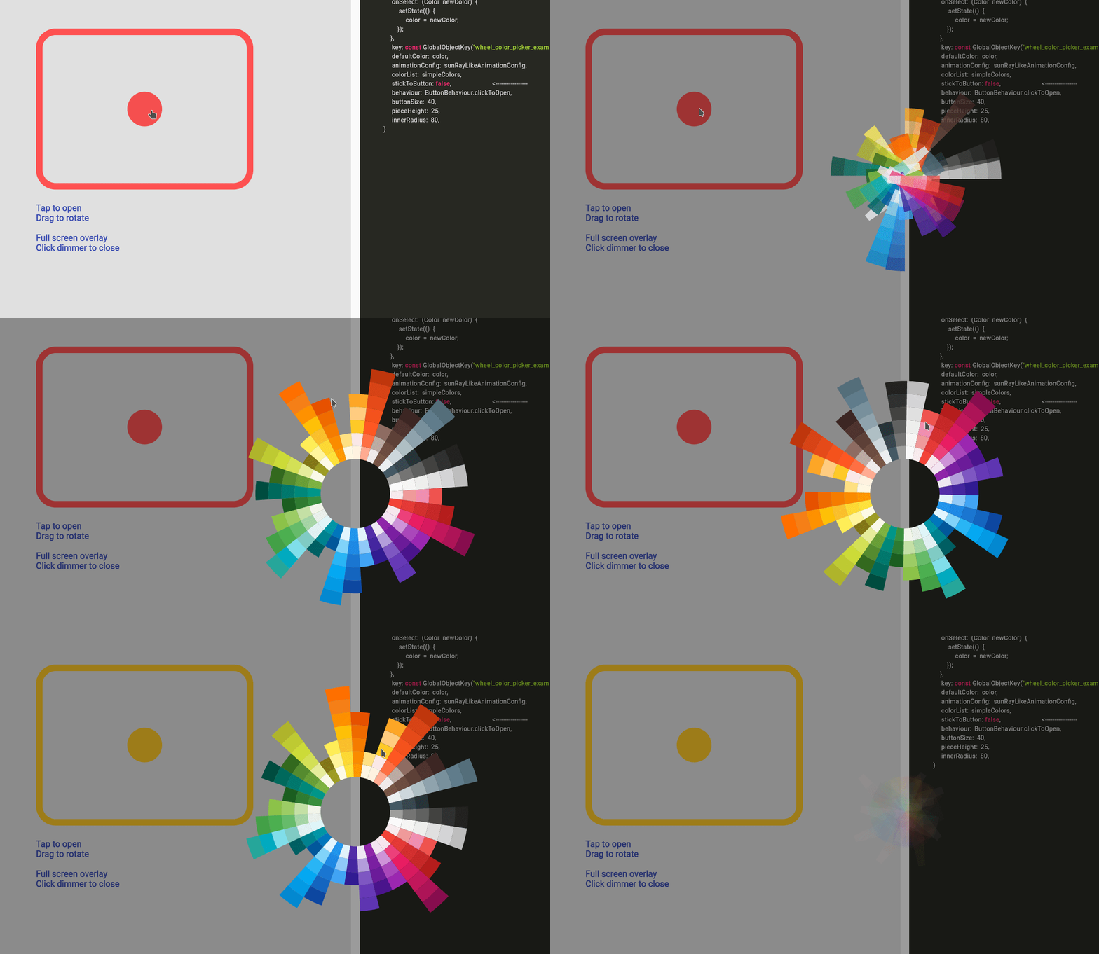
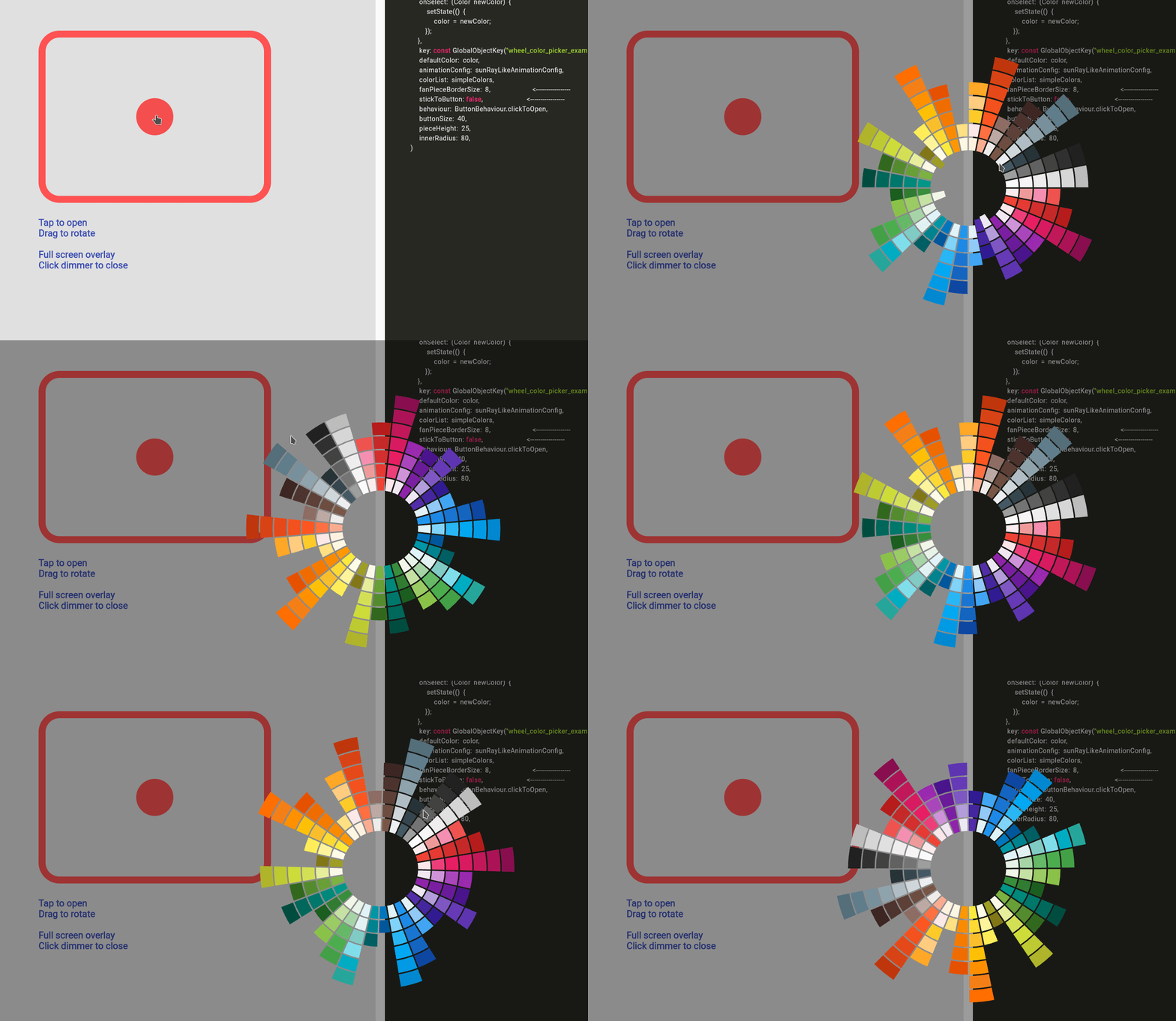
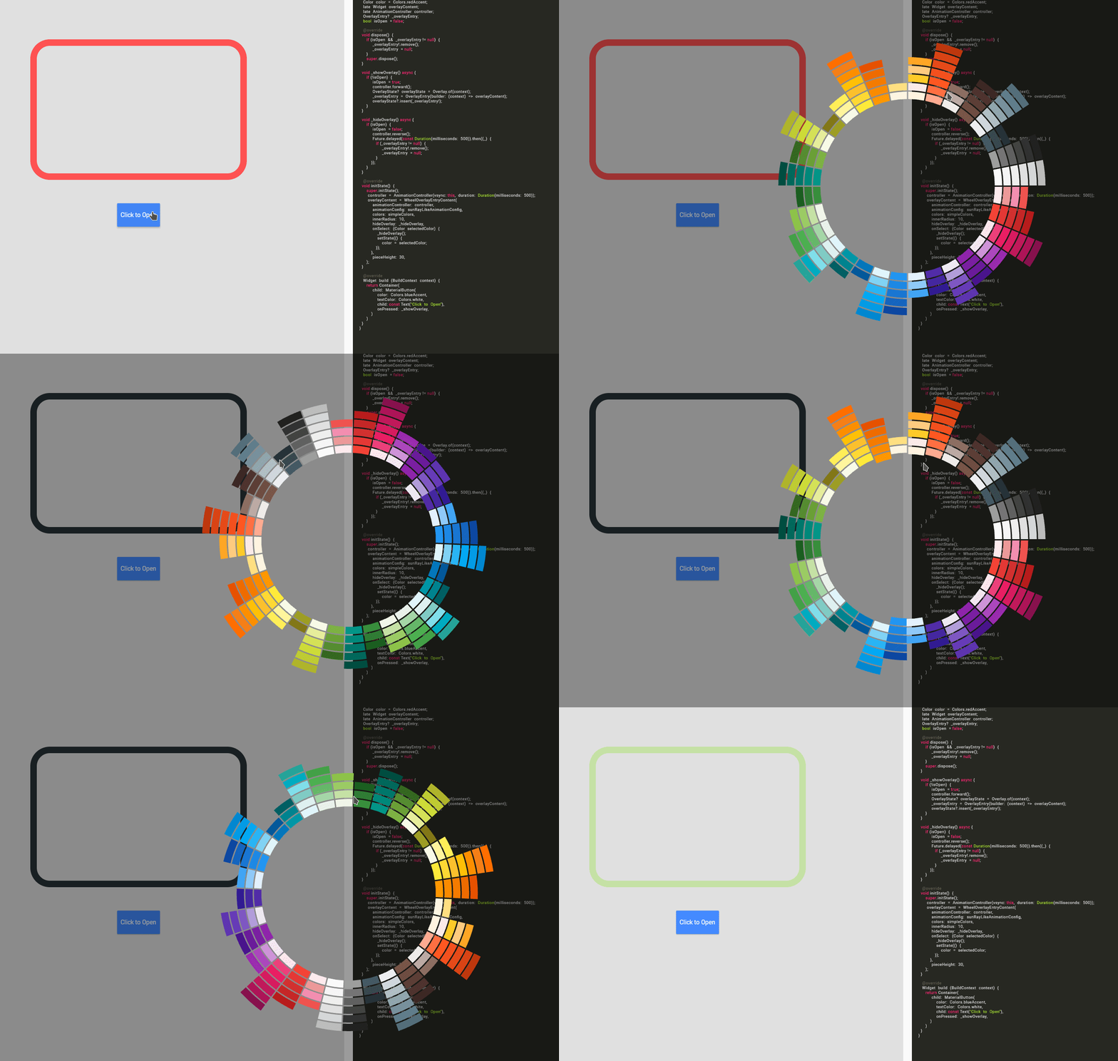
Fan default Fan Default Preset Fan simpleFan Simple Preset Ray Default Sun Ray Default
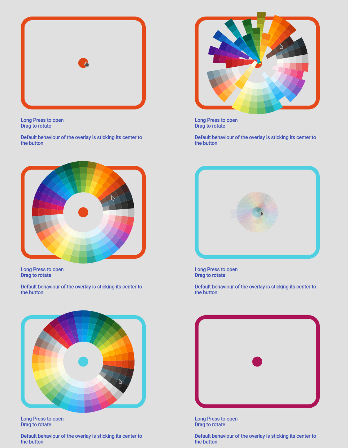
Sun Ray Simple Sun Ray Simple Detached Overlay default Detached Full Screen without Gap Detached Full Screen with gap Detached Full Screen with Gap
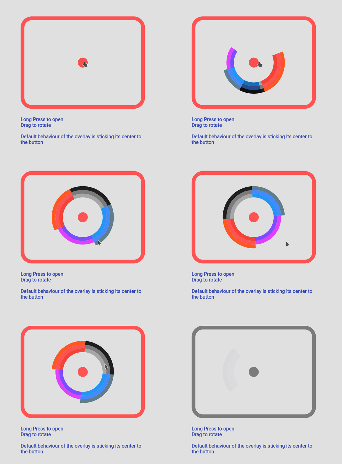
Custom Color Custom Color Set Custom Animation Custom Animation Manage your own OverlayEntry Manage Your Own OverlayEntry

Example Code

you can find more examples in the example path of this repository

Simple Usecase
Sun Ray Simple
import 'package:flutter_color_picker_wheel/flutter_color_picker_wheel.dart';

Color color; /// you want to initialize this color in the initState method

Widget myButton = WheelColorPicker(
  onSelect: (Color newColor) {
    setState(() {
       color = newColor;
    });
  },
  /// long press to open, another behaviour is clickToOpen to open
  behaviour: ButtonBehaviour.longPressToOpen,
  /// inital color
  defaultColor: color,
  /// fanLikeAnimationConfig is a preset, you can import this from the package
  animationConfig: fanLikeAnimationConfig,
  /// simpleColors is a preset, you can import this from the package
  colorList: simpleColors,
  /// size of the clickable button in the middle
  buttonSize: 40,
  /// height of each piece (outerRadius - innerRadius of a piece)
  pieceHeight: 25,
  /// starting radius of the donut shaped wheel
  innerRadius: 80,
);

Custom Color Set
Sun Ray Simple
WheelColorPicker(
  onSelect: (Color newColor) {
    setState(() {
      color = newColor;
    });
  },
  defaultColor: color,
  animationConfig: fanLikeAnimationConfig,
  colorList: const [
    [Colors.red, Colors.redAccent, Colors.deepOrange],
    [Colors.black26, Colors.black45, Colors.black87],
    [Colors.blue, Colors.blueAccent, Colors.blueGrey],
    [Colors.deepPurpleAccent, Colors.purpleAccent],
  ],
  buttonSize: 40,
  pieceHeight: 15,
  innerRadius: 80,
);

Custom Animation
Sun Ray Simple
WheelColorPicker(
  onSelect: (Color newColor) {
    setState(() {
      color = newColor;
    });
  },
  behaviour: ButtonBehaviour.clickToOpen,
  defaultColor: color,
  animationConfig: const FanAnimationConfig(
    animationDurationInMillisecond: 1000,
    rayAnimationConfig: RayAnimationConfig(
      curve: Curves.easeInQuad,
      enabled: false,
    ),
    scaleAnimationConfig: ScaleAnimationConfig(
      curve: Curves.easeInOutCubic,
      enabled: true,
      animationStartDelay: 0,
      animationFinishDelay: 0.2,
    ),
    opacityAnimationConfig: OpacityAnimationConfig(
      curve: Curves.linear,
      enabled: true,
      animationStartDelay: 0.2,
      animationFinishDelay: 0,
    ),
    rotationAnimationConfig: RotationAnimationConfig(
      curve: Curves.easeInQuad,
      enabled: true,
      animationFinishDelay: 0.4
    )
  ),
  colorList: defaultAvailableColors,
  buttonSize: 40,
  pieceHeight: 25,
  innerRadius: 80,
)

Using WheelColorPickerEntryContent
Sun Ray Simple

Note: This use case is a bit complicated.

If you decided to go this route there are several core ideas that you need to wrap your head around.

  • WheelOverlayEntryContent should be generated only ONCE but not generated each build. You can have a new OverlayEntry, but you only need one WheelOverlayEntryContent. This helps us to have a decent performance.
  • To stick the WheelOverlayEntryContent to some component, you want to use LayerLink. See WheelColorPicker as an example
  • You need to provide AnimationController to the Widget, thus you want to extend some ticker provider, eg. SingleTickerProviderStateMixin

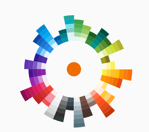
Example:

class ExampleUseOverlayOnlyState extends State<ExampleUseOverlayOnly> with SingleTickerProviderStateMixin {
  Color color = Colors.redAccent;
  late Widget overlayContent;
  late AnimationController controller;
  OverlayEntry? _overlayEntry;
  bool isOpen = false;

  @override
  void dispose() {
    if (_overlayEntry != null) {
      _overlayEntry!.remove();
      _overlayEntry = null;
    }
    controller.dispose();
    super.dispose();
  }

  void _showOverlay() async {
    if (!isOpen) {
      isOpen = true;
      controller.forward();
      OverlayState? overlayState = Overlay.of(context);
      _overlayEntry = OverlayEntry(builder: (context) => overlayContent);
      overlayState?.insert(_overlayEntry!);
    }
  }

  void _hideOverlay() async {
    if (isOpen) {
      isOpen = false;
      controller.reverse();
      Future.delayed(const Duration(milliseconds: 500)).then((_) {
        if (_overlayEntry != null) {
          _overlayEntry!.remove();
          _overlayEntry = null;
        }
      });
  }
  }

  @override
  void initState() {
    super.initState();
    controller = AnimationController(vsync: this, duration:Duration(milliseconds: 500));
    overlayContent = WheelOverlayEntryContent(
      animationController: controller,
      animationConfig: sunRayLikeAnimationConfig,
      colors: simpleColors,
      innerRadius: 200,
      pieceHeight: 20,
      pieceBorderSize: 5,
      hideOverlay: _hideOverlay,
      onSelect: (Color selectedColor) {
        _hideOverlay();
        setState(() {
          color = selectedColor;
        });
      },
    );
  }

  @override
  Widget build(BuildContext context) {
    return Container(
      padding: const EdgeInsets.all(150),
      child: Column(
        children:[
          Expanded(
            flex:12,
            child: Container(
              height: 500,
              width: 500,
              decoration: BoxDecoration(
                borderRadius: BorderRadius.circular(45),
                border: Border.all(
                  width: 15,
                  color: color
                )
              ),
            )
          ),
          const Expanded(flex:2, child: SizedBox()),
          Expanded(
            flex:2,
            child: MaterialButton(
              color: Colors.blueAccent,
              textColor: Colors.white,
              child: const Text("Click to Open"),
              onPressed: _showOverlay,
            ),
          ),
        ],
      )
    );
  }
}

Categorias

Dependências

Lista de dependências 1 itens

Repositório-fonte

Projetos que usam este pacote

Ainda não há dados.