Buscar pacotes, repositórios e categorias de apps

Capa de flutter_date_picker_timeline
Detalhes do pacotev0.3.3

flutter_date_picker_timeline

Um seletor de data personalizável gregoriano e jaleli como uma linha do tempo horizontal

AndroidiOSWebmacOSWindowsLinux
Downloads em 30 dias
103
Curtidas
86
Pontos Pub
130

Instalar pacote

flutter pub add flutter_date_picker_timeline

Visão geral do pacote

Orientação gerada a partir de informações públicas. Apenas para referência.

Um seletor de data personalizável para o Flutter que exibe datas como uma linha do tempo horizontal, suportando os calendários gregoriano e jaleali (persa). Permite aos usuários selecionar datas de forma intuitiva com rolagem suave e feedback visual. O pacote é projetado para aplicativos que exigem navegação de datas em períodos estendidos, como agendamento, planejamento ou fluxos de trabalho baseados em calendário. Funciona em todas as principais plataformas, incluindo Android, iOS, Web, macOS, Windows e Linux.

Casos de uso

  • Aplicativos de agendamento
  • Planejadores de tarefas baseados em calendário
  • Interfaces de reserva de eventos
  • Gerenciamento de itinerário de viagem
  • cronogramas de projetos de longo prazo

Principais recursos

  • Suporta calendários gregoriano e jalali
  • interface de linha do tempo rolável horizontalmente
  • Aparência e estilo personalizáveis
  • Compatibilidade multiplataforma
  • Navegação suave de datas
  • Faixa de datas e modos de seleção configuráveis

Indicado para

  • Aplicativos que precisam de seleção de datas por longos períodos
  • Desenvolvedores direcionados para públicos falantes de persa
  • Projetos que exigem suporte a calendários duplos
  • implementações de calendário com foco em UI
  • Aplicações multiplataforma do Flutter

Considerações

  • Pode exigir estilos adicionais para uma experiência de usuário ideal
  • Desempenho com intervalos de datas muito grandes
  • Validação embutida limitada além da seleção de data
  • Depende da localização externa para idiomas não ingleses

README original

Snapshot do README original do repositório-fonte vinculado. Consulte o repositório para o conteúdo mais recente.

Flutter Date Picker Timeline

Flutter Date Picker Timeline Banner pub package

💥 Gregorian and Jalali customizable date picker as a horizontal timeline 💥

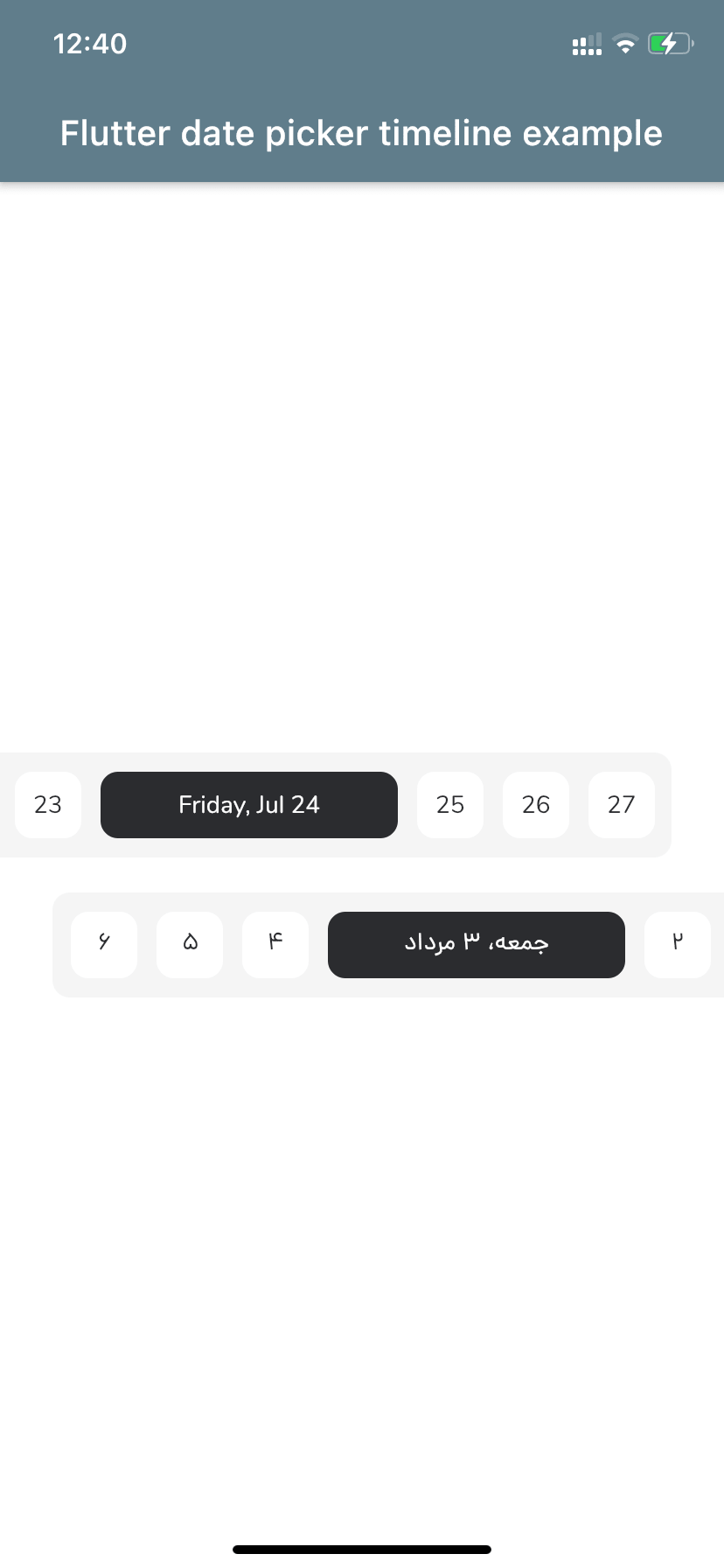
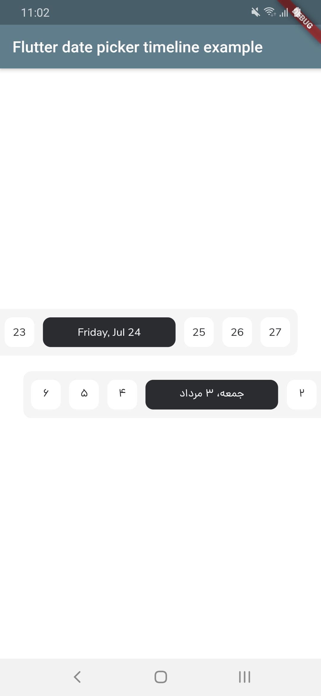
Screenshot iOS      Screenshot android


Let's get started

1 - Depend on it
Add it to your package's pubspec.yaml file
dependencies:
  flutter_date_picker_timeline: ^0.3.3
2 - Install it
Install packages from the command line
flutter pub get
3 - Import it
Import it to your project
import 'package:flutter_date_picker_timeline/flutter_date_picker_timeline.dart';

How to use?

Use the FlutterDatePickerTimeline Widget
FlutterDatePickerTimeline(
    startDate: DateTime(2020, 07, 01),
    endDate: DateTime(2020, 12, 30),
    initialSelectedDate: DateTime(2020, 07, 24),
    onSelectedDateChange: (DateTime dateTime) {
        print(dateTime);
      },
    )
Constructor:
FlutterDatePickerTimeline({
    Key key,
    // Determines the [FlutterDatePickerTimeline] mode.
    this.calendarMode = CalendarMode.gregorian,
    // The first date of [FlutterDatePickerTimeline].
    @required this.startDate,
    // The last date of [FlutterDatePickerTimeline].
    @required this.endDate,
    // Initially selected date.
    this.initialSelectedDate,
    // Initially focused date(If nothing is provided, a [initialSelectedDate] will be used).
    this.initialFocusedDate,
    // Used for setting the textDirection of [FlutterDatePickerTimeline].
    this.textDirection,
    // Used for setting the width of selected items.
    this.selectedItemWidth = 170,
    // Used for setting the width of unselected items.
    this.unselectedItemWidth = 38,
    // Used for setting the height of selected and unselected items.
    this.itemHeight = 38,
    // Used for setting the radius of selected and unselected items background.
    this.itemRadius = 10,
    // Used for setting the padding of [ListView].
    this.listViewPadding = const EdgeInsets.only(right: 5.5, left: 5.5),
    // Used for setting the margin of selected items.
    this.selectedItemMargin = const EdgeInsets.only(right: 5.5, left: 5.5),
    // Used for setting the margin of unselected items.
    this.unselectedItemMargin = const EdgeInsets.only(right: 5.5, left: 5.5),
    // Used for setting the color of selected items background.
    this.selectedItemBackgroundColor = const Color(0xFF2B2C30),
    // Used for setting the color of unselected items background.
    this.unselectedItemBackgroundColor = Colors.white,
    // Used for setting the style of selected items [Text].
    this.selectedItemTextStyle,
    // Used for setting the style of unselected items [Text].
    this.unselectedItemTextStyle,
    // Called whenever any date gets selected.
    @required this.onSelectedDateChange,
  }) : super(key: key);

Props

props types defaultValues
calendarMode CalendarMode CalendarMode.gregorian
startDate DateTime
endDate DateTime
initialSelectedDate DateTime?
initialFocusedDate DateTime? If nothing is provided, a [initialSelectedDate] will be used
textDirection TextDirection? If nothing is provided, a [calendarMode] will be used. (CalendarMode.gregorian -> TextDirection.ltr , CalendarMode.jalali -> TextDirection.rtl)
selectedItemWidth double 170
unselectedItemWidth double 38
itemHeight double 38
itemRadius double 10
listViewPadding EdgeInsets const EdgeInsets.only(right: 5.5, left: 5.5)
selectedItemMargin EdgeInsets const EdgeInsets.only(right: 5.5, left: 5.5)
unselectedItemMargin EdgeInsets const EdgeInsets.only(right: 5.5, left: 5.5)
selectedItemBackgroundColor Color const Color(0xFF2B2C30)
unselectedItemBackgroundColor Color Colors.white
selectedItemTextStyle TextStyle? TextStyle(fontFamily: widget.calendarMode == CalendarMode.gregorian ? 'nunito' : 'dana', package: 'flutter_date_picker_timeline', color: widget.unselectedItemBackgroundColor)
unselectedItemTextStyle TextStyle? TextStyle(fontFamily: widget.calendarMode == CalendarMode.gregorian ? 'nunito' : 'dana', package: 'flutter_date_picker_timeline', color: widget.selectedItemBackgroundColor)
onSelectedDateChange DateChangeListener

Categorias

Dependências

Lista de dependências 3 itens

Repositório-fonte

Projetos que usam este pacote

Ainda não há dados.