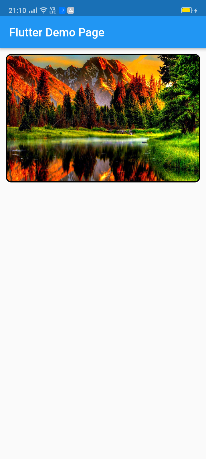
Este pacote permite criar um slider de widget (deslizamento automático/manual) com personalização total. Principalmente destinado a sliders de imagens, ele também aceita todos os outros widgets.
Orientação gerada a partir de informações públicas. Apenas para referência.
O pacote image_slider permite a criação de controles deslizantes personalizáveis no Flutter, com suporte para transições automáticas e manuais. Projetado principalmente para exibir imagens, também suporta qualquer tipo de widget, oferecendo flexibilidade na apresentação de conteúdo. Com opções completas de personalização, os desenvolvedores podem adaptar a aparência e o comportamento do controle para atender às diversas necessidades de design. É ideal para exibir galerias, exibições de produtos ou conteúdo promocional dentro dos aplicativos. O pacote é de código aberto e mantido no GitHub, tornando-o acessível para contribuições e modificações da comunidade.
Casos de uso
Galerias de imagens
Carrosséis de produtos
Banners promocionais
Diapositivas de conteúdo dinâmico
Elementos de interface interativa
Principais recursos
Deslizamento automático e manual
Personalização completa do widget
Suporte para qualquer tipo de widget
Open-source e comunitário
Integração fácil por meio do pub add
Indicado para
desenvolvedores de aplicativos móveis
designers de UI/UX
Aplicações de comércio eletrônico
Aplicações ricas em conteúdo
Implementações personalizadas de carrossel
Considerações
Otimizações específicas de plataforma limitadas
Sem indicadores de paginação embutidos
Requer estilização manual para designs avançados
Depende de manutenção externa
Pode ser necessário dependências adicionais para animações
README original
Snapshot do README original do repositório-fonte vinculado. Consulte o repositório para o conteúdo mais recente.
image_slider
This pub lets you make a widget slider (automatic/manual sliding) with full customization. Mainly intended for image slider, this also accepts all other widgets.
ImageSlider(
/// Shows the tab indicating circles at the bottom
showTabIndicator: false,
/// Cutomize tab's colors
tabIndicatorColor: Colors.lightBlue,
/// Customize selected tab's colors
tabIndicatorSelectedColor: Color.fromARGB(255, 0, 0, 255),
/// Height of the indicators from the bottom
tabIndicatorHeight: 16,
/// Size of the tab indicator circles
tabIndicatorSize: 16,
/// tabController for walkthrough or other implementations
tabController: tabController,
/// Animation curves of sliding
curve: Curves.fastOutSlowIn,
/// Width of the slider
width: MediaQuery.of(context).size.width,
/// Height of the slider
height: 220,
/// If automatic sliding is required
autoSlide: false,
/// Time for automatic sliding
duration: newDuration(seconds: 6),
/// If manual sliding is required
allowManualSlide: true,
/// Children in slideView to slide
children: links.map((String link) {
returnnewClipRRect(
borderRadius: BorderRadius.circular(8.0),
child: Image.network(
link,
width: MediaQuery.of(context).size.width,
height: 220,
fit: BoxFit.fill,
));
}).toList(),
),
License
Copyright 2020 Jay Mehta

Licensed under the Apache License, Version 2.0 (the "License");
you may not use this file except in compliance with the License.
You may obtain a copy of the License at

    http://www.apache.org/licenses/LICENSE-2.0

Unless required by applicable law or agreed to in writing, software
distributed under the License is distributed on an "AS IS" BASIS,
WITHOUT WARRANTIES OR CONDITIONS OF ANY KIND, either express or implied.
See the License for the specific language governing permissions and
limitations under the License.
Getting Started
This project is a starting point for a Dart
package,
a library module containing code that can be shared easily across
multiple Flutter or Dart projects.
For help getting started with Flutter, view our
online documentation, which offers tutorials,
samples, guidance on mobile development, and a full API reference.
Example
As time based...
import'package:flutter/material.dart';
import'package:image_slider/image_slider.dart';
voidmain() {
runApp(MyApp());
}
classMyAppextendsStatelessWidget{
@overrideWidgetbuild(BuildContext context) {
returnMaterialApp(
title: 'Flutter Demo',
debugShowCheckedModeBanner: false,
theme: ThemeData(
primarySwatch: Colors.blue,
visualDensity: VisualDensity.adaptivePlatformDensity,
),
home: MyHomePage(title: 'Flutter Image Slider Demo Page'),
);
}
}
classMyHomePageextendsStatefulWidget{
MyHomePage({Key key, this.title}) : super(key: key);
finalString title;
@override_MyHomePageStatecreateState() => _MyHomePageState();
}
class_MyHomePageStateextendsState<MyHomePage>
withSingleTickerProviderStateMixin{
/// This pub allows you to make image_slider widget and also multiple other useful widgets like walkthrough etc.@overridevoidinitState() {
super.initState();
tabController = TabController(length: 3, vsync: this);
}
TabController tabController;
staticList<String> links = [
"https://i.pinimg.com/originals/cc/18/8c/cc188c604e58cffd36e1d183c7198d21.jpg",
"https://www.kyoceradocumentsolutions.be/blog/wp-content/uploads/2019/03/iStock-881331810.jpg",
"https://resources.matcha-jp.com/resize/720x2000/2020/04/23-101958.jpeg"
];
@overrideWidgetbuild(BuildContext context) {
returnScaffold(
appBar: AppBar(
title: Text(widget.title),
),
body: Column(
children: [
Container(
margin: EdgeInsets.all(10),
decoration: BoxDecoration(
borderRadius: BorderRadius.circular(10),
border: Border.all(width: 2)),
child: ImageSlider(
/// Shows the tab indicating circles at the bottom
showTabIndicator: false,
/// Cutomize tab's colors
tabIndicatorColor: Colors.lightBlue,
/// Customize selected tab's colors
tabIndicatorSelectedColor: Color.fromARGB(255, 0, 0, 255),
/// Height of the indicators from the bottom
tabIndicatorHeight: 16,
/// Size of the tab indicator circles
tabIndicatorSize: 16,
/// tabController for walkthrough or other implementations
tabController: tabController,
/// Animation curves of sliding
curve: Curves.fastOutSlowIn,
/// Width of the slider
width: MediaQuery.of(context).size.width,
/// Height of the slider
height: 220,
/// If automatic sliding is required
autoSlide: false,
/// Time for automatic sliding
duration: newDuration(seconds: 6),
/// If manual sliding is required
allowManualSlide: true,
/// Children in slideView to slide
children: links.map((String link) {
returnnewClipRRect(
borderRadius: BorderRadius.circular(8.0),
child: Image.network(
link,
width: MediaQuery.of(context).size.width,
height: 220,
fit: BoxFit.fill,
));
}).toList(),
),
),
Row(
mainAxisAlignment: MainAxisAlignment.spaceEvenly,
children: [
tabController.index == 0
? Container(
width: 0,
height: 0,
)
: RaisedButton(
onPressed: () {
tabController.animateTo(tabController.index - 1);
setState(() {});
},
child: Text("Previous"),
),
tabController.index == 2
? Container(
width: 0,
height: 0,
)
: RaisedButton(
onPressed: () {
tabController.animateTo(2);
setState(() {});
},
child: Text("Skip"),
),
tabController.index == 2
? Container(
width: 0,
height: 0,
)
: RaisedButton(
onPressed: () {
tabController.animateTo(tabController.index + 1);
setState(() {});
},
child: Text("Next"),
),
],
)
],
));
}
}