Buscar pacotes, repositórios e categorias de apps

Capa de modals
Detalhes do pacotev1.0.0+1

modals

Modais, um pacote do Flutter para simplificar todas as suas necessidades de sobreposição!

AndroidiOSWebmacOSWindowsLinux
Downloads em 30 dias
337
Curtidas
49
Pontos Pub
140

Instalar pacote

flutter pub add modals

Visão geral do pacote

Orientação gerada a partir de informações públicas. Apenas para referência.

Modals é um pacote do Flutter projetado para simplificar a criação e gestão de sobreposições, como diálogos, bottom sheets e popups personalizados. Ele oferece uma API limpa e consistente para exibir e manipular modais em todas as plataformas, reduzindo o código boilerplate e melhorando a experiência do desenvolvedor. Com suporte integrado a animações, possibilidade de fechamento e layouts responsivos, ele simplifica padrões comuns de sobreposição em aplicativos Flutter. O pacote é ideal para desenvolvedores que buscam uma solução leve e confiável para gerenciar sobrepõeis sem configurações complexas.

Casos de uso

  • Exibindo diálogos e alertas
  • Criando telas de sobreposição personalizadas
  • Gerenciando interações de sheet inferior
  • Implementando fluxos de usuário guiados
  • Gerenciando navegação modal
  • Simplificando a lógica de pop-up

Principais recursos

  • API modal unificada
  • Compatibilidade multiplataforma
  • animações embutidas
  • Manipulação fácil de cancelamento
  • Suporte a design responsivo
  • Boilerplate mínimo

Indicado para

  • Iniciantes do Flutter
  • aplicações com foco em UI
  • Aplicativos com sobreposições frequentes
  • Desenvolvedores que desejam consistência
  • Equipes que priorizam a manutenibilidade
  • Projetos que exigem prototipagem rápida

Considerações

  • Limitado a funcionalidades específicas de sobreposição
  • Sem gerenciamento de estado embutido
  • Requer integração manual com soluções de estado existentes
  • Não adequado para pilhas de navegação complexas
  • Depende do pipeline de renderização do Flutter
  • Pode ser necessário estilização adicional para designs avançados

README original

Snapshot do README original do repositório-fonte vinculado. Consulte o repositório para o conteúdo mais recente.

Modals

Modals

Flutter overlays simplified!

Pub

Motivation

Working with Flutter overlays is quite cumbersome. Adding a simple context menu next to your button should not be hard.

Say hello 👋  to Modals, a package to simplify all your overlay needs!

Features

  • Show modals easily
    • Position modals using absolute position
    • Position modals using alignment
    • Position modals based on another widget position
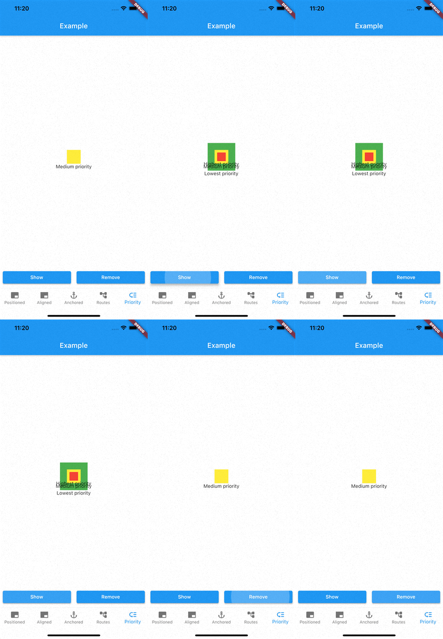
  • Prioritise modal visibility
  • Remove modals easily
    • Remove modal by id
    • Remove all modals at once
    • Remove modal by tapping modal barrier
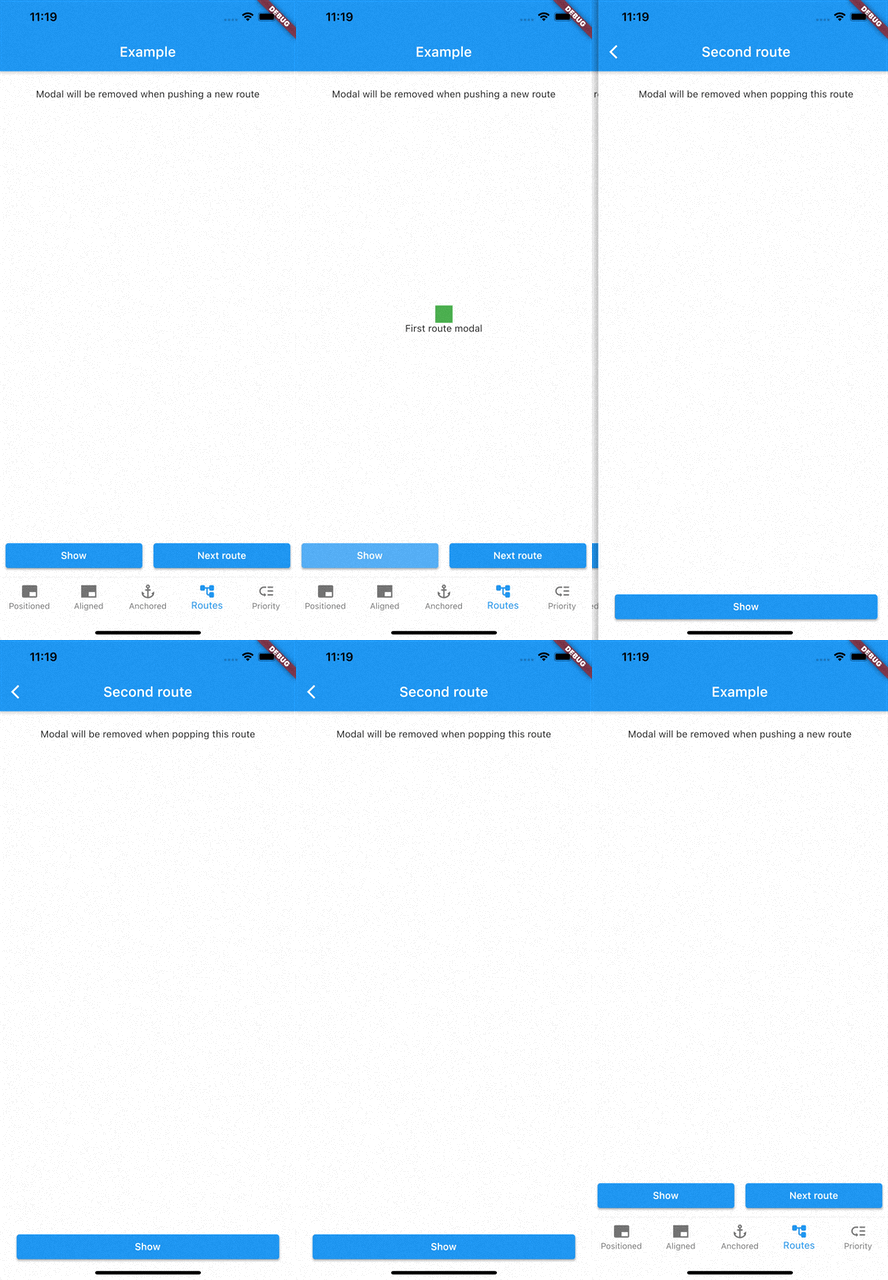
    • Remove modals on route changes

How to use

Showing modals

showModal is used to show modals. Function accepts a ModalEntry as parameter. ModalEntry has 3 options ModalEntry.positioned, ModalEntry.aligned and ModalEntry.anchored

Positioned
class PositionedModalExample extends StatelessWidget {
  const PositionedModalExample({Key? key}) : super(key: key);

  @override
  Widget build(BuildContext context) {
    return Center(
      child: ElevatedButton(
        onPressed: () {
          showModal(ModalEntry.positioned(context,
              tag: 'containerModal',
              left: 200,
              top: 200,
              child: Container(
                color: Colors.red,
                width: 50,
                height: 50,
              )));
        },
        child: const Text('Show Modal'),
      ),
    );
  }
}

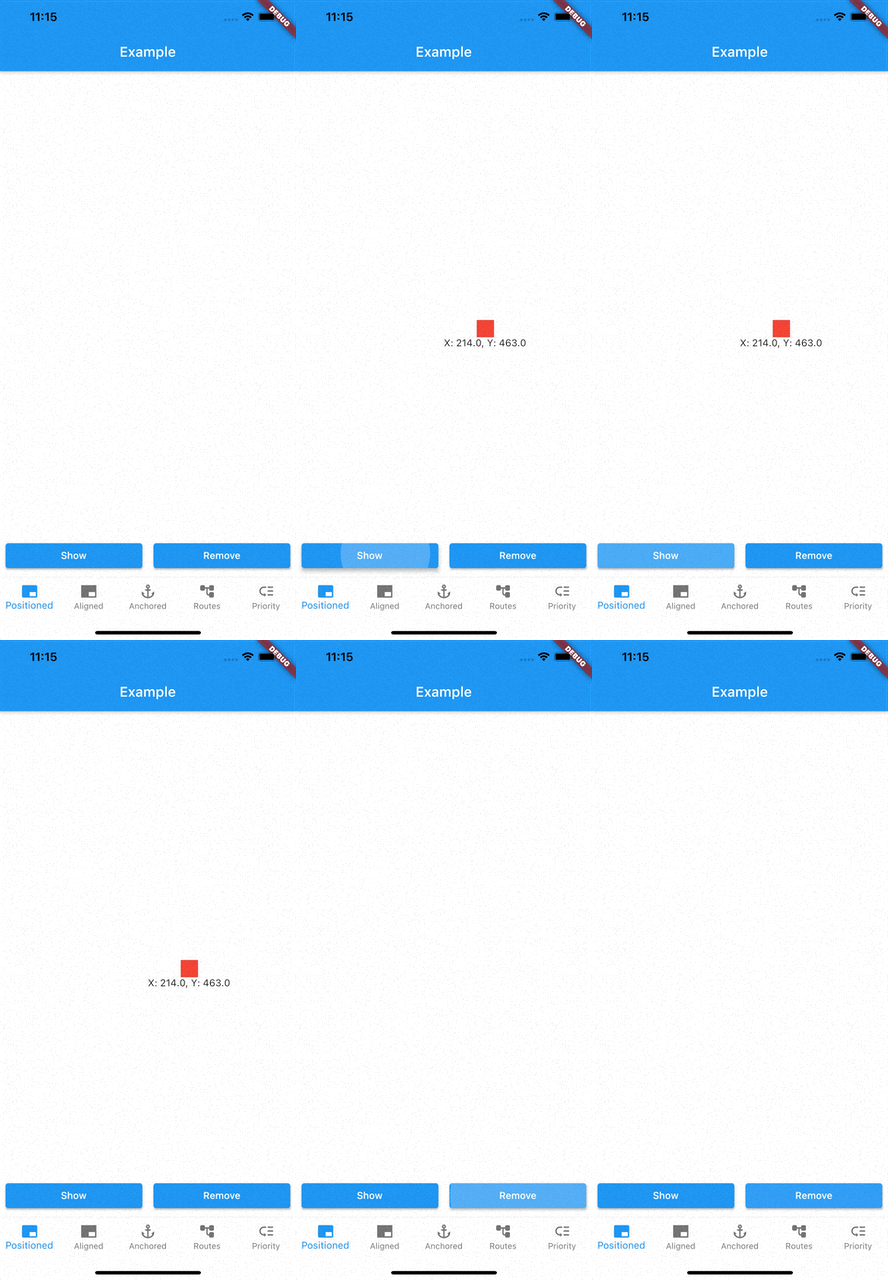
Above example positions your widget to absolute position of left: 200 and top 200.

Aligned
class AlignmentModalExample extends StatelessWidget {
  const AlignmentModalExample({Key? key}) : super(key: key);

  @override
  Widget build(BuildContext context) {
    return Center(
      child: ElevatedButton(
        onPressed: () {
          showModal(ModalEntry.aligned(context,
              tag: 'containerModal',
              alignment: Alignment.center,
              child: Container(
                color: Colors.red,
                width: 50,
                height: 50,
              )));
        },
        child: const Text('Show Modal'),
      ),
    );
  }
}

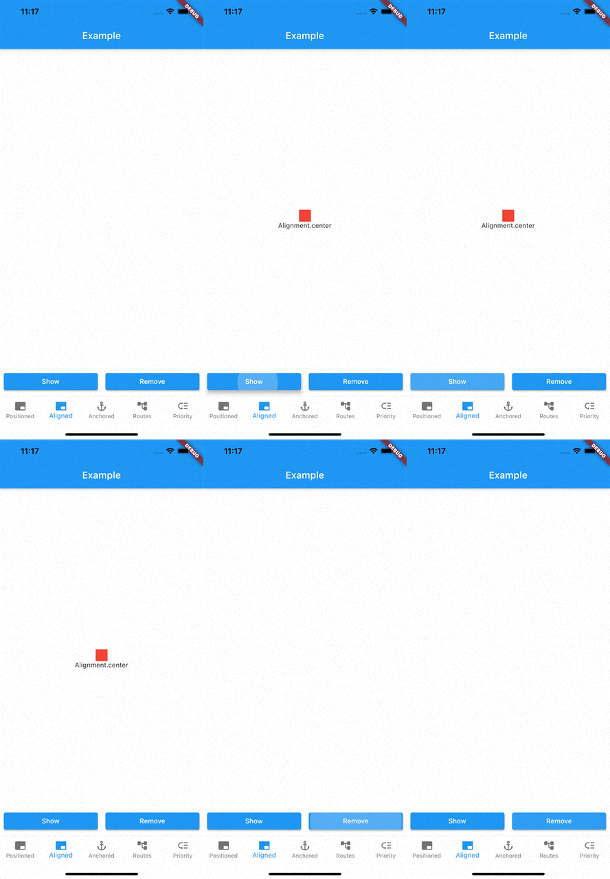
Above example aligns your widget to center of the screen.

Anchored

class AnchoredModalExample extends StatelessWidget {
  const AnchoredModalExample({Key? key}) : super(key: key);

  @override
  Widget build(BuildContext context) {
    return Center(
      child: Column(
        children: [
          const ModalAnchor(
              tag: 'anchor',
              child: Card(
                color: Colors.grey,
                child: Padding(
                  padding: EdgeInsets.all(8.0),
                  child: Icon(Icons.anchor),
                ),
              )),
          Column(
            mainAxisSize: MainAxisSize.min,
            children: [
              ElevatedButton(
                onPressed: () {
                  showModal(ModalEntry.anchored(context,
                      tag: 'anchoredModal',
                      anchorTag: 'anchor',
                      modalAlignment: Alignment.centerLeft,
                      anchorAlignment: Alignment.centerRight,
                      child: Container(
                        color: Colors.red,
                        width: 50,
                        height: 50,
                      )));
                },
                child: const Text('Show Modal'),
              ),
            ],
          ),
        ],
      ),
    );
  }
}

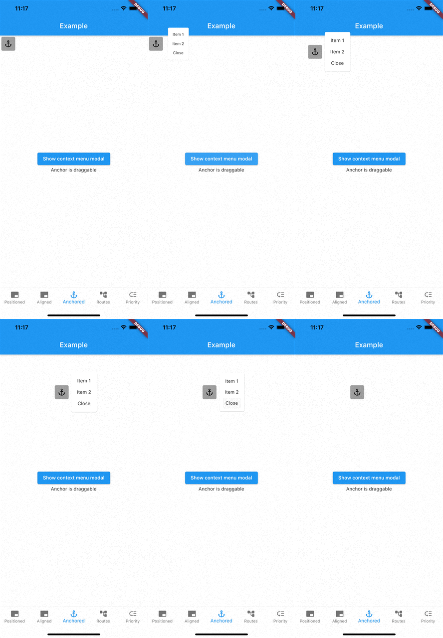
Above example positions widget at next to ModalAnchor widget.

To make widget act as an anchor, wrap widget with ModalAnchor widget.

Prioritising modals

To prioritise modals, use aboveTag and belowTag parameters.

  • aboveTag

    • Modal will be positioned just above given aboveTag
  • belowTag

    • Modal will be positioned just above given belowTag
Removing modals

You have 4 options to remove modals

removeModal(String id) removes modal by the given id

removeAllModals() removes all modals

Below parameters are configured in ModalEntry.

  • Tapping modal barrier

    • barrierDismissible when true (defaults to false) removes modal when tapping the barrier
    • barrierColor change barrier color (defaults to Colors.transparent)
  • Observing route changes

    • removeOnPop
      • The modal is removed when route is popped where the modal exists
    • removeOnPushNext
      • The modal is removed when new route is pushed on top of the route where the modal exists

To enable observing route changes, add navigator observer to root widget.

class MyApp extends StatelessWidget {
  const MyApp({Key? key}) : super(key: key);

  @override
  Widget build(BuildContext context) {
    return MaterialApp(
      title: 'AppModals',
      navigatorObservers: [modalsRouteObserver], // <- This line here. Imported from modals
      theme: ThemeData(
        primarySwatch: Colors.blue,
      ),
      home: const _Home(),
    );
  }
}

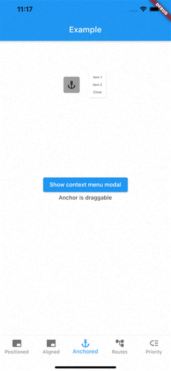
Gallery

See the Examples for more information

Categorias

Repositório-fonte

Projetos que usam este pacote

Ainda não há dados.