Buscar pacotes, repositórios e categorias de apps

Detalhes do pacotev1.0.0-beta

navigation_drawer_menu

Menu de Navegação do Flutter Material Design. Este pacote fornece o widget NavigationDrawerMenu que funciona como uma ListView. O exemplo implementa o menu de navegação completo.

Downloads em 30 dias
27
Curtidas
27
Pontos Pub
60

Instalar pacote

flutter pub add navigation_drawer_menu

Visão geral do pacote

Orientação gerada a partir de informações públicas. Apenas para referência.

Um pacote Flutter que fornece um widget NavigationDrawerMenu compatível com o Material Design, funcionando de forma semelhante a uma ListView dentro de um menu de navegação. Simplifica a implementação de menus de navegação completos com estilos e lógica de layout embutidos, alinhados aos princípios do Material Design. O pacote inclui um exemplo completo demonstrando casos de uso típicos, tornando fácil para desenvolvedores integrar navegação intuitiva em seus aplicativos. Projetado para simplicidade e consistência entre plataformas.

Casos de uso

  • Implementando navegação lateral em aplicativos móveis
  • Criando layouts responsivos com menus colapsáveis
  • Construindo painéis de administração com navegação hierárquica
  • Adicionando padrões de navegação consistentes entre telas

Principais recursos

  • Interface do usuário compatível com o Material Design
  • Comportamento semelhante ao ListView dentro do drawer
  • Exemplo embutido para integração rápida
  • API simples para configuração de item de menu
  • Suporte à renderização de conteúdo dinâmico

Indicado para

  • Iniciantes do Flutter aprendendo padrões de navegação
  • Desenvolvedores procurando implementação rápida de gaveta
  • Aplicativos que exigem navegação padrão do Material Design
  • Projetos que precisam de soluções leves de navegação

Considerações

  • Personalização limitada além do estilo básico
  • Sem suporte embutido para navegação aninhada
  • Pode exigir lógica adicional para roteamento complexo
  • Não otimizado para grandes listas de itens de menu
README original

Snapshot do README original do repositório-fonte vinculado. Consulte o repositório para o conteúdo mais recente.

navigation_drawer_menu

Flutter Material Design Navigation Drawer Menu

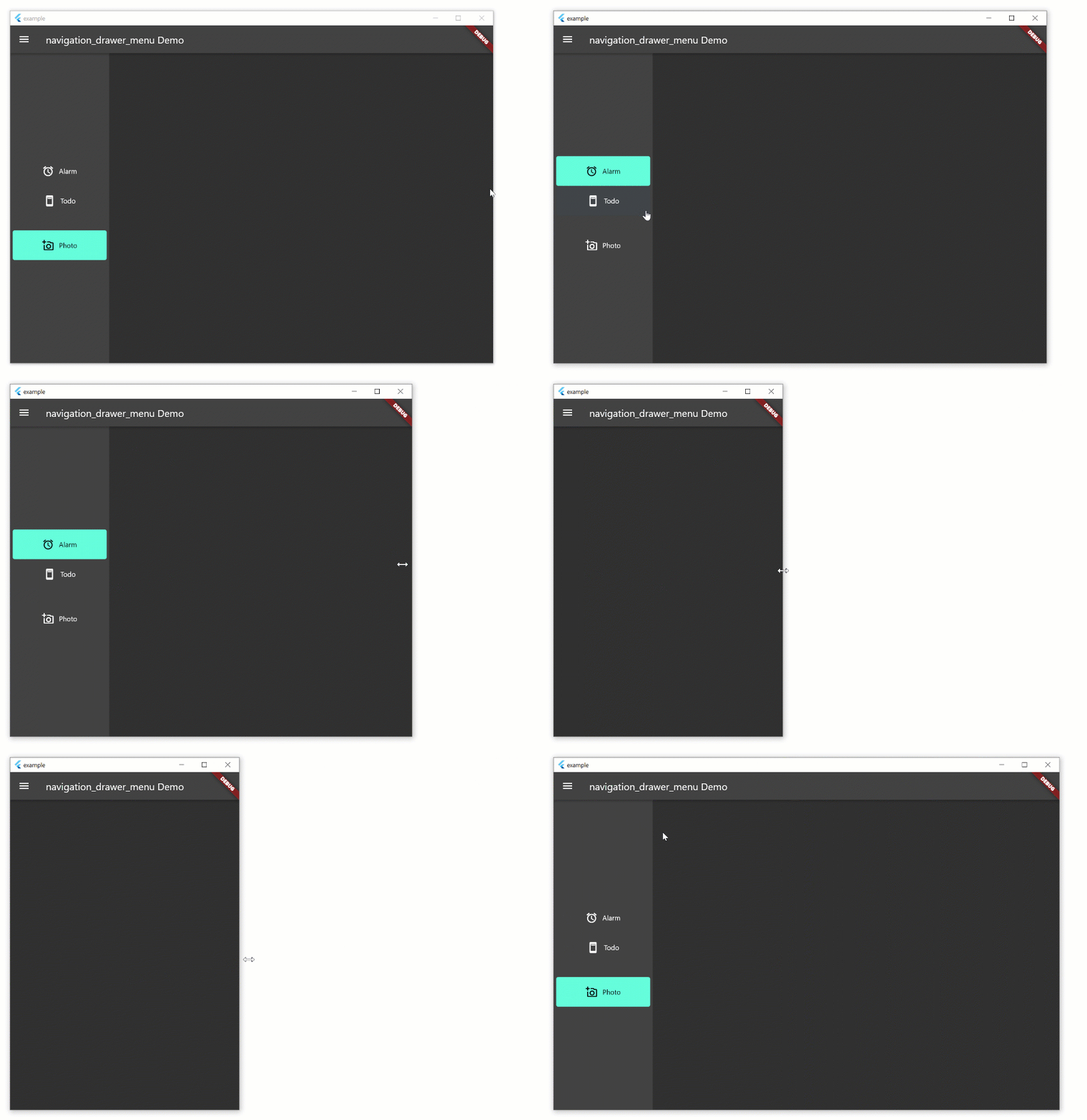
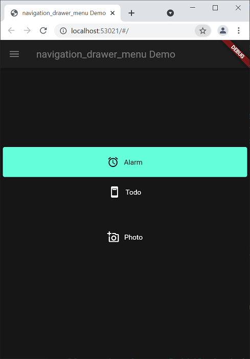
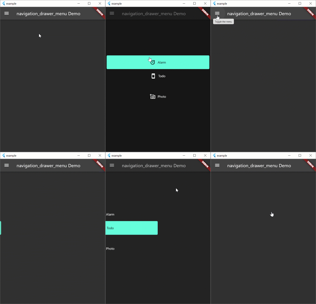
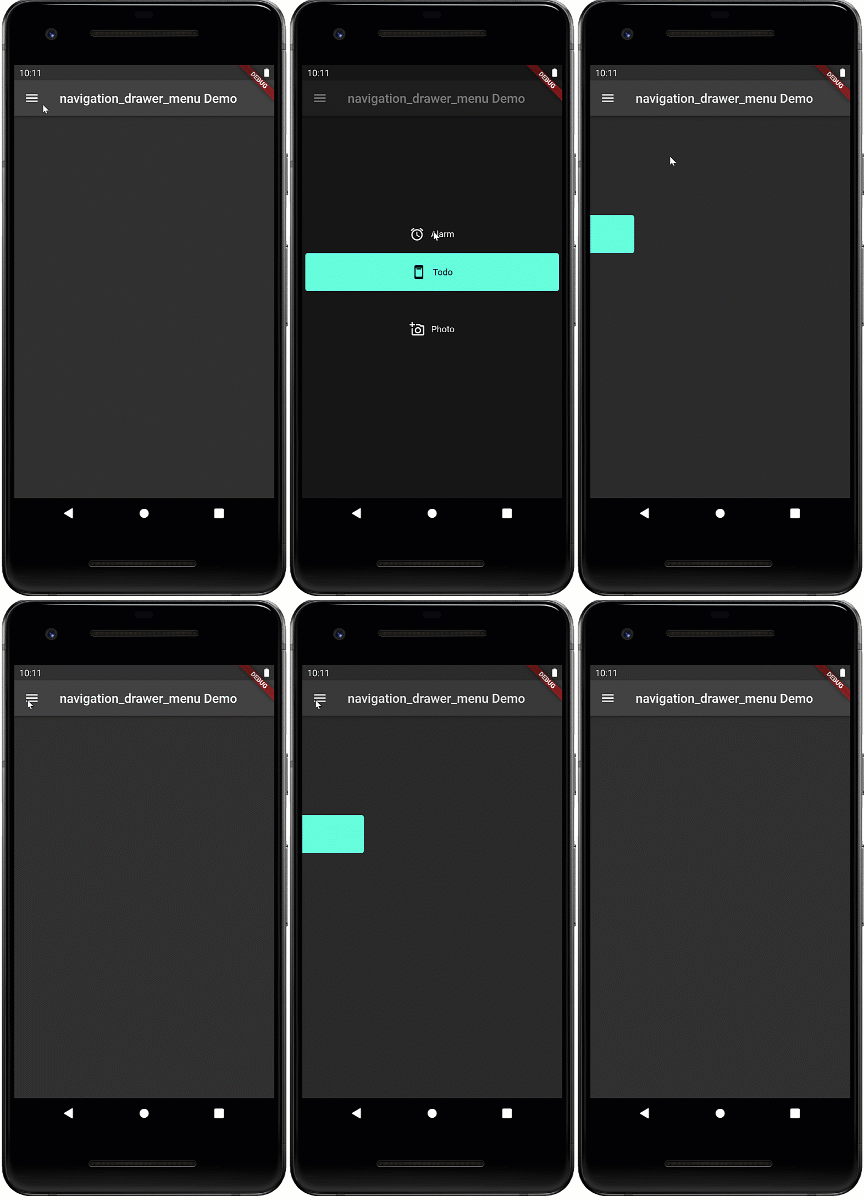
Navigation drawer is a common UI pattern for adaptive menus. The Material Design documentation formalizes the behavior of the menu but this pattern is not peculiar to Material Design. The pattern includes a basic Hamburger menu but isn't limited to small screens. The menu pattern suits all screen sizes. On larger width screens you see the icon and text, smaller screens will display icons only, and on phones, the menu will disappear during normal use and slide in with the hamburger icon.

Hamburger Menu

Beta

This widget is in beta and the public interface is likely to change

Example

The example aims to implement the Navigation Drawer pattern documented above. This is a work in progress and conformance to the behavior in the Material Design documentation is the long term aim. Pull requests to fix behavior are welcome. The example works on all form factors: desktop and tablet (landscape, portrait), phone, and web. Try resizing the width of the window to see how the behavior changes. Most of the behavior exists in the example. the aim is to create a new widget which will replace Scaffold and allow you to spin up new apps with this functionality very quickly.

Note: if you're just looking for a simple drawer menu that doesn't adapt to the screen, check out this.

Hamburger Menu

Hamburger Menu

Hamburger Menu

Run the Example
  • Open the root folder in Visual Studio Code
  • Open a terminal window
  • Add platforms by running these commands in the root folder (not example folder)
  • Click Run -> Start Debugging
flutter create example --platforms=windows,macos,linux

flutter create --platforms=web

flutter create --platforms=android

NavigationDrawerMenu

This is a widget that basically functions like a ListView. However, it exists to remove some of the boilerplate code necessary for constructing the menu, and allows you to put arbitrary sized spacers and headings inside the menu. The example uses this set of definitions. If you don't want to use this widget, you can use ListView instead.

final Map<Key, MenuItemContent> menuItems = {
  alarmValueKey: MenuItemContent(
      menuItem: MenuItemDefinition("Alarm", alarmValueKey,
          iconData: Icons.access_alarm)),
  todoValueKey: MenuItemContent(
      menuItem: MenuItemDefinition("Todo", todoValueKey,
          iconData: Icons.ad_units_rounded)),
  photoValueKey: MenuItemContent(
      menuItem: MenuItemDefinition("Photo", photoValueKey,
          iconData: Icons.add_a_photo_outlined))
};

Categorias

Dependências

Lista de dependências 1 itens

  • material^1.0.0+2

Repositório-fonte

Projetos que usam este pacote

Ainda não há dados.