Orientação gerada a partir de informações públicas. Apenas para referência.
Um pacote Flutter que fornece uma barra de pesquisa com paginação embutida para exibir resultados de busca. Permite aos usuários digitar consultas e navegar pelos resultados em páginas, melhorando o desempenho e a experiência do usuário ao lidar com grandes conjuntos de dados. A biblioteca gerencia operações de busca assíncronas e se integra sem problemas em interfaces existentes com configuração mínima. Suporta exibição personalizável de resultados e estados de carregamento, tornando-o ideal para aplicativos que exigem funcionalidade de busca eficiente e escalável.
Casos de uso
Pesquisando conjuntos de dados grandes de forma eficiente
Implementando resultados de pesquisa paginados
Melhorando a experiência do usuário em aplicativos com grande volume de dados
Construindo interfaces de pesquisa dinâmicas
Integração com APIs remotas para pesquisa
Reduzindo o uso de memória durante pesquisas
Principais recursos
Suporte embutido de paginação
Tratamento de pesquisa assíncrona
Interface de resultado personalizável
Gerenciamento de estado de carregamento e erro
Integração fácil com widgets existentes
Suporte para fontes de dados remotas e locais
Indicado para
Desenvolvedores construindo aplicativos com foco em busca
Aplicativos com grandes conjuntos de dados
UIs que exigem rolagem suave e carregamento preguiçoso
Equipes priorizando desempenho e UX
Projetos usando APIs REST ou GraphQL
Iniciantes do Flutter aprendendo padrões de paginação
Considerações
Requer implementação da lógica de pesquisa
Limitado à personalização básica da interface de pesquisa
Sem filtragem ou ordenação embutidas
Depende de fonte externa de dados
Pode ser necessário estilização adicional para designs complexos
Não otimizado para busca em tempo real sem debounce
README original
Snapshot do README original do repositório-fonte vinculado. Consulte o repositório para o conteúdo mais recente.
Paginated Search Bar
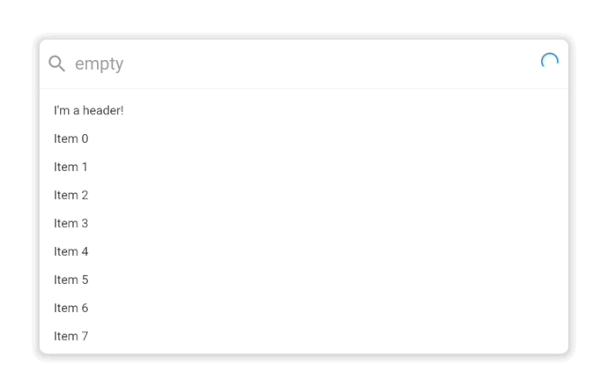
A search bar library that let's you search for items and paginate them in a results list. By default it looks like this:
.
It supports extensive customization with custom styling, headers, placeholders, footers and more powered by the Endless infinite scroll view library.
Usage
classExampleItem{
finalString title;
ExampleItem({
requiredthis.title,
});
}
PaginatedSearchBar<ExampleItem>(
onSearch: ({
required pageIndex,
required pageSize,
required searchQuery,
}) async {
// Call your search API to return a list of itemsreturn [
ExampleItem(title: 'Item 0'),
ExampleItem(title: 'Item 1'),
];
},
itemBuilder: (
context, {
required item,
required index,
}) {
returnText(item.title);
},
);
In this basic usage, all you need to get started is an onSearch function for fetching data and an itemBuilder for how it should be displayed in the search results list.
In this more advanced example, we've provided a few more customization options including an emptyBuilder and headerBuilderState. All of the builder functions like emptyBuilder provide the current BuildContext and return a widget to display. Each builder function additionally has a corresponding StateProperty builder like we see with headerBuilderState. The PaginatedSearchBar library uses the State property pattern for customizing the display of the widget based on the state of the system.
The complete list of paginated search bar states are:
enumPaginatedSearchBarState {
/// Present when the search bar is searching for items. Triggered when they update their search/// query in the input.
searching,
/// Present when the search bar is fetching a page of items either as a result of a modified search query/// or by scrolling to the bottom of the list view and triggering the next page load.
loading,
/// Present when the search bar has no matching items for the current search query.
empty,
/// Present when the search bar has no more items to fetch for the current search query. Triggered/// when the [PaginatedSearchBar.onSearch] function returns fewer than [PaginatedSearchBar.pageLimit]/// items or [EndlessPaginationDelegate.maxPage] has been reached and no more items can be fetched.
done,
/// Present the input is currently focused.
focused,
}
State properties builders then let us customize what we build based on these states. In the above example with headerBuilderState, we specified that it should only build the widget when the search results are empty.
If we instead wanted it show be shown when the search results are empty or done, we could use the state property resolveWith builder:
PaginatedSearchBar<ExampleItem>(
headerBuilderState: PaginatedSearchBarBuilderStateProperty.resolveWith((context, states) {
if (states.contain(PaginatedSearchBarState.empty) || states.contain(PaginatedSearchBarState.done)) {
returnconstText("I'm a header that only shows when the results are empty or done!");
}
}),
onSearch: ({
required pageIndex,
required pageSize,
required searchQuery,
}) async {
returnFuture.delayed(constDuration(milliseconds: 1000), () {
if (searchQuery == "empty") {
return [];
}
return [
ExampleItem(title: 'Page $pageIndex item 1'),
ExampleItem(title: 'Page $pageIndex item 2'),
];
});
},
itemBuilder: (
context, {
required item,
required index,
}) {
returnText(item.title);
},
);
The state properties are available for builders and style properties of the [PaginatedSearchBar].
Feedback
Let us know if there are any additional features or customization options you'd like to see to make a helpful search bar.

 .
