Orientação gerada a partir de informações públicas. Apenas para referência.
ResponsiveSpacing é um pacote Flutter/Dart que permite aos desenvolvedores criar interfaces de usuário adaptativas e responsivas ajustando dinamicamente espaçamentos, margens, preenchimentos, espaçamentos entre colunas, tamanho do corpo e layouts de coluna com base no tamanho da tela. Ele simplifica o design responsivo em múltiplas plataformas, incluindo Android, iOS, Web, macOS, Windows e Linux. Ao usar unidades responsivas e pontos de quebra embutidos, garante uma aparência consistente da IU independentemente das dimensões do dispositivo. Ideal para aplicativos que exigem layouts flexíveis sem escrever lógica repetitiva de consultas de mídia.
Casos de uso
Construindo layouts responsivos multiplataforma
Adaptando a interface do usuário para diferentes tamanhos de tela
Criando sistemas de grade fluidos
Automatizando ajustes de preenchimento e margem
Design de interfaces móveis e web escaláveis
Principais recursos
Espaçamento dinâmico com base no tamanho da tela
Pontos de quebra responsivos embutidos
Suporte para margens, preenchimentos e espaçamentos
Compatibilidade multiplataforma
Integração fácil com widgets do Flutter existentes
Controles flexíveis de tamanho de coluna e corpo
Indicado para
Desenvolvedores construindo aplicativos responsivos do Flutter
Equipes direcionadas para múltiplas plataformas
Designers de interface focados na adaptabilidade
Projetos que exigem sistemas de layout escalonáveis
Aplicativos com requisitos complexos de resposta
Considerações
Pode exigir uma curva de aprendizado inicial para novos usuários
Impacto no desempenho em árvores de widgets muito grandes
Depende da detecção precisa do tamanho da tela
Melhor usado com sistema de design consistente
Personalização limitada além das unidades responsivas fornecidas
README original
Snapshot do README original do repositório-fonte vinculado. Consulte o repositório para o conteúdo mais recente.
This plugin helps to design and develop beautiful responsive and adaptive flutter apps.
Lightweight, Responsive Spacing
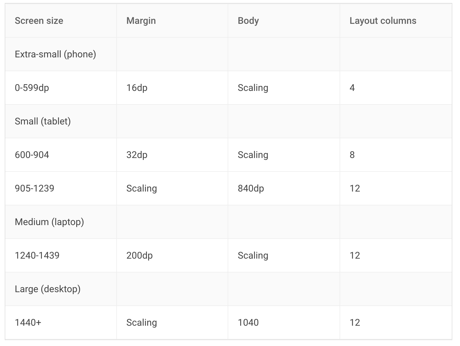
All design principles have roughly the same elements. For example, Material Design works with margin, gutter, body and has a responsive 12 column system.
Our default values are set by the Material Design Guidelines, but you can also easily set your own breakpoints, margins, and spacing.
You can find spacings everywhere in your Project, don't use Magic Numbers, use the context-oriented spacing class instead.
We have developed this plugin so that you can easily make your app adaptive and responsive.
Simple Spacing
Access your own Spacing-System:
// Example values for a Pixel 7 Pro
context.spacing.xs; // default 2
context.spacing.s; // default 8
context.spacing.m; // default 12
context.spacing.l; // default 16
context.spacing.xl; // default 32
context.spacing.xxl; // default 56// Example:// Instead of SizedBox(height: 8);
// useSizedBox(height: context.spacing.s); // Wow!
And whenever your design guru wants to modify the values, you only have to modify it in a single file.
Giga Spacing for all design chads that need more power
Design Gurus are around the world and you will maybe find one in your own company. If you have such a mysterious creature, use the Giga Spacing class for even more fine tuning.
In the previous Example, we used the any override, this will ignore the layout width. If you want to make the spacings responsive, override the values for xl, lg, md, sm2, sm1 & xs
And in your Widget, access the Spacing class with Spacing.of(context) or context.spacingConfig which returns an object of ResponsiveData. The object has all necessary spacings.
context.spacingConfig.margin;
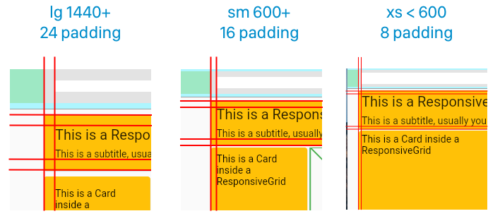
context.spacingConfig.padding;
context.spacingConfig.gutter;
context.spacingConfig.body;
context.spacingConfig.layoutColumns;

// You are now good to use these properties in your layout.
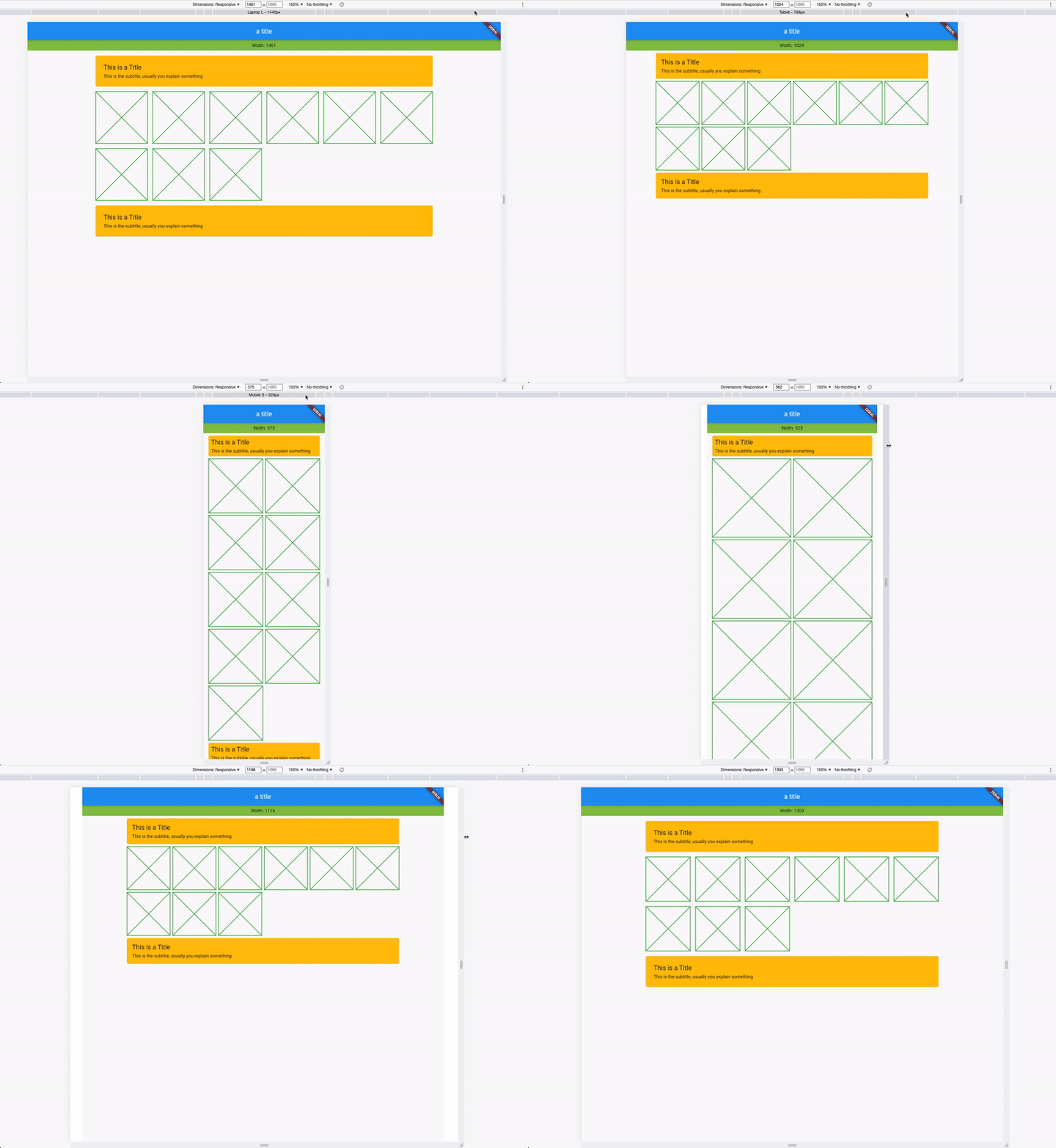
For example with a Card:
Card(
  // use margin
  margin: context.spacingConfig.margin.horizontalEdgeInsets,

  child: Padding(

    // use padding
    padding: context.spacingConfig.padding.allEdgeInsets,

    child: Column(
      children: [
        Text("This is a Title"),
        Text("This is the subtitle, usually you explain something")
      ],
    ),
  ),
)
Columns, Gutters & Margins
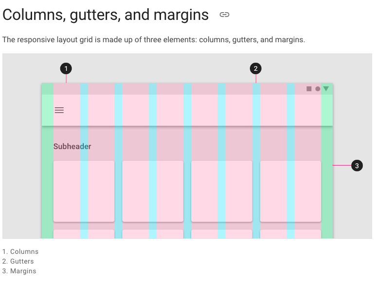
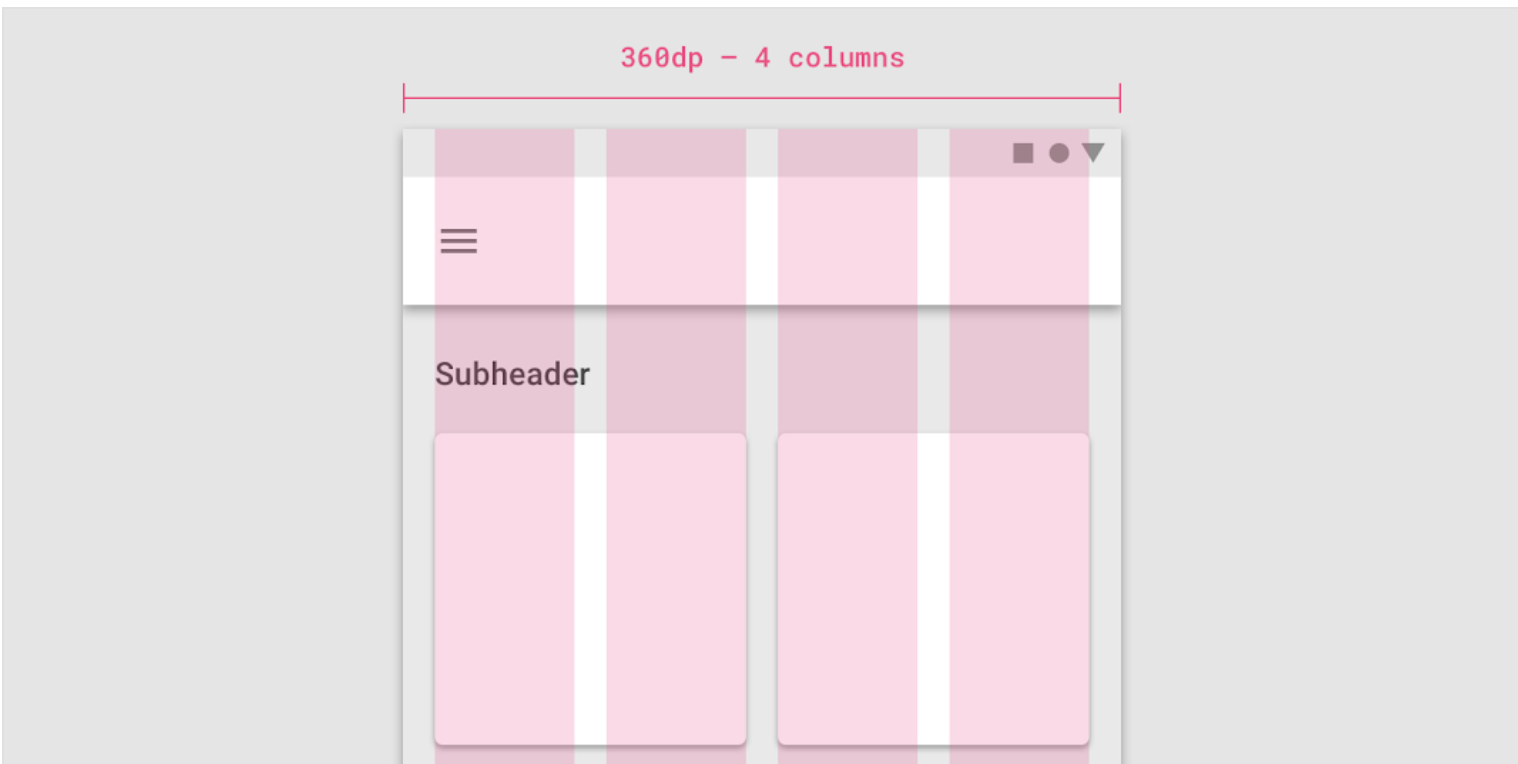
The responsive layout grid is made up of three elements: columns, gutters, and margins. Read everything about Columns, Gutters & Margins on the material guidelines responsive layout page.
Example: Access global padding setting in your widget:
Spacing.of(context).padding

// or

context.spacingConfig.padding
Just like the custom breakpoints, you can also set your own spacing, spaces, and margins. Create your own gutter class by extending ResponsiveCollection:
There are two types of widgets, the data widgets that create the spacing context and widgets that use the spacing context.
Data Widgets
Data widgets create the spacing context and provide responsive values to all widgets created in the tree below. if there are multiple data widgets in the tree, the closest one is taken.