Orientação gerada a partir de informações públicas. Apenas para referência.
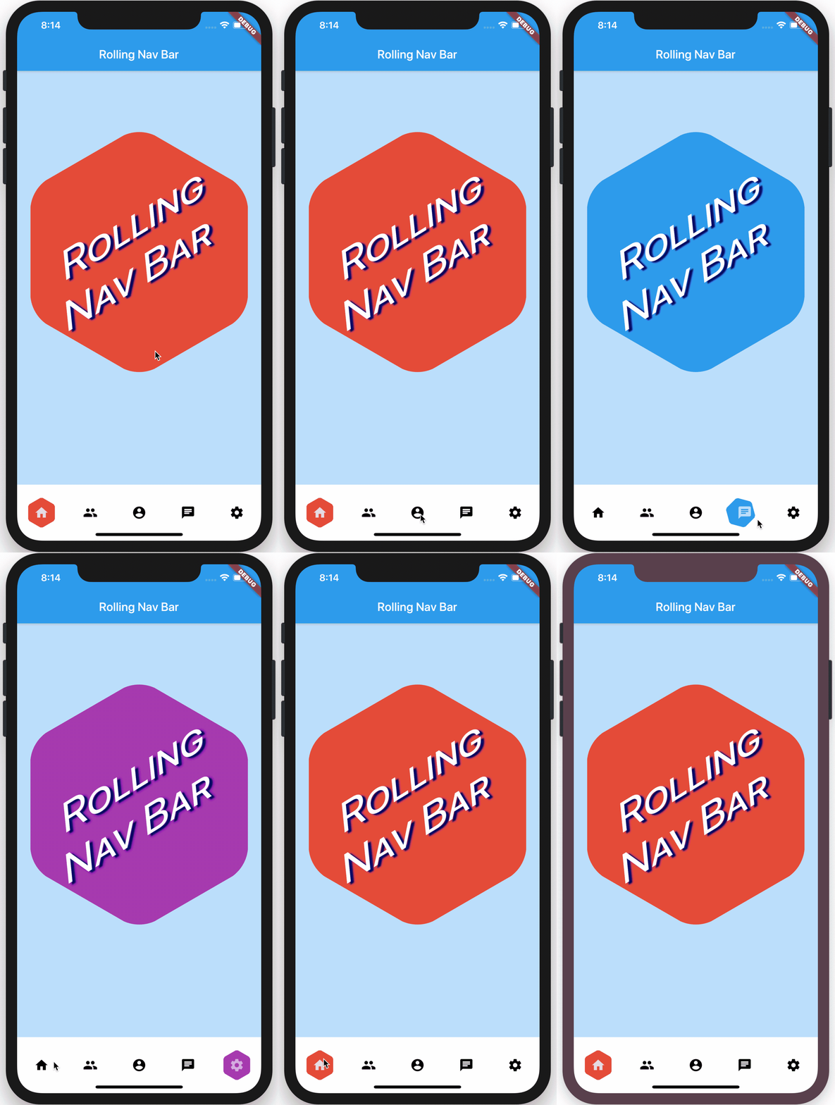
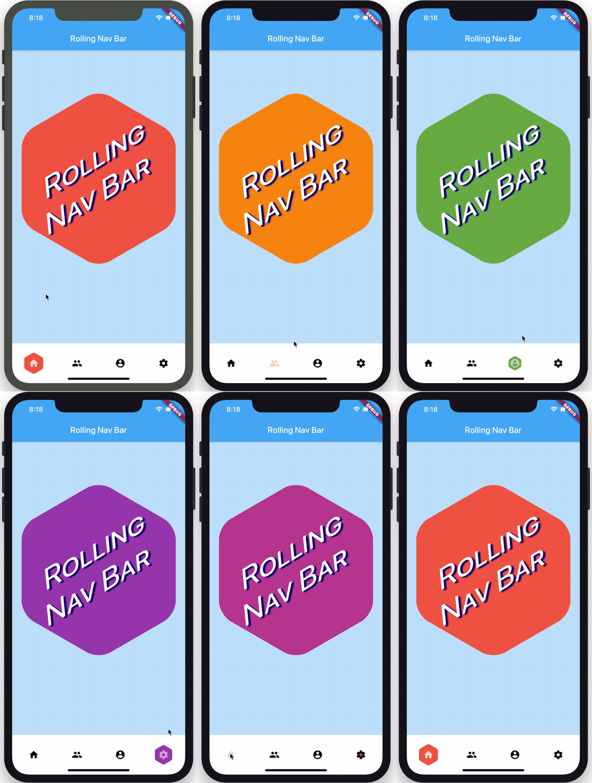
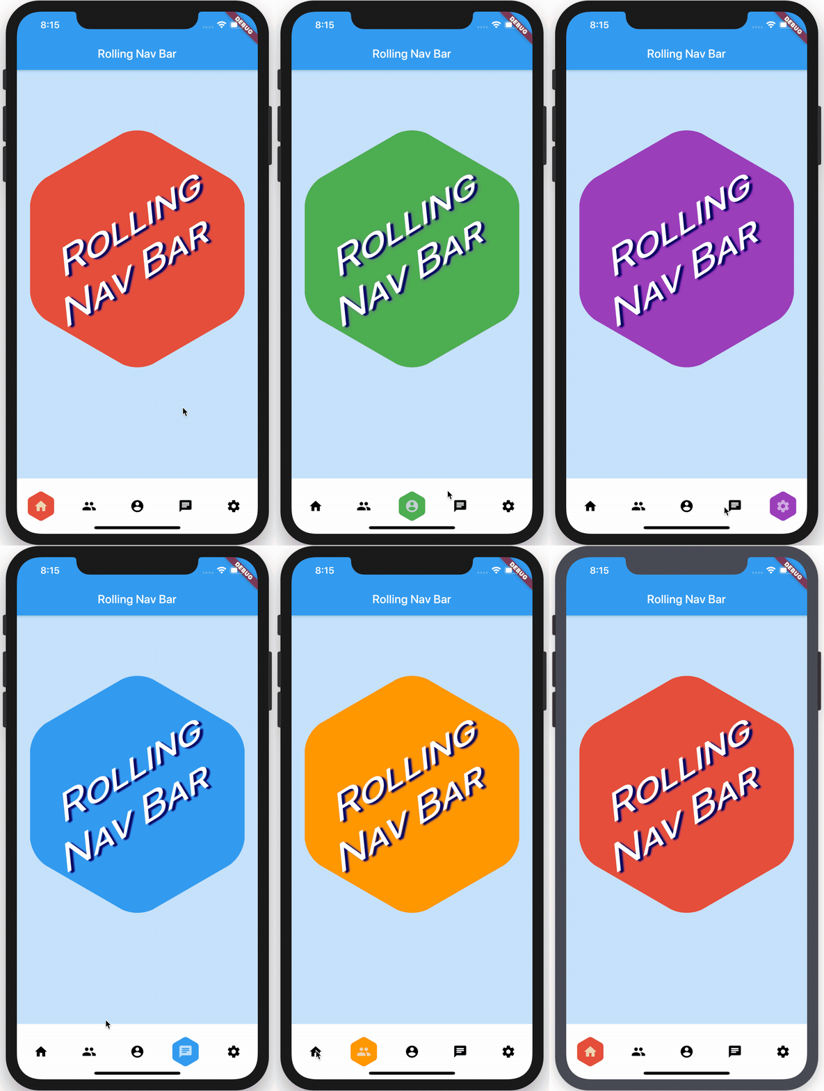
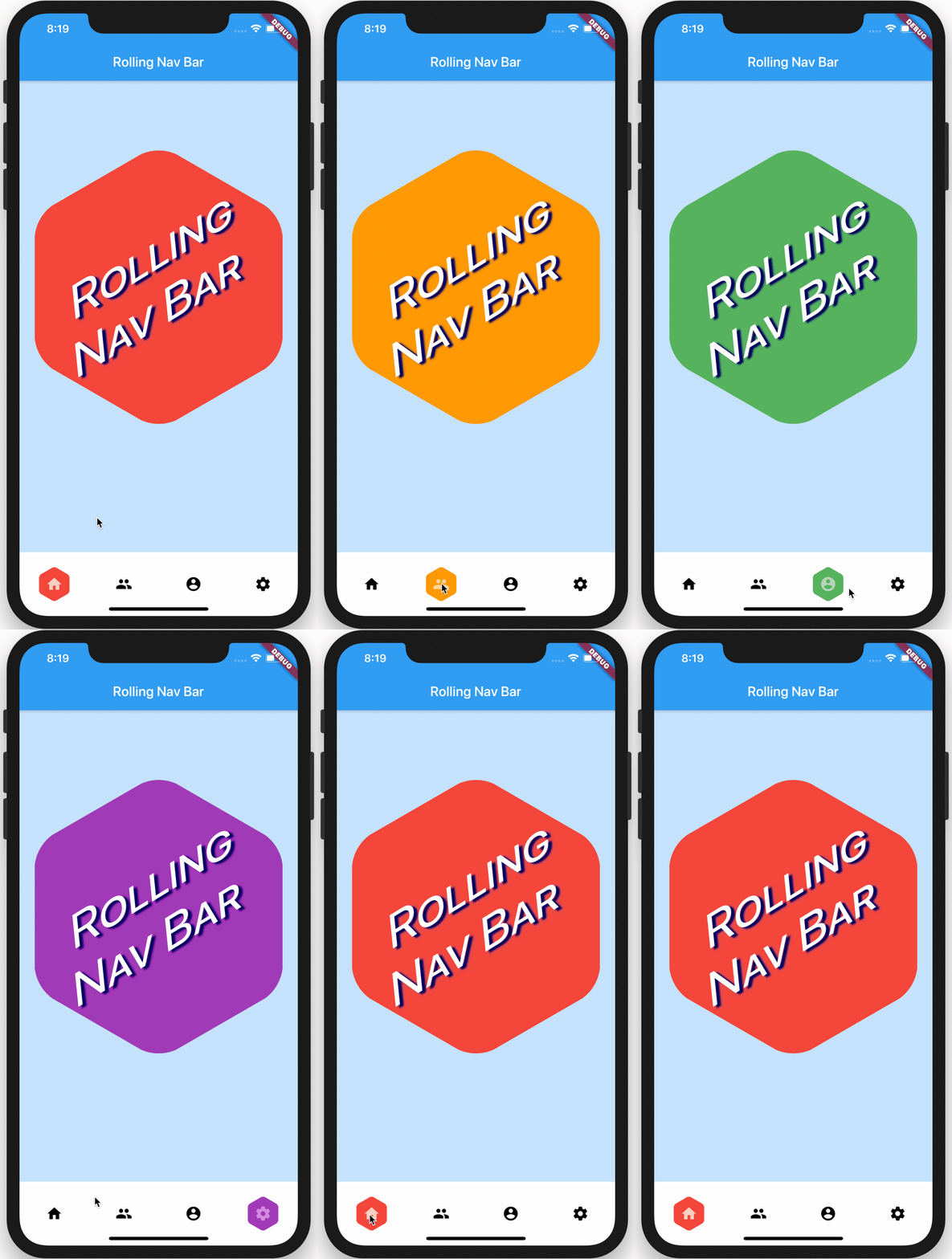
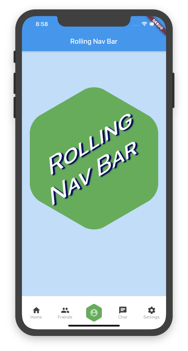
Uma barra de navegação inferior do Flutter com um indicador ativo suave e rolante que anima atrás de cada ícone quando selecionado. Projetada para melhorar a experiência do usuário com feedback visual e estética moderna. O pacote é leve e fácil de integrar, oferecendo cores, tamanhos e velocidades de animação personalizáveis. Suporta temas claro e escuro e funciona perfeitamente com padrões de navegação padrão do Flutter. Ideal para aplicativos que exigem navegação intuitiva com pistas visuais dinâmicas.
Casos de uso
Aplicativos móveis com navegação inferior
Feedback do usuário aprimorado na navegação
Designs de UI modernos com indicadores animados
Aplicativos que priorizam o acabamento visual
Barras inferiores personalizáveis
Principais recursos
Animação de indicador ativo rolante
Cores e tamanhos personalizáveis
Efeitos de transição suave
Suporte a tema claro e escuro
Integração fácil com MaterialApp ou Navigator
Indicado para
Desenvolvedores procurando interfaces de navegação modernas
Projetos do Flutter com foco em design
Aplicativos com várias abas inferiores
Equipes que desejam configuração mínima
Projetos que enfatizam a experiência do usuário
Considerações
Personalização específica de plataforma limitada
Sem badges de ícone embutidos
Requer manipulação manual da gestão de rotas
Não otimizado para contagens muito grandes de guias
O desempenho da animação pode variar em dispositivos mais antigos
README original
Snapshot do README original do repositório-fonte vinculado. Consulte o repositório para o conteúdo mais recente.
rolling_nav_bar
A bottom nav bar with layout inspired by this design and with heavily customizable animations, colors, and shapes.
Getting Started
To get started, place your RollingNavBar in the bottomNavigationCar slot of a
Scaffold, wrapped in a widget that provides max height. For example:
RollingNavBar is heavily customizable and works with 3, 4, or 5 navigation elements.
Each element is also fully customizable through the two primary ways to specify child
navigation elements.
The first option is to pass a list of IconData objects, along with optional lists
of Color objects.
The second option is to provide a widget builder, though this comes with some loss of
helpful active state management.
RollingNavBar.builder(
builder: (context, index, info, update) {
// The `iconData` constructor handles all active state management,// but this constructor, as it deals with completed widgets, must// assume that you have already made all relevant considerations.var textStyle = index == info.nextIndex
? TextStyle(color: Colors.white)
: TextStyle(color: Colors.grey);
returnText('${index + 1}', style: style);
},
indicatorColors: <Color>[
Colors.red,
Colors.yellow,
Colors.blue,
],
numChildren: 3,
)
Animation Types
RollingNavBar comes with four animation flavors for the active indicator's transition from
tab to tab.
The first animation type is the namesake: AnimationType.roll:
RollingNavBar.iconData(
  animationCurve: Curves.easeOut,  // `easeOut` (the default) is recommended here
  animationType: AnimationType.roll,
  baseAnimationSpeed: 200, // milliseconds
  iconData: <IconData>[
    ...
  ],
)
Note: For the roll animation type, your supplied animation speed is a multiplier considered against the distance the indicator must travel. This ensures a constant speed of travel no matter where the user clicks.
The second animation type is a fade-and-reappear effect:
RollingNavBar.iconData(
  animationCurve: Curves.linear, // `linear` is recommended for `shrinkOutIn`
  animationType: AnimationType.shrinkOutIn,
  baseAnimationSpeed: 500, // slower animations look nicer for `shrinkOutIn`
  iconData: <IconData>[
    ...
  ],
)
Note: For the shinkOutIn animation type, your supplied animation speed is constant, since the active indicator never travels the intermediate distance.
The third animation type is a spinning version of fade-and-reappear:
RollingNavBar.iconData(
  animationCurve: Curves.linear, // `linear` is recommended for `spinOutIn`
  animationType: AnimationType.spinOutIn,
  baseAnimationSpeed: 500, // slower animations look nicer for `spinOutIn`
  iconData: <IconData>[
    ...
  ],
)
Note: Like with shinkOutIn, for the spinOutIn animation type, your supplied animation speed is constant, since the active indicator never travels the intermediate distance.
The final animation flavor is a non-animation:
RollingNavBar.iconData(
  // `animationCurve` and `baseAnimationSpeed` are ignored
  animationType: AnimationType.snap,
  iconData: <IconData>[
    ...
  ],
)
Hooking into the animation
In the demo, the background of the larger hexagon matches the background of
the nav bar hexagon. To achieve this and similar effects, two callbacks, onTap and
onAnimate, are available. onAnimate can be particularly helpful for syncing
visual effects elsewhere in your app with nav bar progress.
Tab Item Text
If using the iconData constructor, you are also able to pass a list of widgets
to render as text below inactive icons.
RollingNavBar.iconData(
  // A list of length one implies the same color for all icons
  iconColors: <Color>[
    Colors.grey[800],
  ],
  iconData: <IconData>[
    Icons.home,
    Icons.friends,
    Icons.settings,
  ],
  iconText: <Widget>[
    Text('Home', style: TextStyle(color: Colors.grey, fontSize: 12)),
    Text('Friends', style: TextStyle(color: Colors.grey, fontSize: 12)),
    Text('Settings', style: TextStyle(color: Colors.grey, fontSize: 12)),
  ]
)
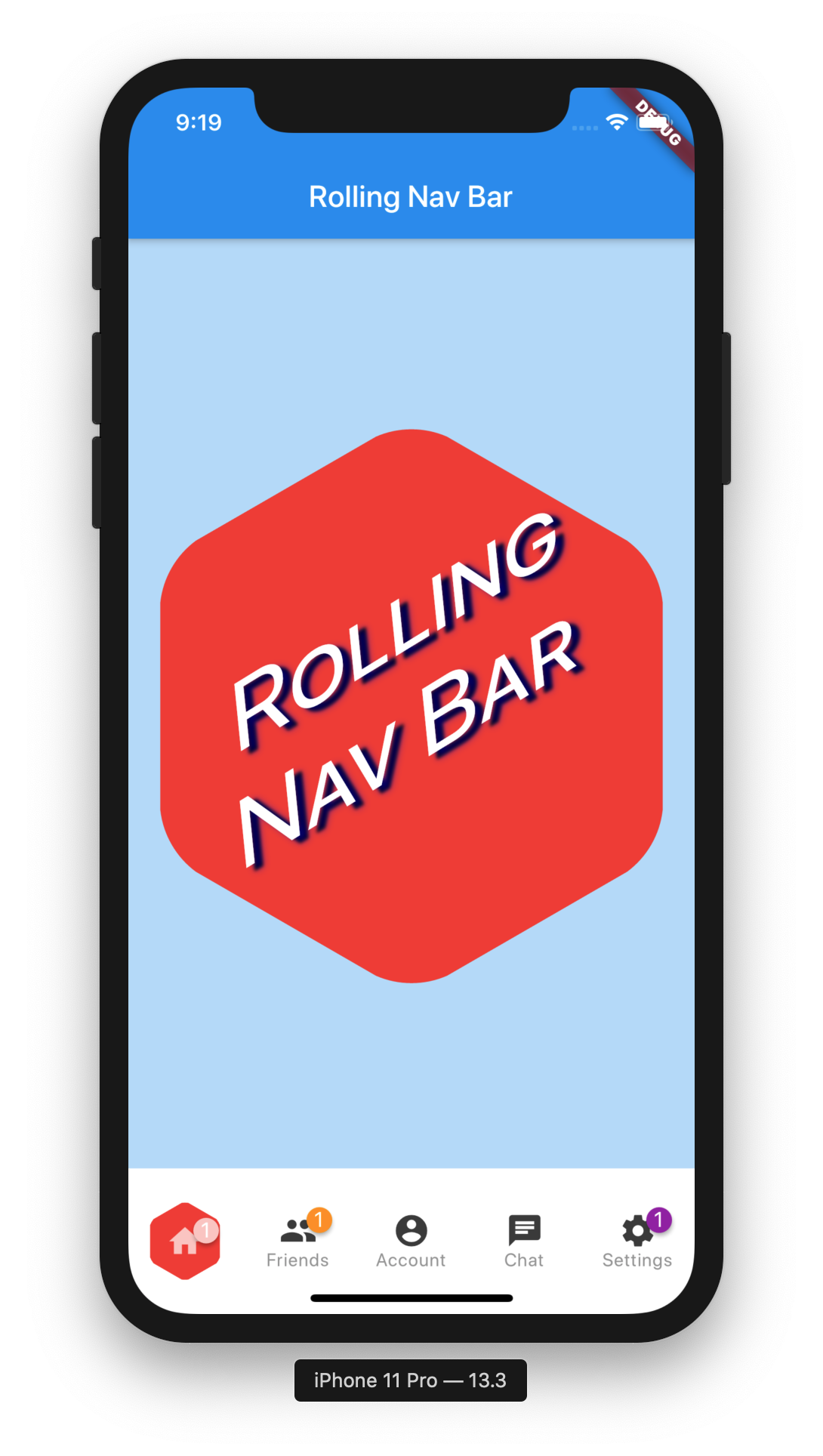
Icon badges
Using the Badges library, RollingNavBar is able to easily expose nav bar badges. The following works with either constructor.
You can programmatically change the active navigation bar tab by passing a new activeIndex to the RollingNavBar widget. However, there are two steps to successfully keeping everything in sync.
class_MyAppStateextendsState<MyApp> {
int activeIndex;
/// Handler that responds to navigation events (likely derived/// from user clicks) and keeps the parent in sync.void_onTap(int index) {
setState(() {
activeIndex = index;
});
}
/// Handler for when you want to programmatically change/// the active index. Calling `setState()` here causes/// Flutter to re-render the tree, which `RollingNavBar`/// responds to by running its normal animation.////// Note: This is an example function that you can define/// and call wherever you like. That is why it is not passed/// to `RollingNavBar.iconData` in the `build` method.voidchangeActiveIndex(int index) {
setState((){
activeIndex = index;
});
}
Widgetbuild(BuildContext context) {
returnRollingNavBar.iconData(
activeIndex: activeIndex,
iconData: iconData,
onTap: _onTap,
);
}
}