Buscar pacotes, repositórios e categorias de apps

Capa de rounded_expansion_tile
Detalhes do pacotev0.0.13

rounded_expansion_tile

Uma simples ExpansionTile para aplicativos Flutter com borda arredondada.

AndroidiOSWebmacOSWindowsLinux
Downloads em 30 dias
705
Curtidas
28
Pontos Pub
135

Instalar pacote

flutter pub add rounded_expansion_tile

Visão geral do pacote

Orientação gerada a partir de informações públicas. Apenas para referência.

Um pacote Flutter que fornece um ExpansionTile aprimorado com raio de borda personalizável, oferecendo um design moderno e visualmente atraente para seções de conteúdo colapsáveis. Construído para simplicidade e integração, ele estende o ExpansionTile padrão com cantos arredondados em todas as plataformas. Ideal para criar interfaces limpas e amigáveis ao usuário em aplicativos móveis e web. O pacote é leve e mantém compatibilidade com os widgets principais do Flutter.

Casos de uso

  • Criando seções colapsáveis com estilo em formulários
  • Projetando acordeões responsivos em painéis
  • Melhorando a consistência da interface com elementos interativos arredondados
  • Construindo painéis de navegação acessíveis
  • Implementando detalhes de produtos expansíveis em aplicativos de comércio eletrônico

Principais recursos

  • Raio de borda personalizável
  • Suporte multiplataforma (Android, iOS, Web, macOS, Windows, Linux)
  • Integração simples com projetos Flutter existentes
  • Estende o ExpansionTile padrão
  • Leve e dependências mínimas

Indicado para

  • Desenvolvedores em busca de componentes de interface do usuário refinados
  • Designers de UI focados na coesão visual
  • Projetos que exigem expansões semelhantes a cartões arredondados consistentes
  • Aplicativos destinados a múltiplas plataformas
  • Iniciantes do Flutter explorando personalização de widget

Considerações

  • Limitado apenas ao estilo de raio da borda
  • Não inclui animações adicionais além das padrão do ExpansionTile
  • Requer manipulação manual do preenchimento de conteúdo, se necessário
  • Nenhuma personalização de ícone ou título embutida além do padrão
  • Mais adequado para casos de uso simples de expansão sem layouts complexos
README original

Snapshot do README original do repositório-fonte vinculado. Consulte o repositório para o conteúdo mais recente.

Rounded Expansiontile

A simple combination of widgets to provide an Expansiontile with rounded corners. This widget uses default Flutter widgets only and is available for each platform.

Getting Started

This Widget returns a column with a ListTile and a ListView. It has all properties of the ListTile width a few custom inputfield. Simply load the widget in your pubspec yaml and start using it.

Inputfields

Default ListTile and ExpansionTile inputfields
  • autofocus

  • contentPadding

  • dense

  • enabled

  • enableFeedback

  • focusColor

  • focusNode

  • horizontalTitleGap

  • hoverColor

  • isThreeLine

  • key

  • leading

  • minLeadingWidth

  • minVerticalPadding

  • mouseCursor

  • onLongPress

  • selected

  • selectedTileColor

  • shape

  • subtitle

  • title

  • tileColor

  • trailing

  • visualDensity

  • onTap

  • initiallyExpanded

Extra inputfields and tips
  • shape Shape()

    The shape will be used for the shape of the ListTile, not for the children. This is visible when pressed and will be shown in the ink splash.

    Use the RoundedExpansionTile in a Card-widget with the same shape for the best result.

    Card(
        shape: RoundedRectangleBorder(borderRadius: BorderRadius.circular(16)),
        child: RoundedExpansionTile(
            shape: RoundedRectangleBorder(borderRadius: BorderRadius.circular(16)),
            title: Text('Some title'),
            children: [
                child1,
                child2,
                child3,
                ...
            ],
        ),
    ),
    
  • duration Duration()

    This will be used to show the expansion animation. It is used for the Expansion it self and the rotation / animation of the Icon. By default the duration is 500 milliseconds.

  • children List<Widget>[]

    The children that will be displayd when the ListTile is expanded.

  • childrenPadding EdgeInsets()

    The padding around the children. This is not the same as the contentpadding.

  • curve Curve()

    The curve used for the children animation. By default it uses Curves.fastLinearToSlowEaseIn

  • trailing Widget()

    When provided this will override the default hamburger menu icon (AnimatedIcon). This icon will rotate by default but can be set to false see rotateTrailing.

  • rotateTrailing bool

    Rotate the custom trailing icon when provided. By default this is true. When set to false the icon stays the same. Provide the trailing with an arrow down to make the widget look like the default ExpansionTile.

  • noTrailing bool

    When set to true there will be no trailing at all. Even when provided custom trailing this bool will prevent it from being shown.

Example

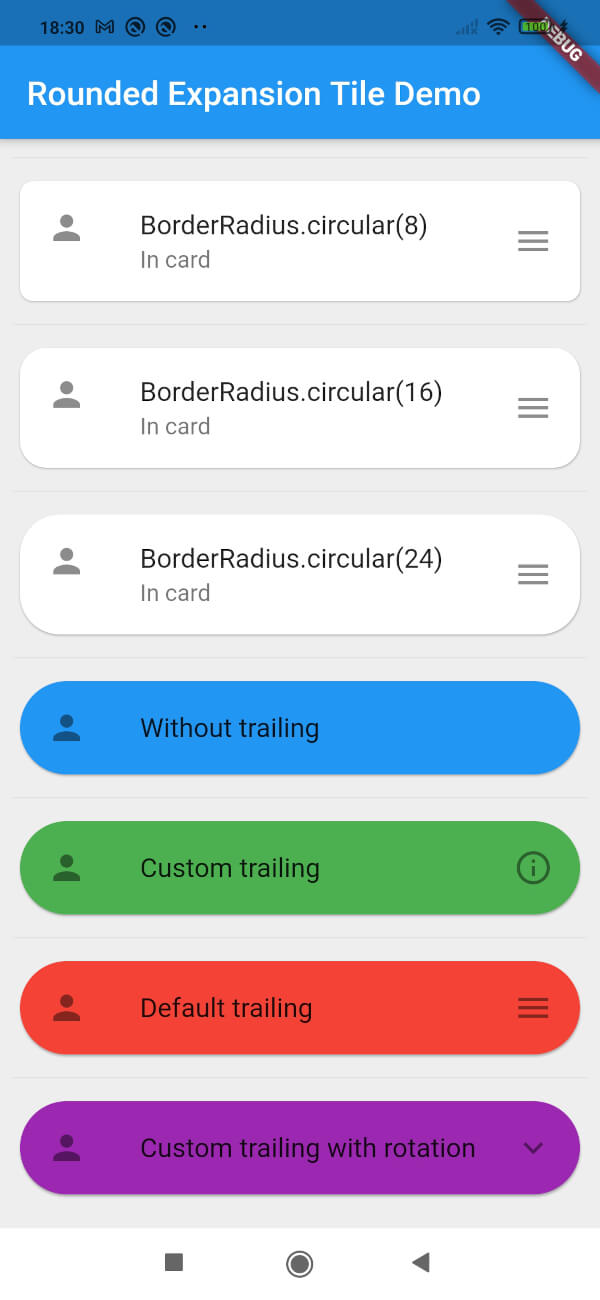
Screenshot of example app

Categorias

Repositório-fonte

Projetos que usam este pacote

Ainda não há dados.