Buscar pacotes, repositórios e categorias de apps

Capa de simple_tooltip
Detalhes do pacotev1.2.0

simple_tooltip

Uma biblioteca simples para criar dicas de ferramentas

AndroidiOSWebmacOSWindowsLinux
Downloads em 30 dias
5,6 mil
Curtidas
78
Pontos Pub
130

Instalar pacote

flutter pub add simple_tooltip

Visão geral do pacote

Orientação gerada a partir de informações públicas. Apenas para referência.

Um pacote leve do Flutter para adicionar facilmente dicas de ferramenta a elementos da interface. Ele fornece uma API simples para exibir texto informativo em pop-up quando os usuários passam o mouse ou tocam em widgets específicos, melhorando a experiência do usuário com configuração mínima. Ideal para aplicativos que precisam de orientação contextual sem animações ou estilos complexos. Suporta todas as principais plataformas, incluindo móvel, web e desktop.

Casos de uso

  • Adicionando ajuda contextual a campos de formulário
  • Guiando os usuários pelas funcionalidades do aplicativo
  • Melhorando a acessibilidade com dicas descritivas
  • Melhorando dicas do painel
  • Exibindo informações rápidas em ícones
  • Fornecendo feedback sobre elementos interativos

Principais recursos

  • Configuração mínima
  • Suporte multiplataforma
  • Aparência personalizável de dica
  • Suporta interações de toque e hover
  • Leve e rápido
  • Integração fácil com widgets existentes

Indicado para

  • Desenvolvedores iniciantes do Flutter
  • Aplicativos que exigem dicas simples
  • Designs focados em acessibilidade
  • Protótipos e desenvolvimento rápido
  • Interfaces com layouts de informações densas

Considerações

  • Opções limitadas de animação avançada
  • O posicionamento de dicas pode precisar de ajuste manual em layouts complexos
  • Sem suporte embutido para navegação com teclado
  • Mais adequado para casos de uso básicos
  • Pode exigir estilos adicionais para consistência com o sistema de design

README original

Snapshot do README original do repositório-fonte vinculado. Consulte o repositório para o conteúdo mais recente.

simple_tooltip

A plugin for creating tooltips with shape of a balloon

You can customize multiple elements

💻 Installation

In the dependencies: section of your pubspec.yaml, add the following line:

dependencies:
  simple_tooltip: <latest version>

Usage

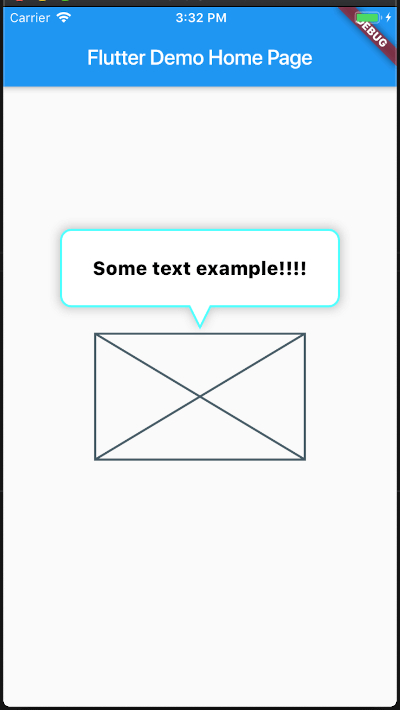
Basic

You can get started really simple, just add

Basic

SimpleTooltip(
        tooltipTap: () {
        print("Tooltip tap");
        },
        animationDuration: Duration(seconds: 3),
        show: true,
        tooltipDirection: TooltipDirection.up,
        child: Container(
        width: 200,
        height: 120,
        child: Placeholder(),
        ),
        content: Text(
        "Some text example!!!!",
        style: TextStyle(
            color: Colors.black,
            fontSize: 18,
            decoration: TextDecoration.none,
        ),
        ),
    ),

Full Api

/// The [child] which the tooltip will target to
  final Widget child;

  /// Sets the tooltip direction
  /// defaults to [TooltipDirection.up]
  final TooltipDirection tooltipDirection;

  /// Defines the content that its placed inside the tooltip ballon
  final Widget content;

  /// If true, it will display the tool , if false it will hide it
  final bool show;

  /// Sets the content padding
  /// defautls to: `const EdgeInsets.symmetric(horizontal: 20, vertical: 16),`
  final EdgeInsets ballonPadding;

  /// sets the duration of the tooltip entrance animation
  /// defaults to [460] milliseconds
  final Duration animationDuration;

  /// [top], [right], [bottom], [left] position the Tooltip absolute relative to the whole screen
  double top, right, bottom, left;

  /// [minWidth], [minHeight], [maxWidth], [maxHeight] optional size constraints.
  /// If a constraint is not set the size will ajust to the content
  double minWidth, minHeight, maxWidth, maxHeight;

  ///
  /// The distance of the tip of the arrow's tip to the center of the target
  final double arrowTipDistance;

  ///
  /// The length of the Arrow
  final double arrowLength;

  ///
  /// the stroke width of the border
  final double borderWidth;

  ///
  /// The minium padding from the Tooltip to the screen limits
  final double minimumOutSidePadding;

  ///
  /// The corder radii of the border
  final double borderRadius;

  ///
  /// The width of the arrow at its base
  final double arrowBaseWidth;

  ///
  /// The color of the border
  final Color borderColor;

  ///
  /// The color of the border
  final Color backgroundColor;

  ///
  /// Set a custom list of [BoxShadow]
  /// defaults to `const BoxShadow(color: const Color(0x45222222), blurRadius: 8, spreadRadius: 2),`
  final List<BoxShadow> customShadows;

  ///
  /// Set a handler for listening to a `tap` event on the tooltip (This is the recommended way to put your logic for dismissing the tooltip)
  final Function() tooltipTap;

  ///
  /// If you want to automatically dismiss the tooltip whenever a user taps on it, set this flag to [true]
  /// For more control on when to dismiss the tooltip please rely on the [show] property and [tooltipTap] handler
  /// defaults to [false]
  final bool hideOnTooltipTap;

  ///
  /// Pass a `RouteObserver` so that the widget will listen for route transition and will hide tooltip when
  /// the widget's route is not active
  final RouteObserver<PageRoute> routeObserver;

Screenshots

Animated
This plugin was inspired by super_tooltip

Getting Started

This project is a starting point for a Dart package, a library module containing code that can be shared easily across multiple Flutter or Dart projects.

For help getting started with Flutter, view our online documentation, which offers tutorials, samples, guidance on mobile development, and a full API reference.

Categorias

Repositório-fonte

Projetos que usam este pacote

Ainda não há dados.