Orientação gerada a partir de informações públicas. Apenas para referência.
Sizer é um pacote Flutter que simplifica o design de interface responsiva em plataformas móveis, web e desktop. Ele oferece uma maneira fácil de criar layouts que se adaptam sem problemas a diferentes tamanhos de tela e orientações usando unidades lógicas baseadas nas dimensões da tela do dispositivo. Com o Sizer, os desenvolvedores podem definir tamanhos relativos à largura e altura da tela, garantindo aparência consistente independentemente do tipo de dispositivo ou resolução. O pacote se integra suavemente em projetos existentes com configuração mínima, tornando-o ideal para construir interfaces de usuário escaláveis e sustentáveis.
Criando layouts adaptativos para múltiplos tamanhos de tela
Garantir uma escala de interface consistente em dispositivos móveis e desktop
Simplificando o design responsivo sem consultas complexas de mídia
Projetar layouts que funcionam tanto em telas de celulares pequenos quanto em telas de desktop grandes
Principais recursos
Adaptação automática do tamanho da tela
Suporte para todas as principais plataformas (Android, iOS, Web, macOS, Windows, Linux)
Dimensionamento baseado em escala fácil de usar
Tratamento de orientação embutido
Mínimo boilerplate necessário
Indicado para
Desenvolvedores direcionados para múltiplas plataformas
Equipes priorizando consistência da interface
Projetos que exigem implementação rápida de layout responsivo
Iniciantes aprendendo design responsivo no Flutter
Aplicativos que precisam de escalabilidade dinâmica em dispositivos diversos
Considerações
Pode ser necessário ajuste inicial de valores embutidos existentes
Melhor usado com um sistema de design consistente
Não ideal para necessidades de dimensionamento altamente personalizadas ou não uniformes
Limitado à responsividade baseada em tamanho, não mudanças na estrutura de layout
Requer compreensão dos princípios de escala de pixel lógico
README original
Snapshot do README original do repositório-fonte vinculado. Consulte o repositório para o conteúdo mais recente.
Sizer (Responsive UI solution for Mobile App,Web and Desktop)
Looking for Flutter development support? Let’s connect — available on WhatsApp and Email.
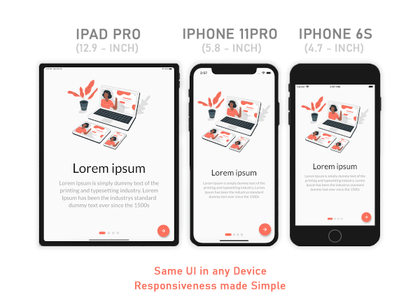
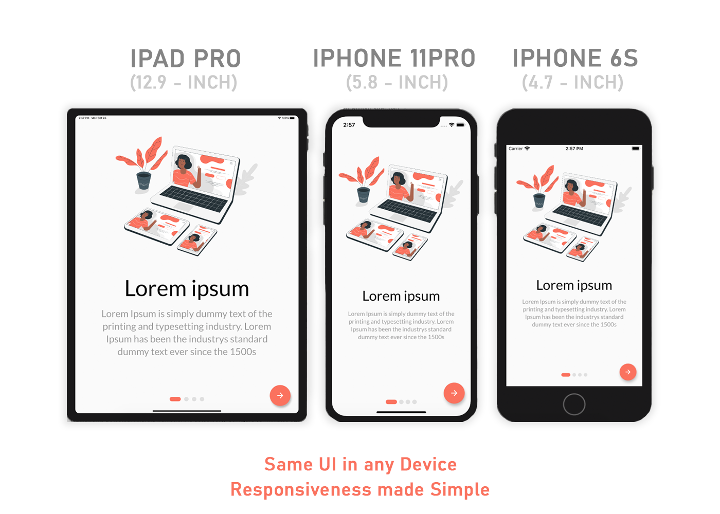
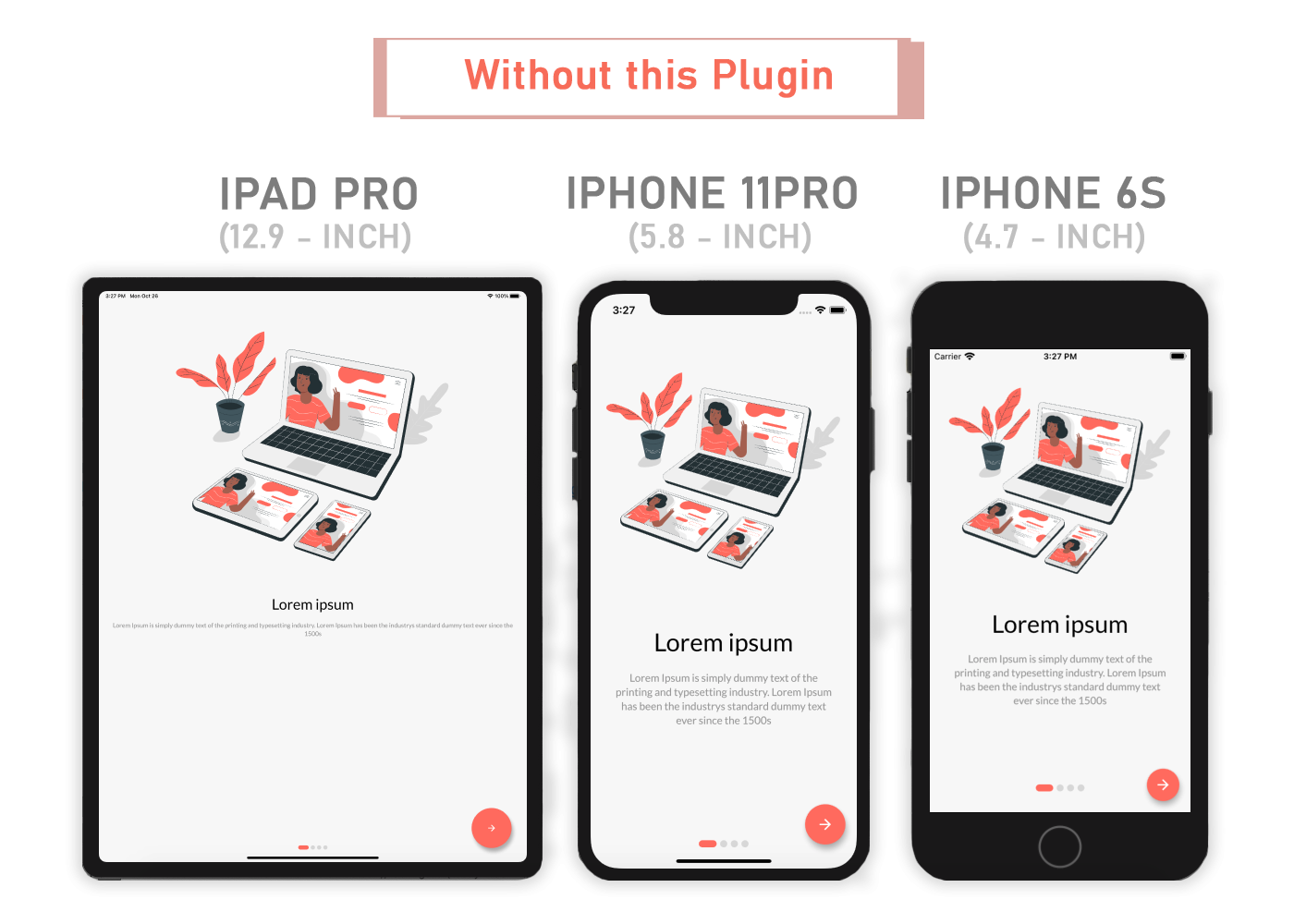
A Flutter package that simplifies responsive design by automatically adapting your app’s UI to any screen size — making responsiveness seamless and intuitive.
Same layout to look different in tablet and mobile, use the Device.screenType method:
Device.screenType == ScreenType.tablet
  ? Container(   // Widget for Tablet
      width: 100.w,
      height: 20.5.h,
   )
  : Container(   // Widget for Mobile
      width: 100.w,
      height: 12.5.h,
   )
*Device.ScreenTypecan not be Desktop unless maxTabletWidth is set
Guideline
Sizer
maxMobileWidth - Maximum width of a mobile device
(If the device's width is larger than this, it will be categorized as a tablet) - Default value: 599
maxTabletWidth - Maximum width of a tablet device
(If the device's width is larger than this, it will be categorized as a desktop) - Optional: enables DesktopScreenType if enabled
Extensions
Adaptive.h() or .h - Calculated percentage of the device's height (40.h -> 40% of device's height)
Adaptive.w() or .w - Calculated percentage of the device's width (40.w -> 40% of device's width)
Adaptive.sp() or .sp - Calculated sp based on the device's pixel density and aspect ratio (See FAQ)
Adaptive.dp() or .dp - Calculated dp based on the device's pixel density (See FAQ)
*Note: Only use .sh and .sw if you want height and width to depend on the device's available height and width after applying SafeArea. Use .h and .w by default.
Adaptive.sh() or .sh - Calculated percentage of the remaining device's height after applying SafeArea
Adaptive.sw() or .sw - Calculated percentage of the remaining device's width after applying SafeArea
Device.boxConstraints - BoxConstraints of the device
Device.orientation - Screen Orientation of the device (portrait or landscape)
Device.screenType - Screen type of the device (mobile or tablet)
Device.aspectRatio - Aspect ratio of the device
Device.pixelRatio - Pixel density ratio of the device
Adaptive.cm() or .cm - The respective value in value in centimeters
Adaptive.mm() or .mm - The respective value in value in millimeters
Adaptive.Q() or .Q - The respective value in quarter-millimeters
Adaptive.inches() or .inches - The respective value in inches
Adaptive.pc() or .pc - The respective value in picas (1/6th of 1 inch)
Adaptive.pt() or .pt - The respective value in points (1/72th of 1 inch)
Adaptive.px() or .px - The respective value in pixels
Note
You need to import sizer package in order to access number.h, number.w, number.dp, and number.sp
Auto import in VSCode and Android Studio doesn't work for dart extension methods. Typing 10.h would not bring up auto import suggestion for this package
One workaround is to type Device so that the auto import suggestion would show up:
Why is dp not calculated using the device's screen density?
Since there is no way to obtain a device's physical width in inches, we could not calculate for screen density. Material Design's screen density calculation involves a device's physical width in inches. As an alternative, dp is calculated using the device's pixel ratio.
Community Support
If you have any suggestions or issues, feel free to open an issue
If you would like to contribute, feel free to create a PR