Buscar pacotes, repositórios e categorias de apps

Capa de slidable_bar
Detalhes do pacotev1.1.1

slidable_bar

Um pacote Flutter para exibir o SideBar e ocultá-lo, além de personalizar seu clique.

AndroidiOSWebmacOSWindowsLinux
Downloads em 30 dias
61
Curtidas
48
Pontos Pub
150

Instalar pacote

flutter pub add slidable_bar

Visão geral do pacote

Orientação gerada a partir de informações públicas. Apenas para referência.

SlidableBar é um pacote do Flutter que permite aos desenvolvedores implementar um componente de navegação com barra lateral deslizante personalizável em múltiplas plataformas. Ele permite que os usuários revelem ou ocultem a barra lateral com animações suaves, oferecendo flexibilidade no design e na interação. O pacote suporta várias opções de personalização para aparência e comportamento da barra lateral, tornando-o ideal para aplicativos que exigem navegação intuitiva. Ele se integra perfeitamente aos projetos do Flutter e funciona no Android, iOS, Web, macOS, Windows e Linux.

Casos de uso

  • Implementando menus de navegação colapsáveis
  • Criando layouts responsivos para dispositivos móveis e web
  • Adicionando gestos de deslize para controle do painel lateral
  • Designando interfaces de gavetas personalizadas
  • Construindo aplicativos com estilo de painel
  • Melhorando a experiência do usuário com transições animadas

Principais recursos

  • Animação de deslizamento suave
  • Aparência personalizável da barra lateral
  • Suporte para gestos de deslize
  • Compatibilidade multiplataforma
  • Integração fácil com aplicativos Flutter existentes
  • Comportamento configurável de abertura/fechamento

Indicado para

  • Desenvolvedores construindo aplicativos com foco em navegação
  • Designers procurando componentes de interface interativa
  • Projetos com destino a múltiplas plataformas
  • Aplicativos que exigem soluções leves de navegação
  • Equipes usando Flutter para desenvolvimento full-stack
  • Prototipagem de layouts de interface dinâmicos

Considerações

  • Pode exigir estilos adicionais para designs complexos
  • Impacto no desempenho com widgets pesados dentro da barra lateral
  • Temas internos limitados em comparação com outros pacotes
  • Requer manipulação cuidadosa de conflitos de gestos
  • Não otimizado para itens de navegação muito grandes
  • Mais adequado para estruturas de navegação de tamanho moderado

README original

Snapshot do README original do repositório-fonte vinculado. Consulte o repositório para o conteúdo mais recente.

slidable_bar

A Flutter side bar slider can be with any widget you want

review

Features

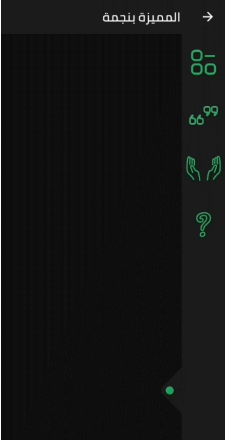
  • The SlidableBar can have four positions: top, bottom, right and left.
  • Customizable clicker, you can change the clicker widget with what you want.
  • Just like Flutter's Drawer, but with new way.

Things to note

  • The SlidableBar should have specific width and height, it works fine with scaffold's body.
  • The SlidableBar doesn't create it's own context, so it will appear under floating action button if you add one.

Usage

    final SlidableBarController controller = SlidableBarController(initialStatus: true);
    
    SlidableBar(
        size: 50, // this will be bar's height in case Side is bottom or top and width in case Side is left or right 
        children: <Widget>[], // here is the widgets inside the bar
        child: Container(), // here is your widget that will be under the bar 
        // optional
        frontColor: Colors.green, // the color of the cycle inside the default clicker
        slidableController: controller, // the contoller to change and listen to the bar status
        barRadius: const BorderRadius.circular(10.0), // the contoller to change and listen to the bar status
        side: Side.bottom, // Side.right is the default
        clickerPosition: 1.0, // the position of the clicker, 0.0 is the default
        clickerSize: 60, // the sizer of the default clicker, 55 is the default
        onChange: (int index){
            print(index); // this will print the index of the widget you clicked inside the bar
        },
        duration: Duration(milliseconds: 500), // the duration of the animation, (300 mil) is the default
        isOpenFirst: true, // the initial state of the bar, false is default
        backgroundColor: Colors.black, // primary color is default
        curve: Curves.ease, // the animation curve, linear is defualt
        clicker: Icon(Icons.arrow_forward_ios), // this will build instead of the default clicker
      )

Getting started

In the pubspec.yaml of your flutter project, add the following dependency:

dependencies:
  slidable_bar: "^1.1.0"

Then run $ flutter pub get. In your library, add the following import:

import 'package:slidable_bar/slidable_bar.dart';

Preview Images (The positions)

right left

top bottom

Custom Clicker

custom-clicker

Author

Mahmoud Haj Ali - GitHub

Categorias

Repositório-fonte

Projetos que usam este pacote

Ainda não há dados.