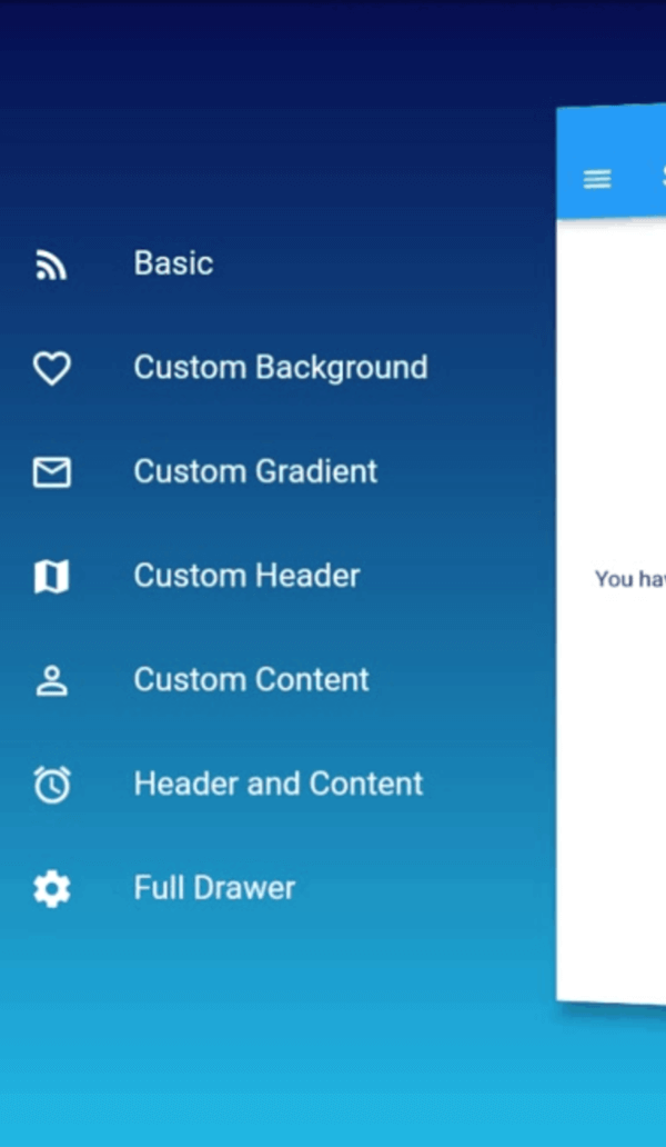
Orientação gerada a partir de informações públicas. Apenas para referência.
slide_drawer é um pacote do Flutter que simplifica a implementação de painéis com animações suaves de deslizamento. Ele fornece uma API fácil de usar para integrar menus de navegação laterais em aplicativos Flutter, melhorando a experiência do usuário com transições fluidas. Projetado para desenvolvedores que buscam uma solução leve e personalizável para painéis, oferece suporte a painéis esquerdo e direito com configuração mínima. O pacote se concentra em desempenho e estética, sendo ideal para aplicativos que exigem navegação intuitiva. Sua base de código limpa e manutenção ativa garantem confiabilidade em diversos projetos.
Casos de uso
Implementando menus de navegação laterais
Adicionando transições animadas de gaveta
Criando layouts responsivos com painéis colapsáveis
Construindo painéis de aplicativos móveis
Melhorando a interatividade da IU com efeitos de deslizamento
Principais recursos
Animação de deslizamento suave
Suporte para gavetas esquerda e direita
Configuração mínima necessária
Leve e eficiente
Aparência e comportamento personalizáveis
Indicado para
desenvolvedores de aplicativos móveis
Designers de UI/UX procurando melhorias em animações
Projetos que exigem funcionalidade de gaveta simples
Iniciantes do Flutter explorando padrões de navegação
Aplicativos com conteúdo de barra lateral dinâmico
Considerações
Limitado a recursos básicos de gaveta
Sem suporte embutido para gavetas aninhadas
Pode exigir estilos adicionais para layouts complexos
Não otimizado para estruturas de navegação em grande escala
Depende de dependências externas para personalização avançada
README original
Snapshot do README original do repositório-fonte vinculado. Consulte o repositório para o conteúdo mais recente.
SlideDrawer
An easy way to use drawer in Flutter with cool sliding animation.
Getting Started
Add dependency in your flutter project.
$ flutter pub add slide_drawer
or
dependencies:slide_drawer:^1.0.3
Then run flutter pub get.
Example
You can see the example folder to learn many different ways of using SlideDrawer in your app.
Usage
As usual, we need to import the package.
import'package:slide_drawer/slide_drawer.dart';
Then wrap the app home page with SlideDrawer.
To use the basic SlideDrawer, you only need to define items (List of MenuItem) to generate menu in your drawer. The drawer will use your default theme color as drawer background, and theme brightness as drawer brightness.
classAppextendsStatelessWidget{
@overrideWidgetbuild(BuildContext context) {
returnMaterialApp(
title: title,
// SlideDrawer will use style from this theme
theme: ThemeData(
brightness: Brightness.dark,
primarySwatch: Colors.blue,
visualDensity: VisualDensity.adaptivePlatformDensity,
),
// wrap your HomePage with SlideDrawer
home: SlideDrawer(
items: [
MenuItem('Home', onTap: (){}),
MenuItem('Project', onTap: (){}),
MenuItem('Favourite', onTap: (){}),
MenuItem('Profile', onTap: (){}),
MenuItem('Setting', onTap: (){}),
],
child: HomePage(),
),
);
}
}
Then set onPressed in your AppBar menu button to toggle SlideDrawer.
appBar: AppBar(
title: Text(title),
leading: IconButton(
icon: Icon(Icons.menu),
// call toggle from SlideDrawer to alternate between open and close// when pressed menu button
onPressed: () => SlideDrawer.of(context).toggle(),
),
),
SlideDrawer also come with parameter backgroundColor and backgroundGradient.
If we specify backgroundGradient, the drawer will use it as background. If not, it will use backgroundColor. If we also not specify backgroundColor, it will use the default theme color as background.
It's good practice to specify brightness (dark or light) if we use backgroundGradient or backgroundColor.
If we set dark color in your backgroundGradient or backgroundColor, use Brightness.dark.
If we set light color, use Brightness.light.
In the previous example, we use items and let the SlideDrawer generate menu in the content drawer.
But we can also set any custom widget as the content drawer.
If you have your own creative idea for the full widget inside the drawer, don't worry. We can use it in SlideDrawer by passing it to drawer. In this way, SlideDrawer will use style of custom drawer and ignore any value in backgroundColor, gradientColor, and brightness.
The default SlideDrawer animate home page by move it to the right (offsetFromRight default to 60), scale it, and rotate it at y axis with some small angle (pi / 24 radian or 180 / 24 degree = 7.5 degree).
If don't want to rotate, we can disable the rotation by setting isRotate to false.
We can also use custom curve and duration. The default values are linear and 300ms. We can specify curveReverse and durationReverse to change curve and duration of animation in the reverse direction.