Orientação gerada a partir de informações públicas. Apenas para referência.
sliver_catalog é um pacote Flutter que oferece uma coleção selecionada de slivers experimentais e criativos projetados para aprimorar interfaces navegáveis. Criado para desenvolvedores que buscam experiências de rolagem únicas e visualmente envolventes, ele amplia os componentes sliver internos do Flutter com layouts e comportamentos inovadores. Ideal para prototipagem ou adicionar charme a aplicativos com interações de rolagem complexas, o pacote suporta todas as principais plataformas, incluindo móvel, web e desktop. Sua arquitetura modular permite integração fácil em visualizações de rolagem existentes.
Casos de uso
Criando interfaces de usuário dinâmicas e roláveis
Prototipagem de efeitos avançados de rolagem
Melhorar o apelo visual do aplicativo
Criando layouts de rolagem personalizados
Adicionando comportamentos experimentais de sliver
Principais recursos
widgets sliver experimentais
Designs criativos de rolagem
Suporte multiplataforma
Modular e extensível
Integração fácil com ScrollView
Indicado para
Desenvolvedores Flutter explorando efeitos de rolagem
Designers que querem componentes de interface únicos
Construtores de aplicativos em busca de inovação visual
Prototipadores testando novos padrões de rolagem
Equipes construindo experiências imersivas baseadas em rolagem
Considerações
Mais adequado para projetos experimentais
Pode exigir estilos adicionais
Não recomendado para estabilidade em produção
Documentação limitada
Impacto potencial no desempenho com layouts complexos
README original
Snapshot do README original do repositório-fonte vinculado. Consulte o repositório para o conteúdo mais recente.
What this library is
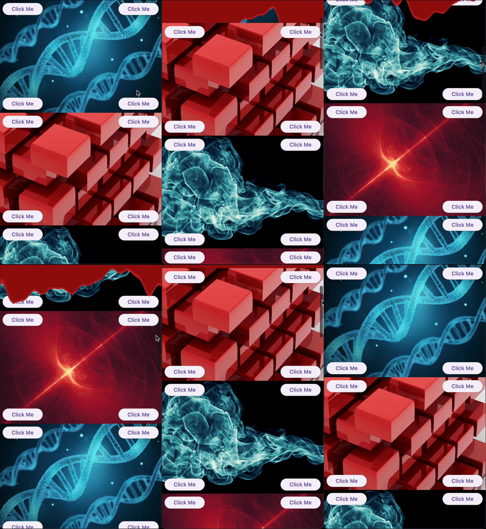
A collection of experimental and creative slivers for Flutter. Extend your scrolling experience beyond the basics.
Gallery
Demo
Overview
Sliver Catalog provides a set of advanced and experimental slivers for Flutter, enabling developers to create unique, visually engaging scroll effects. The package includes basic slivers as a platform for creating effects and specific implementations that provide ready-to-use effects.
Basics
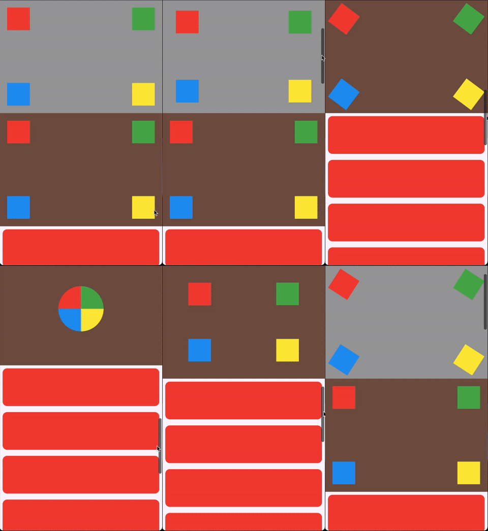
ScrollHijackSliver: A sliver that consumes a specified amount of scrollable space before allowing its child to start scrolling.
LeavingViewportShaderSliver: Applies a shader on top of the child while it leaves the viewport.
LeavingViewportTransformedRenderSliver: A render object that applies a transformation to the child while it leaves the viewport.
Ready-to-use effects
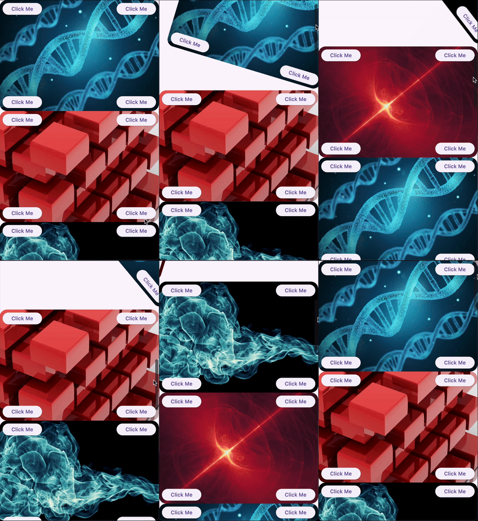
SpinnerSliver: Rotates its child as it leaves the viewport, with configurable anchor and angle.
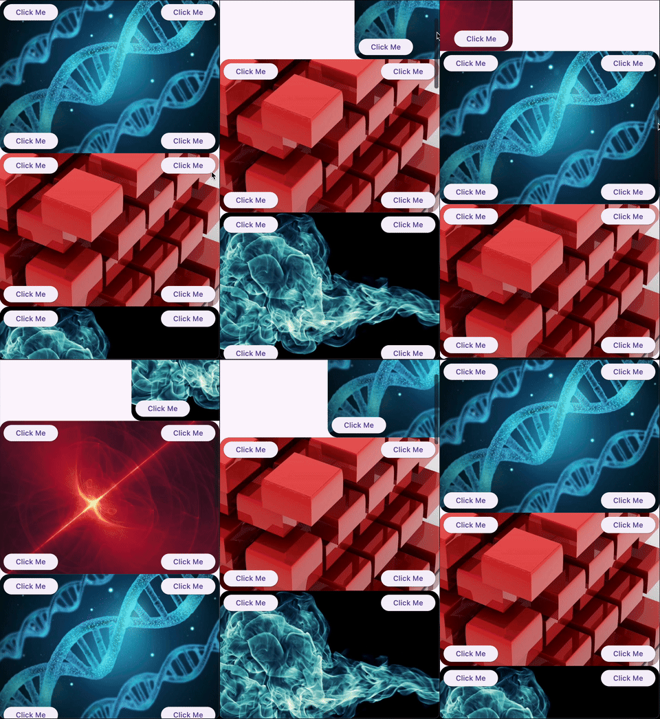
GliderSliver: Smoothly shifts the child in and out of the viewport.
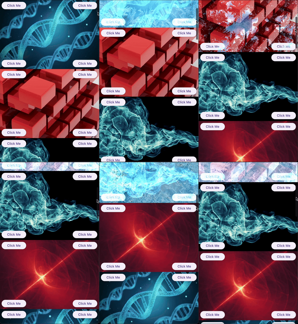
FreezeSliver: Applies a freezing effect to the child while it leaves the viewport.
BloodSliver: Applies a blood covering effect to the child while it leaves the viewport.
Explore the library
ScrollHijackSliver
A sliver that consumes a specified amount of scrollable space before allowing its child to start scrolling. This is useful for creating custom scroll-driven animations and effects.
Key features:
Exposes a ValueListenable<double> progress (0.0–1.0) to the builder, so you can animate your child based on the progress.
Supports different progress calculation behaviors via ScrollHijackProgressBehavior.
A sliver that applies a fragment shader effect to its child as it leaves the viewport. This enables advanced visual effects as the user scrolls.
Key features:
Can operate with a raw FragmentShader that uses a specific order of arguments (size, offset, progress), or with a custom shader wrapper for any uniform order via the LeavingViewportShader interface.
The shader receives the child's size, paint offset, and a progress value (0.0–1.0) indicating how much the child has left the viewport.
Example:
CustomScrollView(
slivers: [
// Using a raw FragmentShader (default uniform order)LeavingViewportShaderSliver.fromFragmentShader(
shader: myFragmentShader,
child: Image.network('https://...'),
),
// Using a custom wrapper for arbitrary uniform orderLeavingViewportShaderSliver(
shader: MyCustomLeavingViewportShader(),
child: Image.network('https://...'),
),
// ... other slivers ...
],
)
There are also two built-in inheritances of LeavingViewportShaderSliver:
FreezeSliver
A sliver that applies a "freezing" shader effect to its child as it leaves the viewport. This effect is built-in and requires no manual shader setup.
Key features:
Uses a predefined freezing shader bundled with the package.
No shader code required—just wrap a content with the sliver.
A sliver that applies a "blood covering" shader effect to its child as it leaves the viewport. This effect is built-in and requires no manual shader setup.
Key features:
Uses a predefined blood shader bundled with the package.
No shader code required—just wrap a content with the sliver.
A base render sliver for creating scroll-driven 3D or 2D transformations as a child leaves the viewport. This class is intended for advanced use, enabling you to define custom transformation effects (such as rotation, scaling, skewing, etc.) based on scroll progress.
Key features:
Exposes a performTransform method to define any transformation matrix based on child size and leaving progress.
Handles all the layout, painting, and hit testing logic for you.
Allows to define a custom hit testing logic if it is necessary.
Usage:
To create a custom effect, extend LeavingViewportTransformedRenderSliver and implement performTransform.
We appreciate any form of support, whether it's a financial donation, a public sharing, or a star on GitHub and a like on Pub. If you want to provide financial support, there are several ways you can do it: